
Accessibility
Flutter is committed to supporting developers who want to make their apps more accessible: usable by as many people as possible, including those with disabilities such as blindness or motor impairment.
Flutter supports three components for accessibility support:
- Large fonts: Render text widgets with user-specified font sizes
- Screen readers: Communicate spoken feedback about UI contents
- Sufficient contrast: Render widgets with colors that have sufficient contrast
Inspecting Accessibility support
Details of these are discussed below. In addition to testing for these specific topics, we recommend using automated accessibility scanners:
- For Android:
- Install the Accessibility Scanner for Android
- Enable the Accessibility Scanner from Android Settings > Accessibility > Accessibility Scanner > On
- Navigate to the Accessibility Scanner ‘checkbox’ icon button to initiate a scan
- For iOS:
- Open the
iOSfolder of your Flutter app in Xcode - Select a Simulator as the target, and click Run button
- In Xcode, select Xcode > Open Developer Tools > Accessibility Inspector
- In the Accessibility Inspector, select Inspection > Enable Point to Inspect, and then select the various user interface elements in running Flutter app to inspect their accessibility attributes
- In the Accessibility Inspector, select Audit in the toolbar, and then select Run Audio to get a report of potential issues
- Open the
Large fonts
Both Android and iOS contain system settings to configure the desired font sizes used by apps. Flutter text widgets respect this OS setting when determining font sizes.
Tips for developers
Font sizes are calculated automatically by Flutter based on the OS setting. However, as a developer you should make sure your layout has enough room to render all its contents when the font sizes are increased. For example you can test all parts of your app on a small-screen device configured to use the largest font setting.
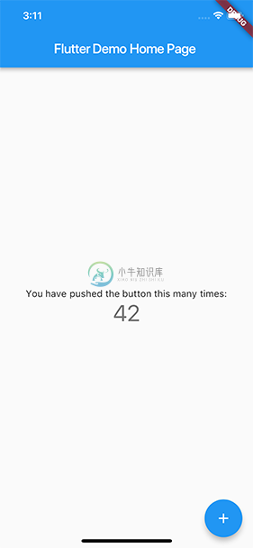
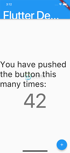
Example
The following two screenshots show the standard Flutter app template rendered with the default iOS font setting, and with the largest font setting selected in iOS accessibility settings.
Screen readers
Screen readers (TalkBack, VoiceOver) enable visually impaired users to get spoken feedback about the contents of the screen.
Tips for developers
Turn on VoiceOver or TalkBack on your device and navigate around your app. If you run into any issues, use the Semantics widget to customize the accessibility experience of your app.
Sufficient contrast
Sufficient color contrast makes text and images easier to read. Along with benefitting users with various visual impairments, sufficient color contrast helps all users when viewing an interface on devices in extreme lighting conditions, such as when exposed to direct sunlight or on a display with low brightness.
The W3C recommends:
- At least 4.5:1 for small text (below 18 point regular or 14 point bold)
- At least 3.0:1 for large text (18 point and above regular or 14 point and above bold)
Tips for developers
Make sure any images you include have sufficient contrast.
When specifying colors on widgets, make sure sufficient contrast is used between foreground and background color selections.