
Fade a Widget in and out
As UI developers, you often need to show and hide elements on screen. However, quickly popping elements on and off the screen can feel jarring to end users. Instead, you can fade elements in and out with an opacity animation to create a smooth experience.
In Flutter, you can achieve this task using the AnimatedOpacity Widget.
Directions
- Show a box to fade in and out
- Define a
StatefulWidget - Display a button that toggles the visibility
- Fade the box in and out
1. Create a box to fade in and out
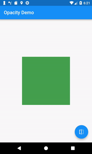
First, you’ll need something to fade in and out. In this example, you’ll draw a green box on screen.
Container(
  width: 200.0,
  height: 200.0,
  color: Colors.green,
);
2. Define a StatefulWidget
Now that you have a green box to animate, you’ll need a way to know whether the box should be visible or invisible. To accomplish this, use a StatefulWidget.
A StatefulWidget is a class that creates a State object. The State object holds some data about our app and provides a way to update that data. When you update the data, you can also ask Flutter to rebuild our UI with those changes.
In this case, you’ll have one piece of data: a boolean representing whether the button is visible or invisible.
To construct a StatefulWidget, you need to create two classes: A StatefulWidget and a corresponding State class. Pro tip: The Flutter plugins for Android Studio and VSCode include the stful snippet to quickly generate this code.
// The StatefulWidget's job is to take in some data and create a State class.
// In this case, our Widget takes in a title, and creates a _MyHomePageState.
class MyHomePage extends StatefulWidget {
  final String title;

  MyHomePage({Key key, this.title}) : super(key: key);

  @override
  _MyHomePageState createState() => _MyHomePageState();
}

// The State class is responsible for two things: holding some data you can
// update and building the UI using that data.
class _MyHomePageState extends State<MyHomePage> {
  // Whether the green box should be visible or invisible
  bool _visible = true;

  @override
  Widget build(BuildContext context) {
    // The green box goes here with some other Widgets.
  }
}
3. Display a button that toggles the visibility
Now that you have some data to determine whether the green box should be visible or invisible, you’ll need a way update that data. In this case, if the box is visible, you want to hide it. If the box is hidden, you want to show it.
To achieve this, you’ll display a button. When a user presses the button, you’ll flip the boolean from true to false, or false to true. You need to make this change using setState, which is a method on the State class. This lets Flutter know it needs to rebuild the Widget.
Note: For more information on working with user input, please see the Gestures section of the Cookbook.
FloatingActionButton(
  onPressed: () {
    // Make sure to call setState. This tells Flutter to rebuild the
    // UI with the changes.
    setState(() {
      _visible = !_visible;
    });
  },
  tooltip: 'Toggle Opacity',
  child: Icon(Icons.flip),
);
4. Fade the box in and out
You’ve got a green box on screen. You’ve got a button to toggle the visibility to true or false. So how do you fade the box in and out? With an AnimatedOpacity Widget.
The AnimatedOpacity Widget requires three arguments:
opacity: A value from 0.0 (invisible) to 1.0 (fully visible).duration: How long the animation should take to complete.child: The Widget to animate. In our case, the green box.
AnimatedOpacity(
  // If the Widget should be visible, animate to 1.0 (fully visible). If
  // the Widget should be hidden, animate to 0.0 (invisible).
  opacity: _visible ? 1.0 : 0.0,
  duration: Duration(milliseconds: 500),
  // The green box needs to be the child of the AnimatedOpacity
  child: Container(
    width: 200.0,
    height: 200.0,
    color: Colors.green,
  ),
);
Complete example
import 'package:flutter/material.dart';

void main() => runApp(MyApp());

class MyApp extends StatelessWidget {
  @override
  Widget build(BuildContext context) {
    final appTitle = 'Opacity Demo';
    return MaterialApp(
      title: appTitle,
      home: MyHomePage(title: appTitle),
    );
  }
}

// The StatefulWidget's job is to take in some data and create a State class.
// In this case, the Widget takes a title, and creates a _MyHomePageState.
class MyHomePage extends StatefulWidget {
  final String title;

  MyHomePage({Key key, this.title}) : super(key: key);

  @override
  _MyHomePageState createState() => _MyHomePageState();
}

// The State class is responsible for two things: holding some data you can
// update and building the UI using that data.
class _MyHomePageState extends State<MyHomePage> {
  // Whether the green box should be visible or invisible
  bool _visible = true;

  @override
  Widget build(BuildContext context) {
    return Scaffold(
      appBar: AppBar(
        title: Text(widget.title),
      ),
      body: Center(
        child: AnimatedOpacity(
          // If the Widget should be visible, animate to 1.0 (fully visible).
          // If the Widget should be hidden, animate to 0.0 (invisible).
          opacity: _visible ? 1.0 : 0.0,
          duration: Duration(milliseconds: 500),
          // The green box needs to be the child of the AnimatedOpacity
          child: Container(
            width: 200.0,
            height: 200.0,
            color: Colors.green,
          ),
        ),
      ),
      floatingActionButton: FloatingActionButton(
        onPressed: () {
          // Make sure to call setState. This tells Flutter to rebuild the
          // UI with the changes.
          setState(() {
            _visible = !_visible;
          });
        },
        tooltip: 'Toggle Opacity',
        child: Icon(Icons.flip),
      ), // This trailing comma makes auto-formatting nicer for build methods.
    );
  }
}