
Basic widgets
Widgets you absolutely need to know before building your first Flutter app.
See more widgets in the widget catalog.
A convenience widget that combines common painting, positioning, and sizing widgets.
DocumentationLayout a list of child widgets in the horizontal direction.
DocumentationLayout a list of child widgets in the vertical direction.
DocumentationA widget that displays an image.
Documentation AbcA run of text with a single style.
Documentation
A Material Design icon.
Documentation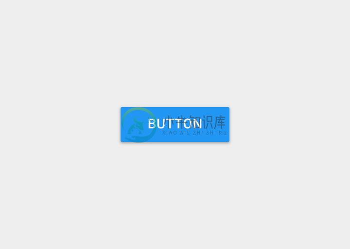
A Material Design raised button. A raised button consists of a rectangular piece of material that hovers over the interface.
Documentation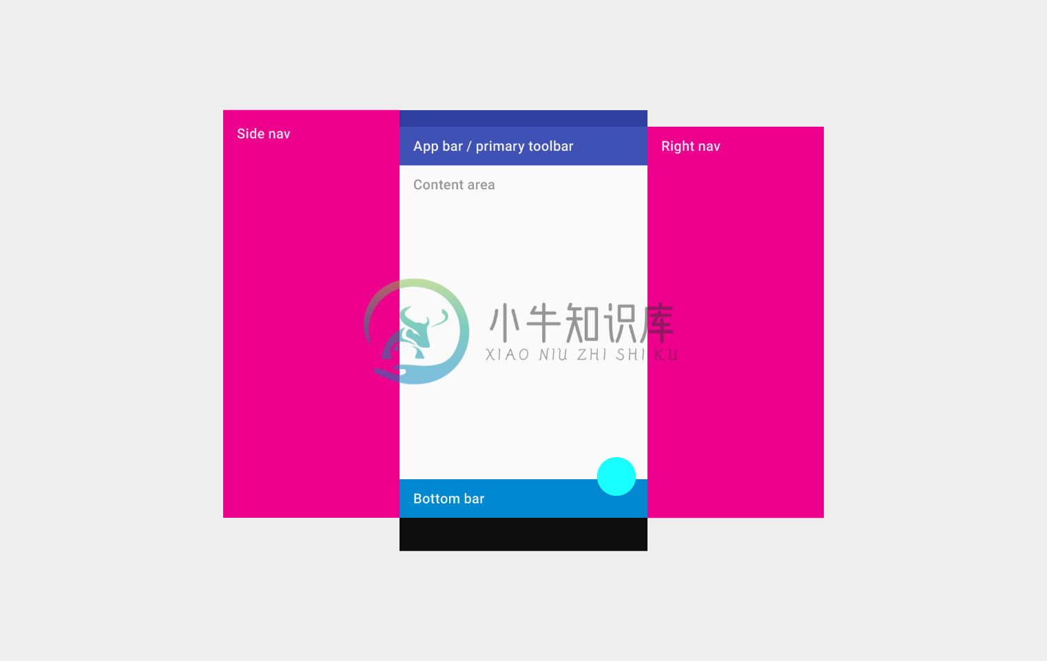
Implements the basic Material Design visual layout structure. This class provides APIs for showing drawers, snack bars, and bottom sheets.
Documentation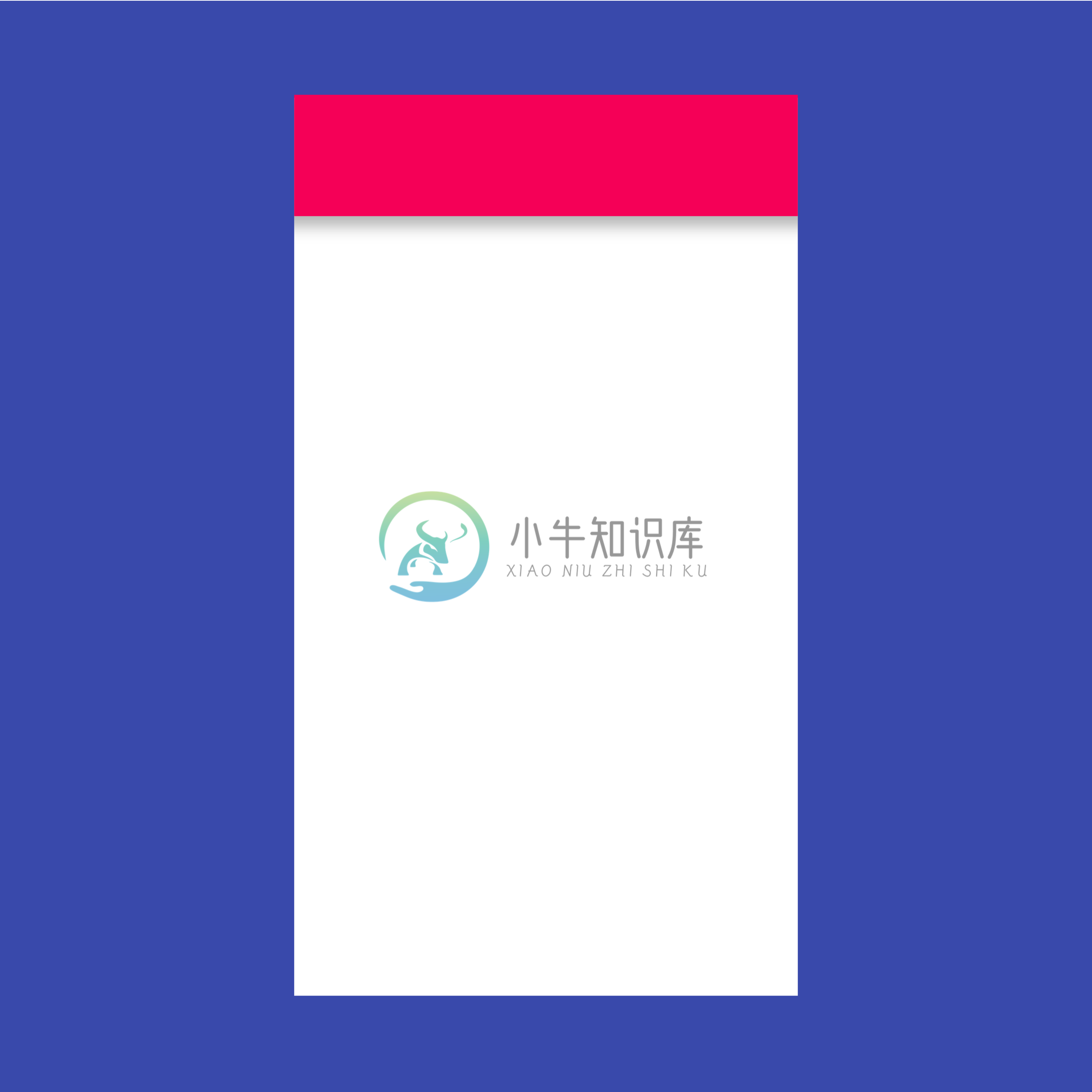
A Material Design app bar. An app bar consists of a toolbar and potentially other widgets, such as a TabBar and a FlexibleSpaceBar.
Documentation
The Flutter logo, in widget form. This widget respects the IconTheme.
Documentation
A widget that draws a box that represents where other widgets will one day be added.
DocumentationSee more widgets in the widget catalog.