Layout tutorial
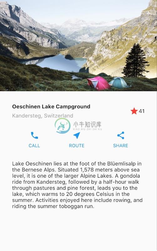
This is a guide to building layouts in Flutter. You’ll build the layout for the following app:

This guide then takes a step back to explain Flutter’s approach to layout, and shows how to place a single widget on the screen. After a discussion of how to lay widgets out horizontally and vertically, some of the most common layout widgets are covered.
If you want a “big picture” understanding of the layout mechanism, start with Flutter’s approach to layout.
Step 0: Create the app base code
Make sure you’ve set up your environment, then do the following:
- Create a basic “Hello World” Flutter app.
Change the app bar title and the app title as follows:
{codelabs/startup_namer/step1_base → layout/base}/lib/main.dart@@ -6,10 +6,10 @@ 6 6 @override 7 7 Widget build(BuildContext context) { 8 8 return MaterialApp( 9 - title: ' WelcometoFlutter',9 + title: 'Flutter layout demo', 10 10 home: Scaffold( 11 11 appBar: AppBar( 12 - title: Text(' WelcometoFlutter'),12 + title: Text('Flutter layout demo'), 13 13 ), 14 14 body: Center( 15 15 child: Text('Hello World'),
Step 1: Diagram the layout
The first step is to break the layout down to its basic elements:
- Identify the rows and columns.
- Does the layout include a grid?
- Are there overlapping elements?
- Does the UI need tabs?
- Notice areas that require alignment, padding, or borders.
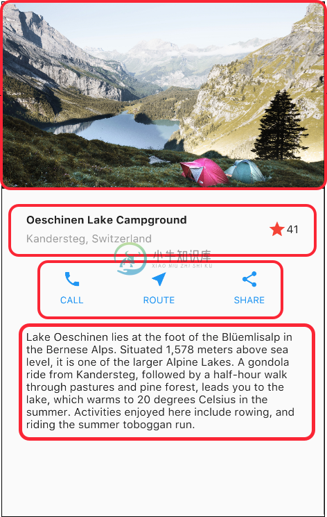
First, identify the larger elements. In this example, four elements are arranged into a column: an image, two rows, and a block of text.

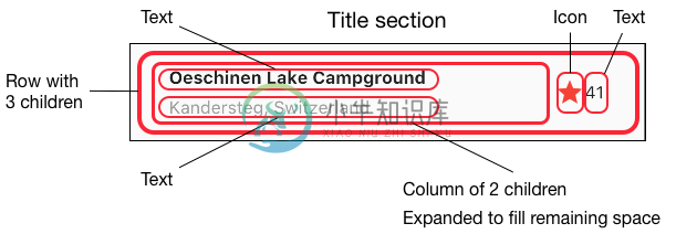
Next, diagram each row. The first row, called the Title section, has 3 children: a column of text, a star icon, and a number. Its first child, the column, contains 2 lines of text. That first column takes a lot of space, so it must be wrapped in an Expanded widget.

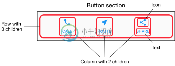
The second row, called the Button section, also has 3 children: each child is a column that contains an icon and text.

Once the layout has been diagrammed, it’s easiest to take a bottom-up approach to implementing it. To minimize the visual confusion of deeply nested layout code, place some of the implementation in variables and functions.
Step 2: Implement the title row
First, you’ll build the left column in the title section. Add the following code at the top of the build() method of the MyApp class:
Widget titleSection = Container(
  padding: const EdgeInsets.all(32),
  child: Row(
    children: [
      Expanded(
        /*1*/
        child: Column(
          crossAxisAlignment: CrossAxisAlignment.start,
          children: [
            /*2*/
            Container(
              padding: const EdgeInsets.only(bottom: 8),
              child: Text(
                'Oeschinen Lake Campground',
                style: TextStyle(
                  fontWeight: FontWeight.bold,
                ),
              ),
            ),
            Text(
              'Kandersteg, Switzerland',
              style: TextStyle(
                color: Colors.grey[500],
              ),
            ),
          ],
        ),
      ),
      /*3*/
      Icon(
        Icons.star,
        color: Colors.red[500],
      ),
      Text('41'),
    ],
  ),
);- Putting a Column inside an Expanded widget stretches the column to use all remaining free space in the row. Setting the
crossAxisAlignmentproperty toCrossAxisAlignment.startpositions the column at the start of the row. - Putting the first row of text inside a Container enables you to add padding. The second child in the Column, also text, displays as grey.
- The last two items in the title row are a star icon, painted red, and the text “41”. The entire row is in a Container and padded along each edge by 32 pixels.
Add the title section to the app body like this:
{../base → step2}/lib/main.dart| @@ -8,11 +46,13 @@ | |
| 8 46 | return MaterialApp( |
| 9 47 | title: 'Flutter layout demo', |
| 10 48 | home: Scaffold( |
| 11 49 | appBar: AppBar( |
| 12 50 | title: Text('Flutter layout demo'), |
| 13 51 | ), |
| 14 | - body: |
| 15 | - |
| 52 | + body: Column( |
| 53 | + children: [ |
| 54 | + titleSection, |
| 55 | + ], |
| 16 56 | ), |
| 17 57 | ), |
| 18 58 | ); |
Step 3: Implement the button row
The button section contains 3 columns that use the same layout—an icon over a row of text. The columns in this row are evenly spaced, and the text and icons are painted with the primary color.
Since the code for building each column is almost identical, create a private helper method named buildButtonColumn(), which takes a color, an Icon and Text, and returns a column with its widgets painted in the given color.
class MyApp extends StatelessWidget {
  @override
  Widget build(BuildContext context) {
    // ···
  }

  Column _buildButtonColumn(Color color, IconData icon, String label) {
    return Column(
      mainAxisSize: MainAxisSize.min,
      mainAxisAlignment: MainAxisAlignment.center,
      children: [
        Icon(icon, color: color),
        Container(
          margin: const EdgeInsets.only(top: 8),
          child: Text(
            label,
            style: TextStyle(
              fontSize: 12,
              fontWeight: FontWeight.w400,
              color: color,
            ),
          ),
        ),
      ],
    );
  }
}
The function adds the icon directly to the column. The text is inside a Container with a top-only margin, separating the text from the icon.
Build the row containing these columns by calling the function and passing the color, Icon, and text specific to that column. Align the columns along the main axis using MainAxisAlignment.spaceEvenly to arrange the free space evenly before, between, and after each column. Add the following code just below the titleSection declaration inside the build() method:
Color color = Theme.of(context).primaryColor;

Widget buttonSection = Container(
  child: Row(
    mainAxisAlignment: MainAxisAlignment.spaceEvenly,
    children: [
      _buildButtonColumn(color, Icons.call, 'CALL'),
      _buildButtonColumn(color, Icons.near_me, 'ROUTE'),
      _buildButtonColumn(color, Icons.share, 'SHARE'),
    ],
  ),
);
Add the button section to the body:
{step2 → step3}/lib/main.dart| @@ -46,3 +59,3 @@ | |
| 46 59 | return MaterialApp( |
| 47 60 | title: 'Flutter layout demo', |
| 48 61 | home: Scaffold( |
| @@ -52,8 +65,9 @@ | |
| 52 65 | body: Column( |
| 53 66 | children: [ |
| 54 67 | titleSection, |
| 68 | + buttonSection, |
| 55 69 | ], |
| 56 70 | ), |
| 57 71 | ), |
| 58 72 | ); |
| 59 73 | } |
Step 4: Implement the text section
Define the text section as a variable. Put the text in a Container and add padding along each edge. Add the following code just below the buttonSection declaration:
Widget textSection = Container(
  padding: const EdgeInsets.all(32),
  child: Text(
    'Lake Oeschinen lies at the foot of the Blüemlisalp in the Bernese '
        'Alps. Situated 1,578 meters above sea level, it is one of the '
        'larger Alpine Lakes. A gondola ride from Kandersteg, followed by a '
        'half-hour walk through pastures and pine forest, leads you to the '
        'lake, which warms to 20 degrees Celsius in the summer. Activities '
        'enjoyed here include rowing, and riding the summer toboggan run.',
    softWrap: true,
  ),
);
By setting softwrap to true, text lines will fill the column width before wrapping at a word boundary.
Add the text section to the body:
{step3 → step4}/lib/main.dart| @@ -59,3 +72,3 @@ | |
| 59 72 | return MaterialApp( |
| 60 73 | title: 'Flutter layout demo', |
| 61 74 | home: Scaffold( |
| @@ -66,6 +79,7 @@ | |
| 66 79 | children: [ |
| 67 80 | titleSection, |
| 68 81 | buttonSection, |
| 82 | + textSection, |
| 69 83 | ], |
| 70 84 | ), |
| 71 85 | ), |
Step 5: Implement the image section
Three of the four column elements are now complete, leaving only the image. Add the image file to the example:
- Create an
imagesdirectory at the top of the project. Add
lake.jpg.Update the
{step4 → step5}/pubspec.yamlpubspec.yamlfile to include anassetstag. This makes the image available to your code.@@ -17,3 +17,5 @@ 17 17 flutter: 18 18 uses-material-design: true 19 + assets: 20 + - images/lake.jpg
Now you can reference the image from your code:
{step4 → step5}/lib/main.dart| @@ -77,6 +77,12 @@ | |
| 77 77 | ), |
| 78 78 | body: Column( |
| 79 79 | children: [ |
| 80 | + Image.asset( |
| 81 | + 'images/lake.jpg', |
| 82 | + width: 600, |
| 83 | + height: 240, |
| 84 | + fit: BoxFit.cover, |
| 85 | + ), |
| 80 86 | titleSection, |
| 81 87 | buttonSection, |
| 82 88 | textSection, |
BoxFit.cover tells the framework that the image should be as small as possible but cover its entire render box.
Step 6: Final touch
In this final step, arrange all of the elements in a ListView, rather than a Column, because a ListView supports app body scrolling when the app is run on a small device.
| @@ -72,13 +77,13 @@ | |
| 72 77 | return MaterialApp( |
| 73 78 | title: 'Flutter layout demo', |
| 74 79 | home: Scaffold( |
| 75 80 | appBar: AppBar( |
| 76 81 | title: Text('Flutter layout demo'), |
| 77 82 | ), |
| 78 | - body: |
| 83 | + body: ListView( |
| 79 84 | children: [ |
| 80 85 | Image.asset( |
| 81 86 | 'images/lake.jpg', |
| 82 87 | width: 600, |
| 83 88 | height: 240, |
| 84 89 | fit: BoxFit.cover, |
Dart code: main.dart
Image: images
Pubspec: pubspec.yaml
That’s it! When you hot reload the app, you should see the same app layout as the screenshot at the top of this page.
You can add interactivity to this layout by following Adding Interactivity to Your Flutter App.

