
Material Components widgets
Visual, behavioral, and motion-rich widgets implementing the Material Design guidelines.
- App structure and navigation
- Buttons
- Input and selections
- Dialogs, alerts, and panels
- Information displays
- Layout
See more widgets in the widget catalog.
App structure and navigation
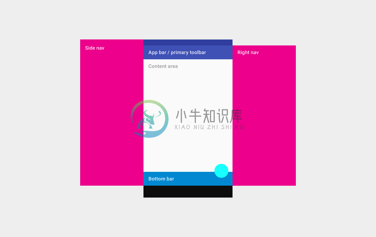
Implements the basic Material Design visual layout structure. This class provides APIs for showing drawers, snack bars, and bottom sheets.
Documentation
A Material Design app bar. An app bar consists of a toolbar and potentially other widgets, such as a TabBar and a FlexibleSpaceBar.
Documentation
Bottom navigation bars make it easy to explore and switch between top-level views in a single tap. The BottomNavigationBar widget implements this component.
Documentation
A Material Design widget that displays a horizontal row of tabs.
Documentation
A page view that displays the widget which corresponds to the currently selected tab. Typically used in conjunction with a TabBar.
Documentation
A convenience widget that wraps a number of widgets that are commonly required for applications implementing Material Design.
Documentation
A convenience class that wraps a number of widgets that are commonly required for an application.
Documentation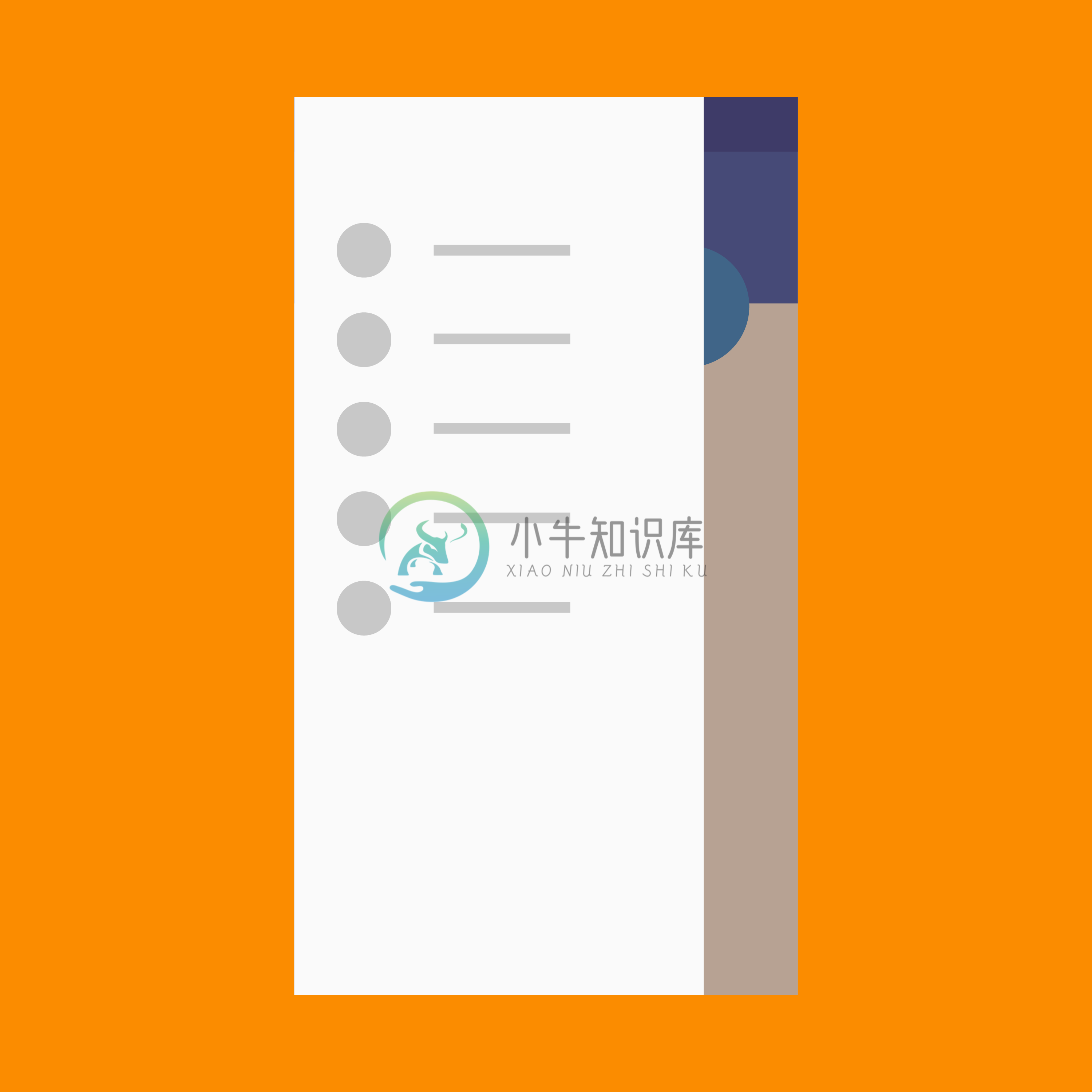
A Material Design panel that slides in horizontally from the edge of a Scaffold to show navigation links in an application.
Documentation
A material design app bar that integrates with a CustomScrollView.
DocumentationButtons
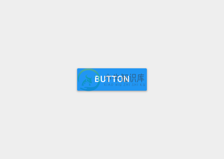
A Material Design raised button. A raised button consists of a rectangular piece of material that hovers over the interface.
Documentation
A floating action button is a circular icon button that hovers over content to promote a primary action in the application. Floating action buttons are most commonly used in the Scaffold.floatingActionButton field.
Documentation
A flat button is a section printed on a Material Components widget that reacts to touches by filling with color.
Documentation
An icon button is a picture printed on a Material widget that reacts to touches by filling with color (ink).
Documentation
Shows the currently selected item and an arrow that opens a menu for selecting another item.
Documentation
Displays a menu when pressed and calls onSelected when the menu is dismissed because an item was selected.
Documentation
A horizontal arrangement of buttons.
DocumentationInput and selections
Touching a text field places the cursor and displays the keyboard. The TextField widget implements this component.
Documentation
Checkboxes allow the user to select multiple options from a set. The Checkbox widget implements this component.
Documentation
Radio buttons allow the user to select one option from a set. Use radio buttons for exclusive selection if you think that the user needs to see all available options side-by-side.
Documentation
On/off switches toggle the state of a single settings option. The Switch widget implements this component.
Documentation
Sliders let users select from a range of values by moving the slider thumb.
Documentation
Date pickers use a dialog window to select a single date on mobile. Time pickers use a dialog to select a single time (in the hours:minutes format) on mobile.
DocumentationDialogs, alerts, and panels
Simple dialogs can provide additional details or actions about a list item. For example they can display avatars icons clarifying subtext or orthogonal actions (such as adding an account).
Documentation
Alerts are urgent interruptions requiring acknowledgement that inform the user about a situation. The AlertDialog widget implements this component.
Documentation
Bottom sheets slide up from the bottom of the screen to reveal more content. You can call showBottomSheet() to implement a persistent bottom sheet or showModalBottomSheet() to implement a modal bottom sheet.
Documentation
Expansion panels contain creation flows and allow lightweight editing of an element. The ExpansionPanel widget implements this component.
Documentation
A lightweight message with an optional action which briefly displays at the bottom of the screen.
DocumentationInformation displays
A widget that displays an image.
Documentation
A Material Design icon.
Documentation