
表单
Bootstrap提供了一些表单控件样式、布局选项,以及用来创建广泛多样化的的表单的自定义组件。
表单控件
bootstrap的表单控件在 重置表单样式的基础上用样式类进行了扩展。使用这些类可以优化自定义显示,以实现一个更一致的跨浏览器跨设备渲染。下面的示例表单演示了用Bootstrap附加类更新样式之后的常见的HTML表单元素。
记住,因为Bootstrap使用HTML文档类型,所有的inputs必须带有一个type属性。

<form>
  <fieldset class="form-group">
    <label for="exampleInputEmail1">Email address</label>
    <input type="email" class="form-control" id="exampleInputEmail1" placeholder="Enter email">
    <small class="text-muted">We'll never share your email with anyone else.</small>
  </fieldset>
  <fieldset class="form-group">
    <label for="exampleInputPassword1">Password</label>
    <input type="password" class="form-control" id="exampleInputPassword1" placeholder="Password">
  </fieldset>
  <fieldset class="form-group">
    <label for="exampleSelect1">Example select</label>
    <select class="form-control" id="exampleSelect1">
      <option>1</option>
      <option>2</option>
      <option>3</option>
      <option>4</option>
      <option>5</option>
    </select>
  </fieldset>
  <fieldset class="form-group">
    <label for="exampleSelect2">Example multiple select</label>
    <select multiple class="form-control" id="exampleSelect2">
      <option>1</option>
      <option>2</option>
      <option>3</option>
      <option>4</option>
      <option>5</option>
    </select>
  </fieldset>
  <fieldset class="form-group">
    <label for="exampleTextarea">Example textarea</label>
    <textarea class="form-control" id="exampleTextarea" rows="3"></textarea>
  </fieldset>
  <fieldset class="form-group">
    <label for="exampleInputFile">File input</label>
    <input type="file" class="form-control-file" id="exampleInputFile">
    <small class="text-muted">This is some placeholder block-level help text for the above input. It's a bit lighter and easily wraps to a new line.</small>
  </fieldset>
  <div class="radio">
    <label>
      <input type="radio" name="optionsRadios" id="optionsRadios1" value="option1" checked>
      Option one is this and that—be sure to include why it's great
    </label>
  </div>
  <div class="radio">
    <label>
      <input type="radio" name="optionsRadios" id="optionsRadios2" value="option2">
      Option two can be something else and selecting it will deselect option one
    </label>
  </div>
  <div class="radio disabled">
    <label>
      <input type="radio" name="optionsRadios" id="optionsRadios3" value="option3" disabled>
      Option three is disabled
    </label>
  </div>
  <div class="checkbox">
    <label>
      <input type="checkbox"> Check me out
    </label>
  </div>
  <button type="submit" class="btn btn-primary">Submit</button>
</form>
下面是一个Bootstrap支持的表控件以及自定义类的完整列表。额外的文档对每个组都是可用的。
| 类 | 作用 | 支持的变量 |
|---|---|---|
.form-group | 表单控件的任一组 | 用在任何块级元素上,比如说<fieldset>或<div> |
.form-control | 文本域控件 | text、 password、datetime、datetime-local、date、month、time、week、number、email、url、search、tel、color |
| 选择菜单 | multiple、size | |
| 多行文本域 | N/A | |
.form-control-file | 文件上传控件 | file |
.radio.radio-inline.checkbox.checkbox-inline | 复选框和单选钮 | N/A |
表单布局
因为Bootstrap对几乎所有的表单控件都应用了display:block以及width:100%,所以表单默认是纵向堆叠的。可以用附加的类来基于表单改变这种布局。
表单组
.form-group类是向表单添加一些结构的最简单的方法。它唯一的目的就是向label以及控件对提供下外边距margin-bottom。相应的,既然它是一个类,你可以在<fieldset>、<div>甚至任何别的元素上使用它。

<form>
  <fieldset class="form-group">
    <label for="formGroupExampleInput">Example label</label>
    <input type="text" class="form-control" id="formGroupExampleInput" placeholder="Example input">
  </fieldset>
  <fieldset class="form-group">
    <label for="formGroupExampleInput2">Another label</label>
    <input type="text" class="form-control" id="formGroupExampleInput2" placeholder="Another input">
  </fieldset>
</form>
内联表单
使用.inline-form类可以在一横行中显示一系列label、表单控件以及按钮。内联表单控件行为有以下区别:
- 控件是
display:inline-block,通过vertical-align以及margin来对齐控件。 - 控件接受
width:auto以覆盖Bootstrap默认的width:100%。 - 控件在宽度至少为768px的视口中才显示为内联,对移动设备上的窄视图作解释。
因为这,你可能需要人为设置宽度、对齐每个表单控件。最后,如下面所示,你必须总是把每个表单控件包含在一个<label>中。
可见的标签
<form class="form-inline">
  <div class="form-group">
    <label for="exampleInputName2">Name</label>
    <input type="text" class="form-control" id="exampleInputName2" placeholder="Jane Doe">
  </div>
  <div class="form-group">
    <label for="exampleInputEmail2">Email</label>
    <input type="email" class="form-control" id="exampleInputEmail2" placeholder="jane.doe@example.com">
  </div>
  <button type="submit" class="btn btn-primary">Send invitation</button>
</form>
隐藏的标签
<form class="form-inline">
  <div class="form-group">
    <label class="sr-only" for="exampleInputEmail3">Email address</label>
    <input type="email" class="form-control" id="exampleInputEmail3" placeholder="Enter email">
  </div>
  <div class="form-group">
    <label class="sr-only" for="exampleInputPassword3">Password</label>
    <input type="password" class="form-control" id="exampleInputPassword3" placeholder="Password">
  </div>
  <div class="checkbox">
    <label>
      <input type="checkbox"> Remember me
    </label>
  </div>
  <button type="submit" class="btn btn-primary">Sign in</button>
</form>
<form class="form-inline">
  <div class="form-group">
    <label class="sr-only" for="exampleInputAmount">Amount (in dollars)</label>
    <div class="input-group">
      <div class="input-group-addon">lt;/div>
      <input type="text" class="form-control" id="exampleInputAmount" placeholder="Amount">
      <div class="input-group-addon">.00</div>
    </div>
  </div>
  <button type="submit" class="btn btn-primary">Transfer cash</button>
</form>
使用网格
要想使用更多结构化表单布局,你可以利用Bootstrap的预定义网格类(或者mixins)。给表单组添加.row类,使用.col-*类给你的label和控件指定宽度。为了让label与文本输入框(带了.form-control类的控件)垂直居中对齐,label需要用.form-control-label类。
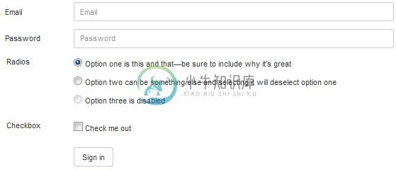
<form>
  <div class="form-group row">
    <label for="inputEmail3" class="col-sm-2 form-control-label">Email</label>
    <div class="col-sm-10">
      <input type="email" class="form-control" id="inputEmail3" placeholder="Email">
    </div>
  </div>
  <div class="form-group row">
    <label for="inputPassword3" class="col-sm-2 form-control-label">Password</label>
    <div class="col-sm-10">
      <input type="password" class="form-control" id="inputPassword3" placeholder="Password">
    </div>
  </div>
  <div class="form-group row">
    <label class="col-sm-2">Radios</label>
    <div class="col-sm-10">
      <div class="radio">
        <label>
          <input type="radio" name="gridRadios" id="gridRadios1" value="option1" checked>
          Option one is this and that—be sure to include why it's great
        </label>
      </div>
      <div class="radio">
        <label>
          <input type="radio" name="gridRadios" id="gridRadios2" value="option2">
          Option two can be something else and selecting it will deselect option one
        </label>
      </div>
      <div class="radio disabled">
        <label>
          <input type="radio" name="gridRadios" id="gridRadios3" value="option3" disabled>
          Option three is disabled
        </label>
      </div>
    </div>
  </div>
  <div class="form-group row">
    <label class="col-sm-2">Checkbox</label>
    <div class="col-sm-10">
      <div class="checkbox">
        <label>
          <input type="checkbox"> Check me out
        </label>
      </div>
    </div>
  </div>
  <div class="form-group row">
    <div class="col-sm-offset-2 col-sm-10">
      <button type="submit" class="btn btn-secondary">Sign in</button>
    </div>
  </div>
</form>
复选框和单选钮
复选框是为了在列表中选择一个或多个选项;单选钮是为了从多个选项中选择一个。
Bootstrap支持禁用复选框和单选钮。为了让鼠标悬停在它们的父<label>上时出现一个“not-allowed”鼠标指针,你必须添加向父.radio、.radio-inline、.checkbox或.checkbox-inline元素添加一个.disabled类。
默认(堆叠)
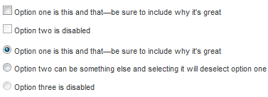
<div class="checkbox">
  <label>
    <input type="checkbox" value="">
    Option one is this and that—be sure to include why it's great
  </label>
</div>
<div class="checkbox disabled">
  <label>
    <input type="checkbox" value="" disabled>
    Option two is disabled
  </label>
</div>

<div class="radio">
  <label>
    <input type="radio" name="exampleRadios" id="exampleRadios1" value="option1" checked>
    Option one is this and that—be sure to include why it's great
  </label>
</div>
<div class="radio">
  <label>
    <input type="radio" name="exampleRadios" id="exampleRadios2" value="option2">
    Option two can be something else and selecting it will deselect option one
  </label>
</div>
<div class="radio disabled">
  <label>
    <input type="radio" name="exampleRadios" id="exampleRadios3" value="option3" disabled>
    Option three is disabled
  </label>
</div>
内联
对一系列复选框或单选钮使用.checkbox-inline或者.radio-inline类,让控件出现在同一行内。
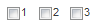
<label class="checkbox-inline">
  <input type="checkbox" id="inlineCheckbox1" value="option1"> 1
</label>
<label class="checkbox-inline">
  <input type="checkbox" id="inlineCheckbox2" value="option2"> 2
</label>
<label class="checkbox-inline">
  <input type="checkbox" id="inlineCheckbox3" value="option3"> 3
</label>
<label class="radio-inline">
  <input type="radio" name="inlineRadioOptions" id="inlineRadio1" value="option1"> 1
</label>
<label class="radio-inline">
  <input type="radio" name="inlineRadioOptions" id="inlineRadio2" value="option2"> 2
</label>
<label class="radio-inline">
  <input type="radio" name="inlineRadioOptions" id="inlineRadio3" value="option3"> 3
</label>
不带label
如果在<label>中没有文字,输入框会如你所愿地放位置。当前只对非行内复选框和单选钮起作用。
<div class="checkbox">
  <label>
    <input type="checkbox" id="blankCheckbox" value="option1">
  </label>
</div>
<div class="radio">
  <label>
    <input type="radio" name="blankRadio" id="blankRadio1" value="option1">
  </label>
</div>
静态控件
如果你需要在表单内、一个表单label旁边放置纯文本,请在<p>上面使用.form-control-static类。
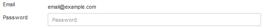
<form class="form-horizontal">
  <div class="form-group">
    <label class="col-sm-2 control-label">Email</label>
    <div class="col-sm-10">
      <p class="form-control-static">email@example.com</p>
    </div>
  </div>
  <div class="form-group">
    <label for="inputPassword" class="col-sm-2 control-label">Password</label>
    <div class="col-sm-10">
      <input type="password" class="form-control" id="inputPassword" placeholder="Password">
    </div>
  </div>
</form>
<form class="form-inline">
  <div class="form-group">
    <label class="sr-only">Email</label>
    <p class="form-control-static">email@example.com</p>
  </div>
  <div class="form-group">
    <label for="inputPassword2" class="sr-only">Password</label>
    <input type="password" class="form-control" id="inputPassword2" placeholder="Password">
  </div>
  <button type="submit" class="btn btn-primary">Confirm identity</button>
</form>
禁用的状态
添加disabled布尔属性可以防止用户输入。被禁用的输入框显示为浅色、并带有not-allowed鼠标指针。
<input class="form-control" id="disabledInput" type="text" placeholder="Disabled input here..." disabled>向一个<fieldset>添加disabled可以禁用其内部的所有控件。
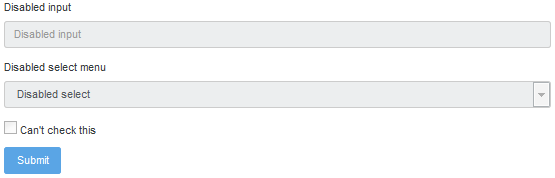
<form>
  <fieldset disabled>
    <div class="form-group">
      <label for="disabledTextInput">Disabled input</label>
      <input type="text" id="disabledTextInput" class="form-control" placeholder="Disabled input">
    </div>
    <div class="form-group">
      <label for="disabledSelect">Disabled select menu</label>
      <select id="disabledSelect" class="form-control">
        <option>Disabled select</option>
      </select>
    </div>
    <div class="checkbox">
      <label>
        <input type="checkbox"> Can't check this
      </label>
    </div>
    <button type="submit" class="btn btn-primary">Submit</button>
  </fieldset>
</form>对<a>功能的警告
默认情况下,浏览器会把放在一个<fieldset disabled>中所有的原生的表单控件(<input>、<select>以及<button>元素)视为禁用的,阻止对它们的键盘输入和鼠标交互。如果你的表单还包含了一个<a ... class="btn btn-*">元素,这些将只给一个pointer-events:none的样式。正如按钮的禁用状态这一章所提到过的(在“锚元素”小节中),这个CSS属性目前还没有标准化,甚至在Opera 18以下的版本以及IE 11以下的版本中没有得到完全的支持,也不会阻止键盘用户用tab键切换到这个焦点,或者激活这个链接。为了安全起见,请使用自定义的JavaScript禁用这种链接。
跨浏览器兼容性
虽然Bootstrap会在所有的浏览器中应用这些样式,但是IE11及以下版本不能完全支持<fieldset>上的disabled属性。请使用自定义JavaScript在这些浏览器中禁用该fieldset。
只读输入框
在一个输入框中添加readonly布尔属性,以防止修改输入框的值。只读输入框显示为淡色(和被禁用的输入框一样),但是保持了标准的鼠标指针。
<input class="form-control" type="text" placeholder="Readonly input here…" readonly>控件尺寸
使用.form-control-lg这些类可以设置控件的高度,使用网格列类比如说.col-lg-*可以设置控件的宽度。
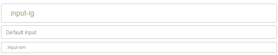
<input class="form-control form-control-lg" type="text" placeholder=".input-lg">
<input class="form-control" type="text" placeholder="Default input">
<input class="form-control form-control-sm" type="text" placeholder=".input-sm">
列尺寸
把输入框放置在网格列中,或者任何其它自定义父元素中,就可以轻松指定想要的宽度。
<div class="row">
  <div class="col-xs-2">
    <input type="text" class="form-control" placeholder=".col-xs-2">
  </div>
  <div class="col-xs-3">
    <input type="text" class="form-control" placeholder=".col-xs-3">
  </div>
  <div class="col-xs-4">
    <input type="text" class="form-control" placeholder=".col-xs-4">
  </div>
</div>
帮助文本
Bootstrap 4中没有官方的帮助文本类(虽然在Bootstrap 3中有.help-block类),但是幸亏我们有实用工具类,比如说.text-muted,你可以根据需要创建很多灵活的帮助文本。
行内文本可以使用任何典型的行内HTML元素(可以是<small>、<span>或其它)。
<small class="text-muted">
  Some inline text with a small tag looks like this.
</small>帮助文本块——放在输入框下面,或者包含多行的帮助文本——可以通过一个<p>来轻松实现。
<p class="text-muted">
  A block of help text that breaks onto a new line and may extend beyond one line.
</p>
验证
Bootstrap包含了出错时的验证样式,以及表单控件的警告、成功状态。要想用它们,只需要在父元素上添加.has-warning、.has-error或者.has-success类,这些元素中的任何.control-label、.form-control或者.text-help元素都将继承到这些验证样式。
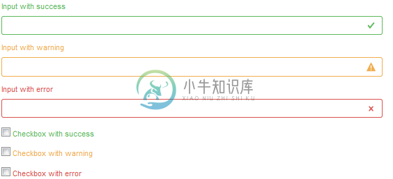
<div class="form-group has-success">
  <label class="control-label" for="inputSuccess1">Input with success</label>
  <input type="text" class="form-control form-control-success" id="inputSuccess1">
</div>
<div class="form-group has-warning">
  <label class="control-label" for="inputWarning1">Input with warning</label>
  <input type="text" class="form-control form-control-warning" id="inputWarning1">
</div>
<div class="form-group has-error">
  <label class="control-label" for="inputError1">Input with error</label>
  <input type="text" class="form-control form-control-error" id="inputError1">
</div>

<div class="has-success">
  <div class="checkbox">
    <label>
      <input type="checkbox" id="checkboxSuccess" value="option1">
      Checkbox with success
    </label>
  </div>
</div>
<div class="has-warning">
  <div class="checkbox">
    <label>
      <input type="checkbox" id="checkboxWarning" value="option1">
      Checkbox with warning
    </label>
  </div>
</div>
<div class="has-error">
  <div class="checkbox">
    <label>
      <input type="checkbox" id="checkboxError" value="option1">
      Checkbox with error
    </label>
  </div>
</div>
自定义表单
为了更多的自定义和跨浏览器兼容性,请使用我们的完全自定义表单元素来代替浏览器默认的。它们基于语义和易用性标签,因此它们是任何默认的表单控件的坚实替代者。
复选框和单选钮
请将每个复选框和单选钮都包裹在一个<label>中,出于以下三个原因:
- 它给选中控件提供了更大的点击区域。
- 它提供了一个有用而且语义化的包裹帮助我们替代默认的
<input>。 - 它能自动触发
<input>的状态,意味着不需要JavaScript。
我们用opacity来隐藏默认的<input>,使用.c-indicator来建立一个新的自定义的表单控件。仅仅使用<input>我们不能建立一个自定义的表单控件,因为CSS的content在那些元素上不起作用。
利用同辈选择符(~),我们使用:checked状态,在该自定义控件上触发一个临时的选中状态。
在选中状态中,我们使用来自Open Iconic的base64 内嵌 SVG 图标。它给我们在不同浏览器和设备上修改样式和定位提供了最好的控件。
多个复选框
<label class="c-input c-checkbox">
  <input type="checkbox">
  <span class="c-indicator"></span>
  Check this custom checkbox
</label>通过JavaScript人为设置自定义复选框的时候,还可以利用:indeterminate伪类(没有可用的HTML属性来指定它。)
如果你正在使用jQuery,照下面写代码就行了:
$('.your-checkbox').prop('indeterminate', true)多个单选钮
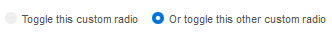
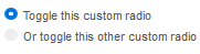
<label class="c-input c-radio">
  <input id="radio1" name="radio" type="radio">
  <span class="c-indicator"></span>
  Toggle this custom radio
</label>
<label class="c-input c-radio">
  <input id="radio2" name="radio" type="radio">
  <span class="c-indicator"></span>
  Or toggle this other custom radio
</label>
堆叠
自定义复选框以及单选钮都开始时是内联的。给它们的父元素添加.c-inputs-stacked类,可以确保每个表单控件各占一行。
<div class="c-inputs-stacked">
  <label class="c-input c-radio">
    <input id="radioStacked1" name="radio-stacked" type="radio">
    <span class="c-indicator"></span>
    Toggle this custom radio
  </label>
  <label class="c-input c-radio">
    <input id="radioStacked2" name="radio-stacked" type="radio">
    <span class="c-indicator"></span>
    Or toggle this other custom radio
  </label>
</div>
选择菜单
自定义<select>菜单只需要一个自定义类.c-select来触发自定义样式。
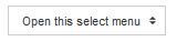
<select class="c-select">
  <option selected>Open this select menu</option>
  <option value="1">One</option>
  <option value="2">Two</option>
  <option value="3">Three</option>
</select>
自定义菜单在IE9及以上版本中表现良好,只需要少量代码来移除自定义的 background-image。**多项选项菜单(比如,<select multiple="">)目前尚不支持**。</select>
文件浏览器
<label class="file">
  <input type="file" id="file">
  <span class="file-custom"></span>
</label>
文件的输入是最危险的一群。这是它的工作原理:
- 把一个
<input>包裹在一个<label>内,从而自定义控件能够适当地触发文件浏览器。 - 通过
opacity隐藏了默认的<input> - 使用
:after生成一个自定义底色以及提示(Choose file…)。 - 使用
:before生成并定位Browse按钮。 - 在
<input>上声明一个height以与周围内容保持适当的距离。
换句话说,这完全是一个自定义元素,全都是通过CSS生成的。
注意!这个自定义文件输入器目前不能通过文件名来更新Choose file…文本,必须要用JavaScript才能改变它。不过我愿意听取意见。
如果你对这篇内容有疑问,欢迎到本站社区发帖提问 参与讨论,获取更多帮助,或者扫码二维码加入 Web 技术交流群。

绑定邮箱获取回复消息
由于您还没有绑定你的真实邮箱,如果其他用户或者作者回复了您的评论,将不能在第一时间通知您!
发布评论
需要 登录 才能够评论, 你可以免费 注册 一个本站的账号。