
表格
因为在第三方部件例如日历和日期选择器中广泛使用表格,我们设计了视情况需要加入的表格类。只需要向某个<table>添加一个基类.table。
基本示例
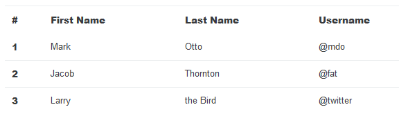
<table class="table">
  <thead>
    <tr>
      <th>#</th>
      <th>First Name</th>
      <th>Last Name</th>
      <th>Username</th>
    </tr>
  </thead>
  <tbody>
    <tr>
      <th scope="row">1</th>
      <td>Mark</td>
      <td>Otto</td>
      <td>@mdo</td>
    </tr>
    <tr>
      <th scope="row">2</th>
      <td>Jacob</td>
      <td>Thornton</td>
      <td>@fat</td>
    </tr>
    <tr>
      <th scope="row">3</th>
      <td>Larry</td>
      <td>the Bird</td>
      <td>@twitter</td>
    </tr>
  </tbody>
</table>
反相表格
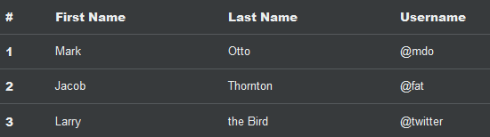
<table class="table table-inverse">
  <thead>
    <tr>
      <th>#</th>
      <th>First Name</th>
      <th>Last Name</th>
      <th>Username</th>
    </tr>
  </thead>
  <tbody>
    <tr>
      <th scope="row">1</th>
      <td>Mark</td>
      <td>Otto</td>
      <td>@mdo</td>
    </tr>
    <tr>
      <th scope="row">2</th>
      <td>Jacob</td>
      <td>Thornton</td>
      <td>@fat</td>
    </tr>
    <tr>
      <th scope="row">3</th>
      <td>Larry</td>
      <td>the Bird</td>
      <td>@twitter</td>
    </tr>
  </tbody>
</table>
表头选项
使用两个修饰类中的一个,使<thead>显示高亮或者暗灰。
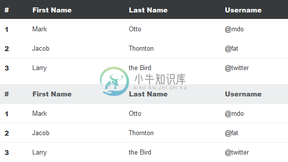
<table class="table">
  <thead class="thead-inverse">
    <tr>
      <th>#</th>
      <th>First Name</th>
      <th>Last Name</th>
      <th>Username</th>
    </tr>
  </thead>
  <tbody>
    <tr>
      <th scope="row">1</th>
      <td>Mark</td>
      <td>Otto</td>
      <td>@mdo</td>
    </tr>
    <tr>
      <th scope="row">2</th>
      <td>Jacob</td>
      <td>Thornton</td>
      <td>@fat</td>
    </tr>
    <tr>
      <th scope="row">3</th>
      <td>Larry</td>
      <td>the Bird</td>
      <td>@twitter</td>
    </tr>
  </tbody>
</table>

<table class="table">
  <thead class="thead-default">
    <tr>
      <th>#</th>
      <th>First Name</th>
      <th>Last Name</th>
      <th>Username</th>
    </tr>
  </thead>
  <tbody>
    <tr>
      <th scope="row">1</th>
      <td>Mark</td>
      <td>Otto</td>
      <td>@mdo</td>
    </tr>
    <tr>
      <th scope="row">2</th>
      <td>Jacob</td>
      <td>Thornton</td>
      <td>@fat</td>
    </tr>
    <tr>
      <th scope="row">3</th>
      <td>Larry</td>
      <td>the Bird</td>
      <td>@twitter</td>
    </tr>
  </tbody>
</table>
条纹行
使用.table-striped向<tbody>中的所有表行添加斑马条纹。
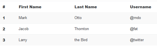
<table class="table table-striped">
  <thead>
    <tr>
      <th>#</th>
      <th>First Name</th>
      <th>Last Name</th>
      <th>Username</th>
    </tr>
  </thead>
  <tbody>
    <tr>
      <th scope="row">1</th>
      <td>Mark</td>
      <td>Otto</td>
      <td>@mdo</td>
    </tr>
    <tr>
      <th scope="row">2</th>
      <td>Jacob</td>
      <td>Thornton</td>
      <td>@fat</td>
    </tr>
    <tr>
      <th scope="row">3</th>
      <td>Larry</td>
      <td>the Bird</td>
      <td>@twitter</td>
    </tr>
  </tbody>
</table>
有边框的表格
添加.table-bordered可以使表格以及单元格的四边都有边框。
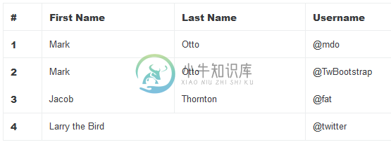
<table class="table table-bordered">
<thead>
<tr>
<th>#</th>
<th>First Name</th>
<th>Last Name</th>
<th>Username</th>
</tr>
</thead>
<tbody>
<tr>
<th scope="row">1</th>
<td>Mark</td>
<td>Otto</td>
<td>@mdo</td>
</tr>
<tr>
<th scope="row">2</th>
<td>Mark</td>
<td>Otto</td>
<td>@TwBootstrap</td>
</tr>
<tr>
<th scope="row">3</th>
<td>Jacob</td>
<td>Thornton</td>
<td>@fat</td>
</tr>
<tr>
<th scope="row">4</th>
<td colspan="2">Larry the Bird</td>
<td>@twitter</td>
</tr>
</tbody>
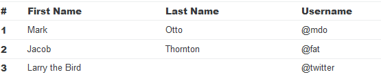
</table>可悬停的行
添加.table-hover向<tbody>中的所有表行启用一个可悬停的状态。
<table class="table table-hover">
  <thead>
    <tr>
      <th>#</th>
      <th>First Name</th>
      <th>Last Name</th>
      <th>Username</th>
    </tr>
  </thead>
  <tbody>
    <tr>
      <th scope="row">1</th>
      <td>Mark</td>
      <td>Otto</td>
      <td>@mdo</td>
    </tr>
    <tr>
      <th scope="row">2</th>
      <td>Jacob</td>
      <td>Thornton</td>
      <td>@fat</td>
    </tr>
    <tr>
      <th scope="row">3</th>
      <td colspan="2">Larry the Bird</td>
      <td>@twitter</td>
    </tr>
  </tbody>
</table>
小型表格
添加.table-sm可以使单元格内填充减半,使表格更紧凑。
<table class="table table-sm">
  <thead>
    <tr>
      <th>#</th>
      <th>First Name</th>
      <th>Last Name</th>
      <th>Username</th>
    </tr>
  </thead>
  <tbody>
    <tr>
      <th scope="row">1</th>
      <td>Mark</td>
      <td>Otto</td>
      <td>@mdo</td>
    </tr>
    <tr>
      <th scope="row">2</th>
      <td>Jacob</td>
      <td>Thornton</td>
      <td>@fat</td>
    </tr>
    <tr>
      <th scope="row">3</th>
      <td colspan="2">Larry the Bird</td>
      <td>@twitter</td>
    </tr>
  </tbody>
</table>
上下文类
使用上下文类对表格或者单个单元格着色。
| Class | Description |
|---|---|
.table-active | Applies the hover color to a particular row or cell |
.table-success | Indicates a successful or positive action |
.table-info | Indicates a neutral informative change or action |
.table-warning | Indicates a warning that might need attention |
.table-danger | Indicates a dangerous or potentially negative action |
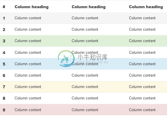
<!-- On rows -->
<tr class="table-active">...</tr>
<tr class="table-success">...</tr>
<tr class="table-warning">...</tr>
<tr class="table-danger">...</tr>
<tr class="table-info">...</tr>

<!-- On cells (`td` or `th`) -->
<tr>
  <td class="table-active">...</td>
  <td class="table-success">...</td>
  <td class="table-warning">...</td>
  <td class="table-danger">...</td>
  <td class="table-info">...</td>
</tr>
响应式表格
Create responsive tables by wrapping any .table in .table-responsive to make them scroll horizontally on small devices (under 768px). When viewing on anything larger than 768px wide, you will not see any difference in these tables.
将任何.table元素包裹在.table-responsive元素内,即可创建一个响应式表格,让其在小屏设备(窄于 768px)上水平滚动。如果在宽于 768px的设备上查看表格,你将看不到这些表格有什么不同。
垂直裁剪、截断
响应式表格使用overflow-y: hidde,它会截断超出表格底部或顶部边缘的所有的内容。特别需要指出的是,它会裁剪下拉菜单以及其它第三方小部件。
火狐浏览器和字段集
Firefox has some awkward fieldset styling involving width that interferes with the responsive table. This cannot be overriden without a Firefox-specific hack that we don’t provide in Bootstrap:
火狐浏览器有一些非常糟糕的字段集式样,涉及干扰响应式表格的.width。如果没有火狐浏览器特有的hack,这将不能被覆盖,所以于我们不能在 Bootstrap 中提供如下代码:
@-moz-document url-prefix() {
  fieldset { display: table-cell; }
}
欲得详细信息,请参阅 Stack Overflow 上的解答。
<div class="table-responsive">
  <table class="table">
    ...
  </table>
</div>
表格转秩(Reflow)
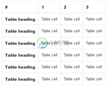
<table class="table table-reflow">
  <thead>
    <tr>
      <th>#</th>
      <th>Table heading</th>
      <th>Table heading</th>
      <th>Table heading</th>
      <th>Table heading</th>
      <th>Table heading</th>
      <th>Table heading</th>
    </tr>
  </thead>
  <tbody>
    <tr>
      <th scope="row">1</th>
      <td>Table cell</td>
      <td>Table cell</td>
      <td>Table cell</td>
      <td>Table cell</td>
      <td>Table cell</td>
      <td>Table cell</td>
    </tr>
    <tr>
      <th scope="row">2</th>
      <td>Table cell</td>
      <td>Table cell</td>
      <td>Table cell</td>
      <td>Table cell</td>
      <td>Table cell</td>
      <td>Table cell</td>
    </tr>
    <tr>
      <th scope="row">3</th>
      <td>Table cell</td>
      <td>Table cell</td>
      <td>Table cell</td>
      <td>Table cell</td>
      <td>Table cell</td>
      <td>Table cell</td>
    </tr>
  </tbody>
</table>如果你对这篇内容有疑问,欢迎到本站社区发帖提问 参与讨论,获取更多帮助,或者扫码二维码加入 Web 技术交流群。

绑定邮箱获取回复消息
由于您还没有绑定你的真实邮箱,如果其他用户或者作者回复了您的评论,将不能在第一时间通知您!
发布评论
需要 登录 才能够评论, 你可以免费 注册 一个本站的账号。