Dialog
Overview
A dialog is a TinyMCE UI component. Dialogs have their own dialog components which can be used inside dialogs to fulfill a use case. The Dialog API allows showing dialogs (sometimes referred to as modals) in the user application. This API supports the use of dynamic content for all aspects and is easily configurable and overridable.
Use cases
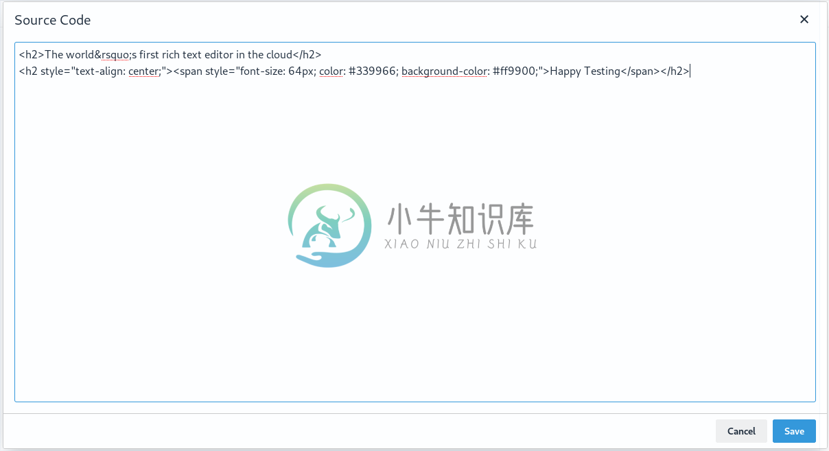
- Display simple information - The plugin that is used to view the source code is an example of a simple dialog that displays the HTML code from the content.
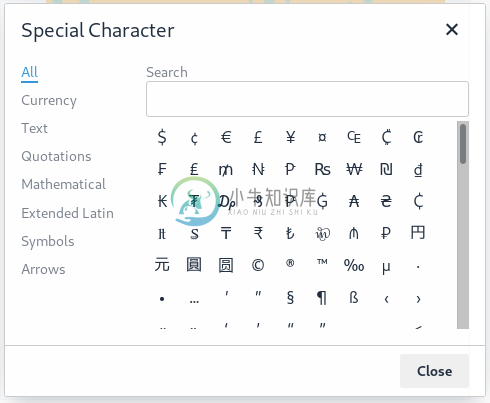
- Display complex information - These dialogs can display complex information by using layouts components like tabs or columns to help present information to the user. For example, the help and special characters dialog are tabbed dialogs.
- Interactive dialogs - These dialogs use web forms to collect interaction data and then apply the data. For example, the search and replace dialog uses an input field, where the input text will be used as the search key. Another example is, special characters or character map dialogs use typeaheads to dynamically narrow down matches as you type.
For example, the search and replace dialog is made up of two input fields - two checkboxes and five buttons. Components are composed by using a configuration structure. The most basic configuration structure is this:
const dialogConfig = {
   title: 'Just a title',
   body: {
     type: 'panel', // The root body type can only be of type Panel or TabPanel
     items: [] // A list of UI component configurations the dialog will have.
   },
   buttons: [] // A list of button configurations the dialog will have.
}
Dialog configuration framework
A Dialog configuration framework has three main parts:
- Title This is the title of a dialog.
- Body The body can be either a Panel or Tab Panel.
- Footer This section consists of a button or list of buttons.
Body components
Panel
A Panel is a basic container that holds other components. Many components can be configured inside a panel. In HTML terms, consider a panel as a <div> wrapper. A dialog body configuration must begin with either a Panel or a TabPanel.
var panelConfig = {
  type: 'panel',
  items: []
};
Items: - These are an array of component configurations. Any component listed in the dialog components are compatible.
TabPanel
A TabPanel is similar to a panel, where it can hold other components. Each tab can hold different components which display information for the user, that are grouped by tabs. A dialog body configuration must begin with either a Panel or a TabPanel.
var tabPanelConfig = {
  type: 'tabpanel',
  tabs: [
    {
      title: string,
      items: [<other dialog components>]
    },
    ...
  ]
};
Tabs: These are an array of tab configurations. Each tab has a title which is used to reference the tab. The items property in the tab configuration takes a list of components and works the same way as a Panel. A tab can be programmatically be switched by calling dialogApi.showTab('title'). For example, the dialog that appears as a result of the Help plugin is usually formatted in tab panels.

Footer components
Button
The following configuration is used to create a button inside the dialog body:
var buttonConfig = {
  type: 'button',
  name: string,
  text: string,
  icon: string,
  disabled: boolean,
  primary: boolean,
  align: 'start' | 'end'
}
Name: The name property on the button is used as an id attribute to identify the dialog component. For example, when name: foobutton is defined and a user clicks on that button, the dialog onAction() handler will fire and provide an object containing the name of the dialog component, e.g. details.name = 'foobutton'. This will allow developers to create a click handler for foobutton. See dialog onAction() configuration.
Text: This will be the text displayed on the button. For example, text: ‘do magic’ will create a button with text do magic.
Icon: This will be the name of the icon to be displayed on the button, instead of any text. The name must correspond to an icon in the icon pack. Dialog buttons do not support mixing icons and text at the moment.
Disabled: (Value: Boolean; Default: False): When set to true, the button will be disabled when the dialog loads. To toggle between disabled and enabled states, use dialogApi.enable(name) or dialogApi.disable(name). See dialog API for more information.
Primary: (Default: False): When set to true, the button will be colored to stand out. The color will depend on the chosen skin.
Align: (Default: ‘end’): This will define the position of the button in the footer. When set to end, the button will be positioned on the right side of the dialog. When set to start, the button will be positioned on the left side of the dialog.
Button types
The Close button is pre-wired to abort and close the dialog.
The Submit button when clicked will invoke the onSubmit callback provided in the configuration. This callback is used to insert the message.
When onSubmit is called, a dialog instance API is passed in as the parameter. The dialog does not close by default because some use cases may require a server-side callback confirmation.
The Cancel button dismisses an action request.
The Custom button can be used to specify a custom operation.
Dialog application examples
Simple dialog
The simple dialogs are used to display simple information, such as the plugins that display the source code or the HTML code from the content in the dialog. These dialogs may not have any values set in the body and footer parts of the dialog configuration.

An example of a simple dialog is:
const dialogConfig = {
   title: 'Just a title',
   body: {
     type: 'panel', // The root body type can only be of type Panel or TabPanel.
     items: [] // A list of UI component configurations the dialog will have.
   },
   buttons: [] // A list of button configurations the dialog will have.
}
Using the above example, calling tinymce.activeEditor.windowManager.open(dialogConfig) will create a dialog with the title Just a title, an empty body, and an empty footer without buttons.
Complex dialog
The complex dialogs are used to display more complex information. These sections can be contained within tabs. For example, the help dialog or the special chars dialog. These dialogs need a way to set the desired content into a defined tab section.

Interactive dialog
The interactive dialogs use web forms to collect data from the user, and then apply the data. For example, the search and replace dialog uses an input field, where the input text will be used as the search key. These are the most complex forms of dialogs and require the users to configure the following:
- Definition of the desired user input (for example, the search value in the search and replace dialog).
- Method to process the user input.
- Required operation to be performed on the user input.

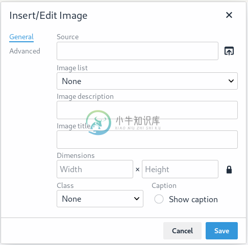
When the dimensions are provided in the above dialog, the interactive dialog can process that information and resize the image to fit the provided values.
Interactive example using redial(config): void
The following example demonstrates one way of implementing an Interactive Dialog using the redial(config): void method. Custom buttons are used for creating two separate dialogs that are cycled through by pressing the Next button.
To see the output of the code, click on the TinyMCE tab on the fiddle below.
TinyMCE HTML JS Edit on CodePen
<textarea class="wizard">
  <p>In this redial example, we have two separate dialogs that we cycle through by pressing the <code>Next</code> button. Looking at the configuration structure, the first level is like any other dialog. The difference is the <code>onAction</code> call, loads a new configuration for the dialog using redial. The configuration we use in the redial(dialogConf) call can be any supported dialog structure. We could even replace the ‘Redial Demo - Page 2’ configuration, with the ‘Pet Name Machine’ dialog.</p>
  <p>This demo also includes the use of <code>dialogApi.enable</code> and <code>dialogApi.disable</code> to disable the <code>Next</code> button when a user input is required. For checkboxes we use the <code>onChange</code> callback to handle the changes for the checkbox data. The checkbox data is mapped to its defined name: <code>anyterms</code>. When a user clicks or presses enter on the checkbox, the new value of the checkbox is returned by the <code>getData()</code> call stored in the <code>anyterms</code> property. Given the state of the checkbox, we either <code>disable</code> or <code>enable</code> the <code>Next</code> button.</p>
  <p>The <code>onAction</code> callback at the root level, is the handler for the <code>Previous</code> and <code>Next</code> buttons. The <code>onAction</code> handler is shared across multiple buttons and we use the name property to identify the clicked button. The <code>Previous</code> button named ‘doesnothing’ is used to highlight branching. A <strong>Switch</strong> statement could be used to handle many buttons.</p>
  <p>The <code>onAction</code> callback inside the <code>redial()</code> call, is a separate handler for the redialed dialog. Since there is only one button we don’t check which named button triggered the click. This handler demonstrates the <code>dialogApi.close()</code> API.</p>
</textarea>
var config = {
title: 'Redial Demo',
body: {
type: 'panel',
items: [{
type: 'htmlpanel',
html: '<p>Redial allows the creation of multi-page forms.</p><p>The Next button has been configured to be disabled. When the <b>checkbox</b> is checked, the next button should be enabled</p>'
}, {
type: 'checkbox',
name: 'anyterms',
label: 'I agree to disagree'
}, {
type: 'htmlpanel',
html: '<p>The next button, calls the redial method which reloads a new dialog in place</p><p>Press next to continue</p>'
}]
},
initialData: {
anyterms: false
},
buttons: [
{
type: 'custom',
name: 'doesnothing',
text: 'Previous',
disabled: true
},
{
type: 'custom',
name: 'uniquename',
text: 'Next',
disabled: true
}
],
onChange: function (dialogApi, changeData) {
var data = dialogApi.getData();
/* Example of enabling and disabling a button, based on the checkbox state. */
var toggle = data.anyterms ? dialogApi.enable : dialogApi.disable;
toggle('uniquename');
},
onAction: function (dialogApi, actionData) {
if (actionData.name === 'uniquename') {
dialogApi.redial({
title: 'Redial Demo - Page 2',
body: {
type: 'panel',
items: [
{
type: 'selectbox',
name: 'choosydata',
label: 'Choose a pet',
items: [
{ value: 'meow', text: 'Cat' },
{ value: 'woof', text: 'Dog' },
{ value: 'thunk', text: 'Rock' }
]
},
{
type: 'htmlpanel',
html: '<p>Click done, your pet choice will be printed in the console.log and the dialog should close</p>'
}
]
},
buttons: [
{
type: 'custom',
name: 'lastpage',
text: 'Done',
disabled: false
}
],
initialData: {
choosydata: ''
},
onAction: function (dialogApi, actionData) {
var data = dialogApi.getData();
var result = 'you chose wisely: ' + data.choosydata;
console.log(result);
tinymce.activeEditor.execCommand('mceInsertContent', false, '<p>' + result + '</p>');
dialogApi.close();
}
});
} else if (actionData.name === 'doesnothing') {
/* this case should never be met as the button is never enabled. */
}
}
};
tinymce.init({
selector: 'textarea.wizard',
toolbar: 'wizardExample',
height: '900px',
setup: function (editor) {
editor.ui.registry.addButton('wizardExample', {
icon: 'code-sample',
onAction: function () {
editor.windowManager.open(config)
}
})
}
});
In the configuration structure, the first level is like any other dialog. The difference is the onAction call loads a new configuration for the dialog using redial. The configuration that is used in the redial(dialogConf) call can be any supported dialog structure. It could even replace this Redial Demo configuration, in the Pet Name Machine example in the compostion section.
This demo also includes the use of dialogApi.enable and dialogApi.disable to disable the Next button when user input is required. For Checkboxes, the onChange callback is used to handle the changes for the checkbox data. The checkbox data is mapped to its defined name: anyterms. When a user clicks or presses Enter on the checkbox, the new value of the checkbox is returned by the getData() call stored in the anyterms property. Given the state of the checkbox, the Next button is either disabled or enabled.
The onAction callback at the root level, is the handler for the Previous and Next buttons. The onAction handler is shared across multiple buttons, and this name property is used to identify the clicked button. The previous button named doesnothing is used to highlight branching.
A Switch statement could be used to handle many buttons.
The onAction callback inside the redial() call, is a separate handler for the redialed dialog. Since there is only one button, which button triggered the click is not checked. This handler demonstrates the dialogApi.close() API.
Note: Please see this page for a comprehensive list of components.
Dialog composition
The following example demonstrates how data flows through the dialog and how buttons are configured. This is an interactive dialog that inserts the name of a cat into the editor content on Submit. This example is referred to throughout the new dialog instance API section.
The following Pet Name Machine example illustrates an interactive dialog:
TinyMCE HTML JS Edit on CodePen
<textarea class="petMachine">
  <p>Click on the custom {;} toolbar button</p>
</textarea>
/* example dialog that inserts the name of a Pet into the editor content */
var dialogConfig = {
title: 'Pet Name Machine',
body: {
type: 'panel',
items: [
{
type: 'input',
name: 'catdata',
label: 'enter the name of a cat'
},
{
type: 'checkbox',
name: 'isdog',
label: 'tick if cat is actually a dog'
}
]
},
buttons: [
{
type: 'cancel',
name: 'closeButton',
text: 'Cancel'
},
{
type: 'submit',
name: 'submitButton',
text: 'Do Cat Thing',
primary: true
}
],
initialData: {
catdata: 'initial Cat',
isdog: false
},
onSubmit: function (api) {
var data = api.getData();
var pet = data.isdog ? 'dog' : 'cat';
tinymce.activeEditor.execCommand('mceInsertContent', false, '<p>My ' + pet +'\'s name is: <strong>' + data.catdata + '</strong></p>');
api.close();
}
};
tinymce.init({
selector: 'textarea.petMachine',
toolbar: 'dialog-example-btn',
setup: function (editor) {
editor.ui.registry.addButton('dialog-example-btn', {
icon: 'code-sample',
onAction: function () {
editor.windowManager.open(dialogConfig)
}
})
}
});The key highlight in this example is the input field for ‘enter the name of a cat’. The name property catdata is associated with the initalData.
Note: All body components that require a name property also require an
initialDataproperty. This is how the relationship between the underlaying data model and the component is declared.
When the dialog is loaded first, the input field is pre-populated with the initial cat.
When initialData.catdata = '' then on load, the input field should be empty.
In this example, two buttons are declared to be placed in the dialog footer, Close and Submit. These are pre-constructed buttons that perform common actions, such as, closing a dialog or submitting a dialog.
Dialog instance API
When a dialog is created, a dialog instance API is returned. For example, const instanceApi = editor.windowManager.open(config);
The instance API is a javascript object containing methods attached to the dialog instance. When the dialog is closed, the instance API is destroyed.
Instance API methods
| Methods | Description |
|---|---|
getData(): <T> | getData() returns a key-value object matching the structure of the initialData. The object keys in the returned data object represent a component name. For the Insert Cat Name example, data.catdata is the value currently being held by the input field with the name catdata. |
setData(newConfig: object): void | setData(newData) updates the data set. This method also works with partial data sets. |
enable(name: string): void | Calling enable() and passing the component name will enable a component, allowing users to interact with the component. |
disable(name: string): void | Calling disable() and passing the component name will disable the component. Calling enable(name) will re-enable the component. |
focus(name: string): void | Calling focus() and passing the component name will set the browser focus to the component. |
block(message: string): void | Calling block() and passing a message string will disable the entire dialog window and show a loading image. This is useful for handling asynchronous data. The message is used for screen reader accessibility. When the data is ready use unblock() to unlock the dialog. |
unblock(): void | Calling unblock() will unlock the dialog instance restoring functionality. |
showTab(name: string): void | This method only applies to tab dialogs only. Calling showTab() and passing the name of a tab will make the dialog switch to the named tag. |
close(): void | Calling the close() method will close the dialog. When closing the dialog, all DOM elements and dialog data are destroyed. When open(config) is called again, all DOM elements and data are recreated from the config. |
redial(config): void | Calling redial() and passing a dialog configuration, will destroy the current dialog and create a new dialog. Redial is used to create a multipage form, where the next button loads a new form page or to re-create the dialog with different components or options. |

