
GUI Style 图形用户界面样式
GUI Styles are a collection of custom attributes for use with UnityGUI. A single GUI Style defines the appearance of a single UnityGUI Control.
图形用户界面样式是一组自定义属性用于Unity图形用户界面。一个独立的图形用户界面样式定义了一个Unity图形用户界面组件的样式。
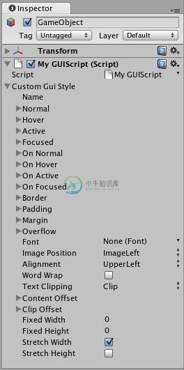
A GUI Style in the Inspector 监视窗中的图形用户界面样式
If you want to add style to more than one control, use a GUI Skin instead of a GUI Style. For more information about UnityGUI, please read the GUI Scripting Guide.
如果你想要添加样式给多于一个控件,请使用图形用户界面皮肤来代替图形用户界面样式,获取更多关于Unity图形用户界面的信息,请参阅图形用户界面脚本指南。
Properties 属性
- Name 名称 The text string that can be used to refer to this specific Style
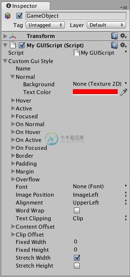
这串文本可以用于找到指定的样式 - Normal 正常状态 Background image & Text Color of the Control in default state
当控件处于默认状态时的背景图像和文本颜色 - Hover 鼠标悬停 Background image & Text Color when the mouse is positioned over the Control
当鼠标位置处于此控件之上时的背景图像和文本颜色 - Active 激活状态 Background image & Text Color when the mouse is actively clicking the Control
当鼠标点击这个控件时的背景图像和文本颜色 - Focused 获取焦点 Background image & Text Color when the Control has keyboard focus
当控件获取键盘焦点时的背景图像和文本颜色 - On Normal 可用状态 Background image & Text Color of the Control in enabled state
当控件处于可用状态时的背景图像和文本颜色 - On Hover 可用悬停 Background image & Text Color when the mouse is positioned over the enabled Control
当控件处于可用状态且鼠标位于此控件之上时的背景图像和文本颜色。 - On Active 可用激活 Properties when the mouse is actively clicking the enabled Control
当控件可用且鼠标点击时的属性 - On Focused 可用并获取焦点 Background image & Text Color when the enabled Control has keyboard focus
当控件可用且获取键盘焦点时的背景图像和文本颜色 - Border 边框 Number of pixels on each side of the Background image that are not affected by the scale of the Control' shape
控件区域的背景图像中每个边不受缩放影响的像素数值。 - Padding 填充 Space in pixels from each edge of the Control to the start of its contents.
控件的内容起始位置与各个边缘之间的空白像素空间。 - Margin 边界 The margins between elements rendered in this style and any other GUI Controls.
在这个使用这个样式渲染的元素中和其他图形用户界面控件之间的边界 - Overflow 溢出 Extra space to be added to the background image.
添加到背景图片的额外空间。 - Font 字体 The Font used for all text in this style
这个样式中的所有文本都将使用这个字体 - Image Position 图像位置 The way the background image and text are combined.
背景图像和文本的组合方式 - Alignment 对齐 Standard text alignment options. 标准文本定位选项
- Word Wrap 自动换行 If enabled, text that reaches the boundaries of the Control will wrap around to the next line
如果启用,文本打到控件边缘时会自动转到下一行显示。 - Text Clipping 文本裁剪 If Word Wrap is enabled, choose how to handle text that exceeds the boundaries of the Control
如果自动换行启用,选择对超出控件的文本怎样处理。 - Overflow 溢出 Any text that exceeds the Control boundaries will continue beyond the boundaries
文本超出控件边界时将会越界显示 - Clip 裁切 Any text that exceeds the Control boundaries will be hidden
当文本超出控件边缘时将会隐藏 - Content Offset 内容偏移 Number of pixels along X and Y axes that the Content will be displaced in addition to all other properties
properties 内容沿X轴和Y轴的内容偏移像素量 - X Left/Right Offset 左右偏移
- Y Up/Down Offset 上下偏移
- Fixed Width 固定宽度 Number of pixels for the width of the Control, which will override any provided Rect() value
控件的宽度,将会覆盖所提供的Rect()值 - Fixed Height 固定高度 Number of pixels for the height of the Control, which will override any provided Rect() value
控件的高度,将会覆盖所提供的Rect()值 - Stretch Width 拉伸宽度 If enabled, Controls using this style can be stretched horizontally for a better layout.
如果启用,控件使用这个样式会拥有更好的水平方向伸展 - Stretch Height 拉伸高度 If enabled, Controls using this style can be stretched vertically for a better layout.
如果启用,控件使用这个样式会拥有更好的垂直方向伸展
Details 详细
GUIStyles are declared from scripts and modified on a per-instance basis. If you want to use a single or few Controls with a custom Style, you can declare this custom Style in the script and provide the Style as an argument of the Control function. This will make these Controls appear with the Style that you define.
图形用户界面样式通过脚本声明然后在每个实例的基础上进行修改,如果你想要使用一个或少量的自定义样式的控件。你可以在脚本中声明这个自定义样式然后以参数的形式传递给控件方法,这将会使这些控件显示你所定义的样式。
First, you must declare a GUI Style from within a script.
首先,你必须用脚本声明一个图形用户界面样式
/* Declare a GUI Style */
/*声明一个图形用户界面样式*/
var customGuiStyle : GUIStyle;

...
When you attach this script to a GameObject, you will see the custom Style available to modify in the Inspector.
当你将这个脚本附加到游戏对象,你将会发现你可以在监视窗中修改它。
A Style declared in a script can be modified in each instance of the script
一个通过脚本声明的样式可以在监视窗中修改它的属性。
Now, when you want to tell a particular Control to use this Style, you provide the name of the Style as the last argument in the Control function.
现在,当你想让一个指定的控件使用此样式,你可以传递样式的名字给控件方法的最后一个参数。
...

function OnGUI () {
	// Provide the name of the Style as the final argument to use it
	//将样式的名字传递到最后一个参数来使用它
	GUILayout.Button ("I am a custom-styled Button", customGuiStyle);

	// If you do not want to apply the Style, do not provide the name
	//如果你不想应用这个样式就不要传递样式名。

	GUILayout.Button ("I am a normal UnityGUI Button without custom style");
}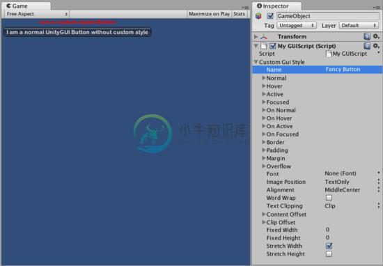
Two Buttons, one with Style, as created by the code example
两个按钮,一个带有上例中所创建的样式。
For more information about using UnityGUI, please read the GUI Scripting Guide.
如需更多关于使用Unigy图形用户界面的信息,请参阅图形用户界面指南。