
如何基于数据统计做网站页面布局的优化和适配

移动适配的必要性
pc的页面布局的特点是宽度比较大,一般可以分成两栏或三栏,除了正文部分,左侧和右侧都可以放置一些相关的组件,比如:相关链接、推广等。而移动端宽度一般比较窄,只能做一栏,因此这些相关组件只能放在底部或以其他方式展现。因此特殊针对移动端做适配是有必要的。
怎么做移动适配
移动适配属于表现层的范畴,因此最好在前端代码中实现,bootstrap已经为我们抽象出了方便的适配方法,在div布局中可以通过区分class是col-sm-*和col-xs-*来分别表示pc端和移动端的视图,而hidden-xs表示移动端这个div隐藏,这为移动适配提供了极大的方便
我是怎么做移动适配的
搜索框的移动适配
文章搜索需求是为了满足用户针对特殊关键词做搜索提供的,放置在了我们网站右上角,如下:
<div class="col-sm-3 hidden-xs">
    <form action="{{ path('blog_search') }}">
        <input type="search" name="q" placeholder="搜文章" maxlength="200">
    </form>
</div>
这里面声明了hidden-xs,表示在移动端隐藏,因为在移动端搜索是一个高成本的功能,用户需要手工输入文字,一般情况下,用户在手机主要是阅览,因此这个在手机端做了隐藏
右侧系列链接的移动适配
为了方便用户浏览全部相关文章,也为了提升网站的pv,在右侧加入了本文章所属tag的相关链接
首先修改src/AppBundle/Controller/BlogController.php在showAction()方法中添加如下代码:
       $tags = $this->blogPost->getTags();
        $pagination = null;
        if (!empty($tags) && sizeof($tags) > 0) {
            $tag = $tags[0];
            $tagName = $tag->getName();
            $this->em = $this->get('doctrine.orm.entity_manager');
            $this->builder = $this->em->createQueryBuilder();
            $query = $this->builder->select('b')
                ->add('from', 'AppBundle:BlogPost b INNER JOIN b.tags t')
                ->where('t.name=:tag_name')
                ->setParameter('tag_name', $tagName)
                ->getQuery();
            $paginator = $this->get('knp_paginator');
            $pagination = $paginator->paginate(
                $query,
                $request->query->get('page', 1)/*page number*/,
                100/*limit per page*/
            );
        }
	……
	return $this->render('blog/show.html.twig', array('blogpost' => $this->blogPost,
                'latestblogs' => BlogController::getLatestBlogs($this),
                'tophotblogs' => BlogController::getTopHotBlogs($this),
                'is_original' => true,
                'lastblog' => $this->findLastBlog($blogId),
                'nextblog' => $this->findNextBlog($blogId),
                'pagination' => $pagination,
                'tags' => $this->getAllTagNames()
            ));
其中的getAllTagNames()方法如下:
    private function getAllTagNames()
    {
        $blogPostRepository = $this->getDoctrine()->getRepository('AppBundle:Tag');
        $tags = $blogPostRepository->findAll();
        return $tags;
    }
再修改app/Resources/views/blog/show.html.twig,先把原来的中部文章标题、内容、评论布局原封不动提出来放到重新设计的一个四列网格中的第二列,然后第三列加入如下内容:
        <div class="col-sm-2 hidden-xs">
            <br/>
            <h4>
                {% for tag in blogpost.tags %}
                    系列:{{ tag.name }}
                {% endfor %}
            </h4>
            <div>
                {% for article in pagination %}
                    {% if blogpost.id == article.id %}
                        <h6>{{ article.simpleTitle }}</h6>
                    {% else %}
                        <h6><a href="{{ path('blog_show', {'blogId':article.id}) }}"
                               onclick="_czc.push(['_trackEvent', '右侧链接', '点击', '{{ article.title }}']);"
                            >{{ article.simpleTitle }}</a></h6>
                    {% endif %}
                {% endfor %}
            </div>
            <h4>
                全部系列
            </h4>
            {% for tag in tags %}
                <h6><a href="{{ path('blog_listbytag', {'tagname':tag.name}) }}"
                       onclick="_czc.push(['_trackEvent', '全部系列', '点击', '{{ tag.name }}']);"
                    >{{ tag.name }}</a></h6>
            {% endfor %}
        </div>
讲解一下,根据当前文章所属的tag,找到这个tag下所有的链接并展示,同时再展示全部tag,这都是为了方便用户点击,同时你会发现网格的第三列声明了hidden-xs,也就是移动端不展示,因为移动端屏幕无法容纳两列内容,因此这部分隐藏。另外在右侧链接中我们也加入了点击事件,通过cnzz来统计事件触发情况
看下最终的效果:

数据统计
我们观察了一段时间的点击统计如下:
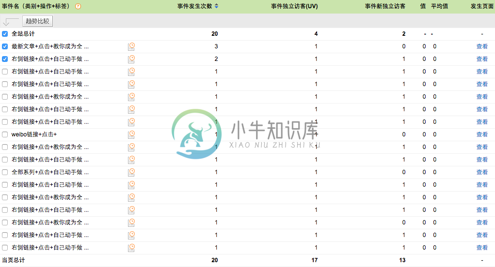
我们发现右侧链接的点击次数比页面底部的“最新文章”、“最热文章”点击次数多很多,这说明我们可以完善右侧来替代底部的链接,这是我们基于数据统计来做的页面布局优化的过程