
wxc-progress
Weex 进度条组件
规则
- 表明某个任务的当前进度
- 需要准确告知当前进度,否则应该使用 Loading
Demo
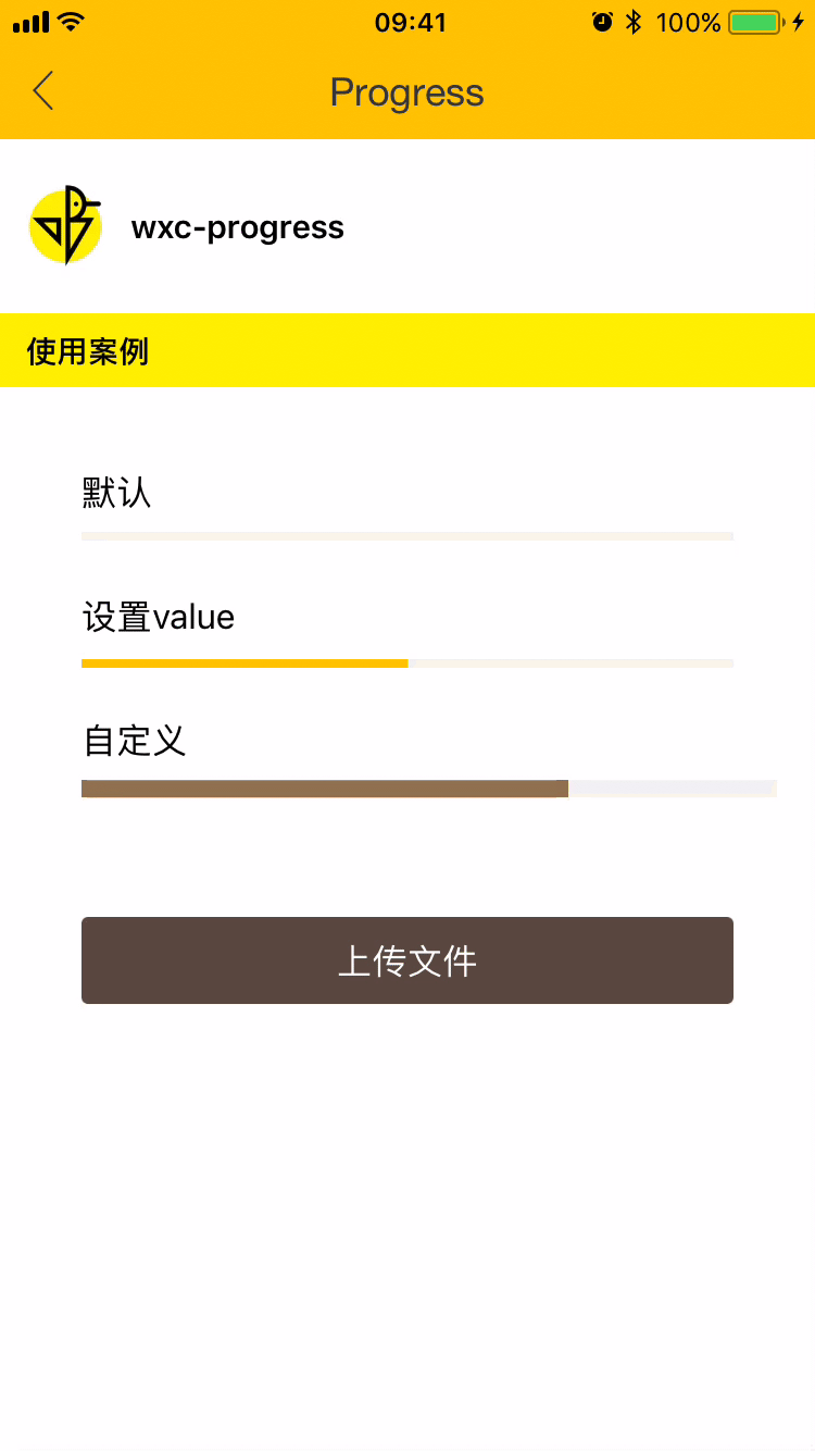

使用方法
<template>
  <div>
    <div>
      <text>默认</text>
      <wxc-progress></wxc-progress>
    </div>
    <div>
      <text>设置value</text>
      <wxc-progress :value=50 :bar-width=600></wxc-progress>
    </div>
    <div>
      <text>自定义</text>
      <wxc-progress :value=70
                    bar-color='#9B7B56'
                    :bar-height=16
                    :bar-radius=16
                    :bar-width=640></wxc-progress>
    </div>
    <div @click="uploadFile">
      <text>上传文件</text>
    </div>
    <div v-if="progressVisible">
      <text>0%</text>
      <wxc-progress :value="value" :bar-width=540></wxc-progress>
      <text>{{value}}%</text>
    </div>
  </div>
</template>

<script>
  import { WxcProgress } from 'weex-ui'
  export default {
    components: { WxcProgress },
    data: () => ({
      value: 0,
      uploading: false,
      progressVisible: false,
      timer: null
    }),
    methods: {
      uploadFile () {
        if (!this.uploading) {
          this.value = 0;
          this.uploading = true;
          this.progressVisible = true;
          this.timer = setInterval(() => {
            if (this.value < 100) {
              this.value++
            } else {
              this.uploading = false;
              setTimeout(() => {
                this.progressVisible = false;
              }, 500)
              clearTimeout(this.timer);
            }
          }, 10);
        }
      }
    }
  }
</script>
更详细代码可以参考 demo
可配置参数
| Prop | Type | Required | Default | Description |
|---|---|---|---|---|
| value | Number | Y | 0 | 百分比(0-100) |
| bar-height | Number | N | 8 | 高度 |
| bar-width | Number | N | 600 | 长度 |
| bar-color | String | N | #FFC900 | 颜色 |
| bar-radius | Number | N | 0 | 圆角 |
| background-color | String | N | #f2f3f4 | 整体背景色 |