seaborn.regplot
seaborn.regplot(x, y, data=None, x_estimator=None, x_bins=None, x_ci='ci', scatter=True, fit_reg=True, ci=95, n_boot=1000, units=None, order=1, logistic=False, lowess=False, robust=False, logx=False, x_partial=None, y_partial=None, truncate=False, dropna=True, x_jitter=None, y_jitter=None, label=None, color=None, marker='o', scatter_kws=None, line_kws=None, ax=None)
Plot data and a linear regression model fit.
There are a number of mutually exclusive options for estimating the regression model. See the regplot() and FacetGrid to plot multiple linear relationships in a dataset.Combine regplot() and JointGrid (when used with kind="reg").Combine regplot() and PairGrid (when used with kind="reg").Plot the residuals of a linear regression model.
Notes
The regplot() and lmplot() functions are closely related, but the former is an axes-level function while the latter is a figure-level function that combines regplot() and FacetGrid.
It’s also easy to combine combine regplot() and JointGrid or PairGrid through the jointplot() and pairplot() functions, although these do not directly accept all of regplot()’s parameters.
Examples
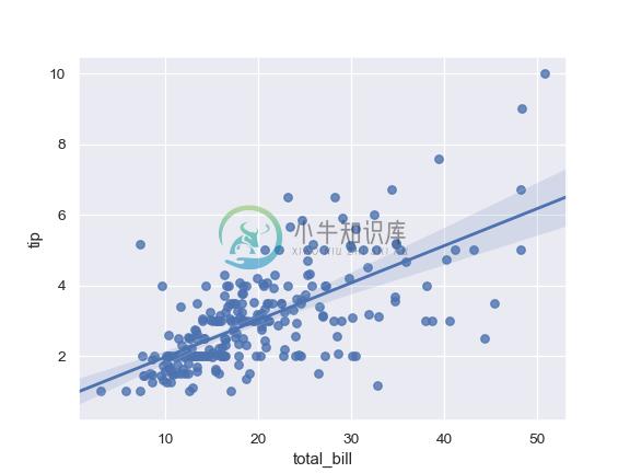
Plot the relationship between two variables in a DataFrame:
>>> import seaborn as sns; sns.set(color_codes=True)
>>> tips = sns.load_dataset("tips")
>>> ax = sns.regplot(x="total_bill", y="tip", data=tips)
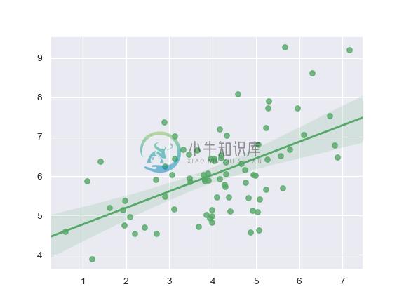
Plot with two variables defined as numpy arrays; use a different color:
>>> import numpy as np; np.random.seed(8)
>>> mean, cov = [4, 6], [(1.5, .7), (.7, 1)]
>>> x, y = np.random.multivariate_normal(mean, cov, 80).T
>>> ax = sns.regplot(x=x, y=y, color="g")
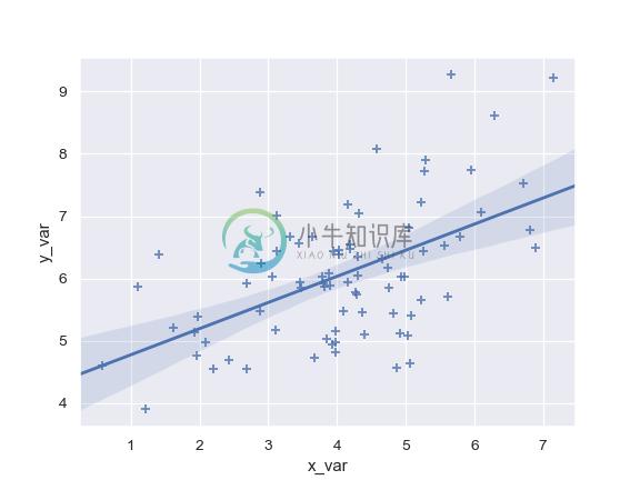
Plot with two variables defined as pandas Series; use a different marker:
>>> import pandas as pd
>>> x, y = pd.Series(x, name="x_var"), pd.Series(y, name="y_var")
>>> ax = sns.regplot(x=x, y=y, marker="+")
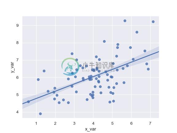
Use a 68% confidence interval, which corresponds with the standard error of the estimate:
>>> ax = sns.regplot(x=x, y=y, ci=68)
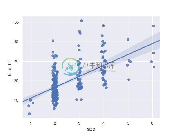
Plot with a discrete x variable and add some jitter:
>>> ax = sns.regplot(x="size", y="total_bill", data=tips, x_jitter=.1)
Plot with a discrete x variable showing means and confidence intervals for unique values:
>>> ax = sns.regplot(x="size", y="total_bill", data=tips,
...                  x_estimator=np.mean)
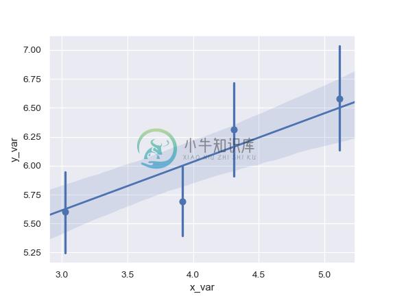
Plot with a continuous variable divided into discrete bins:
>>> ax = sns.regplot(x=x, y=y, x_bins=4)
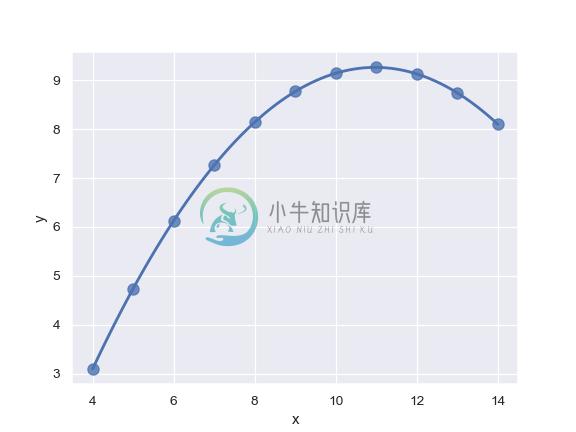
Fit a higher-order polynomial regression and truncate the model prediction:
>>> ans = sns.load_dataset("anscombe")
>>> ax = sns.regplot(x="x", y="y", data=ans.loc[ans.dataset == "II"],
...                  scatter_kws={"s": 80},
...                  order=2, ci=None, truncate=True)
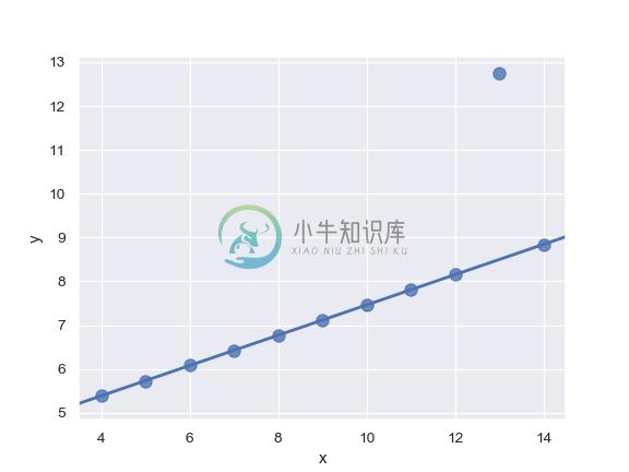
Fit a robust regression and don’t plot a confidence interval:
>>> ax = sns.regplot(x="x", y="y", data=ans.loc[ans.dataset == "III"],
...                  scatter_kws={"s": 80},
...                  robust=True, ci=None)
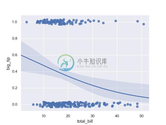
Fit a logistic regression; jitter the y variable and use fewer bootstrap iterations:
>>> tips["big_tip"] = (tips.tip / tips.total_bill) > .175
>>> ax = sns.regplot(x="total_bill", y="big_tip", data=tips,
...                  logistic=True, n_boot=500, y_jitter=.03)
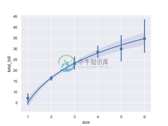
Fit the regression model using log(x) and truncate the model prediction:
>>> ax = sns.regplot(x="size", y="total_bill", data=tips,
...                  x_estimator=np.mean, logx=True, truncate=True)


