seaborn.swarmplot
seaborn.swarmplot(x=None, y=None, hue=None, data=None, order=None, hue_order=None, dodge=False, orient=None, color=None, palette=None, size=5, edgecolor='gray', linewidth=0, ax=None, **kwargs)
Draw a categorical scatterplot with non-overlapping points.
This function is similar to stripplot(), but the points are adjusted (only along the categorical axis) so that they don’t overlap. This gives a better representation of the distribution of values, but it does not scale well to large numbers of observations. This style of plot is sometimes called a “beeswarm”.
A swarm plot can be drawn on its own, but it is also a good complement to a box or violin plot in cases where you want to show all observations along with some representation of the underlying distribution.
Arranging the points properly requires an accurate transformation between data and point coordinates. This means that non-default axis limits must be set before drawing the plot.
Input data can be passed in a variety of formats, including:
- Vectors of data represented as lists, numpy arrays, or pandas Series objects passed directly to the
x,y, and/orhueparameters. - A “long-form” DataFrame, in which case the
x,y, andhuevariables will determine how the data are plotted. - A “wide-form” DataFrame, such that each numeric column will be plotted.
- An array or list of vectors.
In most cases, it is possible to use numpy or Python objects, but pandas objects are preferable because the associated names will be used to annotate the axes. Additionally, you can use Categorical types for the grouping variables to control the order of plot elements.
This function always treats one of the variables as categorical and draws data at ordinal positions (0, 1, … n) on the relevant axis, even when the data has a numeric or date type.
See the color_palette(), or a dictionary mapping hue levels to matplotlib colors.
size:float, optional
Diameter of the markers, in points. (Although
plt.scatteris used to draw the points, thesizeargument here takes a “normal” markersize and not size^2 likeplt.scatter.
edgecolor:matplotlib color, “gray” is special-cased, optional
Color of the lines around each point. If you pass
"gray", the brightness is determined by the color palette used for the body of the points.
linewidth:float, optional
Width of the gray lines that frame the plot elements.
ax:matplotlib Axes, optional
Axes object to draw the plot onto, otherwise uses the current Axes.
返回值:ax:matplotlib Axes
Returns the Axes object with the plot drawn onto it.
See also
A traditional box-and-whisker plot with a similar API.A combination of boxplot and kernel density estimation.A scatterplot where one variable is categorical. Can be used in conjunction with other plots to show each observation.Combine a categorical plot with a class:FacetGrid.
Examples
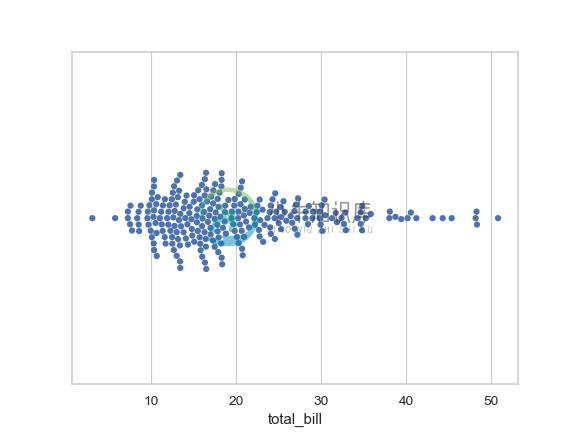
Draw a single horizontal swarm plot:
>>> import seaborn as sns
>>> sns.set(style="whitegrid")
>>> tips = sns.load_dataset("tips")
>>> ax = sns.swarmplot(x=tips["total_bill"])
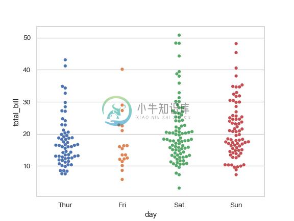
Group the swarms by a categorical variable:
>>> ax = sns.swarmplot(x="day", y="total_bill", data=tips)
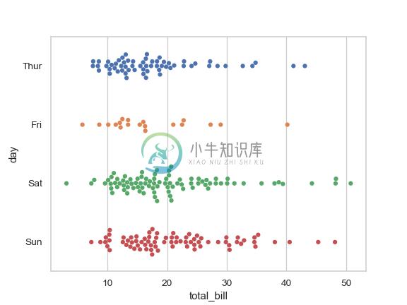
Draw horizontal swarms:
>>> ax = sns.swarmplot(x="total_bill", y="day", data=tips)
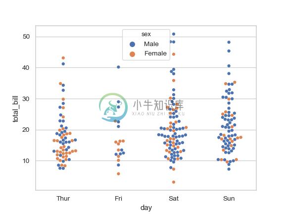
Color the points using a second categorical variable:
>>> ax = sns.swarmplot(x="day", y="total_bill", hue="sex", data=tips)
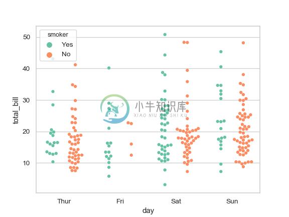
Split each level of the hue variable along the categorical axis:
>>> ax = sns.swarmplot(x="day", y="total_bill", hue="smoker",
...                    data=tips, palette="Set2", dodge=True)
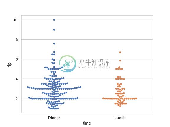
Control swarm order by passing an explicit order:
>>> ax = sns.swarmplot(x="time", y="tip", data=tips,
...                    order=["Dinner", "Lunch"])
Plot using larger points:
>>> ax = sns.swarmplot(x="time", y="tip", data=tips, size=6)
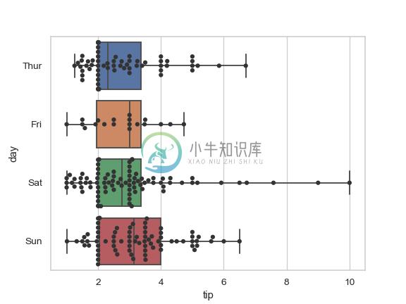
Draw swarms of observations on top of a box plot:
>>> ax = sns.boxplot(x="tip", y="day", data=tips, whis=np.inf)
>>> ax = sns.swarmplot(x="tip", y="day", data=tips, color=".2")
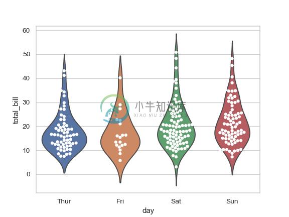
Draw swarms of observations on top of a violin plot:
>>> ax = sns.violinplot(x="day", y="total_bill", data=tips, inner=None)
>>> ax = sns.swarmplot(x="day", y="total_bill", data=tips,
...                    color="white", edgecolor="gray")
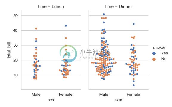
Use catplot() to combine a swarmplot() and a FacetGrid. This allows grouping within additional categorical variables. Using catplot() is safer than using FacetGrid directly, as it ensures synchronization of variable order across facets:
>>> g = sns.catplot(x="sex", y="total_bill",
...                 hue="smoker", col="time",
...                 data=tips, kind="swarm",
...                 height=4, aspect=.7);