Pandas 秘籍 - 第六章
import pandas as pdpd.set_option('display.mpl_style', 'default')figsize(15, 3)
我们前面看到,Pandas 真的很善于处理日期。 它也善于处理字符串! 我们从第 5 章回顾我们的天气数据。
weather_2012 = pd.read_csv('../data/weather_2012.csv', parse_dates=True, index_col='Date/Time')weather_2012[:5]
| Temp (C) | Dew Point Temp (C) | Rel Hum (%) | Wind Spd (km/h) | Visibility (km) | Stn Press (kPa) | Weather | |
|---|---|---|---|---|---|---|---|
| Date/Time | |||||||
| 2012-01-01 00:00:00 | -1.8 | -3.9 | 86 | 4 | 8.0 | 101.24 | Fog |
| 2012-01-01 01:00:00 | -1.8 | -3.7 | 87 | 4 | 8.0 | 101.24 | Fog |
| 2012-01-01 02:00:00 | -1.8 | -3.4 | 89 | 7 | 4.0 | 101.26 | Freezing Drizzle,Fog |
| 2012-01-01 03:00:00 | -1.5 | -3.2 | 88 | 6 | 4.0 | 101.27 | Freezing Drizzle,Fog |
| 2012-01-01 04:00:00 | -1.5 | -3.3 | 88 | 7 | 4.8 | 101.23 | Fog |
6.1 字符串操作
您会看到Weather列会显示每小时发生的天气的文字说明。 如果文本描述包含Snow,我们将假设它是下雪的。
pandas 提供了向量化的字符串函数,以便于对包含文本的列进行操作。 文档中有一些很好的例子。
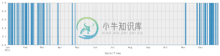
weather_description = weather_2012['Weather']is_snowing = weather_description.str.contains('Snow')
这会给我们一个二进制向量,很难看出里面的东西,所以我们绘制它:
# Not super usefulis_snowing[:5]
Date/Time2012-01-01 00:00:00 False2012-01-01 01:00:00 False2012-01-01 02:00:00 False2012-01-01 03:00:00 False2012-01-01 04:00:00 FalseName: Weather, dtype: bool
# More useful!is_snowing.plot()
<matplotlib.axes.AxesSubplot at 0x403c190>
6.2 使用resample找到下雪最多的月份
如果我们想要每个月的温度中值,我们可以使用resample()方法,如下所示:
weather_2012['Temp (C)'].resample('M', how=np.median).plot(kind='bar')
<matplotlib.axes.AxesSubplot at 0x560cc50>
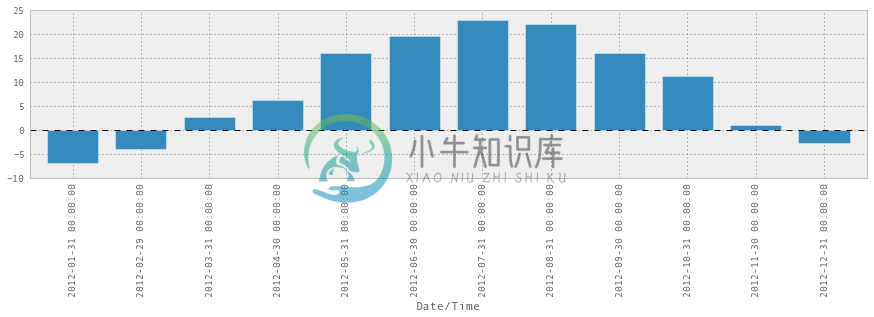
毫无奇怪,七月和八月是最暖和的。
所以我们可以将is_snowing转化为一堆 0 和 1,而不是True和False。
Date/Time2012-01-01 00:00:00 02012-01-01 01:00:00 02012-01-01 02:00:00 02012-01-01 03:00:00 02012-01-01 04:00:00 02012-01-01 05:00:00 02012-01-01 06:00:00 02012-01-01 07:00:00 02012-01-01 08:00:00 02012-01-01 09:00:00 0Name: Weather, dtype: float64
然后使用resample寻找每个月下雪的时间比例。
is_snowing.astype(float).resample('M', how=np.mean)
Date/Time2012-01-31 0.2405912012-02-29 0.1623562012-03-31 0.0873662012-04-30 0.0152782012-05-31 0.0000002012-06-30 0.0000002012-07-31 0.0000002012-08-31 0.0000002012-09-30 0.0000002012-10-31 0.0000002012-11-30 0.0388892012-12-31 0.251344Freq: M, dtype: float64
is_snowing.astype(float).resample('M', how=np.mean).plot(kind='bar')
<matplotlib.axes.AxesSubplot at 0x5bdedd0>
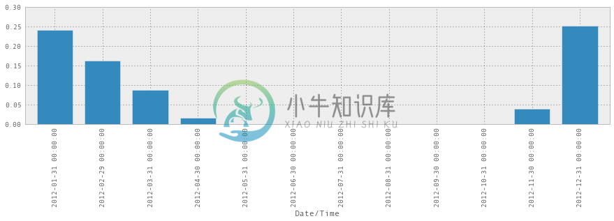
所以现在我们知道了! 2012 年 12 月是下雪最多的一个月。 此外,这个图表暗示着我感觉到的东西 - 11 月突然开始下雪,然后慢慢变慢,需要很长时间停止,最后下雪的月份通常在 4 月或 5 月。
6.3 将温度和降雪绘制在一起
我们还可以将这两个统计(温度和降雪)合并为一个DataFrame,并将它们绘制在一起:
temperature = weather_2012['Temp (C)'].resample('M', how=np.median)is_snowing = weather_2012['Weather'].str.contains('Snow')snowiness = is_snowing.astype(float).resample('M', how=np.mean)# Name the columnstemperature.name = "Temperature"snowiness.name = "Snowiness"
我们再次使用concat,将两个统计连接为一个DataFrame。
stats = pd.concat([temperature, snowiness], axis=1)stats
| Temperature | Snowiness | |
|---|---|---|
| Date/Time | ||
| 2012-01-31 | -7.05 | 0.240591 |
| 2012-02-29 | -4.10 | 0.162356 |
| 2012-03-31 | 2.60 | 0.087366 |
| 2012-04-30 | 6.30 | 0.015278 |
| 2012-05-31 | 16.05 | 0.000000 |
| 2012-06-30 | 19.60 | 0.000000 |
| 2012-07-31 | 22.90 | 0.000000 |
| 2012-08-31 | 22.20 | 0.000000 |
| 2012-09-30 | 16.10 | 0.000000 |
| 2012-10-31 | 11.30 | 0.000000 |
| 2012-11-30 | 1.05 | 0.038889 |
| 2012-12-31 | -2.85 | 0.251344 |
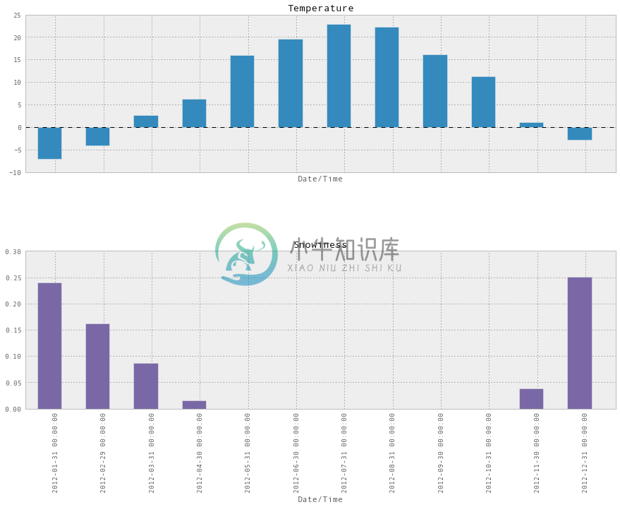
stats.plot(kind='bar')
<matplotlib.axes.AxesSubplot at 0x5f59d50>
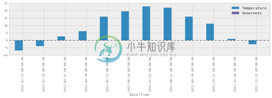
这并不能正常工作,因为比例不对,我们可以在两个图表中分别绘制它们,这样会更好:
stats.plot(kind='bar', subplots=True, figsize=(15, 10))
array([<matplotlib.axes.AxesSubplot object at 0x5fbc150>,<matplotlib.axes.AxesSubplot object at 0x60ea0d0>], dtype=object)