ToggleButton
Extends Widget
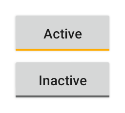
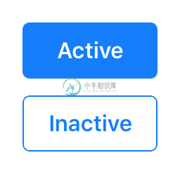
A push button that “snaps in”, i.e. it is selected when pressed and deselected when pressed again.
Import this type with “const {ToggleButton} = require('tabris');”
| Android | iOS |
|---|---|
 |  |
Properties
alignment
Type: string, supported values: left, right, center, default: center
The horizontal alignment of the button text.
checked
Type: boolean, default: false
The checked state of the toggle button.
image
Type: Image
An image to be displayed on the button.
text
Type: string
The button’s label text.
textColor
Type: Color
The color of the text.
Events
alignmentChanged
Fired when the alignment property has changed.
Event Parameters
target: this The widget the event was fired on.
value: string The new value of alignment.
checkedChanged
Fired when the checked property has changed.
Event Parameters
target: this The widget the event was fired on.
value: boolean The new value of checked.
imageChanged
Fired when the image property has changed.
Event Parameters
target: this The widget the event was fired on.
value: Image The new value of image.
select
Fired when the toggle button is selected or deselected by the user.
Event Parameters
target: this The widget the event was fired on.
checked: boolean The current value of checked.
textChanged
Fired when the text property has changed.
Event Parameters
target: this The widget the event was fired on.
value: string The new value of text.
textColorChanged
Fired when the textColor property has changed.
Event Parameters
target: this The widget the event was fired on.
value: Color The new value of textColor.
Example
const {ToggleButton, ui} = require('tabris');

// Create a toggle button with a checked handler

new ToggleButton({
  left: 10, top: 10,
  text: 'checked',
  checked: true
}).on('checkedChanged', event => event.target.text = event.value ? 'checked' : 'not checked')
  .appendTo(ui.contentView);

