Picker
Extends Widget
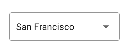
A widget with a drop-down list of items to choose from.
Import this type with “const {Picker} = require('tabris');”
| Android | iOS |
|---|---|
 |  |
Properties
borderColor
Type: Color
The color of the border of the Picker. On iOS this is a rectangular border around the Picker, on Android it is a single line below the Picker.
fillColor
iOS
Type: Color
The color of the background of the Picker - applies only to iOS.
itemCount
Type: number
The number of items to display.
itemText
Type: (index: number) => string
A function that returns the string to display for a given index.
selectionIndex
Type: number
The index of the currently selected item.
textColor
Type: Color
The color of the text.
Events
borderColorChanged
Fired when the borderColor property has changed.
Event Parameters
target: this The widget the event was fired on.
value: Color The new value of borderColor.
fillColorChanged
Fired when the fillColor property has changed.
Event Parameters
target: this The widget the event was fired on.
value: Color The new value of fillColor.
itemCountChanged
Fired when the itemCount property has changed.
Event Parameters
target: this The widget the event was fired on.
value: number The new value of itemCount.
itemTextChanged
Fired when the itemText property has changed.
Event Parameters
target: this The widget the event was fired on.
value: (index: number) => string The new value of itemText.
select
Fired when an item was selected by the user.
Event Parameters
target: this The widget the event was fired on.
index: number Contains the index of the selected item.
selectionIndexChanged
Fired when the selectionIndex property has changed.
Event Parameters
target: this The widget the event was fired on.
value: number The new value of selectionIndex.
textColorChanged
Fired when the textColor property has changed.
Event Parameters
target: this The widget the event was fired on.
value: Color The new value of textColor.
Example
const {Picker, ui} = require('tabris');

// Create a picker widget to select a string from a list

const AIRPORTS = [
  {
    id: 'SFO',
    name: 'San Francisco'
  },
  {
    id: 'TXL',
    name: 'Berlin Tegel'
  },
  {
    id: 'FRA',
    name: 'Frankfurt'
  }
];

let picker = new Picker({
  left: 20, top: 20, right: 20,
  itemCount: AIRPORTS.length,
  itemText: (index) => AIRPORTS[index].name,
  selectionIndex: 1
}).appendTo(ui.contentView);

picker.on('select', ({index}) => console.log('Selected ' + AIRPORTS[index].id));

