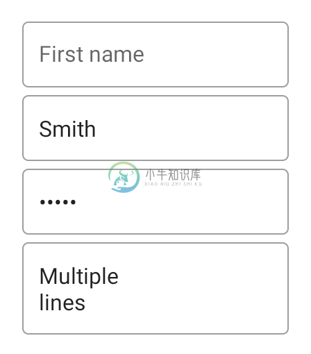
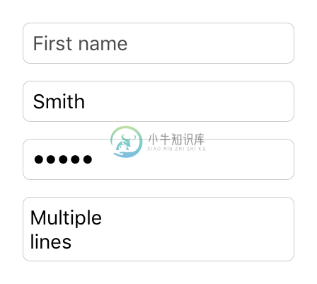
TextInput
Extends Widget
A widget that allows to enter text.
Import this type with “const {TextInput} = require('tabris');”
| Android | iOS |
|---|---|
 |  |
Properties
alignment
iOSAndroid
Type: string, supported values: left, right, center, default: left
The horizontal alignment of the text.
autoCapitalize
iOSAndroid
Type: boolean, default: false
Automatically switch to capital letters after every key pressed.
autoCorrect
Type: boolean, default: false
Enables the spell checker and auto-correction feature.
borderColor
iOSAndroid
Type: Color
The color of the border of the TextInput. On iOS this is a rectangular border around the TextInput, on Android it is a single line below the TextInput.
editable
Type: boolean, default: true
Whether the text can be edited or not.
enterKeyType
Type: string, supported values: default, done, next, send, search, go, default: default
Label or icon to display on the keyboard ‘confirmation’ key. The key press can be captured via the accept event. Setting an enterKeyType other than default will change the key behavior to not close the keyboard automatically. The developer is able close the keyboard by removing the focus from the TextInput.
fillColor
iOS
Type: Color
The color of the background of the TextInput - applies only to iOS.
focused
Type: boolean, default: false
Reflects whether this widget has the keyboard focus. Setting this property to true will focus the widget and open the virtual keyboard, setting it to false will remove the focus and hide the virtual keyboard.
keepFocus
iOSAndroid
Type: boolean, default: false
When true the TextInput will keep its focus, even when tapped outside of the widget bounds.
keyboard
Type: string, supported values: ascii, decimal, email, number, numbersAndPunctuation, phone, url, default, default: default
Selects the keyboard type to use for editing this widget. Has no effect when type is set to multiline.
message
Type: string
A hint text that is displayed when the input field is empty. Does not apply on iOS when type is set to multiline.
text
Type: string
The text in the input field.
textColor
Type: Color
The color of the text.
type
Type: string, supported values: default, password, search, multiline, default: default
The type of the text widget. Windows 10 currently interprets search as default.
This property can only be set on widget creation. Once set, it cannot be changed anymore.
Events
accept
Fired when a text input has been finished by pressing the keyboard’s Enter key. The label of this key may vary depending on the platform and locale.
Event Parameters
target: this The widget the event was fired on.
text: string The current value of text.
alignmentChanged
Fired when the alignment property has changed.
Event Parameters
target: this The widget the event was fired on.
value: string The new value of alignment.
autoCapitalizeChanged
Fired when the autoCapitalize property has changed.
Event Parameters
target: this The widget the event was fired on.
value: boolean The new value of autoCapitalize.
autoCorrectChanged
Fired when the autoCorrect property has changed.
Event Parameters
target: this The widget the event was fired on.
value: boolean The new value of autoCorrect.
blur
Fired when the widget lost focus.
borderColorChanged
Fired when the borderColor property has changed.
Event Parameters
target: this The widget the event was fired on.
value: Color The new value of borderColor.
editableChanged
Fired when the editable property has changed.
Event Parameters
target: this The widget the event was fired on.
value: boolean The new value of editable.
enterKeyTypeChanged
Fired when the enterKeyType property has changed.
Event Parameters
target: this The widget the event was fired on.
value: string The new value of enterKeyType.
fillColorChanged
Fired when the fillColor property has changed.
Event Parameters
target: this The widget the event was fired on.
value: Color The new value of fillColor.
focus
Fired when the widget gains focus.
focusedChanged
Fired when the focused property has changed.
Event Parameters
target: this The widget the event was fired on.
value: boolean The new value of focused.
input
Fired when the text was changed by the user.
Event Parameters
target: this The widget the event was fired on.
text: string The new value of text.
keepFocusChanged
Fired when the keepFocus property has changed.
Event Parameters
target: this The widget the event was fired on.
value: boolean The new value of keepFocus.
keyboardChanged
Fired when the keyboard property has changed.
Event Parameters
target: this The widget the event was fired on.
value: string The new value of keyboard.
messageChanged
Fired when the message property has changed.
Event Parameters
target: this The widget the event was fired on.
value: string The new value of message.
textChanged
Fired when the text property has changed.
Event Parameters
target: this The widget the event was fired on.
value: string The new value of text.
textColorChanged
Fired when the textColor property has changed.
Event Parameters
target: this The widget the event was fired on.
value: Color The new value of textColor.
Example
const {TextInput, TextView, ui} = require('tabris');

// Create a text input field with input finished listener

new TextInput({
  top: 20, left: '20%', right: '20%',
  message: 'Type here, then confirm'
}).on('accept', ({text}) => {
  new TextView({
    top: 'prev() 20', left: '20%',
    text: text
  }).appendTo(ui.contentView);
}).appendTo(ui.contentView);

