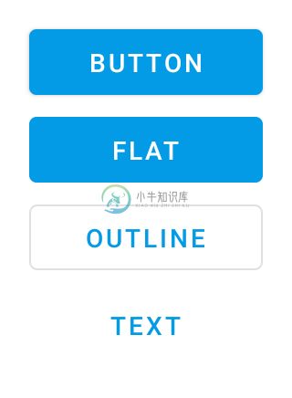
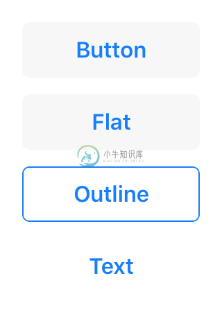
Button
Extends Widget
A push button. Can contain a text or an image.
Import this type with “const {Button} = require('tabris');”
| Android | iOS |
|---|---|
 |  |
Properties
alignment
Type: string, supported values: left, right, center, default: center
The horizontal alignment of the button text.
image
Type: Image
An image to be displayed on the button.
text
Type: string
The button’s label text.
textColor
Type: Color
The color of the text.
Events
alignmentChanged
Fired when the alignment property has changed.
Event Parameters
target: this The widget the event was fired on.
value: string The new value of alignment.
imageChanged
Fired when the image property has changed.
Event Parameters
target: this The widget the event was fired on.
value: Image The new value of image.
select
Fired when the button is pressed.
textChanged
Fired when the text property has changed.
Event Parameters
target: this The widget the event was fired on.
value: string The new value of text.
textColorChanged
Fired when the textColor property has changed.
Event Parameters
target: this The widget the event was fired on.
value: Color The new value of textColor.
Example
const {Button, ui} = require('tabris');

// Create a push button that counts up on selection

let count = 0;

new Button({
  left: 10, top: 10,
  text: 'Button'
}).on('select', ({target}) => target.text = 'Pressed ' + (++count) + ' times')
  .appendTo(ui.contentView);

