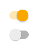
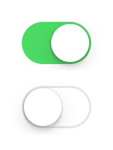
Switch
Extends Widget
A switch widget that can be toggled.
Import this type with “const {Switch} = require('tabris');”
| Android | iOS |
|---|---|
 |  |
Properties
checked
Type: boolean, default: false
The checked state of the switch.
thumbOffColor
Type: Color
The color of the movable thumb, when switched off.
thumbOnColor
Type: Color
The color of the movable thumb, when switched on.
trackOffColor
Type: Color
The color of the track that holds the thumb, when switched off.
trackOnColor
Type: Color
The color of the track that holds the thumb, when switched on.
Events
checkedChanged
Fired when the checked property has changed.
Event Parameters
target: this The widget the event was fired on.
value: boolean The new value of checked.
select
Fired when the switch is toggled by the user.
Event Parameters
target: this The widget the event was fired on.
checked: boolean The current value of checked.
thumbOffColorChanged
Fired when the thumbOffColor property has changed.
Event Parameters
target: this The widget the event was fired on.
value: Color The new value of thumbOffColor.
thumbOnColorChanged
Fired when the thumbOnColor property has changed.
Event Parameters
target: this The widget the event was fired on.
value: Color The new value of thumbOnColor.
trackOffColorChanged
Fired when the trackOffColor property has changed.
Event Parameters
target: this The widget the event was fired on.
value: Color The new value of trackOffColor.
trackOnColorChanged
Fired when the trackOnColor property has changed.
Event Parameters
target: this The widget the event was fired on.
value: Color The new value of trackOnColor.
Example
const {Button, Switch, TextView, ui} = require('tabris');

// Create a switch with a checked handler

let MARGIN = 16;

new Switch({
  left: MARGIN, top: MARGIN,
  id: 'switch',
  checked: true
}).on('checkedChanged', ({value: checked}) => {
  ui.contentView.find('#stateView').first().text = checked ? 'State: checked' : 'State: unchecked';
}).appendTo(ui.contentView);

new TextView({
  left: ['#switch', MARGIN], baseline: '#switch',
  id: 'stateView',
  text: 'State: checked'
}).appendTo(ui.contentView);

new Button({
  left: MARGIN, top: ['#switch', MARGIN],
  text: 'Toggle Switch'
}).on('select', () => {
  let switcher = ui.contentView.find('#switch').first();
  switcher.checked = !switcher.checked;
}).appendTo(ui.contentView);

