Area-spline
我们已经在Highcharts Configuration Syntax一章中看到了用于绘制图表的配置 。 现在,让我们看一个使用样条曲线的面积图示例。 我们还将了解其他配置。 我们在图表中更改了type属性。
图表
将图表类型配置为“areaspline”。 chart.type决定图表的系列类型。 这里,默认值是“line”。
chart.setType(Type.AREA_SPLINE);
例子 (Example)
HelloWorld.java
package cn.xnip.client;
import org.moxieapps.gwt.highcharts.client.Chart;
import org.moxieapps.gwt.highcharts.client.ChartSubtitle;
import org.moxieapps.gwt.highcharts.client.Credits;
import org.moxieapps.gwt.highcharts.client.Legend;
import org.moxieapps.gwt.highcharts.client.Series.Type;
import org.moxieapps.gwt.highcharts.client.Style;
import org.moxieapps.gwt.highcharts.client.ToolTip;
import org.moxieapps.gwt.highcharts.client.ToolTipData;
import org.moxieapps.gwt.highcharts.client.ToolTipFormatter;
import org.moxieapps.gwt.highcharts.client.labels.AxisLabelsData;
import org.moxieapps.gwt.highcharts.client.labels.AxisLabelsFormatter;
import org.moxieapps.gwt.highcharts.client.labels.YAxisLabels;
import org.moxieapps.gwt.highcharts.client.plotOptions.AreaPlotOptions;
import com.google.gwt.core.client.EntryPoint;
import com.google.gwt.user.client.ui.RootPanel;
public class HelloWorld implements EntryPoint {
public void onModuleLoad() {
Chart chart = new Chart()
.setType(Type.AREA_SPLINE)
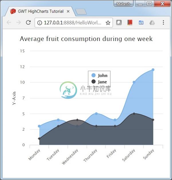
.setChartTitleText("Average fruit consumption during one week")
.setChartSubtitle(new ChartSubtitle()
.setStyle(new Style()
.setPosition("absolute")
.setRight("0px")
.setBottom("0px")
)
)
.setLegend(new Legend()
.setLayout(Legend.Layout.VERTICAL)
.setAlign(Legend.Align.RIGHT)
.setVerticalAlign(Legend.VerticalAlign.TOP)
.setX(-150)
.setY(100)
.setFloating(true)
.setBorderWidth(1)
.setBackgroundColor("#FFFFFF")
)
.setToolTip(new ToolTip()
.setFormatter(
new ToolTipFormatter() {
public String format(ToolTipData toolTipData) {
return "<b>" + toolTipData.getSeriesName() + "</b><br/>" +
toolTipData.getXAsString() + ": " + toolTipData.getYAsLong();
}
}
)
)
.setCredits(new Credits()
.setEnabled(false)
)
.setAreaPlotOptions(new AreaPlotOptions()
.setFillOpacity(0.5)
);
chart.getXAxis()
.setCategories(
"Monday", "Tuesday", "Wednesday", "Thursday", "Friday", "Saturday", "Sunday"
);
chart.getYAxis()
.setAxisTitleText("Y-Axis")
.setLabels(new YAxisLabels()
.setFormatter(new AxisLabelsFormatter() {
public String format(AxisLabelsData axisLabelsData) {
return String.valueOf(axisLabelsData.getValueAsLong());
}
})
);
chart.addSeries(chart.createSeries()
.setName("John")
.setPoints(new Number[] {3, 4, 3, 5, 4, 10, 12})
);
chart.addSeries(chart.createSeries()
.setName("Jane")
.setPoints(new Number[] {1, 3, 4, 3, 3, 5, 4})
);
RootPanel.get().add(chart);
}
}
结果 (Result)
验证结果。