
在由直方图子图组成的matplotlib图中,如何更改一个直方图的高度和条边?

我有一个小函数,可以生成两个子情节的情节。一个子图是重叠的两个直方图,另一个子图是一个直方图除以另一个直方图的结果。
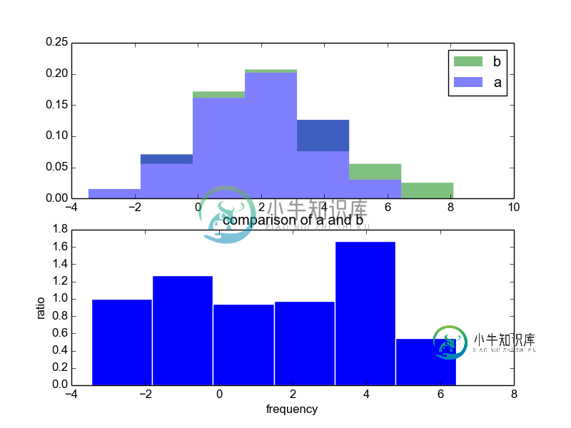
对于第二个子图,我不知道如何删除直方图条之间的边(比如上面的那个),也不知道如何降低它的高度(比如说,它是上面那个高度的一半)。我也不知道如何将标题设置到情节的最顶端。
这些事情怎么可能做到?
我的代码如下:
import numpy
import matplotlib.pyplot
import datavision # sudo pip install datavision
import shijian    # sudo pip install shijian

def main():

    a = numpy.random.normal(2, 2, size = 120)
    b = numpy.random.normal(2, 2, size = 120)

    save_histogram_comparison_matplotlib(
        values_1      = a,
        values_2      = b,
        label_1       = "a",
        label_2       = "b",
        normalize     = True,
        label_ratio_x = "frequency",
        label_y       = "",
        title         = "comparison of a and b",
        filename      = "test.png"
    )

def save_histogram_comparison_matplotlib(
    values_1       = None,
    values_2       = None,
    filename       = None,
    number_of_bins = None,
    normalize      = True,
    label_x        = "",
    label_y        = None,
    label_ratio_x  = "frequency",
    label_ratio_y  = "ratio",
    title          = None,
    label_1        = "1",
    label_2        = "2",
    overwrite      = True,
    LaTeX          = False
    ):

    matplotlib.pyplot.ioff()
    if LaTeX is True:
        matplotlib.pyplot.rc("text", usetex = True)
        matplotlib.pyplot.rc("font", family = "serif")
    if number_of_bins is None:
        number_of_bins_1 = datavision.propose_number_of_bins(values_1)
        number_of_bins_2 = datavision.propose_number_of_bins(values_2)
        number_of_bins   = int((number_of_bins_1 + number_of_bins_2) / 2)
    if filename is None:
        filename = shijian.propose_filename(
            filename  = title.replace(" ", "_") + ".png",
            overwrite = overwrite
        )

    values = []
    values.append(values_1)
    values.append(values_2)
    bar_width = 0.8
    figure, (axis_1, axis_2) = matplotlib.pyplot.subplots(nrows = 2)
    ns, bins, patches = axis_1.hist(
        values,
        normed    = normalize,
        histtype  = "stepfilled",
        bins      = number_of_bins,
        alpha     = 0.5,
        label     = [label_1, label_2],
        rwidth    = bar_width,
        linewidth = 0
    )
    axis_1.legend()
    axis_2.bar(
        bins[:-1],
        ns[0] / ns[1],
        edgecolor = "#ffffff", # "none"
        alpha = 1,
        width = bins[1] - bins[0]
    )
    axis_1.set_xlabel(label_x)
    axis_1.set_ylabel(label_y)
    axis_2.set_xlabel(label_ratio_x)
    axis_2.set_ylabel(label_ratio_y)
    matplotlib.pyplot.title(title)
    matplotlib.pyplot.savefig(filename)
    matplotlib.pyplot.close()

if __name__ == "__main__":
    main()
共有1个答案

你有3个问题:
在这里,您可以为调用栏将线宽设置为0:
axis_2.bar(
    bins[:-1],
    ns[0] / ns[1],
    linewidth=0,
    alpha = 1,
    width = bins[1] - bins[0]
)
在这里,我们可以发送kwargs到gridspec当我们创建子情节。相关选项是height_ratios。我们使用gridspec_kw选项将它们发送到子情节。如果我们将它设置为(2,1),那么第一个子图的高度是第二个子图的两倍。
figure, (axis_1, axis_2) = matplotlib.pyplot.subplots(
    nrows = 2,
    gridspec_kw={'height_ratios':(2,1)}
    )
当您调用matplotlib.pyplot.title(title)时,实际上是设置当前活动的子情节轴的标题,在本例中是axis_2。要设置整体图形的标题,您可以设置suptitle:
matplotlib.pyplot.suptitle(title)
或者,由于您已经命名了图形,您可以使用:
figure.suptitle(title)
同样,您可以使用:
figure.savefig(filename)
保存一些击键。
总而言之:
-
直方图(Histogram),又称质量分布图,它是一种条形图的一种,由一系列高度不等的纵向线段来表示数据分布的情况。 直方图的横轴表示数据类型,纵轴表示分布情况。 首先,我们需要了解柱状图和直方图的区别。直方图用于概率分布,它显示了一组数值序列在给定的数值范围内出现的概率;而柱状图则用于展示各个类别的频数。 例如,我们对某工厂的员工年龄做直方图统计,首先我们要统计出每一位员工的年龄,然后设定一个
-
是否可以动态更改Gnuplot脚本中条的颜色?我有以下脚本 这将生成此绘图: 有没有可能使零度以下的色条变成红色? 谢谢, 斯文
-
我正在用GnuplotPy绘制一些直方图,我想更改直方图条的颜色。(默认情况下,条形图为红色。)这篇StackOverflow文章中的答案给出了几个在普通Gnuplot中如何更改直方图条颜色的选项,但是我还无法让这些解决方案在GnuplotPy中工作。 以下是我使用的基本设置: 上面的代码没有尝试设置直方图条的颜色,它生成了一个带有红色条的直方图: 我尝试了几种方法将直方图条颜色更改为蓝色,但都没
-
问题内容: 我有这段代码可以生成直方图,标识出三种类型的字段。“低”,“中”和“高”: 产生这个: 如何在其中获得三种不同颜色的图例? 问题答案: 您需要自己创建图例。为此,创建一些未在图中显示的矩形(所谓的代理艺术家)。 完整的例子:
-
这个教程中我们会涉及条形图和直方图。我们先来看条形图: import matplotlib.pyplot as plt plt.bar([1,3,5,7,9],[5,2,7,8,2], label="Example one") plt.bar([2,4,6,8,10],[8,6,2,5,6], label="Example two", color='g') plt.legend() plt.xla
-
我是matplotlib的初学者,如果这看起来像一个愚蠢的问题,我很抱歉。 我有一个csv文件,其中包含深度学习模型不同层中单个神经元的权重值。由于我的模型中有四个层,因此文件结构如下所示: weight_1weight_2weight_n weight_1weight_2weight_n weight_1weight_2weight_n weight_1weight_2weight_n 正如你所