
如何在条形图上添加值标签

我陷入了感觉应该相对容易的事情。我下面带来的代码是基于我正在进行的一个更大项目的示例。我认为没有理由发布所有细节,所以请按原样接受我带来的数据结构。
基本上,我正在创建一个条形图,我只是想知道如何在条形图上添加值标签(在条形图的中心,或者就在它的上面)。我一直在网上寻找示例,但是在我自己的代码上没有成功实现。我相信解决方法是用“文本”或“注释”,但我:a)不知道用哪一个(而且总的来说,还没想好什么时候用哪一个)。b)看不到显示价值标签。感谢您的帮助,我的代码如下。提前感谢!
import numpy as np
import pandas as pd
import matplotlib.pyplot as plt
pd.set_option('display.mpl_style', 'default')
%matplotlib inline
# Bring some raw data.
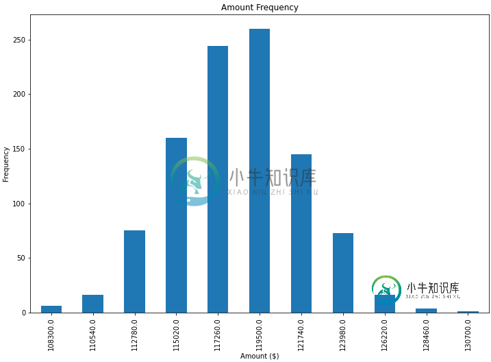
frequencies = [6, 16, 75, 160, 244, 260, 145, 73, 16, 4, 1]
# In my original code I create a series and run on that,
# so for consistency I create a series from the list.
freq_series = pd.Series(frequencies)
x_labels = [108300.0, 110540.0, 112780.0, 115020.0, 117260.0, 119500.0,
121740.0, 123980.0, 126220.0, 128460.0, 130700.0]
# Plot the figure.
plt.figure(figsize=(12, 8))
fig = freq_series.plot(kind='bar')
fig.set_title('Amount Frequency')
fig.set_xlabel('Amount ($)')
fig.set_ylabel('Frequency')
fig.set_xticklabels(x_labels)
共有3个答案

基于以上(太棒了!)答案,我们也可以制作一个单杠图,只需进行一些调整:
# Bring some raw data.
frequencies = [6, -16, 75, 160, 244, 260, 145, 73, 16, 4, 1]

freq_series = pd.Series(frequencies)

y_labels = [108300.0, 110540.0, 112780.0, 115020.0, 117260.0, 119500.0,
            121740.0, 123980.0, 126220.0, 128460.0, 130700.0]

# Plot the figure.
plt.figure(figsize=(12, 8))
ax = freq_series.plot(kind='barh')
ax.set_title('Amount Frequency')
ax.set_xlabel('Frequency')
ax.set_ylabel('Amount ($)')
ax.set_yticklabels(y_labels)
ax.set_xlim(-40, 300) # expand xlim to make labels easier to read

rects = ax.patches

# For each bar: Place a label
for rect in rects:
    # Get X and Y placement of label from rect.
    x_value = rect.get_width()
    y_value = rect.get_y() + rect.get_height() / 2

    # Number of points between bar and label. Change to your liking.
    space = 5
    # Vertical alignment for positive values
    ha = 'left'

    # If value of bar is negative: Place label left of bar
    if x_value < 0:
        # Invert space to place label to the left
        space *= -1
        # Horizontally align label at right
        ha = 'right'

    # Use X value as label and format number with one decimal place
    label = "{:.1f}".format(x_value)

    # Create annotation
    plt.annotate(
        label,                      # Use `label` as label
        (x_value, y_value),         # Place label at end of the bar
        xytext=(space, 0),          # Horizontally shift label by `space`
        textcoords="offset points", # Interpret `xytext` as offset in points
        va='center',                # Vertically center label
        ha=ha)                      # Horizontally align label differently for
                                    # positive and negative values.

plt.savefig("image.png")

基于这个对另一个问题的回答中提到的一个功能,我找到了一个非常普遍适用的解决方案,用于在条形图上放置标签。
不幸的是,其他解决方案在许多情况下不起作用,因为标签和条之间的间距要么以条的绝对单位给出,要么按条的高度缩放。前者仅适用于较窄的值范围,后者在一个地块内给出不一致的间距。这两种方法都不适用于对数轴。
我提出的解决方案独立于比例(即对于小数字和大数字),甚至正确地为负值和对数比例放置标签,因为它使用视觉单元point进行偏移。
我添加了一个负数来展示在这种情况下标签的正确位置。
每个条的高度值用作其标签。其他标签可以很容易地与Simon的<code>for rect,label in zip(rect,标签)
import numpy as np
import pandas as pd
import matplotlib.pyplot as plt

# Bring some raw data.
frequencies = [6, -16, 75, 160, 244, 260, 145, 73, 16, 4, 1]

# In my original code I create a series and run on that,
# so for consistency I create a series from the list.
freq_series = pd.Series.from_array(frequencies)

x_labels = [108300.0, 110540.0, 112780.0, 115020.0, 117260.0, 119500.0,
            121740.0, 123980.0, 126220.0, 128460.0, 130700.0]

# Plot the figure.
plt.figure(figsize=(12, 8))
ax = freq_series.plot(kind='bar')
ax.set_title('Amount Frequency')
ax.set_xlabel('Amount ($)')
ax.set_ylabel('Frequency')
ax.set_xticklabels(x_labels)


def add_value_labels(ax, spacing=5):
    """Add labels to the end of each bar in a bar chart.

    Arguments:
        ax (matplotlib.axes.Axes): The matplotlib object containing the axes
            of the plot to annotate.
        spacing (int): The distance between the labels and the bars.
    """

    # For each bar: Place a label
    for rect in ax.patches:
        # Get X and Y placement of label from rect.
        y_value = rect.get_height()
        x_value = rect.get_x() + rect.get_width() / 2

        # Number of points between bar and label. Change to your liking.
        space = spacing
        # Vertical alignment for positive values
        va = 'bottom'

        # If value of bar is negative: Place label below bar
        if y_value < 0:
            # Invert space to place label below
            space *= -1
            # Vertically align label at top
            va = 'top'

        # Use Y value as label and format number with one decimal place
        label = "{:.1f}".format(y_value)

        # Create annotation
        ax.annotate(
            label,                      # Use `label` as label
            (x_value, y_value),         # Place label at end of the bar
            xytext=(0, space),          # Vertically shift label by `space`
            textcoords="offset points", # Interpret `xytext` as offset in points
            ha='center',                # Horizontally center label
            va=va)                      # Vertically align label differently for
                                        # positive and negative values.


# Call the function above. All the magic happens there.
add_value_labels(ax)

plt.savefig("image.png")
编辑:我已经提取了函数中的相关功能,正如barnhillec所建议的那样。
这会产生以下输出:
使用对数刻度(以及对输入html" target="_blank">数据进行一些调整以显示对数刻度),结果是:

首先是freq_series。plot返回一个轴,而不是一个数字,为了让我的答案更清楚,我已经更改了给定的代码,将其称为<code>ax,以便与其他代码示例更加一致。
您可以从ax.patches成员获取绘图中生成的条形图列表。然后,您可以使用此matplotlib库示例中演示的技术使用ax.text方法添加标签。
import pandas as pd
import matplotlib.pyplot as plt

# Bring some raw data.
frequencies = [6, 16, 75, 160, 244, 260, 145, 73, 16, 4, 1]
# In my original code I create a series and run on that,
# so for consistency I create a series from the list.
freq_series = pd.Series(frequencies)

x_labels = [
    108300.0,
    110540.0,
    112780.0,
    115020.0,
    117260.0,
    119500.0,
    121740.0,
    123980.0,
    126220.0,
    128460.0,
    130700.0,
]

# Plot the figure.
plt.figure(figsize=(12, 8))
ax = freq_series.plot(kind="bar")
ax.set_title("Amount Frequency")
ax.set_xlabel("Amount ($)")
ax.set_ylabel("Frequency")
ax.set_xticklabels(x_labels)

rects = ax.patches

# Make some labels.
labels = [f"label{i}" for i in range(len(rects))]

for rect, label in zip(rects, labels):
    height = rect.get_height()
    ax.text(
        rect.get_x() + rect.get_width() / 2, height + 5, label, ha="center", va="bottom"
    )

plt.show()
这将生成一个带标签的图,如下所示:
-
问题内容: 我陷入一种感觉应该相对容易的事情上。我在下面提供的代码是基于我正在从事的一个较大项目的示例。我没有理由发布所有详细信息,因此请原样接受我带来的数据结构。 基本上,我正在创建一个条形图,我可以弄清楚如何在条形图上(在条形图的中心或上方)添加值标签。一直在网上查看示例,但在我自己的代码上实现未成功。我相信解决方案是使用“文本”或“注释”,但是我:a)不知道要使用哪个(通常来说,还没有弄清楚
-
问题内容: 在Bokeh指南中,可以创建各种条形图的示例。http://docs.bokeh.org/en/0.10.0/docs/user_guide/charts.html#id4 此代码将创建一个: 我的问题是是否可以向图表的每个单独的条形添加数据标签?我在网上搜索,但找不到明确的答案。 问题答案: 使用标签集 使用Labelset在每个单独的条形上方创建标签 在我的示例中,我将vbar与绘
-
我一直试图得到一个条形图,每个条形图上都有值标签。我找遍了,但还是找不到。我的df如下所示。 到目前为止,我的代码是
-
任何人都可以帮我把城市名称添加到每个水平条的顶部吗?我已经做了其他一切。只需要弄清楚这一点。 这是我为了得到条形图而写的代码。我需要指导每个条顶部的标签。
-
最近在glassdoor-like网站上遇到了一个面试问题,我找不到一个优化的解决方案来解决这个问题: 这和积水问题完全不同。请通读这些例子。 给定一个输入数组,每个元素表示塔的高度,将浇水量,索引号表示浇水位置。每个塔的宽度为1。浇水后打印图表。 备注: > 浇注位置永远不会处于峰值位置。无需考虑分水的情况。 (如果您给出了这种情况的解决方案,您可以假设如果在峰值位置倒入N水,N/2水向左,N/
-
我有一个这样的数据帧: 现在,我想绘制水平条形图,其中平台名称位于相应的条形图中,使其看起来像这样: 我该怎么做?