
Android selector状态选择器的使用详解

一、目的效果
越好的用户体验来源更直接更明显的事件反馈。selector可以“预存”多种响应的反馈,主要以下多种状态有:
android:state_selected是选中
android:state_focused是获得焦点
android:state_pressed是点击
android:state_enabled是设置是否响应事件,指所有事件
设置不同状态的表现形式,则会在不同场景下有不同状态。如文字:被选中状态,未被选中状态。
selector的普通使用则是为对应单个控件添加以selector为背景的资源,则能达到目的。联合使用则是基本使用一种升级。在我们的导航栏中,常使用LinearLayout或者RelativeLayout包含一个ImageView和一个TextView。图片用于直观观感,文字用于更清晰的描述。
在一个整体菜单被选中时,需要图片及文字都表现对应的状态。并为保证较大的事件响应范围,点击事件常赋予包含图片和文字的父控件。即:为LinearLayout设置点击事件,ImageView、TextView表现对应的状态。
二、具体实现
文字的selector:res添加目录color,res/color/bg_tv_selector.xml
<?xml version="1.0" encoding="utf-8"?>
<selector xmlns:android="http://schemas.android.com/apk/res/android">
  <item android:color="@color/red" android:state_pressed="true" />
  <item android:color="@color/black" />
</selector>
图片的selector:bg_qq_iv_selector.xml
<?xml version="1.0" encoding="utf-8"?>
<selector xmlns:android="http://schemas.android.com/apk/res/android">
  <item android:drawable="@mipmap/b_qq_pressed" android:state_pressed="true" />
  <item android:drawable="@mipmap/b_qq" />
</selector>
使用shape为Button的背景图,并设置selector:
bg_bt_drawable_normal.xml:
<?xml version="1.0" encoding="utf-8"?>
<shape xmlns:android="http://schemas.android.com/apk/res/android">
  <corners android:radius="10dp" />
  <stroke
    android:width="2dp"
    android:color="@color/black" />
</shape>
bg_bt_drawable_pressed.xml:
<?xml version="1.0" encoding="utf-8"?>
<shape xmlns:android="http://schemas.android.com/apk/res/android">
  <corners android:radius="5dp" />
  <stroke
    android:width="2dp"
    android:color="@color/blue"
    android:dashGap="10dp" />
  <gradient
    android:centerColor="@color/red"
    android:endColor="@color/green" />
</shape>
bg_bt_selector.xml:
<?xml version="1.0" encoding="utf-8"?>
<selector xmlns:android="http://schemas.android.com/apk/res/android">
  <item android:drawable="@drawable/bg_bt_drawable_pressed" android:state_pressed="true" />
  <item android:drawable="@drawable/bg_bt_drawable_normal" />
</selector>
activity_main.xml中使用:
<?xml version="1.0" encoding="utf-8"?>
<LinearLayout xmlns:android="http://schemas.android.com/apk/res/android"
  xmlns:tools="http://schemas.android.com/tools"
  android:layout_width="match_parent"
  android:layout_height="match_parent"
  android:orientation="vertical"
  tools:context="com.future.selectorlldemo.MainActivity">

  <LinearLayout
    android:layout_width="match_parent"
    android:layout_height="wrap_content"
    android:orientation="horizontal">

    <LinearLayout
      android:id="@+id/qq_ll"
      android:layout_width="0dp"
      android:layout_height="wrap_content"
      android:layout_weight="1"
      android:background="@color/green"
      android:clickable="true"
      android:gravity="center"
      android:orientation="vertical">

      <ImageView
        android:layout_width="wrap_content"
        android:layout_height="wrap_content"
        android:src="@drawable/bg_qq_iv_selector" />

      <TextView
        android:layout_width="wrap_content"
        android:layout_height="wrap_content"
        android:text="QQ"
        android:textColor="@color/bg_tv_selector" />

    </LinearLayout>

    <LinearLayout
      android:id="@+id/weixin_ll"
      android:layout_width="0dp"
      android:layout_height="wrap_content"
      android:layout_weight="1"
      android:background="@color/blue"
      android:clickable="true"
      android:gravity="center"
      android:orientation="vertical">

      <ImageView
        android:layout_width="wrap_content"
        android:layout_height="wrap_content"
        android:src="@drawable/bg_weixin_iv_selector" />

      <TextView
        android:layout_width="wrap_content"
        android:layout_height="wrap_content"
        android:text="WeChat"
        android:textColor="@color/bg_tv_selector" />

    </LinearLayout>
  </LinearLayout>

  <LinearLayout
    android:id="@+id/text_button_ll"
    android:layout_width="match_parent"
    android:layout_height="wrap_content"
    android:orientation="horizontal">

    <TextView
      android:layout_width="0dp"
      android:layout_height="wrap_content"
      android:layout_weight="1"
      android:text="文字和Button"
      android:textColor="@color/bg_tv_selector" />

    <Button
      android:layout_width="0dp"
      android:layout_height="wrap_content"
      android:layout_weight="1"
      android:background="@drawable/bg_bt_selector"
      android:clickable="false"
      android:text="确认" />

  </LinearLayout>
</LinearLayout>
MainActivity.Java中应用效果:
public class MainActivity extends AppCompatActivity implements View.OnClickListener {
  /**
   * qq登录按钮
   */
  private LinearLayout qqLoginLL;
  /**
   * 微信登录按钮
   */
  private LinearLayout weixinLoginLL;
  /**
   * 文字和Button一起
   */
  private LinearLayout textButtonLL;

  @Override
  protected void onCreate(Bundle savedInstanceState) {
    super.onCreate(savedInstanceState);
    setContentView(R.layout.activity_main);

    qqLoginLL = (LinearLayout) findViewById(R.id.qq_ll);
    weixinLoginLL = (LinearLayout) findViewById(R.id.weixin_ll);
    textButtonLL = (LinearLayout) findViewById(R.id.text_button_ll);

    qqLoginLL.setOnClickListener(this);
    weixinLoginLL.setOnClickListener(this);
    textButtonLL.setOnClickListener(this);
  }

  @Override
  public void onClick(View v) {
    switch (v.getId()) {
      case R.id.qq_ll:
        Toast.makeText(MainActivity.this, "你点击了QQ登录区间", Toast.LENGTH_SHORT).show();
        break;
      case R.id.weixin_ll:
        Toast.makeText(MainActivity.this, "你点击了WeChat登录区间", Toast.LENGTH_SHORT).show();
        break;
      case R.id.text_button_ll:
        Toast.makeText(MainActivity.this, "你点击了Text_Button区间", Toast.LENGTH_SHORT).show();
        break;
    }
  }
}
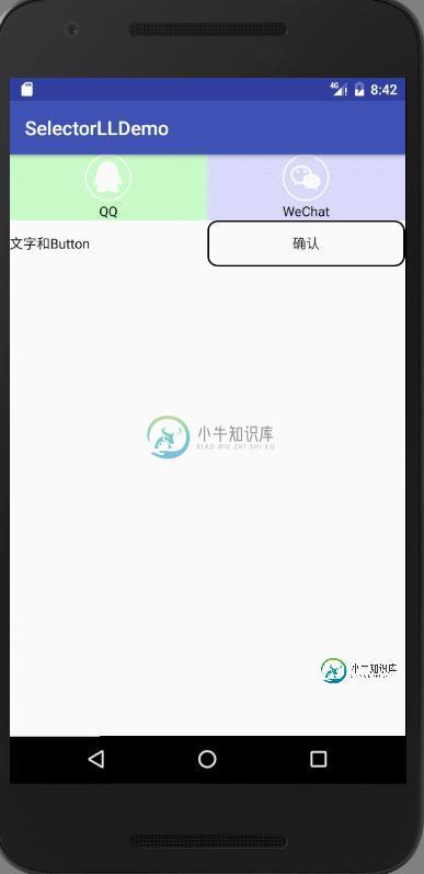
展示效果:
三、注意细节
1.默认状态放在selector的最后
<?xml version="1.0" encoding="utf-8"?>
<selector xmlns:android="http://schemas.android.com/apk/res/android">
  <item android:drawable="@mipmap/b_qq" />
  <item android:drawable="@mipmap/b_qq_pressed" android:state_pressed="true" />
</selector>
不能实现对应效果!!!
2.TextView selector需要放置在 res/corlor目录下
3.Button的点击事件优先级高于包含他的父控件,需要将他只为不可点击状态,才能保证状态的一致性。
以上就是本文的全部内容,希望对大家的学习有所帮助,也希望大家多多支持小牛知识库。
-
For example, here’s how you would select the object: And to fetch the counter’s currentValue, we can pass in a string array, where each string plucks a single property from the application state one a
-
UI状态伪类选择器,用于选择处于某种状态下的UI元素,主要用于HTML表单上,根据表单元素的不同状态,定义不同的样式,来增强用户体验。 表单元素的状态包括获得焦点、失去焦点、选中、未选中、可用、不可用、有效、无效、必填、选填、只读等等。 表 2-10 UI状态伪类选择器 选择器 功能描述 版本 E:focused 选择表单中获得焦点的元素 3 E:checked 选择表单中被选中的radio或者c
-
本文向大家介绍jQuery选择器之属性筛选选择器用法详解,包括了jQuery选择器之属性筛选选择器用法详解的使用技巧和注意事项,需要的朋友参考一下 在这么多属性选择器中[attr="value"]和[attr*="value"]是最实用的 [attr="value"]能帮我们定位不同类型的元素,特别是表单form元素的操作,比如说input[type="text"],input[type="che
-
本文向大家介绍Android数字选择器NumberPicker使用详解,包括了Android数字选择器NumberPicker使用详解的使用技巧和注意事项,需要的朋友参考一下 数字选择器NumberPicker是Android3.0之后引入的一个控件,比较常用,比如说手机常用的闹钟,可以选择小时和分钟,如果你需要兼容3.0之前版本,GitHub上有开源的项目,具体的下载地址。本人就没有使用开源的项
-
问题内容: 用户选择州后,如何更新我的城市微调器? 这两个字段均使用填充,该返回数据并将信息解析为微调框的数组。 下面的代码将城市设置为默认的 “选择州” 值,一旦用户选择了该州,则应使用notifyDataSetChanged,因为城市微调框的默认数组已使用新的城市名称进行了更新。我在下面的代码中评论了我遇到的错误。 问题答案: 现在尝试
-
问题内容: 我有一个ListView,里面有自定义元素。我想为每个元素创建选择器。选择器本身不会很复杂,因为在项目悬停/选中/选择时,它们仅需要处理背景色。但是,这些选择器的颜色必须来自外部来源,我需要能够从变量中进行设置,因此某些简单的静态代码将无法使用。 如何以编程方式定义所有参数的扇区? 如何以编程方式将该选择器分配给特定视图? 问题答案: 您可以在StateListDrawable中添加任
-
我试图收集信息,以便为UML状态机编写正确的转换选择算法。 UML上层结构规范(15.3.12 StateMachine)规定 只有在相互正交的区域中发生的转换才能同时触发。 “相互正交”是否意味着这些区域处于相同的嵌套级别? 对于给定级别的每个状态,将评估所有原始转换,以确定它们是否已启用。 在我看来,它们必须在同一个嵌套层上。正当因为如果在某个嵌套级别上找到一个转换,搜索就会结束。。。 第二个
-
本文最初发表于博客园,并在GitHub上持续更新前端的系列文章。欢迎在GitHub上关注我,一起入门和进阶前端。 以下是正文。 CSS3介绍 CSS3在CSS2基础上,增强或新增了许多特性, 弥补了CSS2的众多不足之处,使得Web开发变得更为高效和便捷。 CSS3的现状 浏览器支持程度不够好,有些需要添加私有前缀 移动端支持优于PC端 不断改进中 应用相对广泛 应对的策略:渐进增强 (1)坚持渐