
在保持比率的同时填充父div

我希望有一个div部分,尽可能多地填充其div父级,同时保持一个比率。
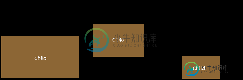
渲染结果如下所示:
到目前为止我所拥有的:
html,
body {
  height: 100%;
}

.parent {
  /* Parent's height and width are unknown,
     it could be dynamic, e.g. parent is part of a flex layout. */
  height: 80%;
  width: 90%;
  border-style: solid;
  border-width: 2px;
  border-color: black;
}

.child {
  width: 90vw;
  /* 90% of viewport vidth */
  height: 50.625vw;
  /* ratio = 9/16 * 90 = 50.625 */
  max-height: 90vh;
  max-width: 160vh;
  /* 16/9 * 90 = 160 */
  margin: auto;
  position: absolute;
  top: 0;
  bottom: 0;
  left: 0;
  right: 0;
  background: #A0522D;
}
<div class="parent">
<div class="child">
content that is not images...
</div>
</div>这个css的行为就像我想要的方式,但是这是使用视口而不是父div,这在实际情况下是一个问题。
我正在寻找一种方法来填补基于父div。
共有3个答案

使用flexbox和padding。使用媒体查询确定视口的最小纵横比。然后进行相应的调整。
html,
body {
  height: 100%;
}

.parent {
  height: 100%;
  width: 100%;
  border-style: solid;
  border-width: 2px;
  border-color: black;
  /* to center */
  display: flex;
  align-items: center;
  justify-content: center;
}

.child {
  width: 100vw;
  /* 16:9 aspect ratio = 9 / 16 = 0.5625 = padding-bottom*/
  padding-bottom: 56.25%;
  background: #A0522D;
}

@media (min-aspect-ratio: 16/9) {
  .child {
    height: 100vh;
    /*16:9 aspect ratio = 9 / 16 = 177.77 = width*/
    width: 177.77vh;
    padding: 0;
    margin: 0px;
    background: red;
  }
}
<div class="parent">
<!-- the viewbox will provide the desired aspect ratio -->
<div class="child">
content that is not images...
</div>
</div>
也许添加位置绝对和它的工作原理,通过设置顶部,右,底部,左到0与边距自动.你也可以使用flex居中它或绝对与左50%和变换-50%太。
body {
            padding: 0;
            margin: 0;
            height: 100vh;
            width: 100vh;


        }

        .child {
            width: 90vw;
            /* 90% of viewport vidth */
            height: 50.625vw;
            max-height: 90vh;
            max-width: 160vh;
            /* Adding this maybe min-width and min-height */
            min-height: 90vh;
            min-width: 160vh;

            /* 16/9 * 90 = 160 */
            background: #f7f7f7;
            box-shadow: 0px 5px 30px 0px rgba(0, 0, 0, 0.18);
            border-radius: 4px;
            margin: auto;
            position: absolute;
            top: 0;
            left: 0;
            right: 0;
            bottom: 0;
        }
<!DOCTYPE html>
<html lang="en">
<head>
<meta charset="UTF-8">
<meta http-equiv="X-UA-Compatible" content="IE=edge">
<meta name="viewport" content="width=device-width, initial-scale=1.0">
<title>Parent Child</title>
</head>
<body> <!-- parent -->
<div class="child"></div>
</body>
</html>
使用纵横比:16/9;溢出:隐藏(纵横比MDN文档)应该可以提供您想要的准确结果,而无需使用填充技巧。确保父级设置为显示:栅格,否则可能无法正确缩放。
除了Safari,所有主要浏览器(caniuse.com)都支持宽高比CSS属性,尽管Safari计划今年增加支持。这是实现这种效果的最佳/正确方法,而不必求助于JavaScript或任何黑客解决方案。
堆栈溢出的相关问题和答案:
- https://stackoverflow.com/a/66786774/3824249(与我的解决方案非常相似)
html, body { height: 100%; }

.parent {
  display: grid;
  resize: both;
  height: 50%;
  width: 90%;
  border: 2px solid #000;
  overflow: hidden;
}

.child {
  width: 100%;
  max-height: 100%;
  margin: auto;
  aspect-ratio: 16 / 9;
  overflow: hidden;
  box-sizing: border-box;
  position: relative;
  background: #a0522d;
  text-align: center;
  font-size: 20px;
  color: white;
  /* using the below to center the text, optional */
  display: flex;
  align-items: center;
  justify-content: center;
}
<div style="padding: 5px 10px; margin-bottom: 10px; background: #f00; color: #fff; text-align: center; z-index: 1;">Resize the block below using the resize controls to see this in action.</div>
<div class="parent">
<div class="child">content that is not images...</div>
</div>-
我找到了这条线索-如何拉伸图像以填充 我有一个具有一定大小的div和其中的图像。无论图像是横向还是纵向,我都想始终用图像填充div。图像是否被切断也没关系(div本身隐藏了溢出)。 因此,如果图像是纵向的,我希望宽度是100%,高度是自动的,所以它保持成比例。如果图像是横向的,我希望高度为100%,宽度为自动。听起来很复杂对吧? 因为我不知道怎么做,我只是简单地创建了一个我的意思的快速图像。我甚至
-
我已经尝试了上面问题中的其他东西,但我不能得到我想要的结果(状态栏下面的背景图像)。我做错了什么?以下是重要的整个源代码(我排除了样板) PS:我想保留状态栏。我想要的是像链接问题的截图:全屏图像和图像上方的半透明状态栏。如果我将背景图像设置为根布局,我会得到我想要的结果,除了图像纵横比没有保持。见下图。 舱单 这种布局奏效了。
-
问题内容: 我有一个可以放在一起的网站,它的固定长宽比大约等于风景,例如视频。 我想使它居中并扩展以填充可用的宽度和可用的高度,但不要在任何一侧变大。 例如: 高而薄的页面将使内容伸展整个宽度,同时保持成比例的高度。 短而宽的页面将使内容伸展到整个高度,并具有成比例的宽度。 我一直在研究两种方法: 使用具有正确长宽比的图像来扩展容器,但我无法在主要浏览器中以相同的方式表现该图像。 设置成比例的底部
-
我有一个。的数据是从服务器请求的。 以下是中的项布局: 我从服务器请求数据,获取图像url并将图像加载到 适配器中有方法的代码 图像大小为。我在我的Nexus4上运行我的应用程序。图像填充宽度,但高度不缩放。不显示整个图像。 我如何解决这个问题?
-
我最近决定在我的android应用程序上放广告。我看到的问题是,当我第一次打开应用程序时,我只收到“一个”广告。从那以后,我再也看不到其他地方的广告了。它只是保持空白! 根据admob的说法,我得到了100%的填充率,这没有任何意义。 下面是我的logcat输出。 我不太确定是怎么回事。 下面是我的xml布局。 这是我的代码 注意:我在oncreate中为活动使用该代码,在onactivitycr
-
我有一个保持宽高比的元素:它根据其宽度计算其高度(使用填充技巧)。我想做的是通过垂直和水平地拟合最大可用空间,将此放入另一个div中,不进行裁剪。我认为最接近我想要的东西是-这是而已。 我希望div覆盖最大的高度和宽度,同时保持纵横比。没有垂直或水平的作物。 它甚至可能与CSS只有?如果有,如何? 更新:这是一篇很好的文章,介绍了目前的情况。 代码(可以是任何其他解决方案,不必在此代码段上构建):