
如何使Matplotlib / Pandas条形图看起来像历史图?

由于在一些数据pandas.Series,rv,之间是有差异
-
hist直接调用数据进行绘图 -
计算直方图结果(用
numpy.histogram),然后用绘制bar
示例数据生成
%matplotlib inline

import numpy as np
import pandas as pd
import scipy.stats as stats
import matplotlib
matplotlib.rcParams['figure.figsize'] = (12.0, 8.0)
matplotlib.style.use('ggplot')

# Setup size and distribution
size = 50000
distribution = stats.norm()

# Create random data
rv = pd.Series(distribution.rvs(size=size))
# Get sane start and end points of distribution
start = distribution.ppf(0.01)
end = distribution.ppf(0.99)

# Build PDF and turn into pandas Series
x = np.linspace(start, end, size)
y = distribution.pdf(x)
pdf = pd.Series(y, x)

# Get histogram of random data
y, x = np.histogram(rv, bins=50, normed=True)
# Correct bin edge placement
x = [(a+x[i+1])/2.0 for i,a in enumerate(x[0:-1])]
hist = pd.Series(y, x)
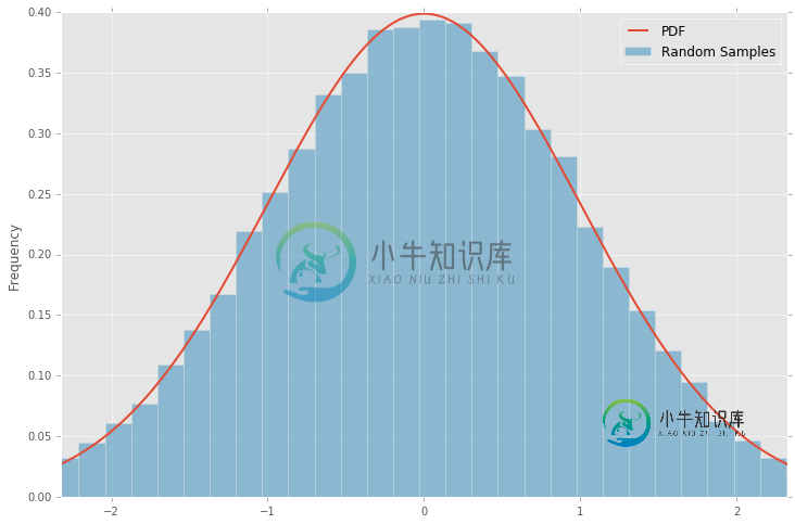
hist() 绘图
ax = pdf.plot(lw=2, label='PDF', legend=True)
rv.plot(kind='hist', bins=50, normed=True, alpha=0.5, label='Random Samples', legend=True, ax=ax)
bar() 绘图
ax = pdf.plot(lw=2, label='PDF', legend=True)
hist.plot(kind='bar', alpha=0.5, label='Random Samples', legend=True, ax=ax)
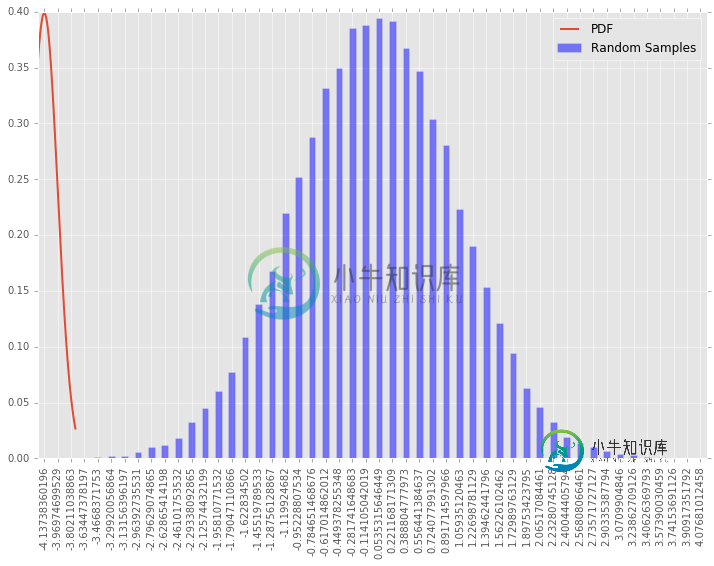
如何使bar情节看起来像hist情节?
为此,用例仅需保存 直方图 数据以供以后使用(以后通常会比原始数据小)。
问题答案:
条形图差异
要获得bar类似于该hist图的图,需要对的默认行为进行一些处理bar。
bar通过传递x(hist.index)和y(hist.values)强制使用实际x数据绘制范围。默认bar行为是在任意范围内绘制y数据,并将x数据作为标签。- 将
width参数设置为与x数据的实际步长相关(默认值为0.8) - 将
align参数设置为'center'。 - 手动设置轴图例。
需要这些变化经由到制成matplotlib的bar()呼吁轴线(ax)代替pandas的bar()呼吁数据(hist)。
绘图示例
%matplotlib inline

import numpy as np
import pandas as pd
import scipy.stats as stats
import matplotlib
matplotlib.rcParams['figure.figsize'] = (12.0, 8.0)
matplotlib.style.use('ggplot')

# Setup size and distribution
size = 50000
distribution = stats.norm()

# Create random data
rv = pd.Series(distribution.rvs(size=size))
# Get sane start and end points of distribution
start = distribution.ppf(0.01)
end = distribution.ppf(0.99)

# Build PDF and turn into pandas Series
x = np.linspace(start, end, size)
y = distribution.pdf(x)
pdf = pd.Series(y, x)

# Get histogram of random data
y, x = np.histogram(rv, bins=50, normed=True)
# Correct bin edge placement
x = [(a+x[i+1])/2.0 for i,a in enumerate(x[0:-1])]
hist = pd.Series(y, x)

# Plot previously histogrammed data
ax = pdf.plot(lw=2, label='PDF', legend=True)
w = abs(hist.index[1]) - abs(hist.index[0])
ax.bar(hist.index, hist.values, width=w, alpha=0.5, align='center')
ax.legend(['PDF', 'Random Samples'])

-
问题内容: 我正在使用ASP.NET,我的某些按钮只是进行重定向。我希望它们是普通的链接,但是我不希望我的用户注意到外观上的很大差异。我考虑了用锚(即标签)包裹的图像,但我不想每次更改按钮上的文本时都必须启动图像编辑器。 问题答案: 将课程应用于
-
问题内容: 如何添加值的标签以显示在条形图中的条形上方: 问题答案: 捕获绘图所在的轴,然后将其作为普通对象进行操作。将值放在条形上方将是这样的:
-
问题内容: 我在Matplotlib中制作条形图,调用如下: 有没有一种方法可以在Matplotlib中使用此功能来实现? 问题答案: 将添加为关键字参数。例如 。 这将垂直填充条形间隙。
-
我用Matplotlib做了一个条形图,调用如下: 我得到一个条形图,看起来像这样: 我想要的是在连续的条之间没有空白,例如,更像这样: 有没有办法在Matplotlib中使用函数来实现这一点?
-
问题内容: 有什么办法可以将位图转换为棕褐色?我知道要转换为grayScale是在ColorMatrix中设置setSaturation。但是棕褐色呢? 问题答案: 我知道答案,但也许有些人有其他更好的解决方案。
-
问题内容: 我需要使按钮看起来像使用CSS的链接。所做的更改已经完成,但是当我单击它时,它显示的效果就像按按钮一样。任何想法如何删除它,以便即使单击该按钮也可以用作链接? 问题答案: