
Matplotlib:如何指定X标签边框的宽度

我正在尝试在MatPlotLib中创建一个堆叠的条形图,在顶部和底部带有两个不同的x标签。上面的一个应该有一个边框,边框的宽度与钢筋本身的宽度相同。
情节不太正确
这是我创建标签的方式:
plt.tick_params(axis="both", left=False, bottom=False, labelleft=False)
plt.xticks(ind, diagram.keys())
ax.set_frame_on(False)

for label, x in zip([q[1] for q in diagram.values()], ind):
    ax.text(
        x, 1.05, '{:4.0%}'.format(label),
        ha="center", va="center",
        bbox={"facecolor": "blue", "pad": 3}
    )
diagram 是像 {bottom-label: [[contents], top-label]}
因此,我想我的问题可以归结为: 如何处理文本对象的边界 框 ?
非常感谢!
根据请求,一个可运行的示例:
import matplotlib.pyplot as plt
import numpy as np


def stacked_bar_chart(
        diagram, title="example question", img_name="test_image", width=0.7, clusters=None, show_axes=True,
        show_legend=True, show_score=True):
    """
    Builds one or multiple scaled stacked bar charts for grade
    distributions. saves image as png.
    :param show_score: whether the score should be shown on top
    :param show_legend: whether the legend should be shown
    :param show_axes: whether question name should be shown on bottom
    :param clusters: indices of clusters to be displayed.
    :param width: the width of the bars as fraction of available space
    :param title: diagram title
    :param img_name: output path
    :param diagram: dictionary: {x-label: [[grade distribution], score]}
    :return: nothing.
    """

    grades = {
        "sehr gut":     "#357100",
        "gut":          "#7fb96a",
        "befriedigend": "#fdd902",
        "ausreichend":  "#f18d04",
        "mangelhaft":   "#e3540e",
        "ungenügend":   "#882d23"
    }

    # select clusters
    if clusters is not None:
        diagram = {i: diagram[i] for i in clusters}

    # normalize score distribution => sum of votes = 1.0
    normalized = []
    for question in diagram.values():
        s = sum(question[0])
        normalized.append([x / s for x in question[0]])

    # transpose dict values (score distributions) to list of lists
    transformed = list(map(list, zip(*normalized)))

    # input values for diagram generation
    n = len(diagram)  # number of columns
    ind = np.arange(n)  # x values for bar center
    base = [0] * n  # lower bounds for individual color set
    bars = []
    fig, ax = plt.subplots()

    # loop over grades
    for name, grade in zip(grades.keys(), transformed):
        assert len(grade) == n, \
            "something went wrong in plotting grade stack " + img_name
        bar = plt.bar(ind, grade, width=width, color=grades[name], bottom=base)
        bars.append(bar)

        # loop over bars
        for i, (rect, score) in enumerate(zip(bar, grade)):
            # update lower bound for next bar section
            base[i] += grade[i]
            # label with percentage
            # TODO text color white
            ax.text(
                rect.get_x() + width / 2, rect.get_height() / 2 + rect.get_y(), "{0:.0f}%".format(score * 100),
                va="center", ha="center")

    # label diagram

    plt.suptitle(title)
    if show_axes:
        plt.tick_params(axis="both", left=False, bottom=False, labelleft=False)
        plt.xticks(ind, diagram.keys())
        ax.set_frame_on(False)

    else:
        plt.tick_params(axis="both", left=False, bottom=False, labelleft=False, labelbottom=False)
        plt.axis("off")

    # show score label above
    if show_score:
        for label, x in zip([q[1] for q in diagram.values()], ind):
            ax.text(
                x, 1.05, '{:4.0%}'.format(label),
                ha="center", va="center",
                bbox={"facecolor": "blue", "pad": 3}
            )

    # create legend
    if show_legend:
        plt.legend(
            reversed(bars), reversed([*grades]),
            bbox_to_anchor=(1, 1), borderaxespad=0)

    # save file
    plt.show()


diagram = {
    "q1": [[1, 2, 3, 4, 5, 6], 0.6],
    "q2": [[2, 3, 1, 2, 3, 1], 0.4]
}
stacked_bar_chart(diagram)
问题答案:
关于为什么很难将文本框的宽度设置为定义的宽度的争论,请参见此问题,该问题与设置标题文本框的宽度有关。原则上,也可以在此处使用该答案-
使其变得相当复杂。
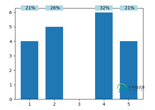
一个相对简单的解决方案是在数据坐标中指定文本的x位置,在轴坐标中指定其y位置。这允许为具有相同坐标的文本创建一个矩形作为背景,使其看起来像文本的边框。
import matplotlib.pyplot as plt
import numpy as np

ind = [1,2,4,5]
data = [4,5,6,4]
perc = np.array(data)/float(np.array(data).sum())
width=0.7
pad = 3 # points


fig, ax = plt.subplots()
bar = ax.bar(ind, data, width=width)

fig.canvas.draw()
for label, x in zip(perc, ind):
    text = ax.text(
        x, 1.00, '{:4.0%}'.format(label),
        ha="center", va="center" , transform=ax.get_xaxis_transform(), zorder=4)
    bb= ax.get_window_extent()
    h = bb.height/fig.dpi
    height = ((text.get_size()+2*pad)/72.)/h
    rect = plt.Rectangle((x-width/2.,1.00-height/2.), width=width, height=height,
                         transform=ax.get_xaxis_transform(), zorder=3,
                         fill=True, facecolor="lightblue", clip_on=False)
    ax.add_patch(rect)


plt.show()
-
以下是postgres 9.1数据库的一些SQL示例: 这是我的python脚本: 有没有办法防止标签相互重叠?理想情况下是以自动方式,因为我无法预测棒的数量。
-
问题内容: 标签标签没有属性’width’,那么我应该如何控制标签标签的宽度? 问题答案: 当然,使用CSS … 不推荐使用该属性,并且应始终使用CSS来控制这些类型的表示样式。
-
我想在聚焦时改变边框宽度。我的输入框有1px的实心边框。对焦时改变2px不同颜色的实心边框。但是有1px的差异,所以包含这个输入框的div在聚焦时会改变它的宽度1px。我想解决这个问题。我是html和css的初学者,所以我需要你的帮助。谢谢. null null
-
嗨,我们可以在flutter中自定义标签栏宽度吗?我的标签栏宽度在这里是固定的,所以当我有长文本在我的标签栏中,它将不会显示完整,我想使我的标签栏宽度是灵活的根据内容,所以当我的文本只是短文本时,标签栏宽度将是小的,当文本是长文本时,标签栏宽度将大于短文本标签。我一直在网上搜索,但我找不到任何答案来解决我的问题。
-
我想设置我的情节标题和x和y标签。总数都是浮点数64.我想尽可能简单地做这件事。 以下是我的代码部分:
-
问题内容: 我如何解析边框宽度 在jQuery / javascript中? 不这样做。 注意我需要从css解析宽度,因为元素可能是 谢谢 编辑 我实际上并没有使用内联样式,我只是为了简单起见以这种方式编写了该代码,因为我没有意识到任何令人讨厌的差异。虽然对于内联样式它似乎工作正常,但是仍然无法从已应用的CSS类中获取任何值。 问题答案: 您可以使用 解析从 到的边框宽度 : 我周围有一个Goog