material-intro
A simple material design app intro with cool animations and a fluent API.
Very inspired by Google's app intros.
Demo:
A demo app is available on Google Play:

Screenshots:
| Simple slide | Custom slide | Fade effect | Permission request |
|---|---|---|---|
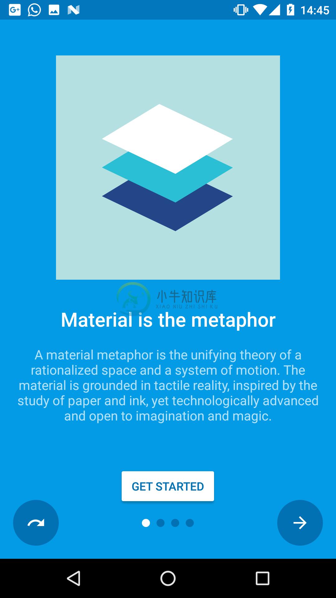 |
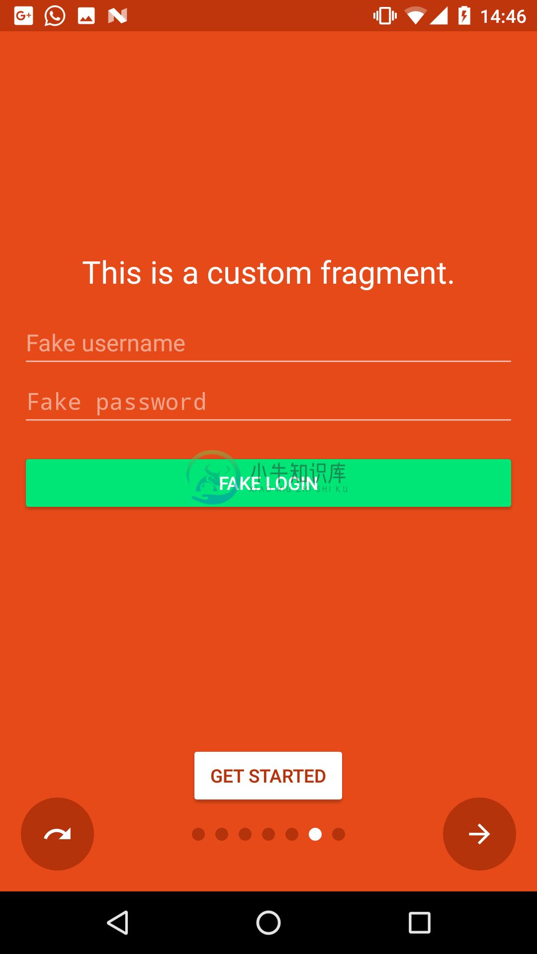 |
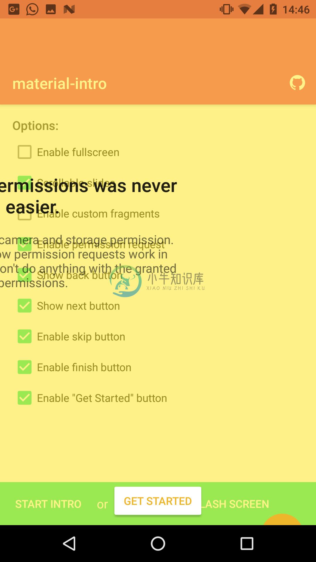 |
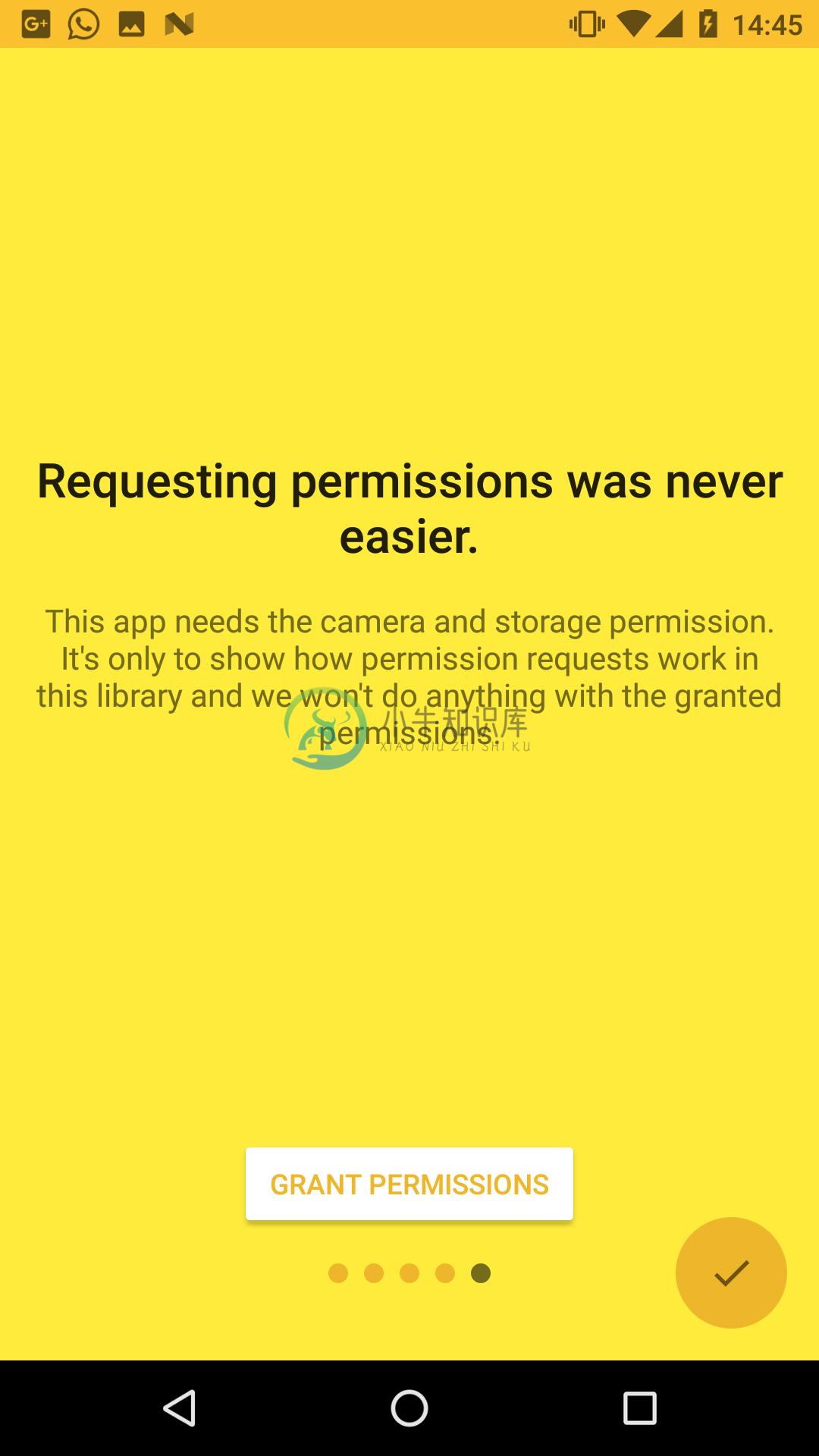 |
SimpleSlide.java |
FragmentSlide.java |
IntroActivity.java |
SimpleSlide.java |
Features:
- Material design (check the docs)
- Easy customization
- Predefined slide layouts
- Custom slides
- Autoplay
- Parallax slides
- Fluent API
Table of Contents
- Setup
- Slides
- Customization
- Navigation
- Tips & Tricks
- Apps using this library
- Changes
- Open-source libraries
- License
Setup:
Gradle Dependency:
material-intro is available on jitpack.io.
Add this in your root build.gradle file (not your module build.gradle file):
allprojects {
    repositories {
        maven { url 'https://jitpack.io' }
    }
}
Add this in your module build.gradle file:
dependencies {
    implementation 'com.heinrichreimersoftware:material-intro:x.y.z'
}
Requirements:
The activity must extend IntroActivity and have a theme extending @style/Theme.Intro:
public class MainIntroActivity extends IntroActivity {
    @Override
    protected void onCreate(Bundle savedInstanceState) {
        super.onCreate(savedInstanceState);
	    // Add slides, edit configuration...
    }
}
<manifest ...>
    <application ...>
        <activity
            android:name=".MainIntroActivity"
            android:theme="@style/Theme.Intro"/>
    </application>
</manifest>
(Unless mentioned otherwise, all of the following method calls should go in the Activity's onCreate().)
Slides:
material-intro has fluent style builders for both a simple text/image slide, as seen in Google's apps, and for slides featuring a custom Fragment or layout resource.
Feel free to submit an issue or pull request if you think any slide types are missing.
Standard slide (SimpleSlide):
Standard slide featuring a title, short description and image like Google's intros.
addSlide(new SimpleSlide.Builder()
        .title(R.string.title_1)
        .description(R.string.description_1)
        .image(R.drawable.image_1)
        .background(R.color.background_1)
        .backgroundDark(R.color.background_dark_1)
        .scrollable(false)
        .permission(Manifest.permission.CAMERA)
        .build());
Fragment slide (FragmentSlide):
Custom slide containing a Fragment or a layout resource.
addSlide(new FragmentSlide.Builder()
        .background(R.color.background_2)
        .backgroundDark(R.color.background_dark_2)
        .fragment(R.layout.fragment_2, R.style.FragmentTheme)
        .build());
(When using FragmentSlide with a Fragment, you should extend SlideFragment to proxy navigation calls to the intro activity.)
Custom slide (Slide):
Base slide. If you want to modify what's shown in your slide this is the way to go.
Customization:
Left ("back") button:
Control left button behavior or hide/show it.
/* Show/hide button */
setButtonBackVisible(true);
/* Use skip button behavior */
setButtonBackFunction(BUTTON_BACK_FUNCTION_SKIP);
/* Use back button behavior */
setButtonBackFunction(BUTTON_BACK_FUNCTION_BACK);
Right ("next") button:
Control right button behavior or hide/show it.
/* Show/hide button */
setButtonNextVisible(true);
/* Use next and finish button behavior */
setButtonNextFunction(BUTTON_NEXT_FUNCTION_NEXT_FINISH);
/* Use next button behavior */
setButtonNextFunction(BUTTON_NEXT_FUNCTION_NEXT);
CTA button:
Change the appearance of the "call to action" button:
/* Show/hide button */
setButtonCtaVisible(getStartedEnabled);
/* Tint button text */
setButtonCtaTintMode(BUTTON_CTA_TINT_MODE_TEXT);
/* Tint button background */
setButtonCtaTintMode(BUTTON_CTA_TINT_MODE_BACKGROUND);
/* Set custom CTA label */
setButtonCtaLabel(R.string.start)
/**/
setButtonCtaClickListener(new View.OnClickListener() {

});
Fullscreen:
Display the intro activity at fullscreen. This hides the status bar.
public class MainIntroActivity extends IntroActivity{
    @Override protected void onCreate(Bundle savedInstanceState){
        setFullscreen(true);
        super.onCreate(savedInstanceState);
	...
    }
}
Make sure to call setFullscreen() before calling super.onCreate()
Scroll duration:
Adjust how long a single slide scroll takes.
setPageScrollDuration(500);
(The page scroll duration is dynamically adapted when scrolling more than one position to reflect dynamic durations from the Material design docs.The exact formula for calculating the scroll duration is duration * (distance + sqrt(distance)) / 2.)
Navigation:
Block navigation:
There are three ways to block navigation for a slide:
- In a
SlideFragment(using aFragmentSlide) by overridingcanGoForward()/canGoBackward()methods. - For a
SimpleSlideby settingSimpleSlide.Builder#canGoForward(boolean)/SimpleSlide.Builder#canGoBackward(boolean).(If at least one permission is set to theSimpleSlide, navigation is automatically blocked until every permission is granted.) - From your
IntroActivityby setting aNavigationPolicy:setNavigationPolicy(new NavigationPolicy() { @Override public boolean canGoForward(int position) { return true; } @Override public boolean canGoBackward(int position) { return false; } });
Navigate to slides
Navigate through the intro manually using one of the following methods e.g. from a listeners callback.Each of them will respect blocked navigation settings.
/* Scroll to any position */
goToSlide(5);

/* Scroll to the next slide in the intro */
nextSlide();

/* Scroll to the previous slide in the intro */
previousSlide();

/* Scroll to the last slide of the intro */
goToLastSlide();

/* Scroll to the first slide of the intro */
goToFirstSlide();
Autoplay
Automatically scroll through the intro until user interacts with the intro.
/* Start an auto slideshow with 2500ms delay between scrolls and infinite repeats */
autoplay(2500, INFINITE);
/* Start an auto slideshow with default configuration  */
autoplay();
/* Cancel the slideshow */
cancelAutoplay()
Callbacks
If any of the above returns false when a user tries to navigate to a slide, a OnNavigationBlockedListener callback is fired that you can use to display a message. Additionally you can add plain-old ViewPager.OnPageChangeListeners to listen for page scrolls:
addOnNavigationBlockedListener(new OnNavigationBlockedListener() {
    @Override public void onNavigationBlocked(int position, int direction) { ... }
});

addOnPageChangeListener(new ViewPager.OnPageChangeListener(){
    @Override public void onPageScrolled(int position, float positionOffset, int positionOffsetPixels) { ... }
    @Override public void onPageSelected(int position) { ... }
    @Override public void onPageScrollStateChanged(int state) { ... }
});
Tips & Tricks:
Activity result:
You can check if the user canceled the intro (by pressing back) or finished it including all slides.Just call up the activity using startActivityForResult(intent, REQUEST_CODE_INTRO); and then listen for the result:
@Override
protected void onActivityResult(int requestCode, int resultCode, Intent data) {
    super.onActivityResult(requestCode, resultCode, data);
    if (requestCode == REQUEST_CODE_INTRO) {
        if (resultCode == RESULT_OK) {
            // Finished the intro
        } else {
            // Cancelled the intro. You can then e.g. finish this activity too.
            finish();
	}
    }
}
Parallax slides:
You can easily achieve a nice looking parallax effect for any slide by using either ParallaxFrameLayout.java, ParallaxLinearLayout.java or ParallaxRelativeLayout.java and defining layout_parallaxFactor for its direct childrens.A higher factor means a stronger parallax effect, 0 means no parallax effect at all.
<com.heinrichreimersoftware.materialintro.view.parallax.ParallaxLinearLayout
    android:layout_width="match_parent"
    android:layout_height="match_parent"
    ... >

    <TextView
        android:layout_width="match_parent"
        android:layout_height="wrap_content"
        app:layout_parallaxFactor="0"
        ... />

    <ImageView
        android:layout_width="match_parent"
        android:layout_height="wrap_content"
        app:layout_parallaxFactor="1.25"
        ... />

</com.heinrichreimersoftware.materialintro.view.parallax.ParallaxLinearLayout>
Check the "Canteen"-demo for a layout example.
Splash screens:
If you want to show the intro only at the first app start you can use onActivityResult() to store a shared preference when the user finished the intro.
See the demo app for a sample splash screen implementation:
- SplashActivity.java: A fake splash screen
- SplashIntroActivity.java: The intro started from FinishActivity
- FinishActivity.java: The activity started after the splash screen
Apps using this library:
- Simply Unroot by @pinpong
- Prodigal Music Player by @SpongeBobSun
- Puff Password Utility by @SpongeBobSun
- QualityGate by @FrontEndART
- Monitor by @daniel-stoneuk
- Contact Lenses Time by @ste23droid
- Antidote Danmark by @AntidoteDanmark
- Speed Boost Lite by @tjmille2
- Root Checker by @joeykrim
Changes:
See the releases section for changelogs.
Open-source libraries:
material-intro uses the following open-source files:
- CheatSheet.java by @Roman Nurik (Apache License 2.0)
- AnimUtils.java by @Nick Butcher (Apache License 2.0), modified version
- InkPageIndicator.java by @Nick Butcher (Apache License 2.0)
License:
MIT License

Copyright (c) 2017 Jan Heinrich Reimer

Permission is hereby granted, free of charge, to any person obtaining a copy
of this software and associated documentation files (the "Software"), to deal
in the Software without restriction, including without limitation the rights
to use, copy, modify, merge, publish, distribute, sublicense, and/or sell
copies of the Software, and to permit persons to whom the Software is
furnished to do so, subject to the following conditions:

The above copyright notice and this permission notice shall be included in all
copies or substantial portions of the Software.

THE SOFTWARE IS PROVIDED "AS IS", WITHOUT WARRANTY OF ANY KIND, EXPRESS OR
IMPLIED, INCLUDING BUT NOT LIMITED TO THE WARRANTIES OF MERCHANTABILITY,
FITNESS FOR A PARTICULAR PURPOSE AND NONINFRINGEMENT. IN NO EVENT SHALL THE
AUTHORS OR COPYRIGHT HOLDERS BE LIABLE FOR ANY CLAIM, DAMAGES OR OTHER
LIABILITY, WHETHER IN AN ACTION OF CONTRACT, TORT OR OTHERWISE, ARISING FROM,
OUT OF OR IN CONNECTION WITH THE SOFTWARE OR THE USE OR OTHER DEALINGS IN THE
SOFTWARE.
-
https://github.com/hbctraining/Intro-to-rnaseq-hpc-O2/tree/master/lessons Greetings, The following incident has been resolved: INC0435489 (Seek for your lesson material from https://github.com/hbctr
-
什么是AppBarLayout AppBarLayout继承自LinearLayout,子控件默认为竖直方向显示,可以用它实现Material Design的Toolbar;它支持滑动手势;它的子控件可以通过在代码里调用setScrollFlags(int)或者在XML里app:layout_scrollFlags来设置它的滑动手势。当然实现这些的前提是它的根布局必须是CoordinatorLay
-
http://id3.org/id3v2.3.0 @turbidwater flashls supports parsing of ID3 tags embedded in MPEG2-TS. ID3 PID is detected by parsing the PMT (ID3 PID stream type = 0x15) this seems consistent with the poin
-
Material Design for AngularJS Apps Material Design is a specification for aunified system of visual, motion, and interaction design that adapts across different devices. Ourgoal is to deliver a lean,
-
材料拥有确定不变的特性和固定的行为。了解这些特性将有助于你在一定程度上熟悉材料,这与 Material Design 的构想是一致的。 物理特性 材料具有变化的长宽尺寸(以 dp 为计)和均匀的厚度(1dp)。 (上图)可取 材料的高度和宽度是可变的。 (上图)不可取 材料总是 1dp 厚。 材料会形成阴影。 阴影是由于材料元件之间的相对高度(Z 轴位置)而自然产生的。 (上图)可取 阴影描述材料
-
Material ScrollTop 是轻量级的回到页面顶部按钮,特点: 轻量级 Material Design inspired 涟漪效应 平滑的动态效果 定制化 一些实用的选项 CSS3 (Sass) + jQuery
-
Vue Material 是一个实现 Google 的像素材料设计的 Vue 组件库,它提供了适合所有现代Web浏览器的内置动态主题的组件,它的 API 也简单明了。 安装和使用: 通过 npm or yarn 安装 npm install vue-material@beta --saveyarn add vue-material@beta 像 JSPM and Bower 暂时还不支持 在代码中
-
Material-Animations 是一个很好过渡动画库, 可以应用于 Activity 与 Activity 之间的跳转, Fragment 与 Fragment 之间的跳转, 以及各个 View 变化前后的过渡动画。 效果图:


