
Android自定义控件LinearLayout实例讲解

很多时候Android常用的控件不能满足我们的需求,那么我们就需要自定义一个控件了。今天做了一个自定义控件的实例,来分享下。
首先定义一个layout实现按钮内部布局:
<?xmlversion="1.0"encoding="utf-8"?>
 <LinearLayoutxmlns:android="http://schemas.android.com/apk/res/android"
 android:layout_width="fill_parent"
 android:layout_height="fill_parent"
 android:orientation="horizontal">

 <ImageView
 android:id="@+id/imageView1"
 android:layout_width="wrap_content"
 android:layout_height="wrap_content"
 android:layout_gravity="center_vertical"
 android:paddingBottom="5dip"
 android:paddingLeft="40dip"
 android:paddingTop="5dip"
 android:src="@drawable/right_icon"/>

 <TextView
 android:id="@+id/textView1"
 android:layout_width="wrap_content"
 android:layout_height="wrap_content"
 android:layout_gravity="center_vertical"
 android:layout_marginLeft="8dip"
 android:text="确定"
 android:textColor="#000000"/>

 </LinearLayout>
接下来写一个类继承LinearLayout,导入刚刚的布局,并且设置需要的方法,从而使的能在代码中控制这个自定义控件内容的显示。
 public class ImageBtn extendsLinearLayout {

 privateImageView imageView;
 privateTextView textView;

 publicImageBtn(Context context) {
 super(context);
 // TODO Auto-generated constructor stub
 }
 publicImageBtn(Context context, AttributeSet attrs) {
 super(context, attrs);
 // TODO Auto-generated constructor stub
 LayoutInflater inflater=(LayoutInflater) context.getSystemService(Context.LAYOUT_INFLATER_SERVICE);
 inflater.inflate(R.layout.imagebtn,this);
 imageView=(ImageView) findViewById(R.id.imageView1);
 textView=(TextView)findViewById(R.id.textView1);
 }

 /**
 * 设置图片资源
 */
 publicvoidsetImageResource(intresId) {
 imageView.setImageResource(resId);
 }

 /**
 * 设置显示的文字
 */
 publicvoidsetTextViewText(String text) {
 textView.setText(text);
 }

 }
在需要使用这个自定义控件的layout中加入这控件,只需要在xml中加入即可。
 <?xmlversion="1.0"encoding="utf-8"?>
 <LinearLayoutxmlns:android="http://schemas.android.com/apk/res/android"
 android:layout_width="fill_parent"
 android:layout_height="fill_parent"
 android:orientation="horizontal">

 <cn.com.karl.view.ImageBtn
 android:id="@+id/btn_right"
 android:layout_height="wrap_content"
 android:layout_width="wrap_content"
 android:background="@drawable/btn"
 />

 <cn.com.karl.view.ImageBtn
 android:id="@+id/btn_error"
 android:layout_marginLeft="5dp"
 android:layout_height="wrap_content"
 android:layout_width="wrap_content"
 android:background="@drawable/btn"
 />

 </LinearLayout>
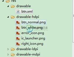
这里用到了背景图片 在drawable/btn.xml
 <?xmlversion="1.0"encoding="utf-8"?>
 <selectorxmlns:android="http://schemas.android.com/apk/res/android">

 <itemandroid:state_focused="true"android:state_pressed="false"android:drawable="@drawable/btn_normal"></item>
 <itemandroid:state_pressed="true"android:drawable="@drawable/btn_white"></item>
 <itemandroid:state_checked="true"android:drawable="@drawable/btn_white"></item>
 <itemandroid:state_focused="false"android:state_pressed="false"android:drawable="@drawable/btn_normal"></item>

 </selector>
最后在activity中设置该控件,和其他控件差不多:
 public class IdentifyButtonActivity extendsActivity {
 privateImageBtn imageBtn1;
 privateImageBtn imageBtn2;
 @Override
 protectedvoidonCreate(Bundle savedInstanceState) {
 // TODO Auto-generated method stub
 super.onCreate(savedInstanceState);
 setContentView(R.layout.identifybutton);

 imageBtn1=(ImageBtn)this.findViewById(R.id.btn_right);
 imageBtn2=(ImageBtn)this.findViewById(R.id.btn_error);
 imageBtn1.setTextViewText("确定");
 imageBtn2.setTextViewText("取消");
 imageBtn1.setImageResource(R.drawable.right_icon);
 imageBtn2.setImageResource(R.drawable.error_icon);

 imageBtn1.setOnClickListener(newView.OnClickListener() {

 publicvoidonClick(View v) {
 // TODO Auto-generated method stub
 Toast.makeText(getApplicationContext(),"点击的正确按钮",1).show();
 }
 });

 imageBtn2.setOnClickListener(newView.OnClickListener() {

 publicvoidonClick(View v) {
 // TODO Auto-generated method stub
 Toast.makeText(getApplicationContext(),"点击的错误按钮",1).show();
 }
 });
 }
 }
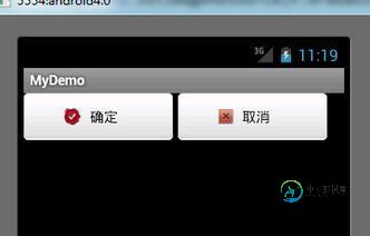
最后看看我们自定义控件的效果吧!
以上就是本文的全部内容,希望对大家的学习有所帮助,也希望大家多多支持小牛知识库。
-
本文向大家介绍实例讲解Android自定义控件,包括了实例讲解Android自定义控件的使用技巧和注意事项,需要的朋友参考一下 小编在此之前给大家介绍过关于Android自定义控件的用法等,需要的可以参考下: Android开发之自定义控件用法详解 详解Android自定义控件属性 可以看到QQ上的ToolBar其实就是一个自定义的view,可以看到不同的界面就是简单地修改了文字而已,在第二张与第
-
本文向大家介绍实例讲解Android应用中自定义组合控件的方法,包括了实例讲解Android应用中自定义组合控件的方法的使用技巧和注意事项,需要的朋友参考一下 自定义view大概可以分成: 继承view 组合view 自己画的view(用paint和canvas) 自定义viewgroup(widget) 最近又跟同学聊起来了,于是就准备自己实现一个imagebutton来练练手。(最简单的了)以
-
Tabris.js控件由JavaScript API和原生平台的实现组成。本文档介绍Android平台上的自定义控件的原生实现。 为了实现自定义控件你需要本地构建。 在Cordova基础上构建 为了创建Tabris.js自定义控件,我们使用Cordova的构建系统。因此,我们创建一个与Tabris.js特定的API相关联的Cordova插件。Tabris.js自定义控件不需要接触任何Cordova
-
本文向大家介绍AngularJS自定义控件实例详解,包括了AngularJS自定义控件实例详解的使用技巧和注意事项,需要的朋友参考一下 本文实例讲述了AngularJS自定义控件。分享给大家供大家参考,具体如下: 自定义指令介绍 AngularJS 指令作用是在 AngulaJS 应用中操作 Html 渲染。比如说,内插指令 ( {{ }} ), ng-repeat 指令以及 ng-if 指令。
-
本文向大家介绍Android自定义控件之自定义组合控件(三),包括了Android自定义控件之自定义组合控件(三)的使用技巧和注意事项,需要的朋友参考一下 前言: 前两篇介绍了自定义控件的基础原理Android自定义控件基本原理详解(一)、Android自定义控件之自定义属性(二)。今天重点介绍一下如何通过自定义组合控件来提高布局的复用,降低开发成本,以及维护成本。 使用自定义组合控件的好处? 我
-
本文向大家介绍Android自定义LinearLayout实现淘宝详情页,包括了Android自定义LinearLayout实现淘宝详情页的使用技巧和注意事项,需要的朋友参考一下 1.简单说明 淘宝详情页就不用我一一介绍了,昨天逛淘宝看到这个效果时,让我想起了去年刚学习Android只会使用现成的时候,当时在网上找了一个这种效果的使用了,并不懂怎么实现的。现在就看到一种效果就想自己实现一下,我想这