
js实现旋转木马效果

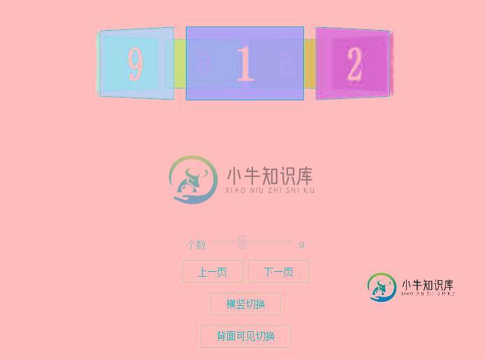
效果图:
代码如下:
<html class=" js csstransforms3d" lang="zh"><head>
 <meta charset="UTF-8">
 <meta http-equiv="X-UA-Compatible" content="IE=edge,chrome=1">
 <meta name="viewport" content="width=device-width, initial-scale=1.0">
 <title>CSS3 3D transforms-旋转木马</title>
 <link rel="stylesheet" type="text/css" href="http://www.htmleaf.com/pins/1412/201502062108/css/style.css" rel="external nofollow" >
 <style media="screen">
   .container {
    width: 210px;
    height: 140px;
    position: relative;
    margin: 50px auto 40px;
    border: 1px solid #CCC;
    -webkit-perspective: 1100px;
     -moz-perspective: 1100px;
      -o-perspective: 1100px;
        perspective: 1100px;
   }
   #carousel {
    width: 100%;
    height: 100%;
    position: absolute;
    -webkit-transform-style: preserve-3d;
     -moz-transform-style: preserve-3d;
      -o-transform-style: preserve-3d;
        transform-style: preserve-3d;
   }
   .ready #carousel {
    -webkit-transition: -webkit-transform 1s;
     -moz-transition: -moz-transform 1s;
      -o-transition: -o-transform 1s;
        transition: transform 1s;
   }
   #carousel.panels-backface-invisible figure {
    -webkit-backface-visibility: hidden;
     -moz-backface-visibility: hidden;
      -o-backface-visibility: hidden;
        backface-visibility: hidden;
   }
   #carousel figure {
    display: block;
    position: absolute;
    width: 186px;
    height: 116px;
    left: 10px;
    top: 10px;
    border: 2px solid black;
    line-height: 116px;
    font-size: 80px;
    font-weight: bold;
    color: white;
    text-align: center;
   }
   .ready #carousel figure {
    -webkit-transition: opacity 1s, -webkit-transform 1s;
     -moz-transition: opacity 1s, -moz-transform 1s;
      -o-transition: opacity 1s, -o-transform 1s;
        transition: opacity 1s, transform 1s;
   }
 #options{
  margin-top: 200px;
  width: 100%;
  text-align: center;
 }
 #options button{padding: 0.5em 1.5em;border: 2px solid #6699cc;background: #fff;}
  </style>
 <!--[if IE]>
 <script src="http://libs.useso.com/js/html5shiv/3.7/html5shiv.min.js"></script>
 <![endif]-->
</head>
 <section class="container">
   <div id="carousel" style="transform: translateZ(-286px) rotateY(0deg);">
    <figure style="opacity: 1; background-color: rgba(255, 0, 0, 0.8); transform: rotateY(0deg) translateZ(286px);">1</figure>
    <figure style="opacity: 1; background-color: rgba(255, 170, 0, 0.8); transform: rotateY(40deg) translateZ(286px);">2</figure>
    <figure style="opacity: 1; background-color: rgba(169, 255, 0, 0.8); transform: rotateY(80deg) translateZ(286px);">3</figure>
    <figure style="opacity: 1; background-color: rgba(0, 255, 0, 0.8); transform: rotateY(120deg) translateZ(286px);">4</figure>
    <figure style="opacity: 1; background-color: rgba(0, 255, 169, 0.8); transform: rotateY(160deg) translateZ(286px);">5</figure>
    <figure style="opacity: 1; background-color: rgba(0, 169, 255, 0.8); transform: rotateY(200deg) translateZ(286px);">6</figure>
    <figure style="opacity: 1; background-color: rgba(0, 0, 255, 0.8); transform: rotateY(240deg) translateZ(286px);">7</figure>
    <figure style="opacity: 1; background-color: rgba(170, 0, 255, 0.8); transform: rotateY(280deg) translateZ(286px);">8</figure>
    <figure style="opacity: 1; background-color: rgba(255, 0, 169, 0.8); transform: rotateY(320deg) translateZ(286px);">9</figure>
    <figure style="opacity: 0; transform: none;">10</figure>
    <figure style="opacity: 0; transform: none;">11</figure>
    <figure style="opacity: 0; transform: none;">12</figure>
    <figure style="opacity: 0; transform: none;">13</figure>
    <figure style="opacity: 0; transform: none;">14</figure>
    <figure style="opacity: 0; transform: none;">15</figure>
    <figure style="opacity: 0; transform: none;">16</figure>
    <figure style="opacity: 0; transform: none;">17</figure>
    <figure style="opacity: 0; transform: none;">18</figure>
    <figure style="opacity: 0; transform: none;">19</figure>
    <figure style="opacity: 0; transform: none;">20</figure>
   </div>
  </section>
  <section id="options">
   <p>
    <label for="panel-count">个数</label>
    <input id="panel-count" value="9" min="3" max="20" type="range">
   <span class=" range-display"></span></p>
   <p id="navigation">
    <button id="previous" data-increment="-1">上一页</button>
    <button id="next" data-increment="1">下一页</button>
   </p>
   <p>
    <button id="toggle-axis">横竖切换</button>
   </p>
   <p>
    <button id="toggle-backface-visibility">背面可见切换</button>
   </p>
  </section>
 </div>
 <script src="http://www.htmleaf.com/pins/1412/201502062108/js/utils.js"></script>
 <script>
  var transformProp = Modernizr.prefixed('transform');
  function Carousel3D ( el ) {
   this.element = el;
   this.rotation = 0;
   this.panelCount = 0;
   this.totalPanelCount = this.element.children.length;
   this.theta = 0;
   this.isHorizontal = true;
  }
  Carousel3D.prototype.modify = function() {
   var panel, angle, i;
   this.panelSize = this.element[ this.isHorizontal ? 'offsetWidth' : 'offsetHeight' ];
   this.rotateFn = this.isHorizontal ? 'rotateY' : 'rotateX';
   this.theta = 360 / this.panelCount;
   // do some trig to figure out how big the carousel
   // is in 3D space
   this.radius = Math.round( ( this.panelSize / 2) / Math.tan( Math.PI / this.panelCount ) );
   for ( i = 0; i < this.panelCount; i++ ) {
    panel = this.element.children[i];
    angle = this.theta * i;
    panel.style.opacity = 1;
    panel.style.backgroundColor = 'hsla(' + angle + ', 100%, 50%, 0.8)';
    // rotate panel, then push it out in 3D space
    panel.style[ transformProp ] = this.rotateFn + '(' + angle + 'deg) translateZ(' + this.radius + 'px)';
   }
   // hide other panels
   for ( ; i < this.totalPanelCount; i++ ) {
    panel = this.element.children[i];
    panel.style.opacity = 0;
    panel.style[ transformProp ] = 'none';
   }
   // adjust rotation so panels are always flat
   this.rotation = Math.round( this.rotation / this.theta ) * this.theta;
   this.transform();
  };
  Carousel3D.prototype.transform = function() {
   // push the carousel back in 3D space,
   // and rotate it
   this.element.style[ transformProp ] = 'translateZ(-' + this.radius + 'px) ' + this.rotateFn + '(' + this.rotation + 'deg)';
  };
  var init = function() {
   var carousel = new Carousel3D( document.getElementById('carousel') ),
     panelCountInput = document.getElementById('panel-count'),
     axisButton = document.getElementById('toggle-axis'),
     navButtons = document.querySelectorAll('#navigation button'),
     onNavButtonClick = function( event ){
      var increment = parseInt( event.target.getAttribute('data-increment') );
      carousel.rotation += carousel.theta * increment * -1;
      carousel.transform();
     };
   // populate on startup
   carousel.panelCount = parseInt( panelCountInput.value, 10);
   carousel.modify();
   axisButton.addEventListener( 'click', function(){
    carousel.isHorizontal = !carousel.isHorizontal;
    carousel.modify();
   }, false);
   panelCountInput.addEventListener( 'change', function( event ) {
    carousel.panelCount = event.target.value;
    carousel.modify();
   }, false);
   for (var i=0; i < 2; i++) {
    navButtons[i].addEventListener( 'click', onNavButtonClick, false);
   }
   document.getElementById('toggle-backface-visibility').addEventListener( 'click', function(){
    carousel.element.toggleClassName('panels-backface-invisible');
   }, false);
   setTimeout( function(){
    document.body.addClassName('ready');
   }, 0);
  };
  window.addEventListener( 'DOMContentLoaded', init, false);
 </script>
 <p id="disclaimer">对不起,你的浏览器不支持CSS 3D transforms。</p>
</body></html>
以上就是本文的全部内容,希望本文的内容对大家的学习或者工作能带来一定的帮助,同时也希望多多支持小牛知识库!
-
本文向大家介绍JavaScript实现旋转木马轮播图,包括了JavaScript实现旋转木马轮播图的使用技巧和注意事项,需要的朋友参考一下 本文实例为大家分享了JavaScript实现旋转木马轮播图的具体代码,供大家参考,具体内容如下 html代码段 图片自己添加,或者使用本人的上传照片,拉到最下面即可看见 css代码段: 初始化 reset js代码段: 这个是封装好的的js代码,直接引用即可
-
所以基本上我想跟滑头做点这样的事...我想有正常的幻灯片,但事情是,是,我想有行动呼吁(按钮)在他们。这通常很容易将按钮与幻灯片一起放入,但有一个溢出:旋转式播放器上隐藏的样式无法取下,否则其他幻灯片会显示出来。我想知道如何才能做到这一点(按钮稍微往外走而不被切断)。 编辑:添加边框到旋转木马,这是真正的问题,我有...维护边框并使底部与边框重叠
-
本文向大家介绍基于jQuery实现自动轮播旋转木马特效,包括了基于jQuery实现自动轮播旋转木马特效的使用技巧和注意事项,需要的朋友参考一下 本文实例讲述了jQuery实现自动轮播旋转木马特效。分享给大家供大家参考。具体如下: 这是一款基于jQuery实现自动轮播旋转木马特效代码,实现过程很简单。 运行效果图: -------------------查看效果 下载源码----
-
本文向大家介绍js实现3D旋转效果,包括了js实现3D旋转效果的使用技巧和注意事项,需要的朋友参考一下 本文实例为大家分享了js实现3D旋转效果的具体代码,供大家参考,具体内容如下 实现效果: 实现过程: 步骤一:先写一个简单的html结构,创建一个box盒子,里面放对应的图片(也可以用js创建图片,这里为了好理解,我们直接用html创建). 步骤二:给盒子和图片,设置对应的样式 第三步: js
-
我想把velocity.js效果结合到Slick Carousel插件中。 slick:http://kenwheeler.github.io/slick/velocity:http://julian.com/research/velocity/ 这很管用,但有一个奇怪的副作用: 这是我现在得到的密码。所以我做了一个效果序列,它是用钩子beforeChange触发的。 当我转到下一张幻灯片时,它起
-
本文向大家介绍jQuery旋转木马式幻灯片轮播特效,包括了jQuery旋转木马式幻灯片轮播特效的使用技巧和注意事项,需要的朋友参考一下 本文为大家分享anoSlide是一款超轻型响应式jQuery旋转木马幻灯片插件,它适合在PC端与移动端实现旋转木马幻灯片特效。具体内容如下 特点 响应式——适应任何视窗的宽度 混合内容 不需要CSS 轻量级(< 8 kb未压缩) 基于jQuery构建 集成图像预加