
Android 自定义view实现TopBar效果

本文实例为大家分享了Android自定义view实现TopBar的具体代码,供大家参考,具体内容如下
布局文件
<?xml version="1.0" encoding="utf-8"?>
<RelativeLayout xmlns:android="http://schemas.android.com/apk/res/android"
  xmlns:tools="http://schemas.android.com/tools"
  android:id="@+id/activity_main"
  android:layout_width="match_parent"
  android:layout_height="match_parent"
  android:paddingBottom="@dimen/activity_vertical_margin"
  android:paddingLeft="@dimen/activity_horizontal_margin"
  android:paddingRight="@dimen/activity_horizontal_margin"
  android:paddingTop="@dimen/activity_vertical_margin"
  tools:context="com.bwie.test.MainActivity">

  <com.bwie.test.MyView
    xmlns:android="http://schemas.android.com/apk/res/android"
    xmlns:lt="http://schemas.android.com/apk/res-auto"
    android:id="@+id/titlebar"
    android:layout_width="match_parent"
    android:layout_height="60dp"
    lt:leftButtonText="返回"
    lt:leftButtonTextColor="@android:color/white"
    lt:leftButtonTextSize="8sp"
    lt:buttonBgColor="#4556ec"
    lt:titleText="标题"
    lt:titleColor="@android:color/white"
    lt:titleSize="8sp"
    lt:rightButtonText="完成"
    lt:rightButtonTextColor="@android:color/white"
    lt:rightButtonTextSize="8sp"
    android:background="#47ea10"
    android:padding="10sp"
    >
  </com.bwie.test.MyView>
</RelativeLayout>
自定义属性attrs.xml文件
<?xml version="1.0" encoding="utf-8"?>
<resources>
  <declare-styleable name="Titlebar">
    <attr name="leftButtonText" format="string|reference"></attr>
    <attr name="leftButtonTextColor" format="color|reference"></attr>
    <attr name="leftButtonTextSize" format="dimension|reference"></attr>
    <attr name="leftButtonImage" format="color|reference"></attr>
    <attr name="buttonBgColor" format="color"/>

    <attr name="titleText" format="string|reference"></attr>
    <attr name="titleColor" format="color|reference"></attr>
    <attr name="titleSize" format="dimension|reference"></attr>

    <attr name="rightButtonText" format="string|reference"></attr>
    <attr name="rightButtonTextColor" format="color|reference"></attr>
    <attr name="rightButtonTextSize" format="dimension|reference"></attr>
    <attr name="rightButtonImage" format="color|reference"></attr>


  </declare-styleable>

</resources>
自定义View的Class类
public class MyView extends RelativeLayout{

  private String mLeftButtonText;
  private int mLeftButtonTextColor;
  private float mLeftButtonSize;
  private Drawable mLeftButtonImage;
  private String mTitleButtonText;
  private int mTitleButtonTextColor;
  private float mTitleButtonSize;
  private String mRightButtonText;
  private int mRightButtonTextColor;
  private float mRightButtonSize;
  private Drawable mRightButtonImage;
  private TextView mRightTextView;
  private TextView titleTextView;
  private ImageView mLeftButton;
  private TextView mLeftTextView;
  private ImageView mRightButton;
  int buttonBgColor;
  public MyView(Context context) {
    this(context,null);
  }

  public MyView(Context context, AttributeSet attrs) {
    this(context, attrs,0);
    TypedArray typedArray = context.obtainStyledAttributes(attrs, R.styleable.Titlebar);
    buttonBgColor = typedArray.getColor(R.styleable.Titlebar_buttonBgColor,Color.BLUE);

//左侧的按钮
    mLeftButtonText = typedArray.getString(R.styleable.Titlebar_leftButtonText);
    mLeftButtonTextColor = typedArray.getColor(R.styleable.Titlebar_leftButtonTextColor, Color.GRAY);
    mLeftButtonSize = typedArray.getDimension(R.styleable.Titlebar_leftButtonTextSize, TypedValue.applyDimension(TypedValue.COMPLEX_UNIT_SP, 16, getResources().getDisplayMetrics()));
    mLeftButtonImage = typedArray.getDrawable(R.styleable.Titlebar_leftButtonImage);
//中间的按钮
    mTitleButtonText = typedArray.getString(R.styleable.Titlebar_titleText);
    mTitleButtonTextColor = typedArray.getColor(R.styleable.Titlebar_titleColor, Color.GRAY);
    mTitleButtonSize = typedArray.getDimension(R.styleable.Titlebar_titleSize, TypedValue.applyDimension(TypedValue.COMPLEX_UNIT_SP, 16, getResources().getDisplayMetrics()));
//右侧的按钮
    mRightButtonText = typedArray.getString(R.styleable.Titlebar_rightButtonText);
    mRightButtonTextColor = typedArray.getColor(R.styleable.Titlebar_rightButtonTextColor, Color.GRAY);
    mRightButtonSize = typedArray.getDimension(R.styleable.Titlebar_rightButtonTextSize, TypedValue.applyDimension(TypedValue.COMPLEX_UNIT_SP, 16, getResources().getDisplayMetrics()));
    mRightButtonImage = typedArray.getDrawable(R.styleable.Titlebar_rightButtonImage);

    typedArray.recycle();//回收
    /*调用方法*/
    initView(context);
  }

  public MyView(Context context, AttributeSet attrs, int defStyleAttr) {
    this(context, attrs, defStyleAttr,0);
  }

  public MyView(Context context, AttributeSet attrs, int defStyleAttr, int defStyleRes) {
    super(context, attrs, defStyleAttr, defStyleRes);
  }
  /*构建按钮*/
  private void initView(Context context) {

    if(mLeftButtonImage == null & mLeftButtonText != null){
      // 当用户没有设置左侧按钮图片并设置了左侧的按钮文本属性时--添加左侧文本按钮
      mLeftTextView = new TextView(context);
      mLeftTextView.setText(mLeftButtonText);
      mLeftTextView.setTextColor(mLeftButtonTextColor);
      mLeftTextView.setTextSize(mLeftButtonSize);
      mLeftTextView.setBackgroundColor(buttonBgColor);
      RelativeLayout.LayoutParams leftParams = new RelativeLayout.LayoutParams(LayoutParams.WRAP_CONTENT, LayoutParams.WRAP_CONTENT);
      leftParams.addRule(RelativeLayout.ALIGN_PARENT_LEFT);
      leftParams.addRule(RelativeLayout.CENTER_VERTICAL);
      addView(mLeftTextView, leftParams);
    }else if(mLeftButtonImage != null){
      // 添加左侧图片按钮
      RelativeLayout.LayoutParams leftParams = new RelativeLayout.LayoutParams(LayoutParams.WRAP_CONTENT, LayoutParams.WRAP_CONTENT);
      leftParams.addRule(RelativeLayout.ALIGN_PARENT_LEFT);
      leftParams.addRule(RelativeLayout.CENTER_VERTICAL);
      mLeftButton = new ImageView(context);
      mLeftButton.setImageDrawable(mLeftButtonImage);
      addView(mLeftButton, leftParams);
    }

    if(mTitleButtonText!=null){
      // 添加中间标题
      titleTextView = new TextView(context);
      titleTextView.setText(mTitleButtonText);
      titleTextView.setTextColor(mTitleButtonTextColor);
      titleTextView.setTextSize(mTitleButtonSize);
      RelativeLayout.LayoutParams titleTextViewParams = new RelativeLayout.LayoutParams(LayoutParams.WRAP_CONTENT, LayoutParams.WRAP_CONTENT);
      titleTextViewParams.addRule(RelativeLayout.CENTER_IN_PARENT);
      addView(titleTextView,titleTextViewParams);
    }

    if(mRightButtonImage == null & mRightButtonText != null){
      // 当用户没有设置右侧按钮图片并设置了左侧的按钮文本属性时--添加右侧文本按钮
      mRightTextView = new TextView(context);
      mRightTextView.setText(mRightButtonText);
      mRightTextView.setTextColor(mRightButtonTextColor);
       mRightTextView.setTextSize(mRightButtonSize);
      mRightTextView.setBackgroundColor(buttonBgColor);
      RelativeLayout.LayoutParams rightParams = new RelativeLayout.LayoutParams(LayoutParams.WRAP_CONTENT, LayoutParams.WRAP_CONTENT);
      rightParams.addRule(RelativeLayout.ALIGN_PARENT_RIGHT);
      rightParams.addRule(RelativeLayout.CENTER_VERTICAL);
      addView(mRightTextView,rightParams);
    }else if(mRightButtonImage != null){
      // 添加右侧图片按钮
      RelativeLayout.LayoutParams rightParams = new RelativeLayout.LayoutParams(LayoutParams.WRAP_CONTENT, LayoutParams.WRAP_CONTENT);
      rightParams.addRule(RelativeLayout.ALIGN_PARENT_RIGHT);
      rightParams.addRule(RelativeLayout.CENTER_VERTICAL);
      mRightButton = new ImageView(context);
      mRightButton.setImageDrawable(mRightButtonImage);
      addView(mRightButton, rightParams);
    }
  }
  /*监听事件*/
  public interface OnButtonClickListener{
    void onLeftClick();
    void onRightClick();
  }
  /*点击事件*/
  public void setOnButtonClickListener(final OnButtonClickListener onButtonClickListener) {
    if(onButtonClickListener !=null){
      if(mLeftTextView != null){
        mLeftTextView.setOnClickListener(new OnClickListener() {
          @Override
          public void onClick(View v) {
            onButtonClickListener.onLeftClick();
          }
        });
      }
      /*按钮*/
      if(mLeftButton != null){
        mLeftButton.setOnClickListener(new OnClickListener() {
          @Override
          public void onClick(View v) {
            onButtonClickListener.onLeftClick();
          }
        });
      }
      if(mRightTextView != null){
        mRightTextView.setOnClickListener(new OnClickListener() {
          @Override
          public void onClick(View v) {
            onButtonClickListener.onRightClick();
          }
        });
      }
      /*按钮*/
      if(mRightButton != null){
        mRightButton.setOnClickListener(new OnClickListener() {
          @Override
          public void onClick(View v) {
            onButtonClickListener.onRightClick();
          }
        });
      }
    }
  }
Main方法的代码调用自定义的类和点击事件
public class MainActivity extends AppCompatActivity {

  @Override
  protected void onCreate(Bundle savedInstanceState) {
    super.onCreate(savedInstanceState);
    setContentView(R.layout.activity_main);

    /*找到控件*/
    MyView Myview = (MyView) findViewById(R.id.titlebar);
    /*点击事件*/
    Myview.setOnButtonClickListener(new MyView.OnButtonClickListener() {
      @Override
      public void onLeftClick() {
        Toast.makeText(MainActivity.this,"左侧按钮被点击了",Toast.LENGTH_SHORT).show();
      }

      @Override
      public void onRightClick() {
        Toast.makeText(MainActivity.this,"右侧按钮被点击了",Toast.LENGTH_SHORT).show();
      }
    });

  }
}
效果图:
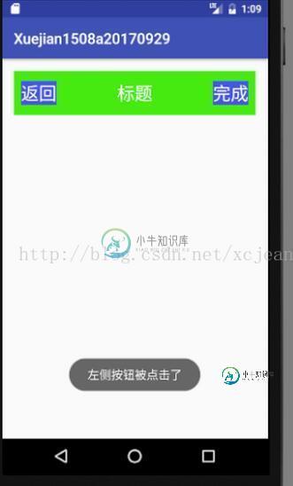
以上就是本文的全部内容,希望对大家的学习有所帮助,也希望大家多多支持小牛知识库。
-
本文向大家介绍Android自定义View实现自动转圈效果,包括了Android自定义View实现自动转圈效果的使用技巧和注意事项,需要的朋友参考一下 本文实例为大家分享了Android实现自动转圈效果展示的具体代码,供大家参考,具体内容如下 在values文件夹下创建attrs.xml 写一个类继承view 在主页面布局中引入自定义view类 以上就是本文的全部内容,希望对大家的学习有所帮助,也
-
本文向大家介绍Android自定义View实现折线图效果,包括了Android自定义View实现折线图效果的使用技巧和注意事项,需要的朋友参考一下 下面就是结果图(每种状态用一个表情图片表示): 一、主页面的布局文件如下: 其中linecharview就是自定义的View,而app:xx就是这个View的各种属性。 二、在values的attrs文件中加入如下xml,来定义linecharview
-
本文向大家介绍Android自定义View实现水波纹效果,包括了Android自定义View实现水波纹效果的使用技巧和注意事项,需要的朋友参考一下 介绍:水波纹散开效果的控件在 App 里面还是比较常见的,例如 网易云音乐歌曲识别,附近搜索场景。 看下实现的效果: 实现思路: 先将最大圆半径与最小圆半径间距分成几等份,从内到外,Paint 透明度依次递减,绘制出同心圆,然后不断的改变这些同心圆的半
-
本文向大家介绍Android自定义View实现弹性小球效果,包括了Android自定义View实现弹性小球效果的使用技巧和注意事项,需要的朋友参考一下 照例先看效果图 自定义代码示例 总结 以上就是Android自定义View实现弹性小球效果的全部内容,希望对大家开发Android能带来一定的帮助,如果有疑问大家可以留言交流。谢谢大家对呐喊教程的支持。
-
本文向大家介绍Android自定义View实现水面上涨效果,包括了Android自定义View实现水面上涨效果的使用技巧和注意事项,需要的朋友参考一下 实现效果如下: 实现思路: 1、如何实现圆中水面上涨效果:利用Paint的setXfermode属性为PorterDuff.Mode.SRC_IN画出进度所在的矩形与圆的交集实现 2、如何水波纹效果:利用贝塞尔曲线,动态改变波峰值,实现“随着进度的
-
本文向大家介绍Android自定义View实现圆环交替效果,包括了Android自定义View实现圆环交替效果的使用技巧和注意事项,需要的朋友参考一下 下面请先看效果图: 看上去是不很炫的样子,它的实现上也不是很复杂,重点在与onDraw()方法的绘制。 首先是我们的attrs文件: 接下来是我们重写View类的自定义View类: 最后是我们的布局文件: 总结 好了,到这里我们的效果就算大工