
android自定义view制作圆形进度条效果

还是我们自定View的那几个步骤:
1、自定义View的属性
2、在View的构造方法中获得我们自定义的属性
[ 3、重写onMesure ]
4、重写onDraw
1、自定义属性:
<?xml version="1.0" encoding="utf-8"?>
<resources>
 <declare-styleable name="CustomTitleView">
  <attr name="mSpeed" format="integer" />
  <attr name="mFirstColor" format="color" />
  <attr name="mSecondColor" format="color" />
  <attr name="mCircleWidth" format="dimension"/>
  <attr name="textSize" format="dimension"/>
 </declare-styleable>
</resources>
2、在View的构造方法中获得我们自定义的属性
/**
 * 当前进度
 */
 private int mProgress;
 /**
 * 第一圈的颜色
 */
 private int mFirstColor;
 /**
 * 第二圈的颜色
 */
 private int mSecondColor;
 /**
 * 圈的宽度
 */
 private int mCircleWidth;
 /**
 * 速度
 */
 private int mSpeed;
 /**
 * 中间进度百分比的字符串的字体
 */
 private float textSize;
 private boolean isNext = false;
 private Paint mPaint;

 public CustomTitleView(Context context, AttributeSet attrs) {
  super(context, attrs);
  TypedArray typearray = context.obtainStyledAttributes(attrs, R.styleable.CustomTitleView);
  int count= typearray.getIndexCount();
  for(int i=0;i<count;i++){
   int attr =typearray.getIndex(i);
   switch(attr){
    case R.styleable.CustomTitleView_mFirstColor:
     mFirstColor=typearray.getColor(attr,Color.BLACK);
     break;
    case R.styleable.CustomTitleView_mSecondColor:
     mSecondColor=typearray.getColor(attr,Color.RED);
     break;
    case R.styleable.CustomTitleView_mCircleWidth:
     mCircleWidth = typearray.getDimensionPixelSize(attr,(int)TypedValue.applyDimension(
       TypedValue.COMPLEX_UNIT_PX,20,getResources().getDisplayMetrics()));
     break;

    case R.styleable.CustomTitleView_textSize:
     textSize = typearray.getDimensionPixelSize(attr,(int)TypedValue.applyDimension(
       TypedValue.COMPLEX_UNIT_PX,30,getResources().getDisplayMetrics()));
     break;
    case R.styleable.CustomTitleView_mSpeed:
     mSpeed = typearray.getInt(attr,100);// 默认100
     break;
   }
  }
  Log.v("----",mSpeed+"");
  typearray.recycle();
  mPaint = new Paint();
  new Thread()
  {
   public void run()
   {
    while (true)
    {
     mProgress++;
     if (mProgress == 360)
     {
      mProgress = 0;
      if (!isNext)
       isNext = true;
      else
       isNext = false;
     }
     postInvalidate();
     try
     {
      Thread.sleep(mSpeed);
     } catch (InterruptedException e)
     {
      e.printStackTrace();
     }
    }
   };
  }.start();
 }
3、直接重写onDraw,这不需要重写onMeasure
protected void onMeasure(int widthMeasureSpec, int heightMeasureSpec){
    super.onMeasure(widthMeasureSpec, heightMeasureSpec);
 }
 protected void onDraw(Canvas canvas)
 {
  /**
  * 画进度百分比
  */
  mPaint.setStrokeWidth(0);
  mPaint.setColor(Color.BLACK);
  mPaint.setTextSize(textSize);
  mPaint.setTypeface(Typeface.DEFAULT_BOLD); //设置字体
  int percent = (int)(((float)mProgress / (float)360) * 100);
  int centre = getWidth() / 2; // 获取圆心的x坐标
  int radius = centre - mCircleWidth / 2;// 半径
  float textWidth = mPaint.measureText(percent + "%"); //测量字体宽度,我们需要根据字体的宽度设置在圆环中间
  canvas.drawText(percent + "%",centre-textWidth/ 2,centre+textSize/2, mPaint); //画出进度百分比
  mPaint.setStrokeWidth(mCircleWidth); // 设置圆环的宽度
  mPaint.setAntiAlias(true); // 消除锯齿
  mPaint.setStyle(Paint.Style.STROKE); // 设置空心
  RectF oval = new RectF(centre - radius, centre - radius, centre + radius, centre + radius); // 用于定义的圆弧的形状和大小的界限
  if(isNext){
   mPaint.setColor(mSecondColor); // 设置圆环的颜色
   canvas.drawCircle(centre, centre, radius, mPaint); // 画出圆环
   mPaint.setColor(mFirstColor); // 设置圆环的颜色
   canvas.drawArc(oval, -90, mProgress, false, mPaint); // 根据进度画圆弧
  }else{
   mPaint.setColor(mFirstColor); // 设置圆环的颜色
   canvas.drawCircle(centre, centre, radius, mPaint); // 画出圆环
   mPaint.setColor(mSecondColor); // 设置圆环的颜色
   canvas.drawArc(oval, -90, mProgress, false, mPaint); // 根据进度画圆弧
  }
 }
activity_main.xml
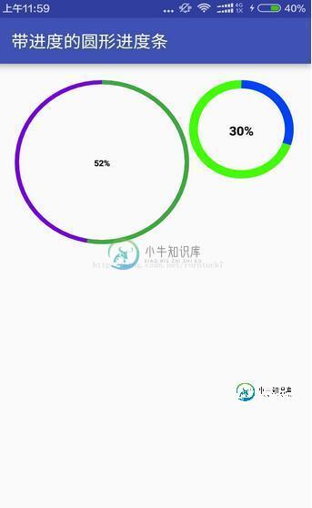
<?xml version="1.0" encoding="utf-8"?>
<RelativeLayout xmlns:android="http://schemas.android.com/apk/res/android"
 xmlns:custom="http://schemas.android.com/apk/res-auto"
 android:layout_width="match_parent"
 android:layout_height="match_parent"
 android:padding="20dp"
 >
 <view.CustomTitleView
  android:layout_width="200dp"
  android:layout_height="400dp"
  custom:mSpeed="50"
  custom:mFirstColor="#7300e6"
  custom:mSecondColor="#39ac39"
  custom:mCircleWidth="10px"
  custom:textSize="20px"
  android:id="@+id/one"
 />
 <view.CustomTitleView
  android:layout_toEndOf="@id/one"
  android:layout_width="200dp"
  android:layout_height="400dp"
  custom:mSpeed="100"
  custom:mFirstColor="#0040ff"
  custom:mSecondColor="#40ff00"
  custom:mCircleWidth="20px"
  custom:textSize="30px"
  />
</RelativeLayout>
效果预览
源码下载:http://xiazai.jb51.net/201701/yuanma/AndroidProgressbar(jb51.net).rar
以上就是本文的全部内容,希望对大家的学习有所帮助,也希望大家多多支持小牛知识库。
-
本文向大家介绍Android自定义View之圆形进度条式按钮,包括了Android自定义View之圆形进度条式按钮的使用技巧和注意事项,需要的朋友参考一下 介绍 今天上班的时候有个哥们问我怎么去实现一个按钮式的进度条,先来看看他需要实现的效果图。 和普通的圆形进度条类似,只是中间的地方有两个状态表示,未开始,暂停状态。而且他说圆形进度的功能已经实现了。那么我们只需要对中间的两个状态做处理就行了。
-
本文向大家介绍Android动态自定义圆形进度条,包括了Android动态自定义圆形进度条的使用技巧和注意事项,需要的朋友参考一下 效果图: A.绘制圆环,圆弧,文本 B.自定义属性的具体步骤 具体步骤: 1. 定义属性: 在values目录下创建attrs.xml 2. 在布局文件中引用当前应用的名称空间 3. 在自定义视图标签中使用自定义属性 4. 在自定义View类的构造方法中, 取出布局中
-
本文向大家介绍android自定义进度条渐变圆形,包括了android自定义进度条渐变圆形的使用技巧和注意事项,需要的朋友参考一下 在安全卫生上,经常看到有圆形的进度条在转动,效果非常好看,于是就尝试去实现一下,具体实现过程不多说了,直接上效果图,先炫耀下。 效果图: 分析:比较常见于扫描结果、进度条等场景 利用canvas.drawArc(RectF oval, float startAngle
-
本文向大家介绍Android实现自定义圆形进度条,包括了Android实现自定义圆形进度条的使用技巧和注意事项,需要的朋友参考一下 今天无意中发现一个圆形进度,想想自己实现一个,如下图: 基本思路是这样的: 1.首先绘制一个实心圆 2.绘制一个白色实心的正方形,遮住实心圆 3.在圆的中心动态绘制当前进度的百分比字符 4.绘制一个与之前实心圆相同颜色的空心圆 5.逐渐改变当前的百分比 6.根据百分比
-
本文向大家介绍自定义Android圆形进度条(附源码),包括了自定义Android圆形进度条(附源码)的使用技巧和注意事项,需要的朋友参考一下 本文实例讲述了Android自定义圆形进度条,分享给大家供大家参考。具体如下: 运行效果截图如下: 具体代码如下: 自定义的View: 所需要的资源文件:attrs.xml 布局文件如下: 其中我们使用了这一句: xmlns:android_custom是
-
本文向大家介绍Android自定义圆形倒计时进度条,包括了Android自定义圆形倒计时进度条的使用技巧和注意事项,需要的朋友参考一下 本文实例为大家分享了Android倒计时进度条展示的具体代码,供大家参考,具体内容如下 效果预览 源代码传送门:https://github.com/yanzhenjie/CircleTextProgressbar 实现与原理 这个文字圆形的进度条我们在很多APP