
c# WPF中CheckBox样式的使用总结

背景
很多时候我们使用WPF开发界面的时候经常会用到各种空间,很多时候我们需要去自定义控件的样式来替换默认的样式,今天通过两个方法来替换WPF中的CheckBox样式,透过这两个例子我们可以掌握基本的WPF样式的开发如何定义ControlTemplate以及使用附加属性来为我们的控件增加新的样式。
常规使用
我们在使用CheckBox的时候,原始的样式有时不能满足我们的需求,这是我们就需要更改其模板,比如我们常用的一种,在播放器中“播放”、“暂停”按钮,其实这也是一种CheckBox,只不过我们只是修改了其相关的模板罢了,下面贴出相关代码:
<CheckBox.Style>
  <Style TargetType="{x:Type CheckBox}">
    <Setter Property="Focusable" Value="False" />
    <Setter Property="IsTabStop" Value="False" />
    <!--把OverridesDefaultStyle设置为True,表示这个控件不使用当前Themes的任何属性。-->
    <Setter Property="OverridesDefaultStyle" Value="True" />
      <Style.Triggers>
        <Trigger Property="IsChecked" Value="True">
       <Setter Property="Template">
          <Setter.Value>
            <ControlTemplate TargetType="{x:Type CheckBox}">
              <Grid Background="Transparent">
                   <Image Source="/EarthSimulation;component/Images/按钮-播放.png"/>
              </Grid>
            </ControlTemplate>
         </Setter.Value>
      </Setter>
      </Trigger>
      <Trigger Property="IsChecked" Value="False">
       <Setter Property="Template">
         <Setter.Value>
            <ControlTemplate TargetType="{x:Type CheckBox}">
                <Grid Background="Transparent">
                        <Image Source="/EarthSimulation;component/Images/按钮-暂停.png"/>
                 </Grid>
            </ControlTemplate>
          </Setter.Value>
        </Setter>
        </Trigger>
      </Style.Triggers>
    </Style>
  </CheckBox.Style>
</CheckBox>
进阶用法
上面的使用较为简单,下面我们通过一个更加复杂一些的例子来增加对自定义控件模板的理解,我们先来看看我们定义的样式。
<Style x:Key="CheckBoxStyle" TargetType="{x:Type CheckBox}">
               <Setter Property="FocusVisualStyle" Value="{x:Null}"/>
               <Setter Property="Background" Value="Transparent"/>
               <Setter Property="BorderBrush" Value="Transparent"/>
               <Setter Property="Foreground" Value="{DynamicResource {x:Static SystemColors.ControlTextBrushKey}}"/>
               <Setter Property="Template">
                   <Setter.Value>
                       <ControlTemplate TargetType="{x:Type CheckBox}">
                           <Border x:Name="templateRoot" Background="{TemplateBinding Background}" >
                               <Grid SnapsToDevicePixels="True">
                                   <Grid.Resources>
                                       <PathGeometry x:Key="geometryCheck" Figures="M540.5696 102.4c-225.83296 0-409.6 183.74656-409.6 409.6s183.76704 409.6 409.6 409.6c225.87392 0 409.6-183.74656 409.6-409.6S766.44352 102.4 540.5696 102.4zM721.16224 468.48l-175.37024 175.39072c-12.20608 12.1856-28.20096 18.28864-44.19584 18.28864-15.95392 0-31.96928-6.10304-44.15488-18.28864l-97.44384-97.44384c-24.39168-24.39168-24.39168-63.93856 0-88.33024 24.39168-24.41216 63.91808-24.41216 88.35072 0l53.248 53.248 131.23584-131.21536c24.35072-24.3712 63.95904-24.3712 88.33024 0C745.55392 404.52096 745.55392 444.08832 721.16224 468.48z"/>
                                   </Grid.Resources>
                                   <Grid.ColumnDefinitions>
                                       <ColumnDefinition Width="20"/>
                                       <ColumnDefinition Width="*"/>
                                       <ColumnDefinition Width="30"/>
                                   </Grid.ColumnDefinitions>

                                   <Border>
                                       <Path Width="18" Height="18" Stretch="Uniform"
                                             Data="{Binding (local_ctrl:GeometryAP.IconGeometry), RelativeSource={RelativeSource Mode=FindAncestor,AncestorType={x:Type CheckBox}}}"
                                             Fill="{Binding (local_ctrl:GeometryAP.IconFill), RelativeSource={RelativeSource Mode=FindAncestor,AncestorType={x:Type CheckBox}}}"/>
                                   </Border>
                                   <ContentPresenter x:Name="contentPresenter" Grid.Column="1" Focusable="False"
                                                 Margin="{TemplateBinding Padding}"
                                                 RecognizesAccessKey="True"
                                                 SnapsToDevicePixels="{TemplateBinding SnapsToDevicePixels}"
                                                 HorizontalAlignment="Left"
                                                 VerticalAlignment="Center"/>

                                   <Border x:Name="checkBoxBorder"
                                       Grid.Column="2"
                                       Margin="1"
                                       BorderBrush="Transparent"
                                       BorderThickness="1"
                                       Background="Transparent"
                                       HorizontalAlignment="Left"
                                       VerticalAlignment="Center">

                                       <Grid x:Name="markGrid">
                                           <Path x:Name="optionMark" Width="20" Height="20"
                                                 Stretch="Uniform"
                                                 Data="{StaticResource geometryCheck}"
                                                 Fill="LightSeaGreen" Margin="1" Opacity="0"/>
                                       </Grid>
                                   </Border>
                               </Grid>
                           </Border>
                           <ControlTemplate.Triggers>
                               <Trigger Property="HasContent" Value="true">
                                   <Setter Property="Padding" Value="4,-1,0,0"/>
                               </Trigger>
                               <Trigger Property="IsMouseOver" Value="true">
                                   <Setter Property="Cursor" Value="Hand"/>
                                   <Setter Property="Background" Value="#22222222"/>
                               </Trigger>
                               <Trigger Property="IsEnabled" Value="false">
                                   <Setter Property="Opacity" Value=".3"/>
                               </Trigger>
                               <Trigger Property="IsPressed" Value="true">
                                   <Setter Property="Cursor" Value="Hand"/>
                                   <Setter Property="Background" Value="#22333333"/>
                               </Trigger>
                               <Trigger Property="IsChecked" Value="true">
                                   <Setter Property="Opacity" TargetName="optionMark" Value="1"/>
                               </Trigger>
                           </ControlTemplate.Triggers>
                       </ControlTemplate>
                   </Setter.Value>
               </Setter>
           </Style>
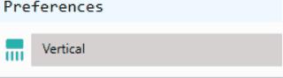
后面我们再来看看,我们使用CheckBox的地方。
<CheckBox Grid.Row="1" Grid.Column="1"
                                      IsChecked="{Binding VM.IsHorizontal,ElementName=_this}" Content="Horizontal"
                                      Style="{StaticResource CheckBoxStyle}"
                                      local_ctrl:GeometryAP.IconGeometry="{StaticResource geometryDirection}"
                                      local_ctrl:GeometryAP.IconFill="LightSeaGreen"/>
这个地方我们为CheckBox增加了两个附加属性IconGeometry、IconFill这样我们就能够将这两个附加属性绑定到CheckBox样式中的Path里面的Data和Fill依赖项属性上面,通过上面的过程我们就能够定义各种各样的CheckBox样式了,下面我们看看我们定义的这两个附加属性具体的代码。
public class GeometryAP : DependencyObject
{
    public static PathGeometry GetIconGeometry(DependencyObject obj)
    {
        return (PathGeometry)obj.GetValue(IconGeometryProperty);
    }
    public static void SetIconGeometry(DependencyObject obj, PathGeometry value)
    {
        obj.SetValue(IconGeometryProperty, value);
    }

    public static Brush GetIconFill(DependencyObject obj)
    {
        return (Brush)obj.GetValue(IconFillProperty);
    }
    public static void SetIconFill(DependencyObject obj, Brush brush)
    {
        obj.SetValue(IconFillProperty, brush);
    }

    public static readonly DependencyProperty IconGeometryProperty = DependencyProperty.RegisterAttached("IconGeometry", typeof(PathGeometry), typeof(GeometryAP));
    public static readonly DependencyProperty IconFillProperty = DependencyProperty.RegisterAttached("IconFill", typeof(Brush), typeof(GeometryAP), new PropertyMetadata(Brushes.Transparent));
}
样式欣赏
以上就是c# WPF中CheckBox样式的使用总结的详细内容,更多关于c# WPF中CheckBox样式的资料请关注小牛知识库其它相关文章!
-
本文向大家介绍C#中DataGridView的样式,包括了C#中DataGridView的样式的使用技巧和注意事项,需要的朋友参考一下 本文实例讲述了C#中DataGridView的样式。分享给大家供大家参考。具体如下: 1、设置grid交替行颜色 2、单元格内容有效性检查 3、 单元格的选择模式 4、设置合适的列宽 希望本文所述对大家的C#程序设计有所帮助。
-
问题内容: 我想在Python中使用传统的C风格的循环。我想遍历字符串的字符,但也要知道它是什么,并且能够跳过字符(例如,代码中的5个字符)。 与并没有给我实际的for循环的灵活性。 问题答案: 简单的答案是在Python中没有简单,精确的C语句等效项。其他答案涵盖了使用带范围的Python语句。如果您希望能够在循环中修改循环变量(并影响后续的迭代),则必须使用循环: 但是在该循环中,一条语句将不
-
问题内容: 我试图在(C#)后面的代码中获取div的ID,并在其上设置一些CSS。我可以从DOM中获取它还是必须使用某种控件? 问题答案: 将属性添加到它,这样您就可以: 这样,您可以使用以下方法访问class属性: 还值得一提的是,该控件实际上是的同义词(至少就渲染标记而言),因此您也可以这样做: 然后,您可以编写: 这使您可以更明确地访问该属性,并且您可能会使用或可能不会使用其他属性。
-
样式用起来特别简单. 直接写到 <style> 段落里面即可. 使用普通的css <style > td { border-bottom: 1px solid grey; } </style> 使用局部的css <style scoped> td { border-bottom: 1px solid grey; } </style> 这段CSS只对当前的 component 适用. 使
-
本文向大家介绍jquery实现的代替传统checkbox样式插件,包括了jquery实现的代替传统checkbox样式插件的使用技巧和注意事项,需要的朋友参考一下 本文实例讲述了jquery实现的代替传统checkbox样式插件。分享给大家供大家参考。具体如下: 效果图如下: 具体代码如下: 希望本文所述对大家的jQuery程序设计有所帮助。
-
我刚刚开始使用C#WPF表单,遇到了一个小问题,我找不到解决方法。 我有一个按钮,目前只是检查一个文件夹是否存在。 正确的流程是; 写入文本框以表示进程已启动。 执行该过程。 写入文本框以表示进程已完成(是否成功) 实际发生的情况是,当按下按钮时,所有操作都完成了,然后写入textbox。 有没有一种方法让文本框在每个过程结束时填充--计划是在一个按钮上执行多个操作,最终按下并记录每一个操作--最