
简单好用可任意定制的iOS Popover气泡效果

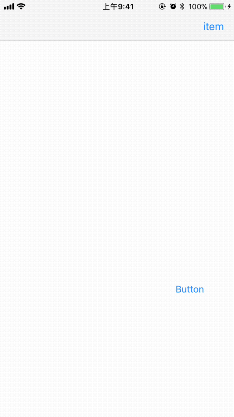
效果图如下所示:
swift: https://github.com/corin8823/Popover OC: https://github.com/Assuner-Lee/PopoverObjC
使用示例
pod 'PopoverObjC'
#import "ASViewController.h"
#import <PopoverObjC/ASPopover.h>
@interface ASViewController ()
@property (weak, nonatomic) IBOutlet UIButton *btn;
@property (nonatomic, strong) ASPopover *btnPopover;
@property (nonatomic, strong) ASPopover *itemPopover;
@end
@implementation ASViewController
- (void)viewDidLoad {
 [super viewDidLoad];
 [self.btn addTarget:self action:@selector(clickBtn:) forControlEvents:UIControlEventTouchUpInside];
 self.navigationItem.rightBarButtonItem = [[UIBarButtonItem alloc] initWithTitle:@"item" style:UIBarButtonItemStylePlain target:self action:@selector(clickItem:)];
}
- (void)didReceiveMemoryWarning {
}
初始化Popover
- (ASPopover *)btnPopover {
 if (!_btnPopover) {
 ASPopoverOption *option = [[ASPopoverOption alloc] init];
 option.popoverType = ASPopoverTypeUp;
 option.autoAjustDirection = NO;
 option.arrowSize = CGSizeMake(9, 6);
 option.blackOverlayColor = [UIColor clearColor];
 option.popoverColor = [UIColor lightGrayColor];
 option.dismissOnBlackOverlayTap = YES;
 option.animationIn = 0.5;
 //...
 _btnPopover = [[ASPopover alloc] initWithOption:option];
 }
 return _btnPopover;
}
- (ASPopover *)itemPopover {
 if (!_itemPopover) {
 ASPopoverOption *option = [[ASPopoverOption alloc] init];
 option.autoAjustDirection = NO;
 option.arrowSize = CGSizeMake(10, 6);
 option.blackOverlayColor = [UIColor clearColor];
 option.sideEdge = 7;
 option.dismissOnBlackOverlayTap = YES;
 option.popoverColor = [[UIColor blackColor] colorWithAlphaComponent:0.7];
 option.autoAjustDirection = YES;
 option.animationIn = 0.4;
 option.springDamping = 0.5;
 option.initialSpringVelocity = 1;
 option.overlayBlur = [UIBlurEffect effectWithStyle:UIBlurEffectStyleLight];
 //...
 _itemPopover = [[ASPopover alloc] initWithOption:option];
 }
 return _itemPopover;
}
popover的属性可在option里设置。
弹出气泡
- (void)clickBtn:(id)sender {
 UIView *view = [[UIView alloc] initWithFrame:CGRectMake(0, 0, [UIScreen mainScreen].bounds.size.width - 50, 40)];
 [self.btnPopover show:view fromView:self.btn]; // in delegate window
}
- (void)clickItem:(id)sender {
 UIView *view = [[UIView alloc] initWithFrame:CGRectMake(0, 0, 100, 200)];
 UIView *itemView = [self.navigationItem.rightBarButtonItem valueForKey:@"view"]; // you should use custom view in item;
 if (itemView) {
// [self.itemPopover show:view fromView:itemView];
 CGPoint originPoint = [self.itemPopover originArrowPointWithView:view fromView:itemView];
 originPoint.y += 5;
 [self.itemPopover show:view atPoint:originPoint];
 }
}
@end
可在某一个视图或某一个point上弹出内容view
Popover interface
#import <UIKit/UIKit.h>
#import "ASPopoverOption.h"
typedef void (^ASPopoverBlock)(void);
@interface ASPopover : UIView
@property (nonatomic, copy) ASPopoverBlock willShowHandler;
@property (nonatomic, copy) ASPopoverBlock willDismissHandler;
@property (nonatomic, copy) ASPopoverBlock didShowHandler;
@property (nonatomic, copy) ASPopoverBlock didDismissHandler;
@property (nonatomic, strong) ASPopoverOption *option;
- (instancetype)initWithOption:(ASPopoverOption *)option;
- (void)dismiss;
- (void)show:(UIView *)contentView fromView:(UIView *)fromView;
- (void)show:(UIView *)contentView fromView:(UIView *)fromView inView:(UIView *)inView;
- (void)show:(UIView *)contentView atPoint:(CGPoint)point;
- (void)show:(UIView *)contentView atPoint:(CGPoint)point inView:(UIView *)inView;
- (CGPoint)originArrowPointWithView:(UIView *)contentView fromView:(UIView *)fromView;
- (CGPoint)arrowPointWithView:(UIView *)contentView fromView:(UIView *)fromView inView:(UIView *)inView popoverType:(ASPopoverType)type;
@end
contentView: 要显示的内容; fromView: 气泡从某一个视图上show; inview: 气泡绘制在某一个视图上,一般为delegate window; atPoint: 气泡从某一点上show; 可先获取originPoint, 偏移;
PopoverOption Interface
typedef NS_ENUM(NSInteger, ASPopoverType) {
 ASPopoverTypeUp = 0,
 ASPopoverTypeDown,
};
@interface ASPopoverOption : NSObject
@property (nonatomic, assign) CGSize arrowSize;
@property (nonatomic, assign) NSTimeInterval animationIn; // if 0, no animation
@property (nonatomic, assign) NSTimeInterval animationOut;
@property (nonatomic, assign) CGFloat cornerRadius;
@property (nonatomic, assign) CGFloat sideEdge;
@property (nonatomic, strong) UIColor *blackOverlayColor;
@property (nonatomic, strong) UIBlurEffect *overlayBlur;
@property (nonatomic, strong) UIColor *popoverColor;
@property (nonatomic, assign) BOOL dismissOnBlackOverlayTap;
@property (nonatomic, assign) BOOL showBlackOverlay;
@property (nonatomic, assign) CGFloat springDamping;
@property (nonatomic, assign) CGFloat initialSpringVelocity;
@property (nonatomic, assign) ASPopoverType popoverType;
@property (nonatomic, assign) BOOL highlightFromView;
@property (nonatomic, assign) CGFloat highlightCornerRadius;
@property (nonatomic, assign) BOOL autoAjustDirection; // down preferred, effect just in view not at point
@end
总结
以上所述是小编给大家介绍的简单好用可任意定制的iOS Popover气泡效果,希望对大家有所帮助,如果大家有任何疑问请给我留言,小编会及时回复大家的。在此也非常感谢大家对小牛知识库的支持!
-
本文向大家介绍使用css实现气泡框的效果相关面试题,主要包含被问及使用css实现气泡框的效果时的应答技巧和注意事项,需要的朋友参考一下 <!DOCTYPE html> <html lang="en"> <head> <meta charset="UTF-8"> <meta name="viewport" content="width=device-width, initial-scale=1.0"
-
本文向大家介绍Asp.net Mvc表单验证气泡提示效果,包括了Asp.net Mvc表单验证气泡提示效果的使用技巧和注意事项,需要的朋友参考一下 本文实例为大家分享了Asp.net Mvc表单验证的制作代码,供大家参考,具体内容如下 将ASP.NET MVC或ASP.NET Core MVC的表单验证改成气泡提示: //新建一个css文件(如:jquery.validate.Bubble.css
-
左边这块绿色的气泡,那个三角形应该怎么实现? 如果实现了,怎么改变三角形的位置,例如放气泡上面,下面,左边或右边?
-
定义 气泡组件。 图片展示 代码演示 import Popover from 'pile/dist/components/popover' const {Tooltip} = Popover <Tooltip overlay={"说明文字"} placement='left' isShow={popleftshow} idName='newIndex' setTooltipC
-
气泡图以气泡的形式可视化度量和维度。 气泡图是一组圆圈。维度字段的每个值表示圆圈,度量值表示这些圆圈的大小。 设置气泡的颜色以区分维度中存在的成员。以下是创建气泡图的步骤。 例如,考虑数据源(如样本超市),以及是否要查找不同出货模式的利润。然后, 第1步:拖动度量利润(Profit)并拖放到“大小(Size)”窗格中。 第2步:拖动维度Ship Mode并放入“Labels”窗格。 第3步:同时将
-
主要内容:什么是JFreeChart 气泡图,JFreeChart 气泡图的示例什么是JFreeChart 气泡图 气泡图以三维方式表示信息。此图表是散点图(XY 图表)的变体,其中数据点由气泡替换,数据的附加维度(z 值)以气泡的大小表示。 下图显示了 JFreeChart 库中包含的气泡图的一些演示版本: JFreeChart 气泡图的示例 让我们考虑以下气泡图的示例数据。 国家 汽车 公交车 卡车 印度 40 65 70 美国 30 20 50 中国 80 50 80