
如何在python中绘制包含多个类别的直方图

我是Python的大一新生,我有一个问题是如何在python中绘制直方图。
首先,我有十个间隔,根据花的花瓣长度平均划分,从最小到最大。因此,我可以根据花瓣将花分成十个间隔。
花的种类是三个,所以我想画一个直方图来描述不同种类的花在不同间隔(箱)中的分布。在同一个垃圾桶里,不同的花有不同的颜色。
我知道Matplotlib中的hist函数,但是我不知道如何使用它来绘制像下面这样的图片。
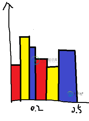
数据是Lbins=[0.1,0.34,0.58,0.82,1.06,1.3,1.54,1.78,2.02,2.26,2.5]和数据是一个形状数组(花数,3)。
共有1个答案

以下是使用Matplotlib中的hist为每个箱子提供多条条形图的示例:
import numpy as np
import matplotlib.pyplot as plt

length_of_flowers = np.random.randn(100, 3)
Lbins = [0.1 , 0.34, 0.58, 0.82, 1.06, 1.3 , 1.54, 1.78, 2.02, 2.26, 2.5 ]
# Lbins could also simply the number of wanted bins

colors = ['red','yellow', 'blue']
labels = ['red flowers', 'yellow flowers', 'blue flowers']
plt.hist(length_of_flowers, Lbins,
         histtype='bar',
         stacked=False,
         fill=True,
         label=labels,
         alpha=0.8, # opacity of the bars
         color=colors,
         edgecolor = "k")

# plt.xticks(Lbins) # to set the ticks according to the bins
plt.xlabel('flower length'); plt.ylabel('count');
plt.legend();
plt.show()
其中给出:
编辑:受此matplotlib演示启发的预装箱数据解决方案。每个条的位置都是自定义计算的。我通过替换零值来验证正确对齐,从而稍微修改了数据。
import numpy as np
import matplotlib.pyplot as plt

binned_data = np.array([[41., 3., 3.], [ 8., 3., 3.], [ 1., 2., 2.], [ 2., 7., 3.],
                        [ 0., 20., 0.], [ 1., 21., 1.], [ 1., 2., 4.], [ 3., 4., 23.],
                        [ 0., 0., 9.], [ 3., 1., 14.]]).T

# The shape of the data array have to be:
#  (number of categories x number of bins)
print(binned_data.shape)  # >> (3, 10)

x_positions = np.array([0.1, 0.34, 0.58, 0.82, 1.06, 1.3, 1.54, 1.78, 2.02, 2.26])

number_of_groups = binned_data.shape[0]
fill_factor =  .8  # ratio of the groups width
                   # relatively to the available space between ticks
bar_width = np.diff(x_positions).min()/number_of_groups * fill_factor

colors = ['red','yellow', 'blue']
labels = ['red flowers', 'yellow flowers', 'blue flowers']

for i, groupdata in enumerate(binned_data):
    bar_positions = x_positions - number_of_groups*bar_width/2 + (i + 0.5)*bar_width
    plt.bar(bar_positions, groupdata, bar_width,
            align='center',
            linewidth=1, edgecolor='k',
            color=colors[i], alpha=0.7,
            label=labels[i])

plt.xticks(x_positions);
plt.legend(); plt.xlabel('flower length'); plt.ylabel('count');
其中给出:
-
我正在学习python,而我一直坚持的是基于FLT列绘制一个直方图来指示每个过滤器。我有这个数据框: 我的目标是绘制FLT列,但要指示不同的过滤器:g、i、r和z。通过搜索如何绘制直方图,我可以根据MAG(幅值)绘制基本的直方图。理想情况下,我想要的是4种不同的颜色来表示不同的过滤器。我知道该图将有重叠的磁过滤器,但我同意它,因为我需要一个视觉,我可以放大,如果我有必要。 下面的代码是我现在拥有的
-
我想创建一个debian包,当安装时,它将用pip安装几个python包。我能想到两种方法: > 将python包安装到一个目录中,然后从该目录生成一个debian包。但这会混淆构建主机(例如其pip元数据),尤其是在主机已经安装了其中一些包的情况下。 用所有python包制作一个debian包,在debian安装和卸载过程中,运行一些脚本来安装/卸载python包。但是这将需要另外两个脚本来维护
-
我已经问了同样的问题,看起来不清楚。因此,让我以不同的方式问它。我有四个.csv个名为I_earthquake2016.csv I_earthquake2017.csv I_earthquake2018.csv I_earthquake2019.csv(不同年份的地震数据)它们都有相同的列,只是行数不同。我做了一些代码来读取其中一个文件,并制作直方图以查看每个月发生多少次地震。 问题: < li
-
有没有一种惯用的方法来绘制两个类的特征直方图?在熊猫方面,我基本上想要 在同一个情节中。我可以 但这给了我两个不同的情节。 这似乎是一项常见的任务,因此我认为有一种惯用的方法来完成这项任务。当然,我可以手动操作柱状图,使其彼此相邻,但熊猫通常都能很好地做到这一点。 基本上,我希望将这个matplotlib示例放在一行熊猫中:http://matplotlib.org/examples/pylab_
-
我有一张桌子,比如: 生成虚拟数据: 我想用垫线 (v1.4) 在 Python 3 中完成一个任务: 绘制的直方图 按 两个小时,未能获得所需的直方图 我阅读了matplotlib的示例和用户指南。令人惊讶的是,我没有找到关于如何从颜色图中指定颜色的教程 我在谷歌上搜索过,但没有找到一个简洁的例子 我想一个人可以用,不导入一系列模块,例如,
-
问题内容: 这个问题已经在这里有了答案 : matplotlib-黑白颜色图(带有破折号,点等) (4个答案) 真的只有4种Matplotlib线型吗? (1个答案) 3年前关闭。 我是Python的新手,我想在一张图中绘制多条线,如下图所示。 我试过编写像这样的简单绘图代码: 我知道这些参数 但是我在第一幅图中有很多行,可以像第一幅图那样使用什么样的参数进行绘制。 谢谢 问题答案: MPL中有许