
如何在matplotlib中为不同的图表中的相同索引设置相同的颜色

我试图在两个图上绘制熊猫数据帧。一个是matplotlib pyplot饼图,另一个是seaborn条形图。在每个图表上,我根据不同的列对数据框进行排序。此外,每个图表都代表数据框排序所依据的相应值。因此,两个图表中的行顺序不同。这样,数据框中相同的索引(或类别)在图表上以不同的颜色出现,这是令人困惑的。为了在不同的图表上有相同颜色的索引,我如何解决这个问题?
我的代码:
df = pd.DataFrame({"Total":totals,"Infected": infected},
                   index=category).sort_values("Total", ascending=False)
fig, ax = plt.subplots(ncols=2, nrows=1,figsize=(20,8))

#creating a pie chart with conditional explode option
threshold = new_train.shape[0]*threshold

if explode==-1:
    ax[0].pie(df[df["Total"]>threshold]["Total"],
              labels=df[df["Total"]>threshold].index.values,
              autopct='%1.1f%%',shadow=False, startangle=rotation,
              textprops={'fontsize': 15})
else:
    ax[0].pie(df[df["Total"]>threshold]["Total"],
              labels=df[df["Total"]>threshold].index.values,
              autopct='%1.1f%%',shadow=False, startangle=rotation,
              textprops={'fontsize': 15}, explode=explode)
ax[0].axis('equal')
ax[0].set_title(col_name)

#created a sorted bar chart
newdf = df[df["Total"]>threshold]
newdf.sort_values("Infected", ascending=False, inplace=True)
ax[1].set_xticklabels(category,rotation=45, horizontalalignment='right')
ax[1].set_title('Infected fractions')
ax[1] = sns.barplot(x=newdf.index, y="Infected",data=newdf,
order=newdf.index)#, orient='h')
plt.show()
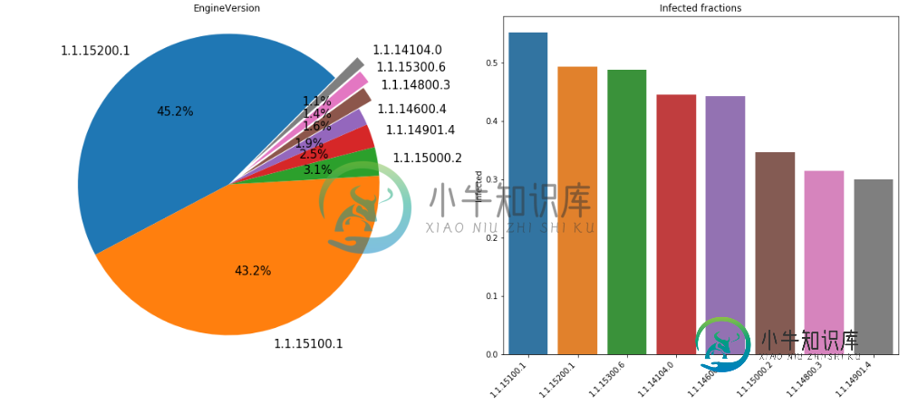
例如,1.1。15200.1在饼图中为蓝色,但在条形图中为橙色。
共有1个答案

您必须制作一个字典,为正在使用的标签的值查找适当的颜色。下面是一个简化版本,希望能涵盖您对数据所做的所有事情:
# a dataframe from a list of lists
el = [['RED', 50, 1],
      ['GREEN', 30, 2],
      ['BLUE', 7, 3],
      ['YELLOW', 3, 4],
      ['ORANGE', 9, 5],
      ['BLACK', 1, 6]]
df = pd.DataFrame(el)

# since you are not using the entire dataframe
df_thres = df[df[1] > 1]

# make a fixed length color map manually
c = ['red', 'green', 'blue', 'yellow', 'orange']
clist1 = {i:j for i, j in zip(df_thres[0].values, c)}

# make an arbitrary-length colormap
cm = plt.get_cmap('rainbow')
c = [cm(1.0 * i/len(df_thres)) for i in range(len(df_thres))]
clist2 = {i:j for i, j in zip(df_thres[0].values, c)}


fig, ax = plt.subplots(nrows=2, ncols=2, figsize=(11, 8))

# manual colors

# PIE PLOT: sort on the third column
newdf = df_thres.sort_values(2, ascending=False)
ax[0, 0].pie(newdf[2], labels=newdf[0], colors=[clist1[i] for i in newdf[0].values])
ax[0, 0].axis('square') # matplotlib 2.x only

# BAR PLOT: sort on the second column
newdf = df_thres.sort_values(1, ascending=False)
ax[0, 1].bar(newdf[0], newdf[1], color=[clist1[i] for i in newdf[0].values])

#----------------

# arbitrary-length generated colorlist
newdf = df_thres.sort_values(2, ascending=False)
ax[1, 0].pie(newdf[1], labels=newdf[0], colors=[clist2[i] for i in newdf[0].values])
ax[1, 0].axis('square') # matplotlib 2.x only

newdf = df_thres.sort_values(1, ascending=False)
ax[1, 1].bar(newdf[0], newdf[1], color=[clist2[i] for i in newdf[0].values])
这是我得到的输出。下一行的颜色不是标记的颜色,但它们是一致的。(另外,请注意,我在这里对两个图都使用matplotlib)
-
我正在做一个条形图并添加图例。代码如下: 我得到的问题是,图例元素具有与下图相同的颜色:为什么?
-
蜡烛渲染类中有一些方法可以将所有蜡烛的边框颜色更改为所需的颜色,但是我需要将所有向上蜡烛边框设置为绿色,将所有向下蜡烛边框设置为红色。任何建议或示例代码都非常感谢。
-
假设我有三个数据集: 我可以分散绘制这个: 10套怎么做得到? 我搜索了这个,可以找到任何关于我所问问题的参考资料。 编辑:澄清(希望)我的问题 如果我多次调用散点,我只能在每个散点上设置相同的颜色。此外,我知道我可以手动设置颜色阵列,但我相信有更好的方法来做到这一点。我的问题是,“我如何自动分散绘制我的几个数据集,每个数据集都有不同的颜色。 如果有帮助,我可以很容易地为每个数据集分配一个唯一的数
-
我有以下具有内部跨度的div: 和相关CSS: 问题是字体大小是良好的分辨率约640 x 320在横向,但如果我试图设置的分辨率设备,例如1920 x 1080,我总是得到的字体小于640 px分辨率(见下图)。 我应该设置什么以得到相同的尺寸和比例的不同的尺寸? 视口设置为: 车身: 整个模板为: 谢谢你的建议。
-
假设我有一个表'some-table',我想在多个模式中创建它。名为“create-some-table.yaml”的文件 最后一个是changelog-master,它非常简单 有什么办法我可以做类似这样的事情吗,谢谢:)
-
假设一个对象有10个实例,其中有一些字段。其中一个字段指定ID。另外两个字段包含有关位置(纬度和经度)的数据。一个字段包含日期时间信息。 在这10个例子中,ID保持不变,但与日期、时间和位置相关的字段发生了变化。 上述数据是虚拟数据。但你可以观察到id保持不变,只是位置和时间发生了变化。 使用java, sping-data-elasticsearch我能够把信息在弹性搜索。 我面临的问题是,在弹