
如何绘制和注释分组条形图

我遇到了一个关于Python中matplotlib的棘手问题。我想用几个代码创建一个分组条形图,但是图表出错了。你能给我一些建议吗?代码如下。
import numpy as np
import pandas as pd
file="https://s3-api.us-geo.objectstorage.softlayer.net/cf-courses-data/CognitiveClass/DV0101EN/labs/coursera/Topic_Survey_Assignment.csv"
df=pd.read_csv(file,index_col=0)

df.sort_values(by=['Very interested'], axis=0,ascending=False,inplace=True)

df['Very interested']=df['Very interested']/2233
df['Somewhat interested']=df['Somewhat interested']/2233
df['Not interested']=df['Not interested']/2233
df

df_chart=df.round(2)
df_chart

labels=['Data Analysis/Statistics','Machine Learning','Data Visualization',
       'Big Data (Spark/Hadoop)','Deep Learning','Data Journalism']
very_interested=df_chart['Very interested']
somewhat_interested=df_chart['Somewhat interested']
not_interested=df_chart['Not interested']

x=np.arange(len(labels))
w=0.8

fig,ax=plt.subplots(figsize=(20,8))
rects1=ax.bar(x-w,very_interested,w,label='Very interested',color='#5cb85c')
rects2=ax.bar(x,somewhat_interested,w,label='Somewhat interested',color='#5bc0de')
rects3=ax.bar(x+w,not_interested,w,label='Not interested',color='#d9534f')

ax.set_ylabel('Percentage',fontsize=14)
ax.set_title("The percentage of the respondents' interest in the different data science Area",
            fontsize=16)
ax.set_xticks(x)
ax.set_xticklabels(labels)
ax.legend(fontsize=14)

def autolabel(rects):
    """Attach a text label above each bar in *rects*, displaying its height."""
    for rect in rects:
        height = rect.get_height()
        ax.annotate('{}'.format(height),
                    xy=(rect.get_x() + rect.get_width() / 3, height),
                    xytext=(0, 3),  # 3 points vertical offset
                    textcoords="offset points",
                    ha='center', va='bottom')


autolabel(rects1)
autolabel(rects2)
autolabel(rects3)

fig.tight_layout()

plt.show()
这个代码模块的输出真是一团糟。但我所期望的应该像图中的条形图。你能告诉我代码中哪一点不正确吗?

共有1个答案

import pandas as pd
import matplotlib.pyplot as plt

# given the following code to create the dataframe
file="https://s3-api.us-geo.objectstorage.softlayer.net/cf-courses-data/CognitiveClass/DV0101EN/labs/coursera/Topic_Survey_Assignment.csv"
df=pd.read_csv(file, index_col=0)

df.sort_values(by=['Very interested'], axis=0, ascending=False, inplace=True)

# all columns are being divided by 2233 so those lines can be replace with the following single line
df = df.div(2233)

# display(df)
                            Very interested  Somewhat interested  Not interested
Data Analysis / Statistics         0.755934             0.198836        0.026870
Machine Learning                   0.729512             0.213614        0.033139
Data Visualization                 0.600090             0.328706        0.045678
Big Data (Spark / Hadoop)          0.596507             0.326467        0.056874
Deep Learning                      0.565607             0.344828        0.060905
Data Journalism                    0.192118             0.484102        0.273175
- 使用
matplotlib。pyplot。条形标签和熊猫。数据帧。绘图 - 有关其他格式选项,请参见matplotlib:Bar标签演示页面。
- 一些格式化可以使用
fmt参数完成,但更复杂的格式化应该使用labels参数完成,如底部演示示例以及如何向条形图添加多个注释中所示
# your colors
colors = ['#5cb85c', '#5bc0de', '#d9534f']

# plot with annotations is probably easier
p1 = df.plot(kind='bar', color=colors, figsize=(20, 8), rot=0, ylabel='Percentage', title="The percentage of the respondents' interest in the different data science Area")

for p in p1.containers:
    p1.bar_label(p, fmt='%.2f', label_type='edge')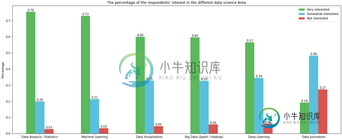
- 在matplotlib条形图上添加值标签
- 如何注释堆叠条形图的每一段
- 带居中标签的堆叠条形图
- 如何绘制和注释多个数据列在海运barplon
- 如何用聚合值注释海运的barploa
- 在matplotlib中堆栈条形图,并将标签添加到每个部分
- 如何将多个注释添加到barplot
w=0.8/3将解决问题,给定当前代码。- 然而,生成情节可以更容易地完成与
熊猫。DataFrame.plot
# your colors colors = ['#5cb85c', '#5bc0de', '#d9534f'] # plot with annotations is probably easier p1 = df.plot.bar(color=colors, figsize=(20, 8), ylabel='Percentage', title="The percentage of the respondents' interest in the different data science Area") p1.set_xticklabels(p1.get_xticklabels(), rotation=0) for p in p1.patches: p1.annotate(f'{p.get_height():0.2f}', (p.get_x() + p.get_width() / 2., p.get_height()), ha = 'center', va = 'center', xytext = (0, 10), textcoords = 'offset points') - 一些格式化可以使用
-
我有一个看起来像这样的数据帧: 我使用条形图表示每行的订阅者。这就是我所做的: 现在我想在同一个图中显示每个用户的“video_count”。目标是比较订阅者数量与视频数量的关系。我如何在图表上描述这一点?
-
我有一个名为pct的数据集 我想使用ggplot2或绘图包获得正条形图和负条形图。 给定下表中的数据集 我想得到这样的东西
-
我有一个直方图,每个面元上有4个不同的对象,它们现在相互堆叠在一起。相反,我需要在同一个直方图框中并排绘制不同的对象(类似于https://matplotlib . org/3 . 1 . 1/gallery/statistics/histogram _ multi hist . html中的左上图): ,等在同一个样本内绘制不同标准的对象(和)。我看的所有示例都与我需要的略有不同,找不到正确的方
-
我有多个数据帧,我想在分组条形图视图中的同一个图上绘制它们。 这是两个非常小的数据帧,我想在同一个图中一起绘制。 数据帧是: 我想画一个像这样的图: 我尝试这样做,只绘制一个图形: 我也试过: 结果只是图片中单个数据帧的数据,而不是两个数据帧的两个数据。请注意,只有两个数据帧的标题出现在同一张图片中,数据仅来自单个独立的数据帧。
-
我想在我的pandas条形图中添加百分比值-以及计数。然而,我不能这样做。我的代码如下所示,到目前为止,我可以得到要显示的计数值。有人能帮我在每个条显示的计数值旁边/下面添加相对%值吗? 我的代码的输出如下所示。如何在显示的每个计数值旁边添加%值?
-
我想验证属性firstName和lastName。但我不想每次都重复注释。 如何创建自定义注释,使代码如下所示 验证也是一样的