
Chrome在列布局中忽略flex-basis[重复]

我很难让Chrome注意到flex-direction:column布局中flex:1 1 25%的flex-basis部分。它在行布局中运行良好。
下面的代码片段演示了这个问题:黄色、蓝色和粉红色的条是基于flex的50px、25%和75%,显示在列和行flex方向上。
如果您在Firefox(或IE11或Edge)中运行,那么列和行都按预期划分区域:
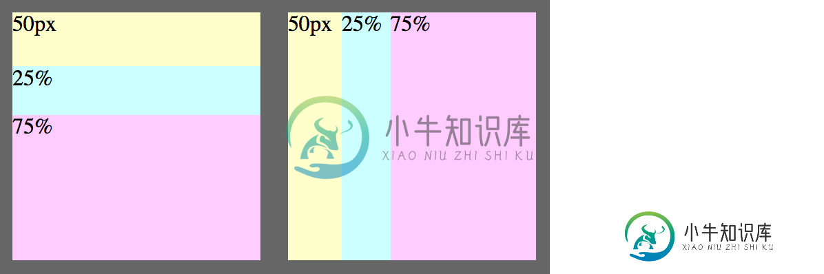

左和右之间的唯一区别是flex-direction。
css lang-css prettyprint-override">.container {
  width: 400px;
  height: 200px;
  display: flex;
  background: #666;
  position: relative;
}

.layout {
  flex: 1 1 100%; /* within .container */
  margin: 10px;
  display: flex;
}

.row {
  flex-direction: row;
}
.column {
  flex-direction: column;
}

.exact {
  flex: 1 1 50px;
  background: #ffc;
}
.small {
  flex: 1 1 25%;
  background: #cff;
}
.large {
  flex: 1 1 75%;
  background: #fcf;
}
<div class="container">
  <div class="layout column">
    <div class="exact">50px</div>
    <div class="small">25%</div>
    <div class="large">75%</div>
  </div>
  <div class="layout row">
    <div class="exact">50px</div>
    <div class="small">25%</div>
    <div class="large">75%</div>
  </div>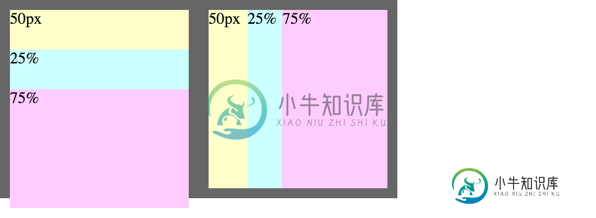
</div>我尝试将height:100%添加到.column中,这使Chrome注意到flex的基础,但却引起了一个不同的问题--flex变得比它的容器大:
.column {
  flex-direction: column;
  height: 100%;
}
我想这是一个长期存在的webkit bug。有什么办法可以解决吗?(我正在尝试创建一些通用的布局组件,所以硬编码特定数量的子元素或特定像素高度是不可行的。)
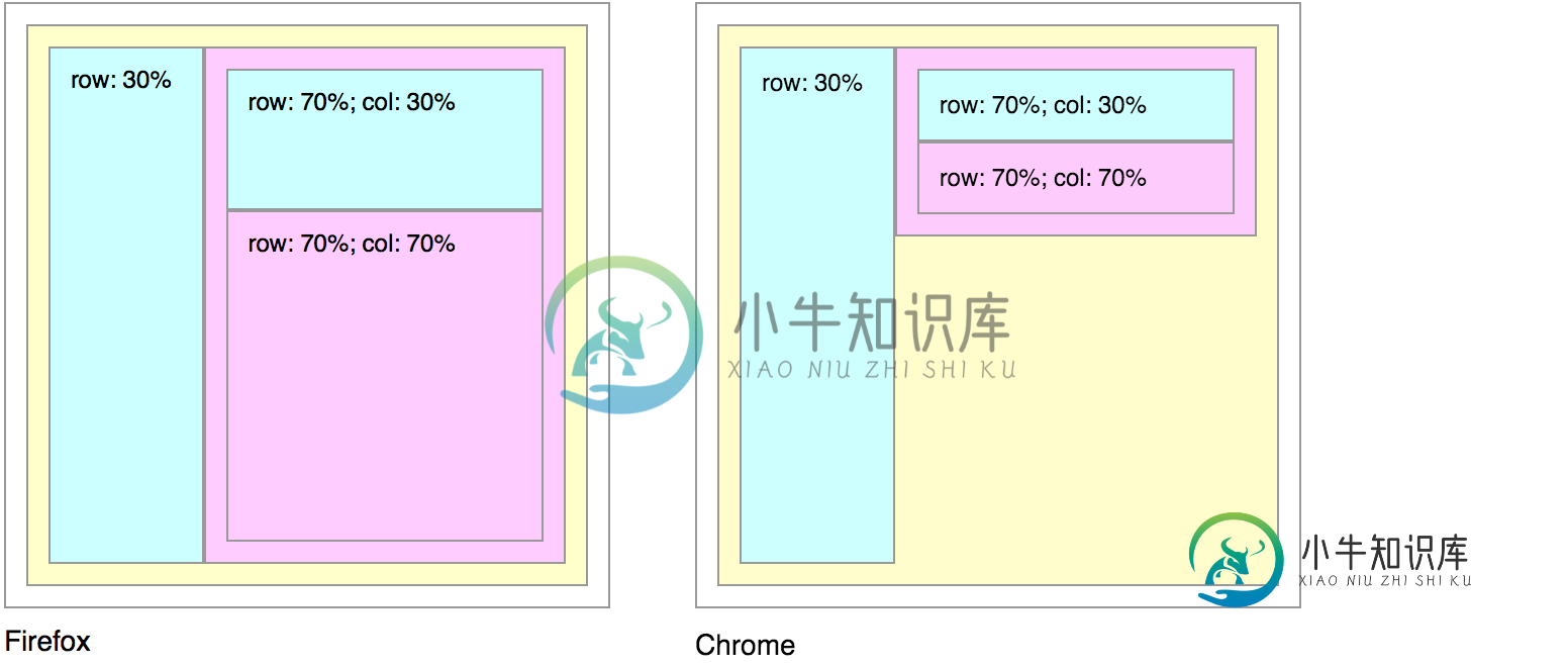
[编辑]下面的另一个示例显示了一般问题(并避免了上面示例中的边际和合计大于100%的问题):
.container {
  width: 300px;
  height: 300px;
  display: flex;
}

.layout {
  flex: 1 1 100%; /* within its flex parent */
  display: flex;
  background: #ffc;
}

.row {
  flex-direction: row;
}
.column {
  flex-direction: column;
  height: 100%; /* attempted workaround for webkit */
}

.small {
  flex: 1 1 30%;
  background: #cff;
}
.large {
  flex: 1 1 70%;
  background: #fcf;
}

div {
  /* border/padding just makes divs easier to see --
     you can remove all of this without changing the problem */
  box-sizing: border-box;
  border: 1px solid #999;
  padding: 10px;
}
<div class="container">
<div class="layout row">
<div class="small">row: 30%</div>
<div class="large layout column">
<div class="small">row: 70%; col: 30%</div>
<div class="large">row: 70%; col: 70%</div>
</div>
</div>
</div>共有1个答案

要审议的三个项目:
>
大于100%的所有高度的总和
在.column布局中,有三个flex项。它们的高度为75%+25%+50px。这本身就超过了您应用的height:100%。这不会导致溢出,因为您将flex-shrink设置为1。
.column {
  flex-direction: column;
  height: calc(100% - 20px);   /* new */
}
.container {
  width: 400px;
  height: 200px;
  display: flex;
  background: #666;
  position: relative;
}

.layout {
  flex: 1 1 100%; /* within .container */
  margin: 10px;
  display: flex;
}

.row {
  flex-direction: row;
}
.column {
  flex-direction: column;
  height: calc(100% - 20px);   /* NEW */
}

.exact {
  flex: 1 1 50px;
  background: #ffc;
}
.small {
  flex: 1 1 25%;
  background: #cff;
}
.large {
  flex: 1 1 75%;
  background: #fcf;
}
<div class="container">
<div class="layout column">
<div class="exact">50px</div>
<div class="small">25%</div>
<div class="large">75%</div>
</div>
<div class="layout row">
<div class="exact">50px</div>
<div class="small">25%</div>
<div class="large">75%</div>
</div>
</div>-
WeUI提供了快速的 flex 布局 示例代码 <template> <div class="page"> <div class="page__bd page__bd_spacing"> <div class="weui-flex"> <div class="weui-flex__item"> <div class="placeholde
-
参考 Flex 布局教程:语法篇
-
问题内容: 我正在尝试占用和div未使用的任何空间。为此,我将flex显示设置为列方向。然后,我将属性设置为1。似乎没有做任何事情。 注意:不确定这是否重要,但是我正在进行一些嵌套的flex显示。 HTML CSS 问题答案: 您代码中的所有内容都可以正常工作。 唯一的问题是 您的flex容器没有指定的高度 。因此,高度解析为,表示内容的高度。 该属性在容器中分配 可用 空间。容器中没有可用空间,
-
Flex是Flexible Box的缩写,意为“弹性布局”,2009年它由W3C提出了一种新的网页布局方案。QAP也支持flex布局。目前flex支持的容器属性有:flexDirection、flexWrap、justifyContent、alignItems、width和height等属性。 flexDirection flexDirection属性决定了主轴的方向,它有两个值(不支持row-r
-
flex 布局介绍 flex 布局可以说是目前为止最好用的布局方式,但是目前还稍微有一点受到兼容性的影响,它对 IE9 不兼容,但是在未来随着 IE9 逐渐被淘汰,我相信,它一定会在布局这块大放异彩,因为它实现了太多我们曾经不能实现的布局效果,而且只要简单的几个属性就可以搞定! 1. 官方解释 一种弹性盒模型布局方式。 2. 慕课解释 flex 布局也叫弹性布局,它的特点是可以实现子元素的自适应屏
-
我创建了一个web应用程序,它使用了一个下拉标签框。这在除了Chrome浏览器(版本21.0.1180.89)之外的所有浏览器中都很好用。 尽管字段和字段都具有属性,但Chrome坚持要显示该字段以前条目的下拉历史记录,这将抹掉tagbox列表。