
Python X轴中的烛台图看起来很拥挤

我从以下网站运行代码:
https://ntguardian.wordpress.com/2018/07/17/stock-data-analysis-python-v2/
这会生成蜡烛图。我在Spyder中运行过类似的代码,我对代码所做的唯一修改是
import numpy as np
from matplotlib.dates import DateFormatter, WeekdayLocator,DayLocator,MONDAY
from mpl_finance import candlestick_ohlc
from matplotlib.dates import date2num
我似乎不明白为什么在我没有修改代码的情况下,我会看到如此明显的差异。
Spyder中是否有一些怪癖导致了这个问题,还是我需要多几行代码?
请帮助我,因为我是matplotlib新手。
非常感谢,非常感谢你在这方面的帮助。
我的整体代码
import pandas as pd
import numpy as np
pd.set_option('display.max_rows', 500)
pd.set_option('display.max_columns', 500)
pd.set_option('display.width', 1000)
import quandl
import datetime
# We will look at stock prices over the past year, starting at January
start = datetime.datetime(2016,1,1)
end =datetime.date.today()
#Fist define the security for which you are extracting the Series
s = "AAPL"
apple = quandl.get("WIKI/" + s, start_date=start, end_date=end)
print (type(apple))
print (apple.head())
#print (apple.tail())
import matplotlib
import matplotlib.pyplot as plt
import pylab
#Lines of Code for Jupyter
# This line is necessary for the plot to appear in a Jupyter notebook
#%matplotlib inline
# Control the default size of figures in this Jupyter notebook
#%pylab inline
pylab.rcParams['figure.figsize'] = (15, 9) # Change the size of plots
print (apple["Adj. Close"].plot(grid = True))
from matplotlib.dates import DateFormatter, WeekdayLocator, DayLocator,
MONDAY
from mpl_finance import candlestick_ohlc
from matplotlib.dates import date2num
def pandas_candlestick_ohlc(dat, stick = "day", adj = False, otherseries =
None):
"""
:param dat: pandas DataFrame object with datetime64 index, and float columns
"Open", "High", "Low", and "Close", likely created via DataReader from
"yahoo"
:param stick: A string or number indicating the period of time covered by a
single candlestick. Valid string inputs include "day", "week", "month", and
"year", ("day" default), and any numeric input indicates the number of
trading days included in a period
:param adj: A boolean indicating whether to use adjusted prices
:param otherseries: An iterable that will be coerced into a list, containing
the columns of dat that hold other series to be plotted as lines
This will show a Japanese candlestick plot for stock data stored in dat,
also plotting other series if passed.
"""
mondays = WeekdayLocator(MONDAY) # major ticks on the mondays
alldays = DayLocator() # minor ticks on the days
dayFormatter = DateFormatter('%d') # e.g., 12
# Create a new DataFrame which includes OHLC data for each period specified
by stick input
fields = ["Open", "High", "Low", "Close"]
if adj:
fields = ["Adj. " + s for s in fields]
transdat = dat.loc[:,fields]
transdat.columns = pd.Index(["Open", "High", "Low", "Close"])
if (type(stick) == str):
if stick == "day":
plotdat = transdat
stick = 1 # Used for plotting
elif stick in ["week", "month", "year"]:
if stick == "week":
transdat["week"] = pd.to_datetime(transdat.index).map(lambda x:
x.isocalendar()[1]) # Identify weeks
elif stick == "month":
transdat["month"] = pd.to_datetime(transdat.index).map(lambda x:
x.month) # Identify months
transdat["year"] = pd.to_datetime(transdat.index).map(lambda x:
x.isocalendar()[0]) # Identify years
grouped = transdat.groupby(list(set(["year",stick]))) # Group by
year and other appropriate variable
plotdat = pd.DataFrame({"Open": [], "High": [], "Low": [], "Close":
[]}) # Create empty data frame containing what will be plotted
for name, group in grouped:
plotdat = plotdat.append(pd.DataFrame({"Open": group.iloc[0,0],
"High": max(group.High),
"Low": min(group.Low),
"Close": group.iloc[-1,3]},
index = [group.index[0]]))
if stick == "week": stick = 5
elif stick == "month": stick = 30
elif stick == "year": stick = 365
elif (type(stick) == int and stick >= 1):
transdat["stick"] = [np.floor(i / stick) for i in
range(len(transdat.index))]
grouped = transdat.groupby("stick")
plotdat = pd.DataFrame({"Open": [], "High": [], "Low": [], "Close": []})
# Create empty data frame containing what will be plotted
for name, group in grouped:
plotdat = plotdat.append(pd.DataFrame({"Open": group.iloc[0,0],
"High": max(group.High),
"Low": min(group.Low),
"Close": group.iloc[-1,3]},
index = [group.index[0]]))
else:
raise ValueError('Valid inputs to argument "stick" include the strings "day", "week", "month", "year", or a positive integer')
# Set plot parameters, including the axis object ax used for plotting
fig, ax = plt.subplots()
fig.subplots_adjust(bottom=0.2)
if plotdat.index[-1] - plotdat.index[0] < pd.Timedelta('730 days'):
weekFormatter = DateFormatter('%b %d') # e.g., Jan 12
ax.xaxis.set_major_locator(mondays)
ax.xaxis.set_minor_locator(alldays)
else:
weekFormatter = DateFormatter('%b %d, %Y')
ax.xaxis.set_major_formatter(weekFormatter)
ax.grid(True)
# Create the candelstick chart
candlestick_ohlc(ax, list(zip(list(date2num(plotdat.index.tolist())),
plotdat["Open"].tolist(), plotdat["High"].tolist(),
plotdat["Low"].tolist(), plotdat["Close"].tolist())),
colorup = "black", colordown = "red", width = stick * .4)
# Plot other series (such as moving averages) as lines
if otherseries != None:
if type(otherseries) != list:
otherseries = [otherseries]
dat.loc[:,otherseries].plot(ax = ax, lw = 1.3, grid = True)
ax.xaxis_date()
ax.autoscale_view()
plt.setp(plt.gca().get_xticklabels(), rotation=45,
horizontalalignment='right')
plt.show()
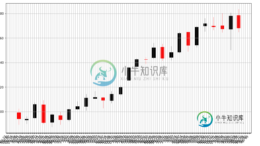
pandas_candlestick_ohlc(apple, adj=True, stick="month")
共有1个答案

我似乎不能理解这一点,但在重新复制代码并关闭Spyder并重新启动后,它现在似乎工作了。感谢@重要性OfBeingEarnest和@DavidG帮助我。
-
我正在使用flutter_launcher_icons包为Android和iOS生成启动器图标。在iOS上一切看起来都很棒,但在Android上图标看起来很小: 是左边第二个。我试过各种方法让它变大。我尝试了几个不同的源图像来生成图标,512x512和900x900,但无论我做什么,我都不能让它生成一个像其他图标一样大的图标。我肯定我错过了一些愚蠢的东西。这是我的flutter_launcher_
-
请访问我的网站:http://www.oneniceday.com 背景图像在我的屏幕上看起来真的很模糊,即使图像大小是1920 x 1080像素。我正在使用一个jQuery脚本来处理这个bg的事情,因为css方法都给了我不希望的结果。 有什么方法可以解决这个模糊问题吗?
-
这是我的 这是我的文件 这是我的依赖项
-
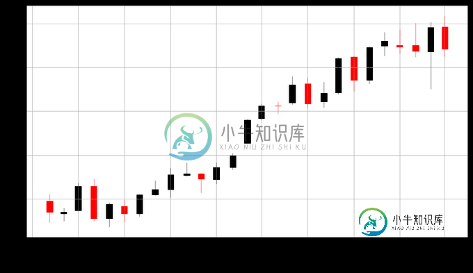
烛台图表用于显示价值差异的开盘价和收盘价,通常用于表示股票。 在本节中,我们将讨论以下类型的基于烛台的图表。 Sr. No. 图表类型/描述 1 Basic Candlestick 基本烛台图表。 2 Candlestick with customized colors 自定义烛台图表。
-
这参考了蜡烛图的JFreeChart渲染。下面是使用JFreeChart生成蜡烛棒图表的代码片段。 这段代码已经过测试,并且已经运行了很长时间。但是,JFreeChart的版本已从1.0.17更改为1.0.19,使用1.0.19生成的烛台图表显示蜡烛对象/线的污迹。当我将库更改回1.0.17时,烛台对象/线再次变得清晰。 下面提供了两个库的图像。 我曾试图找出原因,但至今仍不成功。现在的问题是,由
-
我需要良好的阴阳烛图表为我的网络应用程序和图表http://bitcoinwisdom.com/真的是我在寻找。我喜欢你可以放大和移动的方式。有没有可能弄清楚他们在使用什么,或者你认为他们是自己编的?如果是的话用什么工具?另一个惊人的图表可以在这里找到https://www.tradingview.com/e/这两个网站比一些桌面应用程序有更好的图表,我想知道他们是如何做到的。