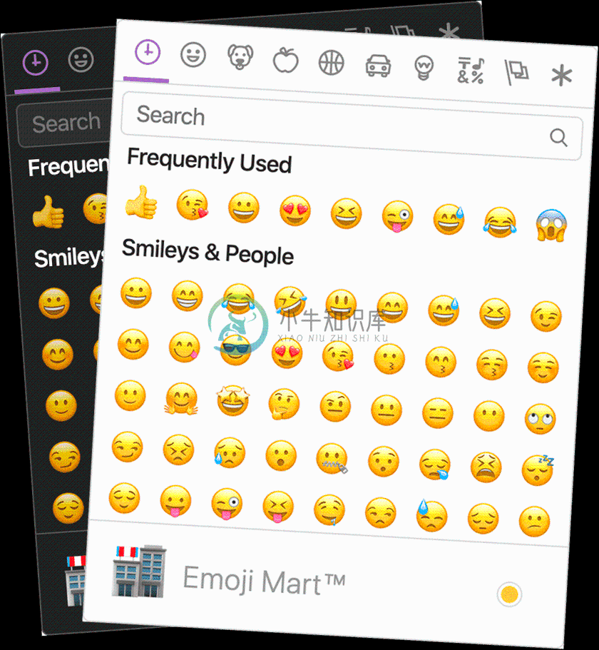
Emoji Mart is a Slack-like customizable
emoji picker component for React
Demo • Changelog

Brought to you by the Missive team
Installation
npm install --save emoji-mart
Components
Picker
import 'emoji-mart/css/emoji-mart.css'
import { Picker } from 'emoji-mart'

<Picker set='apple' />
<Picker onSelect={this.addEmoji} />
<Picker title='Pick your emoji…' emoji='point_up' />
<Picker style={{ position: 'absolute', bottom: '20px', right: '20px' }} />
<Picker i18n={{ search: 'Recherche', categories: { search: 'Résultats de recherche', recent: 'Récents' } }} />
| Prop | Required | Default | Description |
|---|---|---|---|
| autoFocus | false |
Auto focus the search input when mounted | |
| color | #ae65c5 |
The top bar anchors select and hover color | |
| emoji | department_store |
The emoji shown when no emojis are hovered, set to an empty string to show nothing | |
| include | [] |
Only load included categories. Accepts I18n categories keys. Order will be respected, except for the recent category which will always be the first. |
|
| exclude | [] |
Don't load excluded categories. Accepts I18n categories keys. | |
| custom | [] |
Custom emojis | |
| recent | Pass your own frequently used emojis as array of string IDs | ||
| enableFrequentEmojiSort | false |
Instantly sort “Frequently Used” category | |
| emojiSize | 24 |
The emoji width and height | |
| onClick | Params: (emoji, event) => {}. Not called when emoji is selected with enter |
||
| onSelect | Params: (emoji) => {} |
||
| onSkinChange | Params: (skin) => {} |
||
| perLine | 9 |
Number of emojis per line. While there’s no minimum or maximum, this will affect the picker’s width. This will set Frequently Used length as well (perLine * 4) |
|
| i18n | {…} |
An object containing localized strings | |
| native | false |
Renders the native unicode emoji | |
| set | apple |
The emoji set: 'apple', 'google', 'twitter', 'facebook' |
|
| theme | light |
The picker theme: 'auto', 'light', 'dark' |
|
| sheetSize | 64 |
The emoji sheet size: 16, 20, 32, 64 |
|
| backgroundImageFn | ((set, sheetSize) => …) |
A Fn that returns that image sheet to use for emojis. Useful for avoiding a request if you have the sheet locally. | |
| emojisToShowFilter | ((emoji) => true) |
A Fn to choose whether an emoji should be displayed or not | |
| showPreview | true |
Display preview section | |
| showSkinTones | true |
Display skin tones picker. Disable both this and showPreview to remove the footer entirely. |
|
| emojiTooltip | false |
Show emojis short name when hovering (title) | |
| useButton | true |
When clickable, render emojis with a <button>. Some browsers have issues rendering certain emojis on a button, so you might want to disable this. It is better for accessibility to use buttons. |
|
| skin | Forces skin color: 1, 2, 3, 4, 5, 6 |
||
| defaultSkin | 1 |
Default skin color: 1, 2, 3, 4, 5, 6 |
|
| skinEmoji | The emoji used to pick a skin tone. Uses an emoji-less skin tone picker by default | ||
| style | Inline styles applied to the root element. Useful for positioning | ||
| title | Emoji Mart™ |
The title shown when no emojis are hovered | |
| notFoundEmoji | sleuth_or_spy |
The emoji shown when there are no search results | |
| notFound | Not Found | ||
| icons | {} |
Custom icons |
I18n
search: 'Search',
clear: 'Clear', // Accessible label on "clear" button
notfound: 'No Emoji Found',
skintext: 'Choose your default skin tone',
categories: {
  search: 'Search Results',
  recent: 'Frequently Used',
  smileys: 'Smileys & Emotion',
  people: 'People & Body',
  nature: 'Animals & Nature',
  foods: 'Food & Drink',
  activity: 'Activity',
  places: 'Travel & Places',
  objects: 'Objects',
  symbols: 'Symbols',
  flags: 'Flags',
  custom: 'Custom',
},
categorieslabel: 'Emoji categories', // Accessible title for the list of categories
skintones: {
  1: 'Default Skin Tone',
  2: 'Light Skin Tone',
  3: 'Medium-Light Skin Tone',
  4: 'Medium Skin Tone',
  5: 'Medium-Dark Skin Tone',
  6: 'Dark Skin Tone',
},
Tip: You usually do not need to translate the categories and skin tones by youself, because this data and their translations should be included in the Unicode CLDR (the "Common Locale Data Repository"). You can look them up and just take them from there.
Sheet sizes
Sheets are served from unpkg, a global CDN that serves files published to npm.
| Set | Size (sheetSize: 16) |
Size (sheetSize: 20) |
Size (sheetSize: 32) |
Size (sheetSize: 64) |
|---|---|---|---|---|
| apple | 407 KB | 561 KB | 1.34 MB | 3.60 MB |
| 416 KB | 579 KB | 1.38 MB | 3.68 MB | |
| 362 KB | 489 KB | 1.12 MB | 2.78 MB | |
| 361 KB | 485 KB | 1.05 MB | 2.39 MB |
Datasets
While all sets are available by default, you may want to include only a single set data to reduce the size of your bundle.
| Set | Size (on disk) |
|---|---|
| all | 611 KB |
| apple | 548 KB |
| 468 KB | |
| 518 KB | |
| 517 KB |
To use these data files (or any other custom data), use the NimblePicker component:
import data from 'emoji-mart/data/google.json'
import { NimblePicker } from 'emoji-mart'

<NimblePicker set='google' data={data} />
Examples of emoji object:
{
  id: 'smiley',
  name: 'Smiling Face with Open Mouth',
  colons: '��',
  text: ':)',
  emoticons: [
    '=)',
    '=-)'
  ],
  skin: null,
  native: '��'
}

{
  id: 'santa',
  name: 'Father Christmas',
  colons: '��:skin-tone-3:',
  text: '',
  emoticons: [],
  skin: 3,
  native: '����'
}

{
  id: 'octocat',
  name: 'Octocat',
  colons: ':octocat:',
  text: '',
  emoticons: [],
  custom: true,
  imageUrl: 'https://github.githubassets.com/images/icons/emoji/octocat.png'
}
Emoji
import { Emoji } from 'emoji-mart'

<Emoji emoji={{ id: 'santa', skin: 3 }} size={16} />
<Emoji emoji='��:skin-tone-3:' size={16} />
<Emoji emoji='santa' set='apple' size={16} />
| Prop | Required | Default | Description |
|---|---|---|---|
| emoji | ✓ | Either a string or an emoji object |
|
| size | ✓ | The emoji width and height. | |
| native | false |
Renders the native unicode emoji | |
| onClick | Params: (emoji, event) => {} |
||
| onLeave | Params: (emoji, event) => {} |
||
| onOver | Params: (emoji, event) => {} |
||
| fallback | Params: (emoji, props) => {} |
||
| set | apple |
The emoji set: 'apple', 'google', 'twitter' |
|
| sheetSize | 64 |
The emoji sheet size: 16, 20, 32, 64 |
|
| backgroundImageFn | ((set, sheetSize) => `https://unpkg.com/emoji-datasource@3.0.0/sheet_${set}_${sheetSize}.png`) |
A Fn that returns that image sheet to use for emojis. Useful for avoiding a request if you have the sheet locally. | |
| skin | 1 |
Skin color: 1, 2, 3, 4, 5, 6 |
|
| tooltip | false |
Show emoji short name when hovering (title) | |
| html | false |
Returns an HTML string to use with dangerouslySetInnerHTML |
Unsupported emojis fallback
Certain sets don’t support all emojis. By default the Emoji component will not render anything so that the emojis’ don’t take space in the picker when not available. When using the standalone Emoji component, you can however render anything you want by providing the fallback props.
To have the component render �� you would need to:
<Emoji
  set={'apple'}
  emoji={'shrug'}
  size={24}
  fallback={(emoji, props) => {
    return emoji ? `:${emoji.short_names[0]}:` : props.emoji
  }}
/>
Using with dangerouslySetInnerHTML
The Emoji component being a functional component, you can call it as you would call any function instead of using JSX. Make sure you pass html: true for it to return an HTML string.
<span dangerouslySetInnerHTML={{
  __html: Emoji({
    html: true
    set: 'apple'
    emoji: '+1'
    size: 24
  })
}}></span>
Using with contentEditable
Following the dangerouslySetInnerHTML example above, make sure the wrapping span sets contenteditable="false".
<div contentEditable={true}>
  Looks good to me

  <span contentEditable={false} dangerouslySetInnerHTML={{
    __html: Emoji({
      html: true
      set: 'apple'
      emoji: '+1'
      size: 24
    })
  }}></span>
</div>
Custom emojis
You can provide custom emojis which will show up in their own category. You can either use a single image as imageUrl or use a spritesheet as shown in the second object.
import { Picker } from 'emoji-mart'

const customEmojis = [
  {
    name: 'Octocat',
    short_names: ['octocat'],
    text: '',
    emoticons: [],
    keywords: ['github'],
    imageUrl: 'https://github.githubassets.com/images/icons/emoji/octocat.png',
    customCategory: 'GitHub'
  },
  {
    name: 'Test Flag',
    short_names: ['test'],
    text: '',
    emoticons: [],
    keywords: ['test', 'flag'],
    spriteUrl: 'https://unpkg.com/emoji-datasource-twitter@4.0.4/img/twitter/sheets-256/64.png',
    sheet_x: 1,
    sheet_y: 1,
    size: 64,
    sheetColumns: 52,
    sheetRows: 52,
  },
]

<Picker custom={customEmojis} />
The customCategory string is optional. If you include it, then the custom emoji will be shown in whatevercategories you define. If you don't include it, then there will just be one category called "Custom."
Not Found
You can provide a custom Not Found object which will allow the appearance of the not found search results to change. In this case, we change the default 'sleuth_or_spy' emoji to Octocat when our search finds no results.
import { Picker } from 'emoji-mart'

const notFound = () => <img src='https://github.githubassets.com/images/icons/emoji/octocat.png' />

<Picker notFound={notFound} />
Custom icons
You can provide custom icons which will override the default icons.
import { Picker } from 'emoji-mart'

const customIcons = {
  categories: {
    recent: () => <img src='https://github.githubassets.com/images/icons/emoji/octocat.png' />,
    foods: () => <svg role="img" viewBox="0 0 24 24" xmlns="http://www.w3.org/2000/svg"><path d="M0 0l6.084 24H8L1.916 0zM21 5h-4l-1-4H4l3 12h3l1 4h13L21 5zM6.563 3h7.875l2 8H8.563l-2-8zm8.832 10l-2.856 1.904L12.063 13h3.332zM19 13l-1.5-6h1.938l2 8H16l3-2z"/></svg>,
    people: () => <svg xmlns="http://www.w3.org/2000/svg" width="16" height="16" viewBox="0 0 16 16"><path d="M3 2l10 6-10 6z"></path></svg>
  }
}

<Picker icons={customIcons} />
Headless search
The Picker doesn’t have to be mounted for you to take advantage of the advanced search results.
import { emojiIndex } from 'emoji-mart'

emojiIndex.search('christmas').map((o) => o.native)
// => [��, ����, ��, ��, ⛄️, ❄️]
With custom data
import data from 'emoji-mart/datasets/apple'
import { NimbleEmojiIndex } from 'emoji-mart'

let emojiIndex = new NimbleEmojiIndex(data)
emojiIndex.search('christmas')
Get emoji data from Native
You can get emoji data from native emoji unicode using the getEmojiDataFromNative util function.
import { getEmojiDataFromNative, Emoji } from 'emoji-mart'
import data from 'emoji-mart/data/all.json'
const emojiData = getEmojiDataFromNative('����♀️', 'apple', data)
<Emoji
emoji={emojiData}
set={'apple'}
skin={emojiData.skin || 1}
size={48}
/>
Example of emojiData object:
emojiData: {
"id": "woman-swimming",
"name": "Woman Swimming",
"colons": ":woman-swimming::skin-tone-4:",
"emoticons": [],
"unified": "1f3ca-1f3fd-200d-2640-fe0f",
"skin": 4,
"native": "����♀️"
}
Storage
By default EmojiMart will store user chosen skin and frequently used emojis in localStorage. That can however be overwritten should you want to store these in your own storage.
import { store } from 'emoji-mart'

store.setHandlers({
  getter: (key) => {
    // Get from your own storage (sync)
  },

  setter: (key, value) => {
    // Persist in your own storage (can be async)
  }
})
Possible keys are:
| Key | Value | Description |
|---|---|---|
| skin | 1, 2, 3, 4, 5, 6 |
|
| frequently | { 'astonished': 11, '+1': 22 } |
An object where the key is the emoji name and the value is the usage count |
| last | 'astonished' | (Optional) Used by frequently to be sure the latest clicked emoji will always appear in the “Recent” category |
Features
Powerful search
Short name, name and keywords
Not only does Emoji Mart return more results than most emoji picker, they’re more accurate and sorted by relevance.
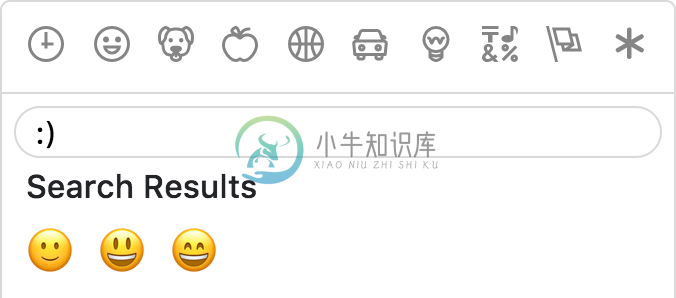
Emoticons
The only emoji picker that returns emojis when searching for emoticons.
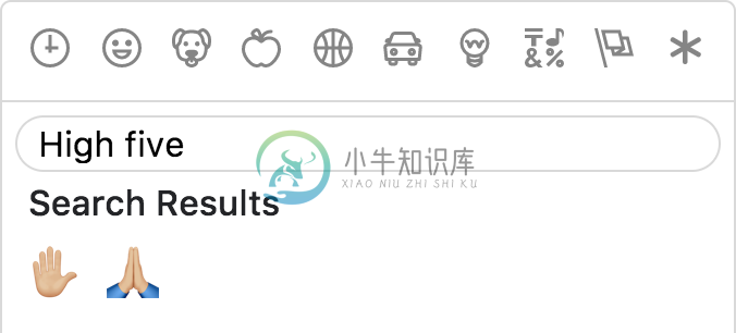
Results intersection
For better results, Emoji Mart split search into words and only returns results matching both terms.
Fully customizable
Anchors color, title and default emoji
Emojis sizes and length
Default skin color
As the developer, you have control over which skin color is used by default.
It can however be overwritten as per user preference.
Multiple sets supported
Apple / Google / Twitter / Facebook
Not opinionated
Emoji Mart doesn’t automatically insert anything into a text input, nor does it show or hide itself. It simply returns an emoji object. It’s up to the developer to mount/unmount (it’s fast!) and position the picker. You can use the returned object as props for the EmojiMart.Emoji component. You could also use emoji.colons to insert text into a textarea or emoji.native to use the emoji.
Usage outside React
Emoji Mart can be used with React alternatives such as Preact, Inferno, and react-lite.
Furthermore, you can use it as a custom element using remount, meaning that you can use it within any JavaScript framework (or vanilla JS).
For an end-to-end example of how to do this, see emoji-mart-outside-react.
Optimizing for production
Modern/ES builds
Emoji Mart comes in three flavors:
dist
dist-es
dist-modern
distis the standard build with the highest level of compatibility.dist-esis the same, but uses ES modules for better tree-shaking.dist-modernremoves features not needed in modern evergreen browsers (i.e. latest Chrome, Edge, Firefox, and Safari).
The default builds are dist and dist-es. (In Webpack, one or the other will be chosen based on your resolve main fields.)If you want to use dist-modern, you must explicitly import it:
import { Picker } from 'emoji-mart/dist-modern/index.js'
Using something like Babel, you can transpile the modern build to suit your own needs.
Removing prop-types
To remove prop-types in production, use babel-plugin-transform-react-remove-prop-types:
npm install --save-dev babel-plugin-transform-react-remove-prop-types
Then add to your .babelrc:
"plugins": [
  [
    "transform-react-remove-prop-types",
    {
      "removeImport": true,
      "additionalLibraries": [
        "../../utils/shared-props"
      ]
    }
  ]
]
You'll also need to ensure that Babel is transpiling emoji-mart, e.g. by not excluding node_modules in babel-loader.
Development
yarn build
In two separate tabs:
yarn start
yarn storybook
The storybook is hosted at localhost:6006, and the code will be built on-the-fly.
��
Hat tips!
Powered by iamcal/emoji-data and inspired by iamcal/js-emoji.
���� Cal Henderson.

Missive mixes team email and threaded group chat for productive teams.
A single app for all your internal and external communication and a full work management solution.
-
/** * emoji表情处理用 * * 用于把用utf16编码的字符转换成实体字符,以供后台存储 * @param {string} str 将要转换的字符串,其中含有utf16字符将被自动检出 * @return {string} 转换后的字符串,utf16字符将被转换成&#xxxx;形式的实体字符 */ function utf16toEntities (str) { var pa
-
大神原文 https://segmentfault.com/a/1190000005869372 1.记录光标最后位置 //1. data() lastEditRange: '' // 2. 给可编辑div绑定keyup事件、click事件 recordLastEditRange() { // 获取选定对象 const selection = getSelection()
-
Emoji 是一个用来快速访问各种表情图片的类,类包含静态方法可直接返回表情的字符串。
-
js-emoji 可以让你在浏览器上显示 Emoji 表情,使用方法: <link href="emoji.css" rel="stylesheet" type="text/css" /><script src="emoji.js" type="text/javascript"></script><script type="text/javascript">// replaces \u{1F604
-
Emoji-Picker 可以让你在网站上的输入编辑框中加入一个 emoji 表情选择器。
-
《Emoji表情编解码库XXL-EMOJI》 方便维护,该项目合并至: https://gitee.com/xuxueli0323/xxl-tool
-
Emoji Keyboard 提供了带苹果所有表情的输入键盘控件。
-
emoji-regex emoji-regex offers a regular expression to match all emoji symbols and sequences (including textual representations of emoji) as per the Unicode Standard. It’s based on emoji-test-regex-pa
-
EMOJI-LOG After building hundreds of open source software I've ended up inventing a git commit log standard called EMOJI-LOG that helps me understand a project's history with a less cognitive load jus
-
node-emoji simple emoji support for node.js projects Help wanted: We are looking for volunteers to maintain this project, if you are interested, feel free to contact me at me@omnidan.net Installation


