flutter_neumorphic
A complete, ready to use, Neumorphic ui kit for Flutter
Try Flutter-Neumorphic on your browser :
⚙️
Installation
https://pub.dev/packages/flutter_neumorphic
dependencies:
  flutter_neumorphic: ^3.0.3

//requires flutter > 1.13.18
The in your .dart files
import 'package:flutter_neumorphic/flutter_neumorphic.dart';
��
Widgets
��
Showcases
��
Neumorphic
Neumorphic(
  style: NeumorphicStyle(
    shape: NeumorphicShape.concave,
    boxShape: NeumorphicBoxShape.roundRect(BorderRadius.circular(12)),
    depth: 8,
    lightSource: LightSource.topLeft,
    color: Colors.grey
  ),
  child: ...
)
��️
Attributes
| Attributes | Values | Description |
|---|---|---|
| LightSource | TopLeft, BottomRight, etc. / (dx, dy) | The source of light specifit to the theme or the widget, used to project white/dark shadows on neumorphic elements |
| Shape | Concave / Convex / Flat | The shape of the curve used in the neumorphic container |
| Depth | -20 <= double <= 20 | The distance of the widget to his parent. Can be negative => emboss. It influences on the shadow's color and its size/blur |
| Intensity | 0 <= double <= 1 | The intensity of the Light, it influences on the shadow's color |
| SurfaceIntensity | 0 <= double <= 1 | The intensity of the Surface, it influences on the concave/convex darkness |
| Color | any Color | The default color of Neumorphic elements |
| Accent | any Color | The default accent color of the Neumorphic element when activated (eg: checkbox) |
| Variant | any Color | The default secondary color of the Neumorphic element (eg: used as second color on the progress gradient) |
| BoxShape | Circle, RoundRect(radius), Stadium, Path | The box shape of a Neumorphic element. Stadium : roundrect with cirlces on each side |
| Border | NeumorphicBorder | A border (color/width) to enhance contrast with background and others elements |
��
Shapes
| Shape | Widget | Image | Condition |
|---|---|---|---|
| Flat | 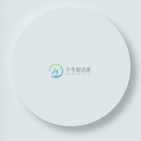 |
 |
depth >= 0 && shape == Flat |
| Convex | 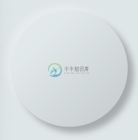 |
 |
depth >= 0 && shape == Convex |
| Concave | 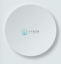 |
 |
depth >= 0 && shape == Concave |
| Emboss | 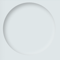 |
 |
depth < 0 |
Neumorphic Text
Text only handle positive depth
child: NeumorphicText(
        "I love flutter",
        style: NeumorphicStyle(
          depth: 4,  //customize depth here
          color: Colors.white, //customize color here
        ),
        textStyle: NeumorphicTextStyle(
          fontSize: 18, //customize size here
          // AND others usual text style properties (fontFamily, fontWeight, ...)
        ),
    ),
Neumorphic Icon
child: NeumorphicIcon(
        Icons.add_circle,
        size: 80,
    ),
How to display SVG icons ?
Simply use https://fluttericon.com/ to export your svg as .ttf & use NeumorphicIcon(YOUR_ICON)
��
Custom Shape
Flutter Neumorphic supports custom shapes, just provide a path to
class MyShapePathProvider extends NeumorphicPathProvider {
  @override
  bool shouldReclip(NeumorphicPathProvider oldClipper) {
    return true;
  }

  @override
  Path getPath(Size size) {
    return Path()
      ..moveTo(0, 0)
      ..lineTo(size.width/2, 0)
      ..lineTo(size.width, size.height/2)
      ..lineTo(size.width/2, size.height/2)
      ..lineTo(size.width, size.height)
      ..lineTo(0, size.height)
      ..close();
  }
}
And use NeumorphicBoxShape.path
Neumorphic(
  style: NeumorphicStyle(
     boxShape: NeumorphicBoxShape.path(MyShapePathProvider()),
  ),
  ...
),
You can import the Flutter logo as a custom shape using
Neumorphic(
  style: NeumorphicStyle(
    shape: NeumorphicBoxShape.path(NeumorphicFlutterLogoPathProvider()),
  ),
  ...
),
��
Accessibility / Border
For design purposes, or simply to enhance accessibility,you can add a border on Neumorphic widgets
Neumorphic(
      style: NeumorphicStyle(
        border: NeumorphicBorder(
          color: Color(0x33000000),
          width: 0.8,
        )
      ),
      ...
)
You can enable/disable it (eg: listening an Accessibility Provider) with isEnabled
border: NeumorphicBorder(
    isEnabled: true,
    color: Color(0x33000000),
    width: 0.8,
)
Note that borderColor and borderWidth default values has been added to NeumorphicThemeData
��
Neumorphic Theme
NeumorphicTheme(
    themeMode: ThemeMode.light, //or dark / system
    darkTheme: NeumorphicThemeData(
        baseColor: Color(0xff333333),
        accentColor: Colors.green,
        lightSource: LightSource.topLeft,
        depth: 4,
        intensity: 0.3,
    ),
    theme: NeumorphicThemeData(
        baseColor: Color(0xffDDDDDD),
        accentColor: Colors.cyan,
        lightSource: LightSource.topLeft,
        depth: 6,
        intensity: 0.5,
    ),
    child: ...
)
To retrieve the current used theme :
final theme = NeumorphicTheme.currentTheme(context);
final baseColor = theme.baseColor;
final accentColor = theme.accentColor;
...
Toggle from light to dark
NeumorphicTheme.of(context).themeMode = ThemeMode.dark;
Know if using dark
if(NeumorphicTheme.of(context).isUsingDark){

}
NeumorphicApp
You can use direcly in your project a NeumorphicApp, surrounding your code
It handle directly NeumorphicTheme & Navigation (and all possibilities of MaterialApp )
void main() => runApp(MyApp());

class MyApp extends StatelessWidget {
  // This widget is the root of your application.
  @override
  Widget build(BuildContext context) {
    return NeumorphicApp(
      debugShowCheckedModeBanner: false,
      title: 'Neumorphic App',
      themeMode: ThemeMode.light,
      theme: NeumorphicThemeData(
        baseColor: Color(0xFFFFFFFF),
        lightSource: LightSource.topLeft,
        depth: 10,
      ),
      darkTheme: NeumorphicThemeData(
        baseColor: Color(0xFF3E3E3E),
        lightSource: LightSource.topLeft,
        depth: 6,
      ),
      home: MyHomePage(),
    );
  }
}
What's neumorphic
Material Cards
A Modern / Material (upgraded) card usually is a surface floating on top of our perceived background and casting a shadow onto it. The shadow both gives it depth and also in many cases defines the shape itself — as it’s quite often borderless.
Neumorphic cards
Neumorphic card however pretends to extrude from the background. It’s a raised shape made from the exact same material as the background. When we look at it from the side we see that it doesn’t “float”.
Here's a Nereumorphic Button tap (slowed x2) from the sample app, you can see how the element seems to change its depth to its surface.
��
Contributors
| Contributors | |
|---|---|
| Florent Champigny | |
| Olivier Bonvila | |
| Gyl Jean Lambert | |
| Jimmy Aumard | |
| Overman775 | |
| schopy |
��
License
Flutter-Neumorphic is released under the Apache2 license.See LICENSE for details.
If you use the open-source library in your project, please make sure to credit and backlink to www.idean.com
-
Best-Flutter-UI-Templates 地址:https://github.com/mitesh77/Best-Flutter-UI-Templates The History of Everything 地址:https://github.com/2d-inc/HistoryOfEverything flame 一款简约的Flutter游戏引擎 地址:https://github.c
-
Flutter插件整理 # 进度指示器 percent_indicator: ^3.0.1 # 视频播放器 video_player: ^2.1.1 chewie: ^1.0.0 # 事件驱动 event_bus: ^2.0.0 # 底部弹窗 modal_bottom_sheet: ^2.0.0 # switch切换 flutter_switch: ^
-
嗨!这里是甜瓜看代码,今天我们要来聊聊如何实现Flutter中的暗黑模式。 实现思路 Flutter支持暗黑模式的实现非常简单,它主要涉及到以下两个步骤: 在Flutter应用程序中检测当前的主题模式(亮色或暗色)。 根据当前的主题模式,选择不同的颜色主题。 要实现这些步骤,我们可以使用Flutter中的内置主题系统,该系统允许我们为不同的主题模式定义不同的颜色、字体和其他UI属性。为了检测当
-
网上下载的flutter demo运行不了,提示 "improt 'package:flutter/material.dart' not exit",网上搜索了下解决办法,只需在项目目录,打开终端,运行 flutter packages get 重启下vscode 就可以了,希望能帮到遇到同样问题的朋友。
-
在pubspec.yaml中修改如下: flutter_neumorphic: git: url: https://github.com/tsvillain/Flutter-Neumorphic.git
-
百度移动统计现已提供Flutter插件的支持,对于基于Flutter开发的APP,您可以按如下步骤使用百度移动统计SDK,完成基础的埋点统计和上报。 集成方法 在 Flutter 项目的 pubspec.yaml 文件中 dependencies 里面添加 baidu_mob_stat 依赖 dependencies: baidu_mob_stat: ^0.0.2 执行 flutter p
-
百度移动统计现已提供Flutter插件的支持,对于基于Flutter开发的APP,您可以按如下步骤使用百度移动统计SDK,完成基础的埋点统计和上报。 集成方法 在 Flutter 项目的 pubspec.yaml 文件中 dependencies 里面添加 baidu_mob_stat 依赖 dependencies: baidu_mob_stat: ^0.0.2 执行 flutter p
-
Flutter 由 Google 的工程师团队打造,用于创建高性能、跨平台的移动应用。Flutter 针对当下以及未来的移动设备进行优化,专注于 Android and iOS 低延迟的输入和高帧率。 Flutter 可以给开发者提供简单、高效的方式来构建和部署跨平台、高性能移动应用;给用户提供漂亮、快速、jitter-free 的 app 体验。 Flutter 的主要组件: 一个高度优化, m
-
MissingPluginException(MissingPluginException(在plugins.flutter.io/firebase_core通道上找不到方法firebase#initializecore的实现) 我在试着连接Flutter应用程序中的firebase。这个错误是什么??我用vs代码开发这里是我的代码
-
1. 初始化小程序 在使用sdk提供的api之前必须要初始化sdk,初始化sdk的接口为 /// /// /// initialize mop miniprogram engine. /// 初始化小程序 /// [appkey] is required. it can be getted from www.finclip.com /// [secret] is requi
-
诸葛io移动统计支持Flutter框架,以下为集成方法。 1.在项目中添加安装插件 在Flutter项目的pubspec.yaml文件中添加zhugeio依赖包 dependencies: # zhugeio flutter plugin zhugeio: ^1.0.1 执行flutter packages get 命令安装插件 flutter packages get


