
Bootstrap所支持的表单控件实例详解

Bootstrap所支持的表单控件如下所示:
Bootstrap 支持最常见的表单控件,主要是 input、textarea、checkbox、radio 和 select。
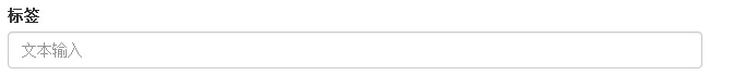
输入框(Input)
最常见的表单文本字段是输入框 input。用户可以在其中输入大多数必要的表单数据。Bootstrap 提供了对所有原生的 HTML5 的 input 类型的支持,包括:text、password、datetime、datetime-local、date、month、time、week、number、email、url、search、tel 和 color。适当的 type 声明是必需的,这样才能让 input 获得完整的样式。
<!DOCTYPE html>
<html>
<head>
<title>Bootstrap 实例 - 输入框</title>
<link rel="stylesheet" href="http://apps.bdimg.com/libs/bootstrap/3.3.0/css/bootstrap.min.css">
<script src="http://apps.bdimg.com/libs/jquery/2.1.1/jquery.min.js"></script>
<script src="http://apps.bdimg.com/libs/bootstrap/3.3.0/js/bootstrap.min.js"></script>
</head>
<body>
<form role="form">
<div class="form-group">
<label for="name">标签</label>
<input type="text" class="form-control" placeholder="文本输入">
</div>
</form>
</body>
</html>
结果如下所示:
文本框(Textarea)
当您需要进行多行输入的时,则可以使用文本框 textarea。必要时可以改变 rows 属性。
<!DOCTYPE html>
<html>
<head>
<title>Bootstrap 实例 - 文本框</title>
<link rel="stylesheet" href="http://apps.bdimg.com/libs/bootstrap/3.3.0/css/bootstrap.min.css">
<script src="http://apps.bdimg.com/libs/jquery/2.1.1/jquery.min.js"></script>
<script src="http://apps.bdimg.com/libs/bootstrap/3.3.0/js/bootstrap.min.js"></script>
</head>
<body>
<form role="form">
<div class="form-group">
<label for="name">文本框</label>
<textarea class="form-control" rows="3"></textarea>
</div>
</form>
</body>
</html>
结果如下所示:

复选框((Checkbox)和单选框(Radio)
复选框和单选按钮用于让用户从一系列预设置的选项中进行选择。
当创建表单时,如果您想让用户从列表中选择若干个选项时,请使用 checkbox。如果您限制用户只能选择一个选项,请使用 radio。
对一系列复选框和单选框使用 .checkbox-inline 或 .radio-inline class,控制它们显示在同一行上。
下面的实例演示了这两种类型(默认和内联):
<!DOCTYPE html>
<html>
<head>
<title>Bootstrap 实例 - 复选框和单选按钮</title>
<link rel="stylesheet" href="http://apps.bdimg.com/libs/bootstrap/3.3.0/css/bootstrap.min.css">
<script src="http://apps.bdimg.com/libs/jquery/2.1.1/jquery.min.js"></script>
<script src="http://apps.bdimg.com/libs/bootstrap/3.3.0/js/bootstrap.min.js"></script>
</head>
<body>
<label for="name">默认的复选框和单选按钮的实例</label>
<div class="checkbox">
<label><input type="checkbox" value="">选项 1</label>
</div>
<div class="checkbox">
<label><input type="checkbox" value="">选项 2</label>
</div>
<div class="radio">
<label>
<input type="radio" name="optionsRadios" id="optionsRadios1"
value="option1" checked> 选项 1
</label>
</div>
<div class="radio">
<label>
<input type="radio" name="optionsRadios" id="optionsRadios2"
value="option2">
选项 2 - 选择它将会取消选择选项 1
</label>
</div>
<label for="name">内联的复选框和单选按钮的实例</label>
<div>
<label class="checkbox-inline">
<input type="checkbox" id="inlineCheckbox1" value="option1"> 选项 1
</label>
<label class="checkbox-inline">
<input type="checkbox" id="inlineCheckbox2" value="option2"> 选项 2
</label>
<label class="checkbox-inline">
<input type="checkbox" id="inlineCheckbox3" value="option3"> 选项 3
</label>
<label class="checkbox-inline">
<input type="radio" name="optionsRadiosinline" id="optionsRadios3"
value="option1" checked> 选项 1
</label>
<label class="checkbox-inline">
<input type="radio" name="optionsRadiosinline" id="optionsRadios4"
value="option2"> 选项 2
</label>
</div>
</body>
</html>
结果如下所示:

复选框和单选按钮
当您想让用户从多个选项中进行选择,但是默认情况下只能选择一个选项时,则使用选择框。
使用 <select> 展示列表选项,通常是那些用户很熟悉的选择列表,比如州或者数字。
使用 multiple="multiple" 允许用户选择多个选项。
下面的实例演示了这两种类型(select 和 multiple):
<!DOCTYPE html>
<html>
<head>
<title>Bootstrap 实例 - 选择框</title>
<link rel="stylesheet" href="http://apps.bdimg.com/libs/bootstrap/3.3.0/css/bootstrap.min.css">
<script src="http://apps.bdimg.com/libs/jquery/2.1.1/jquery.min.js"></script>
<script src="http://apps.bdimg.com/libs/bootstrap/3.3.0/js/bootstrap.min.js"></script>
</head>
<body>
<form role="form">
<div class="form-group">
<label for="name">选择列表</label>
<select class="form-control">
<option>1</option>
<option>2</option>
<option>3</option>
<option>4</option>
<option>5</option>
</select>
<label for="name">可多选的选择列表</label>
<select multiple class="form-control">
<option>1</option>
<option>2</option>
<option>3</option>
<option>4</option>
<option>5</option>
</select>
</div>
</form>
</body>
</html>
结果如下所示:

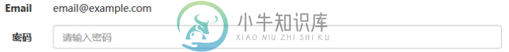
静态控件
当您需要在一个水平表单内的表单标签后放置纯文本时,请在 <p> 上使用 class .form-control-static。
<!DOCTYPE html>
<html>
<head>
<title>Bootstrap 实例 - 静态控件</title>
<link rel="stylesheet" href="http://apps.bdimg.com/libs/bootstrap/3.3.0/css/bootstrap.min.css">
<script src="http://apps.bdimg.com/libs/jquery/2.1.1/jquery.min.js"></script>
<script src="http://apps.bdimg.com/libs/bootstrap/3.3.0/js/bootstrap.min.js"></script>
</head>
<body>
<form class="form-horizontal" role="form">
<div class="form-group">
<label class="col-sm-2 control-label">Email</label>
<div class="col-sm-10">
<p class="form-control-static">email@example.com</p>
</div>
</div>
<div class="form-group">
<label for="inputPassword" class="col-sm-2 control-label">密码</label>
<div class="col-sm-10">
<input type="password" class="form-control" id="inputPassword"
placeholder="请输入密码">
</div>
</div>
</form>
</body>
</html>
结果如下所示:
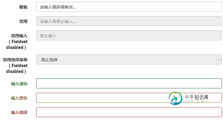
表单控件状态
除了 :focus 状态(即,用户点击 input 或使用 tab 键聚焦到 input 上),Bootstrap 还为禁用的输入框定义了样式,并提供了表单验证的 class。
输入框焦点
当输入框 input 接收到 :focus 时,输入框的轮廓会被移除,同时应用 box-shadow。
禁用的输入框 input
如果您想要禁用一个输入框 input,只需要简单地添加 disabled 属性,这不仅会禁用输入框,还会改变输入框的样式以及当鼠标的指针悬停在元素上时鼠标指针的样式。
禁用的字段集 fieldset
对 <fieldset> 添加 disabled 属性来禁用 <fieldset> 内的所有控件。
验证状态
Bootstrap 包含了错误、警告和成功消息的验证样式。只需要对父元素简单地添加适当的 class(.has-warning、 .has-error 或 .has-success)即可使用验证状态。
<!DOCTYPE html>
<html>
<head>
<title>Bootstrap 实例 - 表单控件状态</title>
<link rel="stylesheet" href="http://apps.bdimg.com/libs/bootstrap/3.3.0/css/bootstrap.min.css">
<script src="http://apps.bdimg.com/libs/jquery/2.1.1/jquery.min.js"></script>
<script src="http://apps.bdimg.com/libs/bootstrap/3.3.0/js/bootstrap.min.js"></script>
</head>
<body>
<form class="form-horizontal" role="form">
<div class="form-group">
<label class="col-sm-2 control-label">聚焦</label>
<div class="col-sm-10">
<input class="form-control" id="focusedInput" type="text"
value="该输入框获得焦点...">
</div>
</div>
<div class="form-group">
<label for="inputPassword" class="col-sm-2 control-label">
禁用
</label>
<div class="col-sm-10">
<input class="form-control" id="disabledInput" type="text"
placeholder="该输入框禁止输入..." disabled>
</div>
</div>
<fieldset disabled>
<div class="form-group">
<label for="disabledTextInput" class="col-sm-2 control-label">
禁用输入(Fieldset disabled)
</label>
<div class="col-sm-10">
<input type="text" id="disabledTextInput" class="form-control"
placeholder="禁止输入">
</div>
</div>
<div class="form-group">
<label for="disabledSelect" class="col-sm-2 control-label">
禁用选择菜单(Fieldset disabled)
</label>
<div class="col-sm-10">
<select id="disabledSelect" class="form-control">
<option>禁止选择</option>
</select>
</div>
</div>
</fieldset>
<div class="form-group has-success">
<label class="col-sm-2 control-label" for="inputSuccess">
输入成功
</label>
<div class="col-sm-10">
<input type="text" class="form-control" id="inputSuccess">
</div>
</div>
<div class="form-group has-warning">
<label class="col-sm-2 control-label" for="inputWarning">
输入警告
</label>
<div class="col-sm-10">
<input type="text" class="form-control" id="inputWarning">
</div>
</div>
<div class="form-group has-error">
<label class="col-sm-2 control-label" for="inputError">
输入错误
</label>
<div class="col-sm-10">
<input type="text" class="form-control" id="inputError">
</div>
</div>
</form>
</body>
</html>
结果如下所示:
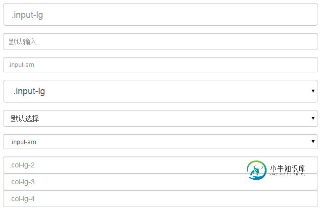
表单控件大小
可以分别使用 class .input-lg 和 .col-lg-* 来设置表单的高度和宽度。下面的实例演示了这点:
<!DOCTYPE html>
<html>
<head>
<title>Bootstrap 实例 - 表单控件大小</title>
<link rel="stylesheet" href="http://apps.bdimg.com/libs/bootstrap/3.3.0/css/bootstrap.min.css">
<script src="http://apps.bdimg.com/libs/jquery/2.1.1/jquery.min.js"></script>
<script src="http://apps.bdimg.com/libs/bootstrap/3.3.0/js/bootstrap.min.js"></script>
</head>
<body>
<form role="form">
<div class="form-group">
<input class="form-control input-lg" type="text"
placeholder=".input-lg">
</div>
<div class="form-group">
<input class="form-control" type="text" placeholder="默认输入">
</div>
<div class="form-group">
<input class="form-control input-sm" type="text"
placeholder=".input-sm">
</div>
<div class="form-group">
</div>
<div class="form-group">
<select class="form-control input-lg">
<option value="">.input-lg</option>
</select>
</div>
<div class="form-group">
<select class="form-control">
<option value="">默认选择</option>
</select>
</div>
<div class="form-group">
<select class="form-control input-sm">
<option value="">.input-sm</option>
</select>
</div>
<div class="row">
<div class="col-lg-2">
<input type="text" class="form-control" placeholder=".col-lg-2">
</div>
<div class="col-lg-3">
<input type="text" class="form-control" placeholder=".col-lg-3">
</div>
<div class="col-lg-4">
<input type="text" class="form-control" placeholder=".col-lg-4">
</div>
</div>
</form>
</body>
</html>
结果如下所示:
小牛知识库小编给大家推荐相关专题:
BootStrap组件操作技巧
Bootstrap 相关知识汇总
以上就是bootstrap所支持的表单控件。大家都看明白了,有任何疑问欢迎给我留言,小编会及时回复大家的,同时也非常感谢大家对小牛知识库网站的支持
-
本文向大家介绍BootStrap 智能表单实战系列(二)BootStrap支持的类型简介,包括了BootStrap 智能表单实战系列(二)BootStrap支持的类型简介的使用技巧和注意事项,需要的朋友参考一下 什么是 Bootstrap? Bootstrap 是一个用于快速开发 Web 应用程序和网站的前端框架。Bootstrap 是基于 HTML、CSS、JAVASCRIPT 的。 历史 Bo
-
本文向大家介绍BootStrap智能表单实战系列(七)验证的支持,包括了BootStrap智能表单实战系列(七)验证的支持的使用技巧和注意事项,需要的朋友参考一下 但凡是涉及到用户编辑信息然后保存的页面,都涉及到一个数据是否符合要求的检查,需要客服端和服务器端的校验的问题; 客服端的校验主要是为了提高用户体验,而服务器端的校验为了数据的合格性 该插件也为您支持到了表单验证,在需要验证的列的配置中加
-
本文向大家介绍BootStrap智能表单实战系列(九)表单图片上传的支持,包括了BootStrap智能表单实战系列(九)表单图片上传的支持的使用技巧和注意事项,需要的朋友参考一下 什么是 Bootstrap? Bootstrap 是一个用于快速开发 Web 应用程序和网站的前端框架。Bootstrap 是基于 HTML、CSS、JAVASCRIPT 的。 历史 Bootstrap 是由 Twitt
-
本文向大家介绍BootStrap智能表单demo示例详解,包括了BootStrap智能表单demo示例详解的使用技巧和注意事项,需要的朋友参考一下 1.基本配置,支持的元素类型 2.自动布局 3.自定义布局 4.自定义表单 5.数据绑定 6.带验证的表单 7、智能搜索 8、级联下拉 9、图片上传 图片有点大了,屏幕不够大的话可能看的不习惯,没事 后面我截图的实际尽量弄小点O(∩_∩)O~~ 接下来
-
本文向大家介绍Bootstrap表单组件教程详解,包括了Bootstrap表单组件教程详解的使用技巧和注意事项,需要的朋友参考一下 表单常见的元素主要包括:文本输入框、下拉选择框、单选框、复选框、文本域、按钮等。下面是不同的bootstrap版本: LESS: forms.less SASS: _forms.scss bootstrap仅对表单内的fieldset、legend、label标签进行
-
本文向大家介绍bootstrap table实例详解,包括了bootstrap table实例详解的使用技巧和注意事项,需要的朋友参考一下 废话不多说了,直接给大家贴代码了,具体代码如下所示: 以上所述是小编给大家介绍的bootstrap table实例详解,希望对大家有所帮助,如果大家有任何疑问请给我留言,小编会及时回复大家的。在此也非常感谢大家对呐喊教程网站的支持!