
如何使flexbox布局占据100%的垂直空间?

如何判断flexbox布局行占用浏览器窗口中剩余的垂直空间?
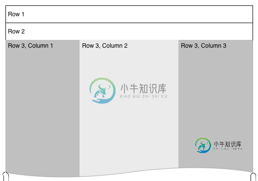
我有一个3排的flexbox布局。前两行是固定高度,但第三行是动态的,我希望它能增长到浏览器的全高度。
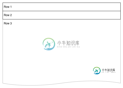
我在第3行中有另一个flexbox,它创建了一组列。为了正确调整这些列中的元素,我需要它们了解浏览器的全部高度——比如背景颜色和底部的项对齐。主要布局最终将类似于此:
.vwrapper {
    display: flex;
    flex-direction: column;
    flex-wrap: nowrap;
    justify-content: flex-start;
    align-items: stretch;
    align-content: stretch;
    //height: 1000px;
}
.vwrapper #row1 {
    background-color: red;
}
.vwrapper #row2 {
    background-color: blue;
}
.vwrapper #row3 {
    background-color: green;
    flex 1 1 auto;
    display: flex;
}
.vwrapper #row3 #col1 {
    background-color: yellow;
    flex 0 0 240px;
}
.vwrapper #row3 #col2 {
    background-color: orange;
    flex 1 1;
}
.vwrapper #row3 #col3 {
    background-color: purple;
    flex 0 0 240px;
}
<body>
<div class="vwrapper">
<div id="row1">
this is the header
</div>
<div id="row2">
this is the second line
</div>
<div id="row3">
<div id="col1">
col1
</div>
<div id="col2">
col2
</div>
<div id="col3">
col3
</div>
</div>
</div>
</body>我尝试添加了一个height属性,当我将其设置为硬数字时,该属性确实有效,但当我将其设置为100%时,该属性无效。我知道height:100%不起作用,因为内容没有填满浏览器窗口,但是我可以使用flexbox布局复制这个想法吗?
共有3个答案

让我告诉你另一种100%有效的方法。我还将为示例添加一些填充。
<div class = "container">
  <div class = "flex-pad-x">
    <div class = "flex-pad-y">
      <div class = "flex-pad-y">
        <div class = "flex-grow-y">
         Content Centered
        </div>
      </div>
    </div>
  </div>
</div>

.container {
  position: fixed;
  top: 0px;
  left: 0px;
  bottom: 0px;
  right: 0px;
  width: 100%;
  height: 100%;
}

  .flex-pad-x {
    padding: 0px 20px;
    height: 100%;
    display: flex;
  }

  .flex-pad-y {
    padding: 20px 0px;
    width: 100%;
    display: flex;
    flex-direction: column;
  }

  .flex-grow-y {
    flex-grow: 1;
    display: flex;
    justify-content: center;
    align-items: center;
    flex-direction: column;
   }
正如您所看到的,我们可以在使用flex grow的同时使用一些包装来实现这一点
1:当父“伸缩-方向”是“行”时,它的子“伸缩-生长”水平工作。2:当父“伸缩方向”是“列”时,它的子“伸缩-生长”垂直工作。
希望这有帮助
丹尼尔

将包装设置为高度100%
.vwrapper {
  display: flex;
  flex-direction: column;

  flex-wrap: nowrap;
  justify-content: flex-start;
  align-items: stretch;
  align-content: stretch;

  height: 100%;
}
并将第三行设置为flex grow
#row3 {
   background-color: green;
   flex: 1 1 auto;
   display: flex;
}
演示

您应该设置html,body的height。将包装到100%(以便继承完整高度),然后只需将大于1的flex值设置为。第3行而不是其他行。
.wrapper, html, body {
    height: 100%;
    margin: 0;
}
.wrapper {
    display: flex;
    flex-direction: column;
}
#row1 {
    background-color: red;
}
#row2 {
    background-color: blue;
}
#row3 {
    background-color: green;
    flex:2;
    display: flex;
}
#col1 {
    background-color: yellow;
    flex: 0 0 240px;
    min-height: 100%;/* chrome needed it a question time , not anymore */
}
#col2 {
    background-color: orange;
    flex: 1 1;
    min-height: 100%;/* chrome needed it a question time , not anymore */
}
#col3 {
    background-color: purple;
    flex: 0 0 240px;
    min-height: 100%;/* chrome needed it a question time , not anymore */
}
<div class="wrapper">
<div id="row1">this is the header</div>
<div id="row2">this is the second line</div>
<div id="row3">
<div id="col1">col1</div>
<div id="col2">col2</div>
<div id="col3">col3</div>
</div>
</div>
-
对于比较复杂的表单,要填写的内容相对较多,采用水平布局显然不合适。因此,垂直布局的表单更加常用。垂直对齐的表单中,标签和输入框可以使用三种对齐方式,包括顶对齐、左对齐和右对齐。 顶对齐可以缩短用户填写表单的时间,由于标签和输入框非常靠近,处理起来毫不费力,用户只需顺着表单向下移动,就可完成整个表单。如图 7‑22 所示: 图7-22 顶对齐的表单 但是,顶对齐的标签会占用额外的垂直空间。因此,如果
-
我想使用flexbox来垂直对齐 中的一些内容,但没有取得很大的成功。 我在网上查了一下,很多教程实际上都使用了包装器div,它从父级的flex设置中获得,但我想知道是否可以去掉这个附加元素? 我选择在此实例中使用flexbox,因为列表项高度将是动态的。 null null
-
在 React Native 中使用 flexbox 规则来指定某个组件的子元素的布局。 flexbox 可以在不同屏幕尺寸上提供一致的布局结构。 一般来说,使用 flexDirection、alignItems 和 justifyContent 三个样式属性就已经能满足大多数布局需求。 React Native 中的 flexbox 的工作原理和 web 上的 css 基本一致,当然也有差异。首
-
我没有试图将任何视图居中,因为我的问题是,我有一条分界线应该从中间向下。为了做分割线,我做了一个LinearLayout并给它一个背景色。但是,两侧还有其他LinearLayouts。 你大概可以看出中间的LinearLayout就是构成线条的那个。我已经改变了很多android:layout_width值,也改变了很多android:gravity和android:layout_gravity值
-
当使用垂直对齐的BoxLayout时,如何阻止组件随着包含JFrame的增长而扩展,从而在底部留下额外的空间?Ive尝试了不同的布局,但很快就变得凌乱了。Ive还尝试在面板底部添加胶水,但是布局管理器将胶水处理成另一个空的JPanel,仍然导致所有组件增长。有什么建议吗?
-
我有一个问题,我假设将是一个相对简单的CSS布局。 我想要。。。 底部的页脚(固定高度) 左侧的导航条(固定宽度) 右侧的外部内容窗格(动态大小) 在内容窗格中。。。 顶部的缎带(固定高度) 内部内容div(动态大小) 我正在尝试使用flexbox来实现这一点,因为它似乎是目前最好的选择(网格太不稳定,并且没有得到很好的支持)。 问题是,我的内部内容div(实际上)在外部内容div中有好几层。这意