
Matplotlib中的内联标签

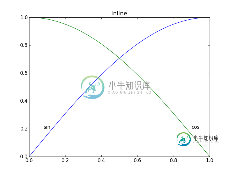
在Matplotlib中,创建图例并不太困难(example\u legend(),如下),但我认为最好将标签放在正在绘制的曲线上(如下面的example\u inline())。这可能非常棘手,因为我必须手动指定坐标,而且,如果我重新格式化绘图,我可能必须重新定位标签。有没有办法在Matplotlib中自动在曲线上生成标签?能够以与曲线角度相对应的角度确定文本方向的额外点数。
import numpy as np
import matplotlib.pyplot as plt
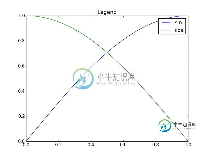
def example_legend():
plt.clf()
x = np.linspace(0, 1, 101)
y1 = np.sin(x * np.pi / 2)
y2 = np.cos(x * np.pi / 2)
plt.plot(x, y1, label='sin')
plt.plot(x, y2, label='cos')
plt.legend()
def example_inline():
    plt.clf()
    x = np.linspace(0, 1, 101)
    y1 = np.sin(x * np.pi / 2)
    y2 = np.cos(x * np.pi / 2)
    plt.plot(x, y1, label='sin')
    plt.plot(x, y2, label='cos')
    plt.text(0.08, 0.2, 'sin')
    plt.text(0.9, 0.2, 'cos')
共有3个答案

好问题,不久前我用它做了一点实验,但没有用太多,因为它仍然不是防弹的。我将绘图区域划分为32x32网格,并根据以下规则计算每条线标签最佳位置的“势场”:
- 空白处是放置标签的好地方
代码是这样的:
import matplotlib.pyplot as plt
import numpy as np
from scipy import ndimage


def my_legend(axis = None):

    if axis == None:
        axis = plt.gca()

    N = 32
    Nlines = len(axis.lines)
    print Nlines

    xmin, xmax = axis.get_xlim()
    ymin, ymax = axis.get_ylim()

    # the 'point of presence' matrix
    pop = np.zeros((Nlines, N, N), dtype=np.float)

    for l in range(Nlines):
        # get xy data and scale it to the NxN squares
        xy = axis.lines[l].get_xydata()
        xy = (xy - [xmin,ymin]) / ([xmax-xmin, ymax-ymin]) * N
        xy = xy.astype(np.int32)
        # mask stuff outside plot
        mask = (xy[:,0] >= 0) & (xy[:,0] < N) & (xy[:,1] >= 0) & (xy[:,1] < N)
        xy = xy[mask]
        # add to pop
        for p in xy:
            pop[l][tuple(p)] = 1.0

    # find whitespace, nice place for labels
    ws = 1.0 - (np.sum(pop, axis=0) > 0) * 1.0
    # don't use the borders
    ws[:,0]   = 0
    ws[:,N-1] = 0
    ws[0,:]   = 0
    ws[N-1,:] = 0

    # blur the pop's
    for l in range(Nlines):
        pop[l] = ndimage.gaussian_filter(pop[l], sigma=N/5)

    for l in range(Nlines):
        # positive weights for current line, negative weight for others....
        w = -0.3 * np.ones(Nlines, dtype=np.float)
        w[l] = 0.5

        # calculate a field
        p = ws + np.sum(w[:, np.newaxis, np.newaxis] * pop, axis=0)
        plt.figure()
        plt.imshow(p, interpolation='nearest')
        plt.title(axis.lines[l].get_label())

        pos = np.argmax(p)  # note, argmax flattens the array first
        best_x, best_y =  (pos / N, pos % N)
        x = xmin + (xmax-xmin) * best_x / N
        y = ymin + (ymax-ymin) * best_y / N


        axis.text(x, y, axis.lines[l].get_label(),
                  horizontalalignment='center',
                  verticalalignment='center')


plt.close('all')

x = np.linspace(0, 1, 101)
y1 = np.sin(x * np.pi / 2)
y2 = np.cos(x * np.pi / 2)
y3 = x * x
plt.plot(x, y1, 'b', label='blue')
plt.plot(x, y2, 'r', label='red')
plt.plot(x, y3, 'g', label='green')
my_legend()
plt.show()

@Jan Kuiken的回答当然是深思熟虑的,但也有一些警告:
- 它并非在所有情况下都有效
- 它需要相当数量的额外代码
- 从一个地块到下一个地块可能会有很大的差异
一种更简单的方法是注释每个绘图的最后一点。为了强调,该点也可以圈出圆圈。这可以通过一个额外的行来完成:
import matplotlib.pyplot as plt

for i, (x, y) in enumerate(samples):
    plt.plot(x, y)
    plt.text(x[-1], y[-1], f'sample {i}')
一种变体是使用方法matplotlib。斧头。斧头。注释。

更新:用户cphyc已经为这个答案中的代码创建了一个Github存储库(参见这里),并将代码捆绑到一个包中,该包可以使用pip install matplotlib label lines安装。
美丽的图画:
在matplotlib中,很容易为等高线图添加标签(自动或通过单击鼠标手动放置标签)。似乎还没有任何等效的功能以这种方式标记数据系列!可能有一些语义上的原因不包括我所缺少的这个特性。
不管怎样,我已经编写了以下模块,该模块采用任何允许半自动打印标签的参数。它只需要numpy和标准math库中的几个函数。
labelLines函数的默认行为是沿着x轴均匀地间隔标签(当然会自动放置在正确的y-值处)。如果需要,您可以传递每个标签的x坐标数组。您甚至可以调整一个标签的位置(如右下角图所示),如果您愿意,可以均匀地间隔其余标签。
此外,label\u line功能不考虑在plot命令中未指定标签的行(或者更准确地说,如果标签包含“line”)。
传递给labelLine或labelLine的关键字参数传递给text函数调用(如果调用代码选择不指定,则设置一些关键字参数)。
- 注释边界框有时会不希望地干扰其他曲线。如左上图中的
1和10注释所示。我甚至不确定这是否可以避免。 - 有时指定一个
y位置会更好。 - 在正确的位置获取注释仍然是一个迭代过程
- 只有当
x-轴值为浮动s 时才起作用
- 默认情况下,
labelLines函数假定所有数据系列跨越轴限制指定的范围。看看这张漂亮照片左上角的蓝色曲线。如果只有x范围0.5-1的数据可用,那么我们不可能在所需位置放置标签(略小于0.2)。请看这个问题,了解一个特别讨厌的例子。现在,代码没有智能地识别这个场景并重新安排标签,但是有一个合理的解决方法。labelLines函数采用xvals参数;用户指定的x-值列表,而不是整个宽度的默认线性分布。因此,用户可以决定用于每个数据系列的标签放置的x-值
此外,我相信这是完成奖金目标的第一个答案,即将标签与它们所在的曲线对齐。:)
给线贴上标签。py:
from math import atan2,degrees
import numpy as np

#Label line with line2D label data
def labelLine(line,x,label=None,align=True,**kwargs):

    ax = line.axes
    xdata = line.get_xdata()
    ydata = line.get_ydata()

    if (x < xdata[0]) or (x > xdata[-1]):
        print('x label location is outside data range!')
        return

    #Find corresponding y co-ordinate and angle of the line
    ip = 1
    for i in range(len(xdata)):
        if x < xdata[i]:
            ip = i
            break

    y = ydata[ip-1] + (ydata[ip]-ydata[ip-1])*(x-xdata[ip-1])/(xdata[ip]-xdata[ip-1])

    if not label:
        label = line.get_label()

    if align:
        #Compute the slope
        dx = xdata[ip] - xdata[ip-1]
        dy = ydata[ip] - ydata[ip-1]
        ang = degrees(atan2(dy,dx))

        #Transform to screen co-ordinates
        pt = np.array([x,y]).reshape((1,2))
        trans_angle = ax.transData.transform_angles(np.array((ang,)),pt)[0]

    else:
        trans_angle = 0

    #Set a bunch of keyword arguments
    if 'color' not in kwargs:
        kwargs['color'] = line.get_color()

    if ('horizontalalignment' not in kwargs) and ('ha' not in kwargs):
        kwargs['ha'] = 'center'

    if ('verticalalignment' not in kwargs) and ('va' not in kwargs):
        kwargs['va'] = 'center'

    if 'backgroundcolor' not in kwargs:
        kwargs['backgroundcolor'] = ax.get_facecolor()

    if 'clip_on' not in kwargs:
        kwargs['clip_on'] = True

    if 'zorder' not in kwargs:
        kwargs['zorder'] = 2.5

    ax.text(x,y,label,rotation=trans_angle,**kwargs)

def labelLines(lines,align=True,xvals=None,**kwargs):

    ax = lines[0].axes
    labLines = []
    labels = []

    #Take only the lines which have labels other than the default ones
    for line in lines:
        label = line.get_label()
        if "_line" not in label:
            labLines.append(line)
            labels.append(label)

    if xvals is None:
        xmin,xmax = ax.get_xlim()
        xvals = np.linspace(xmin,xmax,len(labLines)+2)[1:-1]

    for line,x,label in zip(labLines,xvals,labels):
        labelLine(line,x,label,align,**kwargs)
生成上面漂亮图片的测试代码:
from matplotlib import pyplot as plt
from scipy.stats import loglaplace,chi2

from labellines import *

X = np.linspace(0,1,500)
A = [1,2,5,10,20]
funcs = [np.arctan,np.sin,loglaplace(4).pdf,chi2(5).pdf]

plt.subplot(221)
for a in A:
    plt.plot(X,np.arctan(a*X),label=str(a))

labelLines(plt.gca().get_lines(),zorder=2.5)

plt.subplot(222)
for a in A:
    plt.plot(X,np.sin(a*X),label=str(a))

labelLines(plt.gca().get_lines(),align=False,fontsize=14)

plt.subplot(223)
for a in A:
    plt.plot(X,loglaplace(4).pdf(a*X),label=str(a))

xvals = [0.8,0.55,0.22,0.104,0.045]
labelLines(plt.gca().get_lines(),align=False,xvals=xvals,color='k')

plt.subplot(224)
for a in A:
    plt.plot(X,chi2(5).pdf(a*X),label=str(a))

lines = plt.gca().get_lines()
l1=lines[-1]
labelLine(l1,0.6,label=r'$Re=${}'.format(l1.get_label()),ha='left',va='bottom',align = False)
labelLines(lines[:-1],align=False)

plt.show()
-
到底有什么用处?
-
有许多资源可以解释为什么需要内联显示图。例如%matplotlib内联的目的。然而,我觉得如果我们在你的木星笔记本中使用更高版本的IPython,那就没有必要了。这是因为我可以显示内联或不运行(每次我重启我的内核,我使用的IPython版本是7.17.0)。我的预感是,对于最近的版本,内联后端可能是默认激活的。 当我运行检查新会话上的当前后端时,它会显示Qt5Agg。运行后,当我通过运行再次检查时
-
Sphinx 使用文本解释角色在文档中插入语义标签. 这样写 :rolename:`content`. Note 默认角色 (`content`) 并不特别. 可使用任何其他有效的名字来代替; 使用 :confval:`default_role` 设置. 由主域添加的角色请参考 Sphinx Domains . 交叉索引的语法 多数文本解释角色都会产生交叉索引. 需要写一个 :role:`targ
-
问题内容: 每次启动IPython Notebook时,我运行的第一个命令是 有什么方法可以更改我的配置文件,以便在启动IPython时自动处于此模式? 问题答案: IPython的配置文件位于。默认配置文件称为。在此文件夹中,有两个主要配置文件: 将matplotlib的内联选项添加到: matplotlib与pylab 不鼓励使用inline进行绘图。 它将各种不需要的杂项引入您的名称空间。
-
概述 JSDoc支持两种不同类型的标签: 块标签, 这是在一个JSDoc注释的最高级别。 内联标签, 块标签文本中的标签或说明。 块标签通常会提供有关您的代码的详细信息,如一个函数接受的参数。内联标签通常链接到文件的其他部分,类似于HTML中的锚标记(<a>)。 块标签总是以 at 符号(@)开头。除了JSDoc注释中最后一个块标记,每个块标签后面必须跟一个换行符。 内联标签也以 at 符号(@)
-
我有以下图表,由几行组成: 现在,我想标记绘图中的所有线条。但是,使用将所有标签塞入一个框中,这使得绘图有点难以解释。我想改为使用内联标签。我的理想输出将使用类似以下matplotlib等高线图的标签,但文字标签用于线而不是数字: 在matplotlib文档中,我还没有找到如何做到这一点。有没有办法做到这一点?如果没有,我可以使用什么其他软件生成这种类型的绘图?