
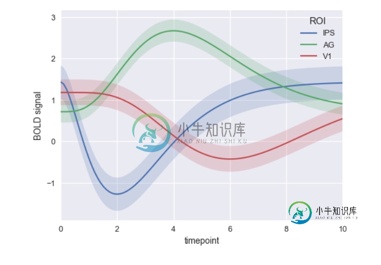
情节:如何制作多条线和阴影区域的图形以显示标准偏差?

如何使用Plotly生成带有阴影标准偏差的折线图?我正在尝试实现类似于seaborn.tsplot的功能。任何帮助表示赞赏。
问题答案:
对于pandas数据框中的列数,以下方法完全灵活,并使用plotly的默认颜色周期。如果行数超过颜色数,将从一开始就重新使用颜色。截至目前px.colors.qualitative.Plotly,您可以使用px.colors.qualitative以下任何十六进制颜色序列替换:
Alphabet = ['#AA0DFE', '#3283FE', '#85660D', '#782AB6', '#565656', '#1...
Alphabet_r = ['#FA0087', '#FBE426', '#B00068', '#FC1CBF', '#C075A6', '...
[...]
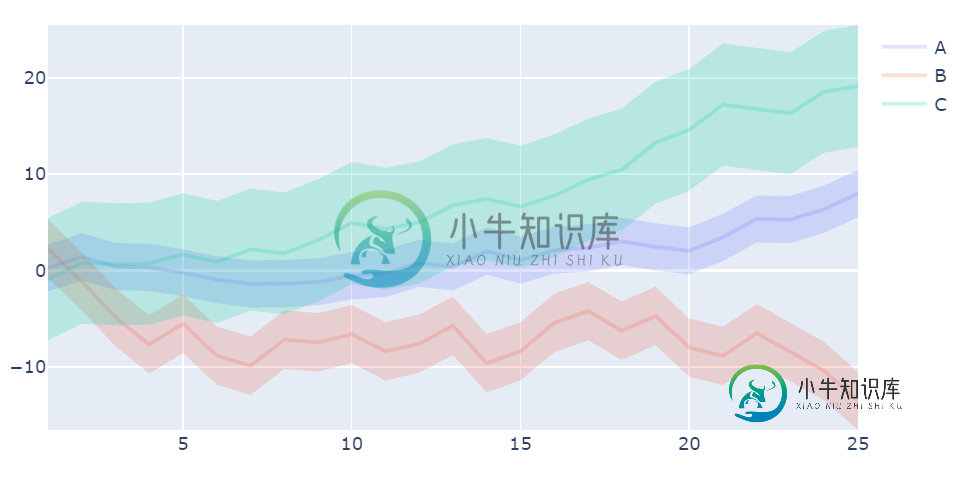
完整的代码:
# imports
import plotly.graph_objs as go
import plotly.express as px
import pandas as pd
import numpy as np

# sample data in a pandas dataframe
np.random.seed(1)
df=pd.DataFrame(dict(A=np.random.uniform(low=-1, high=2, size=25).tolist(),
                    B=np.random.uniform(low=-4, high=3, size=25).tolist(),
                    C=np.random.uniform(low=-1, high=3, size=25).tolist(),
                    ))
df = df.cumsum()

# define colors as a list
colors = px.colors.qualitative.Plotly

# convert plotly hex colors to rgba to enable transparency adjustments
def hex_rgba(hex, transparency):
    col_hex = hex.lstrip('#')
    col_rgb = list(int(col_hex[i:i+2], 16) for i in (0, 2, 4))
    col_rgb.extend([transparency])
    areacol = tuple(col_rgb)
    return areacol

rgba = [hex_rgba(c, transparency=0.2) for c in colors]
colCycle = ['rgba'+str(elem) for elem in rgba]

# Make sure the colors run in cycles if there are more lines than colors
def next_col(cols):
    while True:
        for col in cols:
            yield col
line_color=next_col(cols=colCycle)

# plotly  figure
fig = go.Figure()

# add line and shaded area for each series and standards deviation
for i, col in enumerate(df):
    new_col = next(line_color)
    x = list(df.index.values+1)
    y1 = df[col]
    y1_upper = [(y + np.std(df[col])) for y in df[col]]
    y1_lower = [(y - np.std(df[col])) for y in df[col]]
    y1_lower = y1_lower[::-1]

    # standard deviation area
    fig.add_traces(go.Scatter(x=x+x[::-1],
                                y=y1_upper+y1_lower,
                                fill='tozerox',
                                fillcolor=new_col,
                                line=dict(color='rgba(255,255,255,0)'),
                                showlegend=False,
                                name=col))

    # line trace
    fig.add_traces(go.Scatter(x=x,
                              y=y1,
                              line=dict(color=new_col, width=2.5),
                              mode='lines',
                              name=col)
                                )
# set x-axis
fig.update_layout(xaxis=dict(range=[1,len(df)]))

fig.show()
-
线形图,区域图和条形图允许您在 X/Y 轴上绘制数据。 首先,您需要选择定义值轴的 指标 。 指标聚合: Count 计数 聚合返回所选索引模式中元素的原始计数。 Average 该聚合返回数字字段的平均值 。从下拉菜单中选择一个字段。 Sum 总和 聚合返回数字字段的总和。从下拉菜单中选择一个字段。 Min 最小值 聚合返回数字字段的最小值。从下拉菜单中选择一个字段。 Max 最大值 聚合返回数
-
问题内容: 我想使用matplotlib来说明两个区域之间的定积分:x_0和x_1。 给定以下图,如何在matplotlib中的曲线下的阴影区域从x = -1到x = 1着色 问题答案: 结帐。这是有关填充受约束区域的示例。
-
我有一个这样的数据帧: 现在,我想绘制水平条形图,其中平台名称位于相应的条形图中,使其看起来像这样: 我该怎么做?
-
我正在使用组合图绘制堆叠条形图,并在其上绘制折线图。当我将条形阴影设置为true时,一些条形被隐藏。这是我将条形阴影设置为true的代码。 我得到了下面的图表 条形阴影设置为false的相同代码 生成以下图表,其中条形图如预期的那样正确。 我在这里有什么不正常的事吗? 如果这是一个我希望不是的错误,我可以使用网格线实现条形阴影吗? 尽管如此,伟大的图书馆。
-
问题内容: 我有一种情况,我需要在堆叠的多条形图-nvd3图中显示每个堆栈的值,因为我们可以在离散值-nvd3图中显示值。 我了解,“ showvalue”用于离散条形控制器中,是否可以在堆叠图中使用,如果没有,请提出替代解决方案。 提前致谢 问题答案: 目前不可能。该选项仅在离散条形图中可用。 从维护者处: 我们没有这种能力。堆叠/分组图表还具有复杂的动画,因此这很棘手。我们改用工具提示。 来源
-
我在网上搜索的第二天,虽然我发现了很多点击似乎应该有效,但没有一个似乎适用于我的特殊情况。 我有一个Excel图表,显示了两个系列。一个是指数衰减曲线,一个是与指数曲线相交的常数,但不继续超过它(估计橙色线的最后x值使其看起来像与蓝色曲线相交): 蓝色曲线的原始数据如下(出于保密原因,删除了数据标签,但x值在左边,y值在右边): 这就是我需要解决的问题:我需要用一种颜色填充蓝色曲线下面的所有区域,