
样式与UI美化
我们的前端样式实在是太丑了,让我们想办法来美化一下它们吧——这时候我们就需要一个前端框架来帮助我们做这件事。这里的前端框架并不是指那种MV*框架,而是UI框架。
响应式设计
考虑到易学程度,以其响应式设计的问题,我们决定用Bootstrap来作为这里的前端框架。Bootstrap是Twitter推出的一个用于前 端开发的开源工具包,似乎也是当前“最受欢迎”的前端框架。它提供了全面、美观的文档。你能在这里找到关于 HTML 元素、HTML 和 CSS 组件、jQuery 插件方面的所有详细文档。并且我们能在 Bootstrap 的帮助下通过同一份代码快速、有效适配手机、平板、PC 设备。
它是一个支持响应式设计的框架,即页面的设计与开发应当根据用户行为以及设备环境(系统平台、屏幕尺寸、屏幕定向等)进行相应的响应和调整。如下图所示:
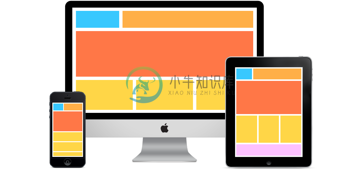
我们在不同的设计上看到的是不同的布局,这会依据我们的设备大小做出调整——使用媒体查询(media queries)实现。
引入前端框架
下好Bootstrap,将里面的内容复制到static/目录,如下所示:
.
├── css
│   ├── bootstrap-theme.css
│   ├── bootstrap-theme.css.map
│   ├── bootstrap-theme.min.css
│   ├── bootstrap-theme.min.css.map
│   ├── bootstrap.css
│   ├── bootstrap.css.map
│   ├── bootstrap.min.css
│   ├── bootstrap.min.css.map
│   └── styles.css
├── fonts
│   ├── glyphicons-halflings-regular.eot
│   ├── glyphicons-halflings-regular.svg
│   ├── glyphicons-halflings-regular.ttf
│   ├── glyphicons-halflings-regular.woff
│   └── glyphicons-halflings-regular.woff2
└── js
    ├── bootstrap.js
    ├── bootstrap.min.js
    └── npm.js
它包含了JavaScript、CSS还有字体,需要注意的一点是bootstrap依赖于jquery。因此,我们需要下载jquery并放到这个目录里。然后在我们的head里引入这些css
<head>
    <title>{% block head_title %}Welcome to my blog{% endblock %}</title>
    <link rel="stylesheet" type="text/css" href="{% static 'css/bootstrap.min.css' %}">
</head>
在我们的body结尾的地方:
<script src="{% static 'js/jquery.min.js' %}"></script>
<script src="{% static 'js/bootstrap.min.js' %}"></script>
</body>
</html>
在这里,将Script放在body的尾部有利于用户打开页面的速度。而对于一些纯前端的框架来说,它们就需要放在页面开始的地方。
页面美化
现在,我们就可以创建一个导航了。
添加导航
根据Bootstrap的官方文档的Demo,我们可以创建对应的导航。
<header class="navbar navbar-static-top bs-docs-nav" id="top" role="banner">
<div class="container">
<div class="navbar-header">
<button class="navbar-toggle collapsed" type="button" data-toggle="collapse"
data-target=".bs-navbar-collapse">
<span class="sr-only">切换视图</span>
<span class="icon-bar"></span>
<span class="icon-bar"></span>
<span class="icon-bar"></span>
</button>
<a href="/" class="navbar-brand">Growth博客</a>
</div>
<nav class="collapse navbar-collapse bs-navbar-collapse" role="navigation">
<ul class="nav navbar-nav">
<li>
<a href="/pages/about/">关于我</a>
</li>
<li>
<a href="/pages/resume/">简历</a>
</li>
</ul>
<ul class="nav navbar-nav navbar-right">
<li><a href="/admin" id="loginLink">登入</a></li>
</ul>
</nav>
</div>
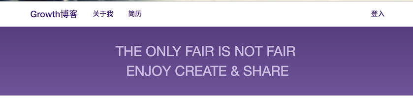
</header>它在桌面下的效果大致如下图所示:
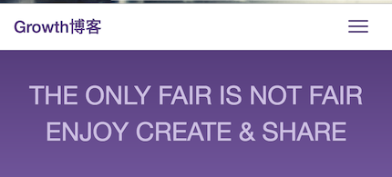
而在移动浏览器下则是这样的效果:
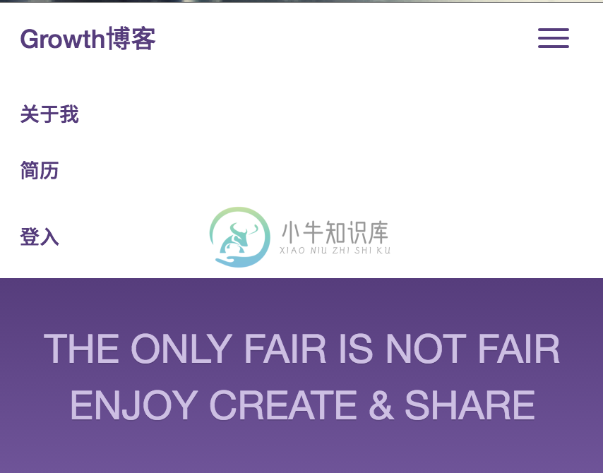
当我们点击右上角的菜单按钮时,会出现我们的菜单
添加标语
接着,我们可以快速的创建一个标语:
<main class="bs-docs-masthead" role="main">
    <div class="container">
        <div>
            THE ONLY FAIR IS NOT FAIR <br>
            ENJOY CREATE & SHARE
        </div>
    </div>
</main>
这里的代码都比较简单,我想也不需要太多的解释。
优化列表
接着,我们可以简单的对首页的博客列表做一个优化,方法比较简单:
- 为博客列表添加一个
row的class,表示它可以滚动 - 在每一篇博客里添加
col-sm-4的class,在不同的大小下会有不同的布局
代码如下所示:
{% extends 'base.html' %}
{% block title %}Welcome to my blog{% endblock %}
{% block content %}
<h2>博客</h2>
<div class="row">
{% if posts %}
{% for post in posts %}
<div class="col-sm-4">
<h2><a href="{{ post.get_absolute_url }}">{{ post.title }}</a></h2>
{{post.body | slice:":80"}}
{{post.posted}} - By {{post.author}}
</div>
{% endfor %}
{% else %}
<p>There are no posts.</p>
{% endif %}
</div>
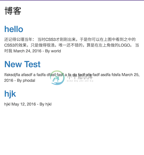
{% endblock %}它在桌面和自动设备上的效果如下图所示:

添加footer
最后,我们可以在页面的最下方添加一个footer,来做一些版权声明:
<footer class="footer">
    <div class="container">
        <p class="text-muted">@Copyright Phodal.com</p>
    </div>
</footer>
它拥有一些简单的样式,来将footer固定在页面的最下方:
.footer {
  position: absolute;
  bottom: 0;
  width: 100%;
  /* Set the fixed height of the footer here */
  height: 60px;
  background-color: #f5f5f5;
}
.footer .container {
  width: auto;
  max-width: 680px;
  padding: 0 15px;
}

.footer .container .text-muted {
  margin: 20px 0;
}