Tips and Tricks for Writing Scientific Papers
Table of contents
- Tips and Tricks for Writing Scientific Papers
- Typesetting your paper
- Mathematical notation
- Bibliography
- Creating figures
- Useful resources
What is this?
This repository contains a list of tools, best practices, tips and other guidelines we found useful/important when writing scientific papers.Some are a matter of style (we tend to follow the guidelines of the Chicago Manual of Style), and we are well aware that other people prefer to do things differently, but we list them anyway to have a consistent guide.Feel free to adapt, change, ignore, or even challenge everything we write!
Typesetting your paper
Typesetting is the composition of text by means of arranging the types, i.e., letters and symbols.It is mostly a question of a aesthetics, but beautiful typography makes documents easier and more pleasant to read, helping the reader to get to the message.
We list below some typesetting tips and tools to help you when composing your documents.Some tips are specific to LaTeX, but others apply regardless of what you are using.
One sentence per line
When writing LaTeX documents, put one sentence per line in your source file.Write:
This is my first sentence.
This is the second one.
and not:
This is my first sentence. This is the second one.
The main reason for this is source control and collaboration: when looking at the changes of a commit, it is much easier to identify what sentence was changed if they are each on their separate line.Your coworkers will thus be able to see the changes more easily.
Another benefit is that you will be able to better identify errors when only given a line number by our LaTeX compiler.
Capitalization
We will refer below to two types of capitalization:
- sentence format : The title of the nice book
- title format: The Title of the Nice Book
Use title format for all section, subsection, etc. titles. In order to help you capitalize the right words, there's a handy website: capitalizemytitle.com.
Tables
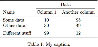
booktabs can help you produce clean and nice-looking tables.
\usepackage{booktabs}
% --
\begin{table}
	\centering
	\begin{tabular}{lcc}
		\toprule
		& \multicolumn{2}{c}{Data} \\ \cmidrule(lr){2-3}
		Name & Column 1 & Another column \\
		\midrule
		Some data & 10 & 95 \\
		Other data & 30 & 49 \\
		\addlinespace
		Different stuff & 99 & 12 \\
		\bottomrule
	\end{tabular}
	\caption{My caption.}
	\label{tab-label}
\end{table}
In general, avoid using vertical lines in your tables.Instead, if you want to group columns, do it in the headers using \cmidrule.You can also replace horizontal lines with spacing, using \addlinespace.
Column heads should use sentence-format capitalization (see http://www.chicagomanualofstyle.org/15/ch13/ch13_sec019.html).
You can find more advice on table formatting here: http://www.inf.ethz.ch/personal/markusp/teaching/guides/guide-tables.pdf.Here is a nice GIF that illustrates some of these rules:
Number formatting
Use the siunitx package to format all numbers, currencies, units, etc:
\usepackage{siunitx}
% ---
This thing costs \SI{123456}{\$}.
There are \num{987654} people in this room, \SI{38}{\percent} of which are male.
You can also use it to round numbers:
\usepackage{siunitx}
% ---
\sisetup{
	round-mode = places,
	round-precision = 3
}%
You can also round numbers, for example \num{1.23456}.
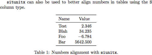
Finally, it can help you better align numbers in a table:
\usepackage{booktabs}
\usepackage{siunitx}
%---
\begin{table}
	\centering
	\begin{tabular}{lS}
		\toprule
		Name & {Value} \\ % headers of S columns have to be in {}
		\midrule
		Test & 2.3456 \\
		Blah & 34.2345 \\
		Foo & -6.7835 \\
		Bar & 5642.5 \\
		\bottomrule
	\end{tabular}
	\caption{Numbers alignment with \texttt{siunitx}.}
\end{table}
Mathematical notation
When writing equations, it is helpful to have a coherent and consistent way of writing variables, vectors, matrices, etc.It helps the reader identifying what you are talking about and remembering the semantics of each symbol.
Notation
We propose the following rules for writing math:
- lowercase italic for variables: x (
$x$) - lowercase italic bold for vectors: x (
$\mathbold{x}$) - uppercase italic bold for matrices: X (
$\mathbold{X}$) - uppercase italic for random variables: X (
$X$)
The \mathbold command comes from the fixmath package and is similar to \boldmath or \bm, except that all symbols are in italics, even greek letters (other packages do not italicize greek letters).
When adding indices or exponents to variables, make sure that you add them outside of the styling of the variable, i.e., write $\mathbold{x}_i$ and not $\mathbold{x_i}$.
Define custom commands
Because we often refer to variables, we suggest defining the following two commands:
\renewcommand{\vec}[1]{\mathbold{#1}}
\newcommand{\mat}[1]{\mathbold{#1}}
You can then use $\vec{x}$ and $\mat{X}$ in your document.If you decide to change the way you want to format matrices, you simply have to change the \mat command, and it will update the whole document.
We also suggest defining commands for the variables you use the most.For example, if you use \vec{x} and \mat{X} a lot, consider defining these commands:
\newcommand{\vx}{\vec{x}}
\newcommand{\vX}{\mat{X}}
You can then write more compact equations: $\vx^T \vy = \vZ$.
Use the correct notation for columns et elements
Note that you should always style the variables with respect to their type.For example, the $i$th element of a vector \vx is x_i and not \vx_i (it is a number).Similarly, if you have a matrix \vX, can call its ith column \vx_i (it is a vector, thus in bold) and one if its element x_{ij}, not \vX_i and \vX_{ij}.
Environments
Use \(...\) to write inline equations.You can also use $...$, but it is a TeX command and gives more obscure error messages.
To write centered equations on their own lines, do not $$...$$ (it is one of the deadly sins of LaTeX use).It works, but gives wrong spacing.Use \begin{equation*} or \begin{align*} instead.
Bibliography
Back references
For longer documents, such as a master or PhD thesis, it can be useful to have back references in the bibliography, to show where a reference was cited.To do so, simply add the option backref=page to the hyperref package:
\usepackage[backref=page]{hyperref}
You can customize the way the back references appear with the following commands:
\renewcommand*{\backref}[1]{}
\renewcommand*{\backrefalt}[4]{{\footnotesize [%
    \ifcase #1 Not cited.%
	\or Cited on page~#2%
	\else Cited on pages #2%
	\fi%
]}}
Creating figures
Figures are an important component to any paper, as they can communicate your results to the reader.You should consider what the information on each figure tells your reader, and that there is just enough information to support your message, not more.For example, if you want to show patterns in 2d points (there are two clusters well separated), it is unnecessary to put ticks and values on the axes (the scale does not really matter)?Figures should not be too complex. It is better to have several figures conveying one or two messages, (method A is better than B, but converges slower) than having one big messy figure.
One script per data-driven figure
Some figures are hand-made, e.g., to explain a system or give a global picture, whereas others are data-driven, i.e., illustrate some data.These data-driven figures should be scripted as much as possible: ideally, if your data changes, you should only have to run a script once to update your figure, without any other intervention (setting the view, zooming, saving/cropping the figure, etc).Similarly, if the data required to generate a figure takes more than seconds to be produced, you should have a first script that computes and saves the data, and a second script that plots it.This way, you will save a lot of time when working on the plot: you won't have to wait after each small change to the figure to see its effect.
We also recommend to save the command used to generate a figure in the LaTeX file, for example as a comment above the figure, especially if the script requires arguments.
\documentclass{article}

\usepackage{graphicx}

\begin{document}

% python figure_example.py --save ../../examples/figure/figure.eps
\begin{figure}
	\centering
	\includegraphics{figure.eps}
	\caption{Example of a sigmoid function}
\end{figure}

\end{document}
Python helper script
If possible, all figures should use the same fonts for their labels, axes, etc.In particular, you should not have one figure with big labels/ticks, and another with smaller ones.One solution to achieve this is to define the size of your figure in the script that generates it, and not rescale it in your document (e.g., do not change set the width of the figure to \textwidth in your LaTeX document).
To have consistent figures, we recommend using a helper script, similar to our plot_utils.py.Using this script, you simply have to call the figure_setup() function to define all the sizes, then create a figure of the size you want, and save it.
import argparse
import matplotlib.pyplot as plt
import numpy as np
import plot_utils as pu


def main(args):
    x = np.linspace(-6, 6, 200)
    y = 1/(1 + np.exp(-x))

    pu.figure_setup()

    fig_size = pu.get_fig_size(10, 5)
    fig = plt.figure(figsize=fig_size)
    ax = fig.add_subplot(111)

    ax.plot(x, y, c='b', lw=pu.plot_lw())

    ax.set_xlabel('$x$')
    ax.set_ylabel('$\\sigma(x)$')

    ax.set_axisbelow(True)

    plt.grid()
    plt.tight_layout()

    if args.save:
        pu.save_fig(fig, args.save)
    else:
        plt.show()


if __name__ == '__main__':
    parser = argparse.ArgumentParser()

    parser.add_argument('-s', '--save')

    args = parser.parse_args()
    main(args)
Figures format
We recommend saving all figures in the EPS format.This way, you can use both latex and pdflatex to generate your documents, and enjoy beautiful vector graphics and texts.
As of September 2015, on Mac OS X and with up-to-date versions of Python, Matplotlib and TeX Live, there is a loss of quality when printing figures that were directly saved as PDF from Matplotlib.It becomes clearly when printed on real paper; try it out for yourself.This is another reason to prefer saving Matplotlib-generated pictures in EPS.If you really want to keep only a PDF version of the figure, use the epspdf command line tool---the resulting PDF will be better than that directly produced by Matplotlib.
For completeness, note that there is another Matplotlib backend, PGF, that produces slightly superior results.However, as of September 2015, the resulting PDFs are twice as heavy as those obtained with the default backend and epspdf.
Matplotlib, even when using tight layout features, adds at times too much white space in the margins.A nifty command-line tool to crop a PDF to its tightest bounding box pdfcrop.
Rasterize parts of the figure
If you have many data points in your plot, the resulting EPS file might be very big.You could save your figure as a PNG file, but this would result in blurry texts.The solution is to rasterize parts of your figure, i.e., to tell matplotlib that the data points have to be rendered as a bitmap in the EPS file, while the rest is in vector format.
You can pass the rasterized=True keyword to most plotting fuctions in matplotlib.You can also use different layers using the zorder and tell matplotlib to rasterize all the layers below a given zorder using the set_rasterization_zorder() method of the axis.See figure_rasterized_example.py and http://matplotlib.org/examples/misc/rasterization_demo.html for examples of rasterization.
Useful resources
- Automatically capitalize your title: https://capitalizemytitle.com
- Chicago Manual of Style: http://www.chicagomanualofstyle.org
- Command-line check of weasel words, passive, etc: https://github.com/devd/Academic-Writing-Check
- An essential guide to LaTeX 2e usage: http://ctan.math.utah.edu/ctan/tex-archive/info/l2tabu/english/l2tabuen.pdf
-
matlab tips and tricks and ... page overview: I created this page as a vectorization helper but it grew to become my annotated Matlab reading cache. In order to motivate the DSP people out there, I am
-
Jupyter Notebook Tips and Tricks A few (hopefully) useful tips and tricks to using the Jupyter Notebook with an eye to pragmatic usage. This is not, in any way, an exhaustive demonstration of the feat
-
PyCharm在启动过程中包含各种提示,帮助用户了解其功能和操作。 它还包括一些必须理解的快捷方式。 在本章中,您将看到一些重要的PyCharm技巧。 将文件更改为特定的更改列表 本技巧说明如何根据用户的选择将文件更改为特定的更改列表。 这有助于根据版本控制系统设置管理存储库。 请观察以下屏幕截图以便更好地理解 - 显示class中所有用法的列表 此函数显示项目中特定类,方法或变量中包含的所有用法
-
Lightning Network Paper This is the Bitcoin Lightning Network paper. Paper PDF: http://lightning.network/lightning-network-paper.pdf #Compiling/Editing Paper is in LaTeX format. Diagrams are in dia, b
-
Cheatsheet about tips and tricks for Android Development. This is a simple set of tips and tricks regarding Android Development which I have gathered from various sources. It helps me direct other and
-
Handsontable performs multiple calculations to display the grid properly. The most demanding actions are performed on load, change and scroll events. Every single operation decreases the performance,
-
基本准则 在shouldComponentUpdate中避免不必要的检查. 使用不可变数据类型(Immutable). 编写针对产品环境的打包配置(Production Build). 通过Chrome Timeline来记录组件所耗费的资源. 在componentWillMount或者componentDidMount里面通过setTimeOut或者requestAnimationFram来延迟


