
Angular Moment Picker
Check out the homepage at http://indrimuska.github.io/angular-moment-picker/.
Angular Moment Picker is a native AngularJS directive for date and time picker that uses Moment.js and does not require jQuery.

Installation
Get Angular Moment Picker from npm, bower or git:
  npm install angular-moment-picker
bower install moment-picker
  git clone   https://github.com/indrimuska/angular-moment-picker.git
Include style and script in your page:
<script src="//ajax.googleapis.com/ajax/libs/angularjs/1.4.4/angular.min.js"></script>
<script src="//cdnjs.cloudflare.com/ajax/libs/moment.js/2.10.6/moment-with-locales.js"></script>
<script src="//cdn.rawgit.com/indrimuska/angular-moment-picker/master/dist/angular-moment-picker.min.js"></script>
<link href="//cdn.rawgit.com/indrimuska/angular-moment-picker/master/dist/angular-moment-picker.min.css" rel="stylesheet">
Add moment-picker dependency to your module:
var myApp = angular.module('myApp', ['moment-picker']);
Provide the attribute to your element:
<div moment-picker="myDate"> {{ myDate }} </div>
Demo
Check out the demo page at http://indrimuska.github.io/angular-moment-picker/.
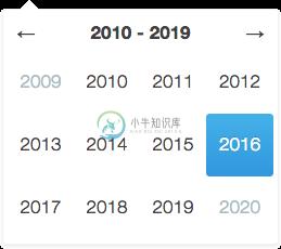
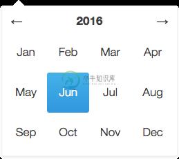
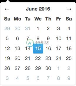
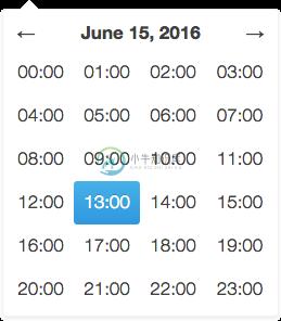
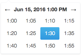
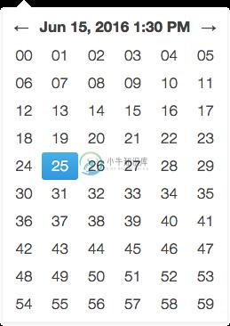
The views
| Decade view | Year view | Month view |
|---|---|---|
 |
 |
 |
| Day view | Hour view | Minute view |
 |
 |
 |
Additional themes
Angular Moment Picker provides the following additional themes. Each theme has a dedicate stylesheet to be included in the application the overrides the default style.
- Material UI - Plunker
<link href="//cdn.rawgit.com/indrimuska/angular-moment-picker/master/dist/themes/material-ui.min.css" rel="stylesheet">
A preview of the each theme is available here.
Options
To configure Angular Moment Picker you have to add to your element or your input the attribute relative to the options you want to set.
<div moment-picker="ctrl.birthday" locale="fr" format="LL">
    Mon anniversaire est le {{ ctrl.birthday }}
</div>
<input moment-picker="ctrl.dateFormatted" ng-model="ctrl.momentDate" format="DD/MM/YYYY">
| Property | Default | Description | Sample |
|---|---|---|---|
| moment-picker | Two-way bindable property as formatted datetime string. | Plunker | |
| ng-model | Two-way bindable property as Moment.js object. | Plunker | |
| locale | "en" |
Locale code. 1 | Plunker |
| format | "L LTS" |
Format of the output value and min/max date. 1 | Plunker |
| min-view | "decade" |
Minimum navigable view. | Plunker |
| max-view | "minute" |
Maximum navigable view. | Plunker |
| start-view | "year" |
Initial view when the picker is open. | Plunker |
| min-date | Two-way bindable property representing the minimum selectable date (as String in the same format of the value, or as a Moment.js object). | Plunker | |
| max-date | Two-way bindable property representing the maximum selectable date (as String in the same format of the value, or as a Moment.js object). | Plunker | |
| start-date | Two-way bindable property representing the initial date to be shown in picker (as String in the same format of the value, or as a Moment.js object). | Plunker | |
| disable | false |
Disables the picker if truly. | Plunker |
| position | Sets a fixed position for the picker. Available values are "top left", "top right", "bottom left", "bottom right". |
Plunker | |
| inline | false |
Views the picker inline. | Plunker |
| validate | true |
Forces picker value between the range minDate and maxDate. |
Plunker |
| autoclose | true |
Closes the picker after selecting a date. | Plunker |
| set-on-select | false |
Updates picker model after selecting a date in each view. | Plunker |
| is-open | Open/closes the picker when set to true or false. |
Plunker | |
| today | false |
Highlights the current day. | Plunker |
| keyboard | false |
Allows using the keyboard to navigate the picker. | Plunker |
| show-header | true |
Shows the header in the view. | Plunker |
| additions | { top: undefined, bottom: undefined } |
Template url for custom contents above and below each picker views (inside the dialog). | Plunker |
Methods
Append your method to your element and define its behavior in the controller.
<div moment-picker="ctrl.exhibition" format="dddd D MMMM" selectable="ctrl.isSelectable(date, type)">
    Next exhibition is on {{ ctrl.exhibition }}.
</div>
ctrl.isSelectable = function (date, type) {
    // disable all Sundays in the Month View
    return type != 'day' || date.format('dddd') != 'Sunday';
};
| Method | Parameters | Description | Sample |
|---|---|---|---|
| selectable | date, type |
Return true if the given date can be selected in the current view. Please note that this method is called for every date in the view, every time a view is rendered, so be careful, it may affect performances. |
Plunker |
Events
As for methods, to bind an event you only need to attach the right property to your picker.
<div moment-picker="ctrl.meeting" format="HH:mm A" change="ctrl.onChange(newValue, oldValue)">
    The meeting starts at {{ ctrl.meeting }}.
</div>
ctrl.onChange = function (newValue, oldValue) {
    $log.log('Meeting changed from ' + oldValue + ' to ' + newValue);
};
| Event | Parameters | Description | Sample |
|---|---|---|---|
| change | newValue, oldValue |
Function fired upon change in picker value. | Plunker |
momentPickerProvider
Angular Moment Picker comes out with its own provider, in order to define your own configuration for all the pickers in your app.
angular
    .module('myApp', ['moment-picker'])
    .config(['momentPickerProvider', function (momentPickerProvider) {
        momentPickerProvider.options({
            /* ... */
        });
    }]);
| Property | Default | Description |
|---|---|---|
| locale | "en" |
Locale code. 1 |
| format | "L LTS" |
Format of the output value and min/max date. 1 |
| min-view | "decade" |
Minimum navigable view. |
| max-view | "minute" |
Maximum navigable view. |
| start-view | "year" |
Initial view after picker opening. |
| position | Sets a fixed position for the picker. Available values are "top left", "top right", "bottom left", "bottom right". |
|
| inline | false |
Views the picker inline. |
| validate | true |
Forces picker value between the range minDate and maxDate. |
| autoclose | true |
Closes the picker after selecting a date. |
| set-on-select | false |
Updates picker model after selecting a date in each view. |
| today | false |
Highlights the current day. |
| keyboard | false |
Allows using the keyboard to navigate the picker. |
| show-header | true |
Shows the header in the view. |
| left-arrow | "←" |
Left arrow string (HTML allowed). |
| right-arrow | "→" |
Right arrow string (HTML allowed). |
| additions | { top: undefined, bottom: undefined } |
Template url for custom contents above and below each picker views (inside the dialog). |
| years-format | "YYYY" |
Years format in decade view. |
| months-format | "MMM" |
Months format in year view. |
| days-format | "D" |
Days format in month view. |
| hours-format | "HH:[00]" |
Hours format in day view. |
| hours-start | 0 |
First rendered hour in day view (24h format). |
| hours-end | 23 |
Last rendered hour in day view (24h format). |
| minutes-format | 2 | Minutes format in hour view. |
| minutes-step | 5 |
Step between each visible minute in hour view. |
| minutes-start | 0 |
First rendered minute in hour view. |
| minutes-end | 59 |
Last rendered minute in hour view. |
| seconds-format | "ss" |
Seconds format in minute view. |
| seconds-step | 1 |
Step between each visible second in minute view. |
| seconds-start | 0 |
First rendered second in minute view. |
| seconds-end | 59 |
Last rendered second in minute view. |
Notes
- Locale codes and format tokens are available at http://momentjs.com/.
- Locale format
LTwithout meridiem part (AM/PM, am/pm).
Builder
Try the online Angular Moment Picker Builder:
http://indrimuska.github.io/angular-moment-picker/#builder.
Dev scripts
npm run build: compile sources and generate built files indistfolder.npm run minify: generate built files and minified ones.npm run release: increase package version and compile the project.npm run test: run all tests in thetestsfolder.
License
Copyright (c) 2015 Indri Muska. Licensed under the MIT license.
-
效果:初次选择(另外一个时间未选) -开始时间:最小值没做限制,最大值为当日 -结束时间:最小值没做限制,最大值为当日 再次次选择(另外一个时间已选) -开始时间:最小值没做限制,最大值为结束时间最大值 -结束时间:最小值开始时间最小值,最大值为
-
第一种:indrimuska/angular-moment-picker 地址:github.com/indrimuska/… 第二种:angular-bootstrap-datetimepicker 地址:github.com/dalelotts/a… 第三种:angular-datepicker 地址:github.com/g00fy-/angu… 第四种:angular-daterangep
-
Angular Js -moment Picker 时间插件(不需引用JQ) 一、使用插件首先下载引用。 npm install angular-moment-picker npm install moment <link href="angular-moment-picker.css" rel="stylesheet"> <script src="angular.js"></script> <
-
Angular Js -moment Picker 时间插件(时间段选择) 一、moment Picker 插件的下载、引用及配置就不在多说了,直接暴力上代码 二、Html <span>{{ctrl.newchoose}}</span> <span id='#showEndTimeError' placeholder="请选择日期" moment-picker=
-
github下载地址:https://www.npmjs.com/package/angular2-simple-datepicker 使用代码: <input #dateText class="form-control input-width col-sm-8" type='text' value={{selDate}} (change)="setInputDate($event)"/> <da
-
1 历史、现状和发展 Moment.js核心库提供了基于偏移量值调整时间的功能。 Moment.js有一个非常灵活和先进的解析器,允许大范围的功能。解析器的灵活性也使其成为Moment.js中最常被滥用的工具之一。 轻量级JavaScript日期库,用于分析,验证,操作和格式化日期。 Moment的解析器支持为日期字符串指定多种可能的格式。 2 安装和使用 2.1 安装 2.1.1 在Node.j
-
ngx-moment moment.js pipes for Angular This module works with Angular 7.0.0 and newer. For older Angular versions, please install angular2-moment. For the AngularJS, please check out angular-moment. I
-
问题内容: 现场演示 我使用指令显示相对时间戳: 默认情况下,其格式为“一天前”,“ 5天前”等。 如何将格式更改为“ 1d”,“ 5d”,“ 3h”等? 问题答案: 您可以在配置或应用开始的某个位置自定义人性化。 关于RealtiveTime的文档 示例:http: //jsbin.com/satohazu/1/edit
-
问题内容: 我正在使用moment.js格式化我的日期时间,这里有两个日期值,当一个日期大于另一个日期时,我想实现一种特定的功能。我阅读了他们的大多数文档,但没有找到实现此目的的功能。我知道会在那里。 这是我的代码: 编辑 在这里,我正在比较两个日期,即,期望第一个日期大于第二个日期,但是它总是转到else条件。不知道为什么 问题答案: 我相信你正在寻找的查询功能,,,和。 但是要确切地说出您要尝
-
我正在使用moment.js格式化我的日期时间,这里我有两个日期值,当一个日期大于另一个时,我想实现一个特定的函数。我读了他们的大部分文档,但没有找到实现这一点的函数。我知道它会在那里。 这是我的代码: 编辑 在这里,我比较了两个日期,即,希望第一个日期大于第二个日期,但它总是转到else条件。我不知道为什么?
-
有没有办法根据日期范围找出年份和季度? 我们考虑将11月作为财政年度的开始日期,将10月作为财政年度的结束日期。 前一年的11月到下一年的10月被认为是一个财政年度。 2014年11月1日-2015年10月31日- 10月31日之后的任何记录都将进入下一个财政年度。 我们还需要找到如下宿舍: 第1季度=11月、12月 - 但它被认为是第一季度。 --代码-- 函数getQuarter(){var