
react-native-material-cards
A material design card component, customizable and versatile.
See Google Material Design for more info on Cards.
Installation
npm install --save react-native-material-cards
Basic Usage
Import the components like so:
import { Card, CardTitle, CardContent, CardAction, CardButton, CardImage } from 'react-native-material-cards'
Then insert the card in your code:
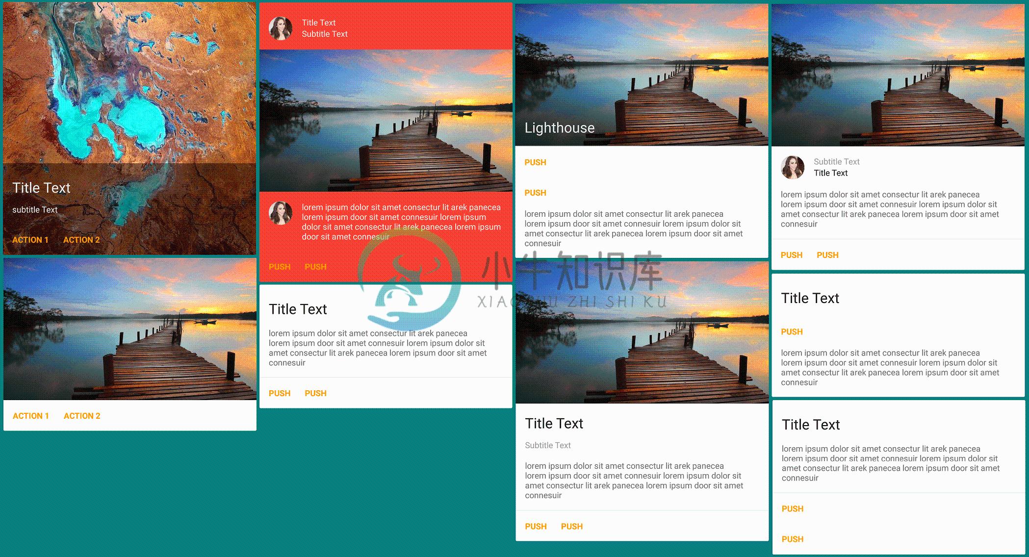
<Card>
  <CardImage
    source={{uri: 'http://placehold.it/480x270'}}
    title="Above all i am here"
  />
  <CardTitle
    title="This is a title"
    subtitle="This is subtitle"
   />
  <CardContent text="Your device will reboot in few seconds once successful, be patient meanwhile" />
  <CardAction
    separator={true}
    inColumn={false}>
    <CardButton
      onPress={() => {}}
      title="Push"
      color="blue"
    />
    <CardButton
      onPress={() => {}}
      title="Later"
      color="blue"
    />
  </CardAction>
</Card>
Card Component Options
| Prop | Type | Effect | Default Value |
|---|---|---|---|
isDark |
boolean |
If the card background is dark, sets a light text color, this prop is passed to all child components | true |
mediaSource |
object |
The image to show in background of a card, with content overlayed, passed to Image's source prop |
undefined |
avatarSource |
object |
The avatar image to be shown in the card's content or header section, whichever comes first, passed to Image's source prop |
undefined |
style |
object |
The style object to be merged with the default style of root container | {} |
CardTitle Component Options
| Prop | Type | Effect | Default Value |
|---|---|---|---|
title |
string |
The title text | undefined |
subtitle |
string |
The subtitle text | undefined |
subtitleAbove |
boolean |
Whether the subtitle should be shown above the title | false |
avatarSource |
object |
The avatar image to be shown, passed to Image's source prop |
undefined |
style |
object |
The style object to be merged with the default style of root container | {} |
titleStyle |
object |
The style object to be merged with the default style of title text | {} |
subtitleStyle |
object |
The style object to be merged with the default style of subtitle text | {} |
CardContent Component Options
| Prop | Type | Effect | Default Value |
|---|---|---|---|
text |
string |
The content text, this can be skipped and any custom content can be rendered as children | undefined |
avatarSource |
object |
The avatar image to be shown, passed to Image's source prop |
undefined |
style |
object |
The style object to be merged with the default style of root container | {} |
textStyle |
object |
The style object to be merged with the default style of text | {} |
CardImage Component Options
| Prop | Type | Effect | Default Value |
|---|---|---|---|
source |
object |
The image to be shown, passed to Image's source prop, , this can be skipped and any custom image or content can be rendered as children |
undefined |
resizeMode |
string |
Determines how to resize the image when the frame doesn't match the raw image dimensions | stretch |
resizeMethod |
string |
Resize the image when the image's dimensions differ from the image view's dimensions. | resize |
singleLineTitle |
boolean |
Set to true if you want the title to be one line, redacted with ellipses | true |
style |
object |
The style object to be merged with the default style of root container | {} |
textStyle |
object |
The style object to be merged with the default style of text | {} |
CardAction Component Options
| Prop | Type | Effect | Default Value |
|---|---|---|---|
separator |
boolean |
Whether a separator should be shown | true |
inColumn |
boolean |
Whether the buttons should be stacked in a column | false |
style |
object |
The style object to be merged with the default style of root container | {} |
CardButton Component Options
| Prop | Type | Effect | Default Value |
|---|---|---|---|
title |
string |
The button's text, this can be skipped and any custom title or content can be rendered as children | undefined |
color |
string |
The color of button text | orange |
onPress |
function |
The function to be called when button is pressed | noop (defined in src/utils) |
style |
object |
The style object to be merged with the default style of root container | {} |
titleStyle |
object |
The style object to be merged with the default style of button title | {} |
To do
- Add cards with side media
PRs are welcome :)
-
React Native Material UI (iOS and Android supported) Highly customizable material design components for React Native! Documentation Getting Started Usage Demo & Examples Components Showroom Savee.io i
-
本文向大家介绍react-native 启动React Native Packager,包括了react-native 启动React Native Packager的使用技巧和注意事项,需要的朋友参考一下 示例 在最新版本的React Native上,无需运行打包程序。它将自动运行。 默认情况下,这将在端口8081上启动服务器。要指定服务器所在的端口
-
React Material Components Web React wrapper of Material Components Web Under Active Development The project is under active development. Every updates can contain breaking changes before 0.2.0. We do
-
百度移动统计SDK支持使用react native框架的H5页面统计,封装好的插件已经在github上开源,相关用法具体请参考:https://github.com/BaiduMobileAnalysis/baidumobstat-react-native。
-
The React Native environment has a lot of little quirks, so this documentation is aimed at helping smooth those over. Please feel free to create issues on GitHub for recommendations and additions to t
-
React Native 可以基于目前大热的开源JavaScript库React.js来开发iOS和Android原生App。而且React Native已经用于生产环境——Facebook Groups iOS 应用就是基于它开发的。 React Native的原理是在JavaScript中用React抽象操作系统原生的UI组件,代替DOM元素来渲染,比如以<View>取代<div>,以<Ima