
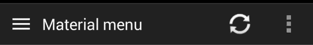
Material Menu
Morphing Android menu, back, dismiss and check buttons
Have full control of the animation:
Including in your project
compile 'com.balysv.materialmenu:material-menu:2.0.0'
Versions up to 2.0 (deprecated)
See README for setting up older versions of the library.
Usage
MaterialMenuDrawable
Use it as a standalone drawable in your Toolbar:
private MaterialMenuDrawable materialMenu;

protected void onCreate(Bundle savedInstanceState) {
    super.onCreate(savedInstanceState);
    setContentView(R.layout.toolbar);
    Toolbar toolbar = (Toolbar) findViewById(R.id.toolbar);
    setSupportActionBar(toolbar);
    toolbar.setNavigationOnClickListener(new View.OnClickListener() {
        @Override public void onClick(View v) {
        // Handle your drawable state here
        materialMenu.animateState(newState);
      }
    });
    materialMenu = new MaterialMenuDrawable(this, Color.WHITE, Stroke.THIN);
    toolbar.setNavigationIcon(materialMenu);
}
MaterialMenuView
A plain old View that draws the icon and provides an API to manipulate its state. You can embed itin any layout including a Toolbar.
Customisation is also available through xml attributes:
app:mm_color="color"               // Color of drawable
app:mm_visible="boolean"           // Visible
app:mm_transformDuration="integer" // Transformation animation duration
app:mm_scale="integer"             // Scale factor of drawable
app:mm_strokeWidth="integer"       // Stroke width of icons (can only be 1, 2 or 3)
app:mm_rtlEnabled="boolean"        // Enabled RTL layout support (flips all drawables)
app:mm_iconState="enum"            // Set the intial state of the drawable (burger, arrow, x or check)
API
There are four icon states:
BURGER, ARROW, X, CHECK
To morph the drawable state
MaterialMenu.animateIconState(IconState state)
To change the drawable state without animation
MaterialMenu.setIconState(IconState state)
To animate the drawable manually (i.e. on navigation drawer slide):
MaterialMenu.setTransformationOffset(AnimationState state, float value)
To hide or show the drawable:
MaterialMenu.setVisible(boolean visible)
where AnimationState is one of BURGER_ARROW, BURGER_X, ARROW_X, ARROW_CHECK, BURGER_CHECK, X_CHECKand value is between 0 and 2
Note: The icon state is resolved by current offset value. Make sure you use offset between 0 and 1 for forward animation and 1 and 2 for backwards to correctly save icon state on activity recreation.
NavigationDrawer slide interaction
Implement MaterialMenu into your ActionBar as described above and add a custom DrawerListener:
private DrawerLayout drawerLayout;
private boolean isDrawerOpened;
private MaterialMenuDrawable materialMenu;

@Override
protected void onCreate(Bundle savedInstanceState) {
    super.onCreate(savedInstanceState);
    toolbar = (Toolbar) findViewById(R.id.toolbar);
    setSupportActionBar(toolbar);
    materialMenu = new MaterialMenuDrawable(this, Color.WHITE, Stroke.THIN);
    toolbar.setNavigationIcon(materialMenu);

    drawerLayout = (DrawerLayout) findViewById(R.id.drawer_layout);
    drawerLayout.setDrawerListener(new DrawerLayout.SimpleDrawerListener() {
        @Override
        public void onDrawerSlide(View drawerView, float slideOffset) {
            materialMenu.setTransformationOffset(
                MaterialMenuDrawable.AnimationState.BURGER_ARROW,
                isDrawerOpened ? 2 - slideOffset : slideOffset
            );
        }

        @Override
        public void onDrawerOpened(View drawerView) {
            isDrawerOpened = true;
        }

        @Override
        public void onDrawerClosed(View drawerView) {
            isDrawerOpened = false;
        }

        @Override
        public void onDrawerStateChanged(int newState) {
            if(newState == DrawerLayout.STATE_IDLE) {
                if(isDrawerOpened) {
                   menu.setIconState(MaterialMenuDrawable.IconState.ARROW);
                } else {
                   menu.setIconState(MaterialMenuDrawable.IconState.BURGER);
                }
            }
        }
    });
}
Developed By
Balys Valentukevicius
License
Copyright 2016 Balys Valentukevicius

Licensed under the Apache License, Version 2.0 (the "License");
you may not use this file except in compliance with the License.
You may obtain a copy of the License at

   http://www.apache.org/licenses/LICENSE-2.0

Unless required by applicable law or agreed to in writing, software
distributed under the License is distributed on an "AS IS" BASIS,
WITHOUT WARRANTIES OR CONDITIONS OF ANY KIND, either express or implied.
See the License for the specific language governing permissions and
limitations under the License.
-
最近用到这个com.google.android.material:material 看到最新版本是1.7.0,但是运行时发现一个错误 查看最新版本 material-版本号\res\values-v31\values-v31.xml:22:5-102: AAPT: error: resource 查了查资料,看到有人说是: 该库从1.5.0开始需要你在gradle文件中声明compile SDK
-
最近在使用material-ui做左侧导航的时候遇到了一点难缠的小问题,由于传统中a标签包裹子元素组成链接的思维习惯,加上MenuItem标签不能包裹子元素,导航部分一开始采用NavLink包裹MenuItem的结构: [/*data*/].map(link => <NavLink key={link.icon} to={link.route} styl
-
Material Design for AngularJS Apps Material Design is a specification for aunified system of visual, motion, and interaction design that adapts across different devices. Ourgoal is to deliver a lean,
-
材料拥有确定不变的特性和固定的行为。了解这些特性将有助于你在一定程度上熟悉材料,这与 Material Design 的构想是一致的。 物理特性 材料具有变化的长宽尺寸(以 dp 为计)和均匀的厚度(1dp)。 (上图)可取 材料的高度和宽度是可变的。 (上图)不可取 材料总是 1dp 厚。 材料会形成阴影。 阴影是由于材料元件之间的相对高度(Z 轴位置)而自然产生的。 (上图)可取 阴影描述材料
-
Material ScrollTop 是轻量级的回到页面顶部按钮,特点: 轻量级 Material Design inspired 涟漪效应 平滑的动态效果 定制化 一些实用的选项 CSS3 (Sass) + jQuery
-
Vue Material 是一个实现 Google 的像素材料设计的 Vue 组件库,它提供了适合所有现代Web浏览器的内置动态主题的组件,它的 API 也简单明了。 安装和使用: 通过 npm or yarn 安装 npm install vue-material@beta --saveyarn add vue-material@beta 像 JSPM and Bower 暂时还不支持 在代码中
-
Material-Animations 是一个很好过渡动画库, 可以应用于 Activity 与 Activity 之间的跳转, Fragment 与 Fragment 之间的跳转, 以及各个 View 变化前后的过渡动画。 效果图: