
基于jquery的手风琴图片展示效果实现方法

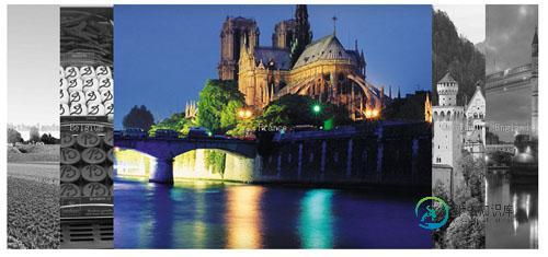
本文实例讲述了基于jquery的手风琴图片展示效果实现方法。分享给大家供大家参考。具体实现方法如下:
代码运行效果如下图所示:
index.html页面代码如下:
<!DOCTYPE html>

<html class=''>

<head>

    <title>一款基于jquery的手风琴图片展示效果demo</title>

    <style class="cp-pen-styles">

        div

        {

            -moz-box-sizing: border-box;

            box-sizing: border-box;

        }


        html, body, .page-container

        {

            height: 100%;

            overflow: hidden;

        }


        .page-container

        {

            -webkit-transition: padding 0.2s ease-in;

            transition: padding 0.2s ease-in;

            padding: 80px;

        }

        .page-container.opened

        {

            padding: 0;

        }

        .page-container.opened .flex-container .country:not(.active)

        {

            opacity: 0;

            -webkit-flex: 0;

            -ms-flex: 0;

            flex: 0;

        }

        .page-container.opened .flex-container .country:not(.active) div

        {

            opacity: 0;

        }

        .page-container.opened .flex-container .active:after

        {

            -webkit-filter: grayscale(0%) !important;

            filter: grayscale(0%) !important;

        }


        .flex-container

        {

            display: -webkit-flex;

            display: -ms-flexbox;

            display: flex;

            height: 100%;

        }

        @media all and (max-width: 900px)

        {

            .flex-container

            {

                -webkit-flex-direction: column;

                -ms-flex-direction: column;

                flex-direction: column;

            }

        }


        .country

        {

            position: relative;

            -webkit-flex-grow: 1;

            -ms-flex-positive: 1;

            flex-grow: 1;

            -webkit-flex: 1;

            -ms-flex: 1;

            flex: 1;

            -webkit-transition: 0.5s ease-in-out;

            transition: 0.5s ease-in-out;

            cursor: pointer;

            font-family: "Bree Serif" , serif;

            text-align: center;

            color: #fff;

            font-size: 22px;

            text-shadow: 0 0 3px #000;

        }

        .country div

        {

            position: absolute;

            width: 100%;

            z-index: 10;

            top: 50%;

            text-align: center;

            -webkit-transition: 0.1s;

            transition: 0.1s;

            -webkit-transform: translateY(-50%);

            -ms-transform: translateY(-50%);

            transform: translateY(-50%);

            -webkit-filter: none;

            filter: none;

        }

        .country:after

        {

            content: " ";

            position: absolute;

            top: 0;

            left: 0;

            right: 0;

            bottom: 0;

            background-size: cover;

            -webkit-transition: 0.5s ease-in-out;

            transition: 0.5s ease-in-out;

            -webkit-filter: grayscale(100%);

            filter: grayscale(100%);

        }

        .country:hover

        {

            -webkit-flex-grow: 6;

            -ms-flex-positive: 6;

            flex-grow: 6;

        }

        .country:hover:after

        {

            -webkit-filter: grayscale(0%);

            filter: grayscale(0%);

        }

        @media all and (max-width: 900px)

        {

            .country

            {

                height: auto;

            }

        }


        .netherlands:after

        {

            background-image: url("Netherlands.png");

            background-position: center;

        }


        .belgium:after

        {

            background-image: url("belgium-307_3.jpg");

            background-position: center;

        }


        .france:after

        {

            background-image: url("30.jpg");

            background-position: center;

        }


        .germany:after

        {

            background-image: url("vacation.jpg");

            background-position: center;

        }


        .england:after

        {

            background-image: url("england.jpg");

            background-position: center;

        }

    </style>

</head>

<body>

    <div class="page-container">

        <div class="flex-container">

            <div class="country netherlands">

                <div>

                    Netherlands</div>

            </div>

            <div class="country belgium">

                <div>

                    Belgium</div>

            </div>

            <div class="country france">

                <div>

                    France</div>

            </div>

            <div class="country germany">

                <div>

                    Germany</div>

            </div>

            <div class="country england">

                <div>

                    England</div>

            </div>

        </div>

    </div>

    <script src='jquery.js'></script>

    <script>

        $('.country').click(function () {

            $(this).toggleClass('active');

            $('.page-container').toggleClass('opened');

        }); //@ sourceURL=pen.js

    </script>

</body>

</html>
完整实例代码点击此处本站下载。
希望本文所述对大家的jQuery特效设计有所帮助。
-
本文向大家介绍JS实现图片手风琴效果,包括了JS实现图片手风琴效果的使用技巧和注意事项,需要的朋友参考一下 ''推拉门''动效也可以称作"手风琴"效果,大多数效果实现的思路基本是一样的,下面介绍两种方法,一种是通过改变图片的偏移位置实现移动,另一种是通过遍历背景图片后改变图片的宽度实现变换。 推拉门收缩状态.png "推拉门"展开状态.png "推拉门"实现方法一:改变图片宽度 html+css代
-
本文向大家介绍简单实现jQuery手风琴效果,包括了简单实现jQuery手风琴效果的使用技巧和注意事项,需要的朋友参考一下 本文实例为大家分享了jQuery实现手风琴效果的具体代码,供大家参考,具体内容如下 js代码: css代码: html代码: 以上就是本文的全部内容,希望对大家的学习有所帮助,也希望大家多多支持呐喊教程。
-
本文向大家介绍jquery超简单实现手风琴效果的方法,包括了jquery超简单实现手风琴效果的方法的使用技巧和注意事项,需要的朋友参考一下 本文实例讲述了jquery超简单实现手风琴效果的方法。分享给大家供大家参考。核心代码如下: 希望本文所述对大家的jQuery程序设计有所帮助。
-
本文向大家介绍JavaScript实现手风琴效果,包括了JavaScript实现手风琴效果的使用技巧和注意事项,需要的朋友参考一下 本文实例为大家分享了JavaScript实现手风琴效果的具体代码,供大家参考,具体内容如下 代码: 以上就是本文的全部内容,希望对大家的学习有所帮助,也希望大家多多支持呐喊教程。
-
本文向大家介绍Html5 js实现手风琴效果,包括了Html5 js实现手风琴效果的使用技巧和注意事项,需要的朋友参考一下 使用H5实现横向的手风琴功能,供大家参考,具体内容如下 下载链接:H5实现手风琴 以上就是本文的全部内容,希望对大家的学习有所帮助,也希望大家多多支持呐喊教程。
-
本文向大家介绍js实现简单的手风琴效果,包括了js实现简单的手风琴效果的使用技巧和注意事项,需要的朋友参考一下 效果图: 图(1)初始图 图(2)点击展开效果 代码如下: 以上就是本文的全部内容,希望本文的内容对大家的学习或者工作能带来一定的帮助,同时也希望多多支持呐喊教程!